先看一道题目:谈谈你对CSS盒模型的理解,思考应该如何回答...
涉及知识点(层层递进):
- 基本概念:标准模型+ IE模型(区别)
- JS如何设置获取盒子模型对应的宽和高
- 实例题(根据盒模型解释边距重叠)
- BFC(边距重叠解决方案)
基本概念
所有HTML元素可以看作盒子,在CSS中,"box model"这一术语是用来设计和布局时使用。
CSS盒模型本质上是一个盒子,封装周围的HTML元素,它包括:边距,边框,填充,和实际内容。
盒模型允许我们在其它元素和周围元素边框之间的空间放置元素。
下面的图片说明了盒子模型(Box Model):
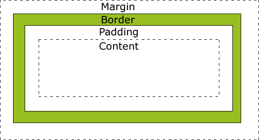
不同部分的说明:
- margin(外边距) - 清除边框外的区域,外边距是透明的。
- border(边框) - 围绕在内边距和内容外的边框。
- padding(内边距) - 清除内容周围的区域,内边距是透明的。
- content(内容) - 盒子的内容,显示文本和图像。
盒子在标准流中的定位原则:
margin控制的是盒子与盒子之间的距离,padding存在于盒子的内部它不涉及与其他盒子之间的关系和相互影响问题,因此要精确控制盒子的位置,就必须对margin有更深入的了解。
(1)行内元素之间的水平margin
当两个行内元素紧邻时,它们之间的距离为第一个元素的右margin加上第二元素的左margin。
(2)块级元素之间的竖直margin
两个竖直排列的块级元素,它们之间的垂直距离不是上边的第一个元素的下margin和第二个元素的上margin的总和,而是两者中的较大者。这在实际制作网页的时候要特别注意。
(3)嵌套盒子之间的margin
这时子块的margin以父块的content为参考进行排列。
(4)margin设为负值
会使设为负数的块向相反的方向移动,甚至会覆盖在另外的块上。
标准盒模型和IE盒模型的区别
标准盒模型
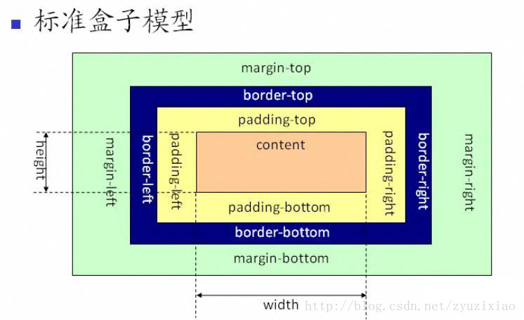
标准盒模型(内容盒子):宽高都指content,不包括padding和border;
- 设置标准盒模型:
box-sizing:content-box;
一般在现代浏览器中使用的都是 标准盒模型content-box。
IE盒模型

它所说的width一般只包含内容,并且盒子的大小会以内容优先,自动扩展,子元素可以撑开父元素.
IE盒模型又称怪异盒模型(边框盒子):宽高是指content+padding+border的总的宽高;
- 设置IE盒模型:
box-sizing:border-box;
一般在IE浏览器中默认为这种怪异盒模型,但是由于其自身的特殊性,手机页面中也有使用怪异盒模型。怪异盒模型中,父元素的盒模型确定,子元素无法撑开父元素的盒模型。
JS如何设置获取盒模型对应的宽和高
以下 dom 是指通过JS获取到的,比如getElementById
dom.style.width/height
- 只能取内联样式中的的宽和高
dom.currentStyle.width/height
- 三种设置方式设置的宽高都可以取到,但是只支持IE浏览器
window.getComputedStyle(dom).width/height
- 三种设置方式设置的宽高都可以取到,兼容firefox和chrome,相比上一种通用性更好一些
dom.getBoundingClientRect().width/height
- 适用场所:计算一个元素的绝对位置,相对于视窗viewport的左顶点的绝对位置,dom.getBoundingClientRect()方法可以拿到left, top, right, bottom, x, y, width, and height
MDN-getBoundingClientRect()
实例题(根据盒模型解释边距重叠)
父子元素:子元素的height=100px;marign-top=10px;请问父元素的高度是?
下面的代码片段显示子元素和父元素的高度都是100px;
若给父元素加上overflow:hidden;(BFC),则子元素的高度为100不变,父元素的高度为110px;
<!DOCTYPE html>
<html>
	<head>
		<meta charset="utf-8">
		<title></title>
	</head>
	<body>
		<section id="sec">
			<style>
				* {
					margin: 0;
					padding: 0;
				}

				#sec {
					background: #f00;
				}

				.child {
					height: 100px;
					margin-top: 10px;
					background: yellow;
				}
			</style>
			<article class="child"></article>
		</section>
	</body>
</html>
兄弟元素:若为上下分布,则大的margin兼容小的margin;若为左右分布,则相加;
上下分布: 以下代码片段中,elderBrother和youngerBrother之间的上下间距是30px;
<!DOCTYPE html>
<html>
	<head>
		<meta charset="utf-8">
		<title></title>
	</head>
	<body>
		<section id="sect">
			<style>
				* {
					margin: 0;
					padding: 0;
				}

				#sect article {
					height: 200px;
				}

				.elderBrother {
					margin-bottom: 30px;
					background: #f00;
				}

				.youngerBrother {
					margin-top: 10px;
					background: yellow;
				}
			</style>
			<article class="elderBrother"></article>
			<article class="youngerBrother"></article>
		</section>
	</body>
</html>
左右分布:以下代码片段中,elderBrother和youngerBrother之间的左右间距是40px;
<!DOCTYPE html>
<html>
	<head>
		<meta charset="utf-8">
		<title></title>
	</head>
	<body>
		<section id="sect">
			<style>
				* {
					margin: 0;
					padding: 0;
				}

				#sect article {
					height: 100px;
					 300px;
					display: inline-block;
				}

				.elderBrother {
					margin-bottom: 30px;
					background: #f00;
				}

				.youngerBrother {
					margin-top: 10px;
					background: yellow;
				}
			</style>
			<article class="elderBrother"></article>
			<article class="youngerBrother"></article>
		</section>
	</body>
</html>
BFC(边距重叠解决方案)
- BFC 的基本概念
- BFC 的布局规则
- 如何创建 BFC
- BFC使用场景
BFC 的基本概念
Block Formatting Context, 块级格式化上下文,一个独立的块级渲染区域,该区域拥有一套渲染规格来约束块级盒子的布局.
简单来说就是一个独立的盒子,并且这个盒子里的布局不受外部影响,也不会影响到外部元素。
BFC 的布局规则
- 内部的Box会在垂直方向,一个接一个地放置。
- Box垂直方向的距离由margin决定。属于同一个BFC的两个相邻Box的margin会发生重叠
- 每个元素的margin box的左边, 与包含块border box的左边相接触(对于从左往右的格式化,否则相反)。即使存在浮动也是如此。
- BFC的区域不会与float box重叠。
- BFC就是页面上的一个隔离的独立容器,容器里面的子元素不会影响到外面的元素。反之也如此。
- 计算BFC的高度时,浮动元素也参与计算
- 块格式化上下文对浮动定位(参见 float)与清除浮动(参见 clear)都很重要。
- 浮动定位和清除浮动时只会应用于同一个BFC内的元素。
- 浮动不会影响其它BFC中元素的布局,而清除浮动只能清除同一BFC中在它前面的元素的浮动。
- 外边距折叠(Margin collapsing)也只会发生在属于同一BFC的块级元素之间。
补充:包含块
确定包含块
---确定一个元素的包含块的过程完全依赖于这个元素的 position 属性:
-
如果 position 属性为 static 或 relative ,包含块就是由它的最近的祖先块元素(比如说inline-block, block 或 list-item元素)或格式化上下文(比如说 a table container, flex container, grid container, or the block container itself)的内容区的边缘组成的。
-
如果 position 属性为 absolute ,包含块就是由它的最近的 position 的值不是 static (也就是值为fixed, absolute, relative 或 sticky)的祖先元素的内边距区的边缘组成。
-
如果 position 属性是 fixed,在连续媒体的情况下(continuous media)包含块是 viewport ,在分页媒体(paged media)下的情况下包含块是分页区域(page area)。
-
如果 position 属性是 absolute 或 fixed,包含块也可能是由满足以下条件的最近父级元素的内边距区的边缘组成的:
- A transform or perspective value other than none
- A will-change value of transform or perspective
- A filter value other than none or a will-change value of filter(only works on Firefox).
- A contain value of paint (例如: contain: paint;)
如何创建 BFC
- 根元素 html
- 浮动元素(元素的 float 不是 none)
- 绝对定位元素(元素的 position 为 absolute 或 fixed)
- 行内块元素(元素的 display 为 inline-block)
- 表格单元格(元素的 display为 table-cell,HTML表格单元格默认为该值)
- 表格标题(元素的 display 为 table-caption,HTML表格标题默认为该值)
- 匿名表格单元格元素(元素的 display为 table、table-row、 table-row-group、table-header-group、table-footer-group(分别是HTML table、row、tbody、thead、tfoot的默认属性)或 inline-table)
- overflow 值不为 visible 的块元素
- display 值为 flow-root 的元素
- contain 值为 layout、content或 paint 的元素
- 弹性元素(display为 flex 或 inline-flex元素的直接子元素)
- 网格元素(display为 grid 或 inline-grid 元素的直接子元素)
- 多列容器(元素的 column-count 或 column-width 不为 auto,包括 column-count 为 1)
- column-span 为 all 的元素始终会创建一个新的BFC,即使该元素没有包裹在一个多列容器中(标准变更,Chrome bug)。
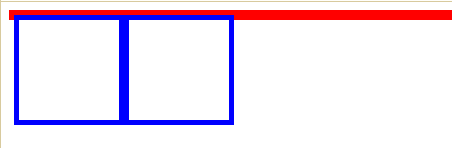
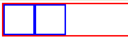
BFC常见作用
解决浮动导致父元素高度塌陷问题
在通常情况下父元素的高度会被子元素撑开,而在这里因为其子元素为浮动元素所以父元素发生了高度坍塌,上下边界重合。这时就可以用BFC来清除浮动了。
<!DOCTYPE html>
<html>
	<head>
		<meta charset="utf-8">
		<title></title>
	</head>
	<body>
		<section>
		  <style>
		    .par{
		      border:5px solid red;
		      1000px;
			  /* 生成BFC,把浮动元素的高度计算在内,变相地清除了内部浮动 */
		      overflow: hidden;
		    }
		    .child{
		      border: 5px solid blue;
		      float: left;
		      height:100px;
		       100px;
		    }
		  </style>
		  <div class="par">
		    <div class="child"></div>
		    <div class="child"></div>
		  </div>
		</section>
	</body>
</html>
BFC 会阻止外边距合并
问题案例:外边距塌陷
创建新的BFC避免两个相邻 div 之间的 外边距合并 问题
两个p 中间取了最大值100为重叠了.
<!DOCTYPE html>
<html>
	<head>
		<meta charset="utf-8">
		<title></title>
	</head>
	<body>
		<section>
			<style>
				.top {
					height: 100px;
					margin-bottom: 50px;
					background-color: red;
				}

				.bottom {
					height: 100px;
					margin-top: 100px;
					background-color: blue;
				}
			</style>
			<p class="top"></p>
			<p class="bottom"></p>
		</section>
	</body>
</html>
在p外面包裹一层容器,并触发该容器生成一个BFC。那么两个P便不属于同一个BFC,就不会发生margin重叠了.
<!DOCTYPE html>
<html>
	<head>
		<meta charset="utf-8">
		<title></title>
	</head>
	<body>
		<section>
			<style>
				.wrap {
					overflow: hidden;
				}

				.top {
					height: 100px;
					margin-bottom: 50px;
					background-color: red;
				}

				.bottom {
					height: 100px;
					margin-top: 100px;
					background-color: blue;
				}
			</style>
			<p class="top"></p>
			<div class="wrap">
				<p class="bottom"></p>
			</div>
		</section>
	</body>
</html>
应用-自适应两栏布局
<!DOCTYPE html>
<html>
	<head>
		<meta charset="utf-8">
		<title></title>
	</head>
	<body>
		<section>
			<style>
				.left {
					 100px;
					float: left;
					height: 100px;
					background-color: yellow;
				}

				.right {
					height: 150px;
					background-color: red;
					overflow: hidden;
				}
			</style>
			<div class="left"></div>
			<div class="right"></div>
		</section>
	</body>
</html>