1.组件cell
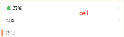
这里的cell分为三种样式,左侧带图标,不带图标,以及左侧带竖线的cell。
每一个组件都有一个底部边框:
这里我们采用了移动端1px像素问题的解决方法:父级元素设置相对定位,构建1个伪元素,设置绝对定位, 将它的长宽放大到2倍, 边框宽度设置为1px, 再以transform缩放到50%.
&:before {
  	content: '';
  	position: absolute;
  	left: 0;
  	bottom: 0;
  	right: 0;
  	height: 1px;
  	background: #eee;
  	transform: scaleY(0.5);
}
不同的样式,我们采用slot内容分发的方式来实现
Index.vue
<m-cell title="提醒" icon>
	<img src="../../assets/images/ic_mine_notification.png" slot="icon">
	<a href="javascript:;" slot="cell-right"><img src="../../assets/images/ic_arrow_gray_small.png" alt=""></a>
</m-cell>
<m-cell title="设置">
	<a href="javascript:;" slot="cell-right"><img src="../../assets/images/ic_arrow_gray_small.png" alt=""></a>
</m-cell>
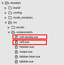
cell.vue
<template>
  <div class="m-cell normal" :class="label">
    <div class="m-cell-title">
      <slot name="icon"></slot> {{title}}
    </div>
    <div class="m-cell-right">
      <slot name="cell-right"></slot>
    </div>
  </div>
</template>
<script>
  export default {
    props: {
      title: {
        type: String,
        default: ''
      },
      hot: {
        type: Boolean,
        default: false
      },
      recommend: {
        type: Boolean,
        default: false
      },
      icon: {
        type: Boolean,
        default: false
      },
      label: {
        type: String,
        default: 'normal'
      }
    }
  }

</script>
<style lang="less">
  .m-cell {
    position: relative;
    padding: 10px 5px 10px 15px;
    display: flex;
    justify-content: space-between;
    align-items: center;
    &:before {
      content: '';
      position: absolute;
      left: 0;
      bottom: 0;
      right: 0;
      height: 1px;
      background: #eee;
      transform: scaleY(0.5);
    }
    .m-cell-title {
      font-size: 15px;
      img {
         20px;
        height: 20px;
      }
    }
    .m-cell-right {
      font-size: 12px;
      a {
        color: #666;
      }
      img {
         20px;
        height: 20px;
      }
    }
    &.normal {}
    &.hot {
      padding: 0px 5px 0px 15px;
      height: 22px;
      &:after {
        content: '';
        position: absolute;
         5px;
        left: 0;
        top: 0px;
        bottom: 0px;
        background: #ff8447;
      }
      &:before {
        height: 0
      }
    }
    &.recommend {
      padding: 0px 5px 0px 15px;
      height: 22px;
      &:after {
        content: '';
        position: absolute;
         5px;
        left: 0;
        top: 0px;
        bottom: 0px;
        background: #42bd56;
      }
      &:before {
        height: 0
      }
    }
  }
</style>
2.组件media-cell
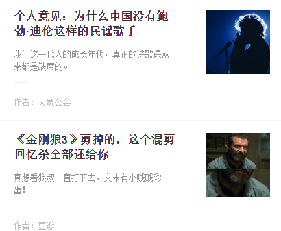
这里的作者,栏目,图片通过props传递,标题描述通过slot内容分发,图片采用背景居中的方式来显示,background-position: center center;background-size: cover;
<m-cell-media author="作者:大象公会" column="来自栏目:广播精选" img="https://qnmob2.doubanio.com/img/files/file-1489047494.jpg">
  <span slot="title">个人意见:为什么中国没有鲍勃·迪伦这样的民谣歌手</span>
  <span slot="describe">我们这一代人的成长年代,真正的诗歌课从来都是缺席的。</span>
</m-cell-media>
cell-media.vue
<template>
  <div class="m-cell-media-wrap">
    <a href="javascript:;">
      <div class="m-cell-media-top">
        <div class="m-cell-media">
          <div class="m-cell-title m-ellipsis-2">
            <slot name="title"></slot>
          </div>
          <div class="m-cell-detail m-ellipsis-2">
            <slot name='describe'></slot>
          </div>
        </div>
        <div class="m-pull-right right-img" :style="{'background-image':'url('+img+')'}">
        </div>
      </div>
      <div class="m-cell-media-bottom">
        <p v-if="author">作者:{{author}}</p>
        <p v-if="column">{{column}}</p>
      </div>
    </a>
  </div>
</template>
<script>
  export default {
    props: ['author', 'column', 'img']
  }

</script>
<style lang="less">
  .m-cell-media-wrap {
    display: flex;
    flex-direction: column;
    padding: 18px 20px;
    position: relative;
    &:after {
      content: '';
      position: absolute;
      left: 0;
      bottom: 0;
      right: 0;
      height: 1px;
      background: #eee;
      transform: scaleY(0.5);
    }
    .m-cell-media-top {
      display: flex;
      flex-direction: row;
      .m-cell-media {
        flex: 1;
        padding-right: 45px;
      }
      .m-cell-title {
        font-size: 17px;
        line-height: 22px;
        color: #333;
        font-weight: bold;
      }
      .m-cell-detail {
        font-size: 12px;
        padding-top: 12px;
        color: #939393;
      }
      .m-pull-right {
         94px;
        height: 94px;
        overflow: hidden;
        background-position: center center;
        background-size: cover;
        img {
           100%;
        }
      }
    }
    .m-cell-media-bottom {
      display: flex;
      justify-content: space-between;
      padding-top: 20px;
      margin-top: 12px;
      color: #bfbfbf;
      position: relative;
      &:before {
        content: '';
        position: absolute;
        top: 0;
        left: 0;
         20px;
        height: 1px;
        background: #eee;
      }
    }
  }

</style>
.