在页面中放置一个类名为container的层作为容器,在该层中再定义一个名为shape的子层,HTML代码描述如下:
<div class="container">
<div class="shape"></div>
</div>
分别为container和shape定义CSS样式规则如下:
.container
{
margin: 0 auto;
500px;
height: 500px;
position: relative;
overflow: hidden;
display: block;
border: 4px solid rgba(255, 0, 0, 0.9);
background:#d8d8d8;
border-radius: 10%;
}
.shape
{
position: absolute;
80%;
height: 45%;
left: 10%;
bottom:30%;
border-radius: 100% 4px;
opacity: 0.6;
background: #fffe33;
}
在CSS样式的作用下,这2个层在浏览器中显示如图1所示,其中子层显示为1个淡黄色的叶片。
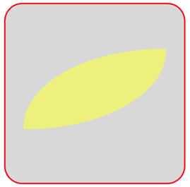
图1 叶片
若将图1所示的叶片每隔10°复制一次,复制17次后,18个叶片将围成一个圆周。为了得到这个圆周图案,在container层中定义18个名为shape的子层,并且为每个子层设置两个变量:表示该子层旋转角度的变量—rotation和表示该子层背景色的变量—color。
编写的HTML文件内容如下。


<!DOCTYPE html>
<html>
<head>
<title>旋转的叶片</title>
<style>
  .container
  {
     margin: 0 auto;
     width: 500px;
     height: 500px;
     position: relative;
     overflow: hidden;
     display: block;
     border: 4px solid rgba(255, 0, 0, 0.9);
     background:#d8d8d8;
     border-radius: 10%;
   }
   .shape
   {
     position: absolute;
     width: 80%;
     height: 45%;
     left: 10%;
     bottom:30%;
     border-radius: 100% 4px;
     opacity: 0.6;
   }
   .shape:nth-child(1n+0)
   {
      background: var(--color);
      transform: rotate(var(--rotation));
   }
</style>
</head>
<body>
<div class="container">
    <div class="shape" style="--rotation: 0deg;--color:#fffe33"></div>
    <div class="shape" style="--rotation: -10deg;--color:#feff00"></div>
    <div class="shape" style="--rotation: -20deg;--color:#ff9935"></div>
    <div class="shape" style="--rotation: -30deg;--color:#f87e07"></div>
    <div class="shape" style="--rotation: -40deg;--color:#ff339c"></div>
    <div class="shape" style="--rotation: -50deg;--color:#ff007e"></div>
    <div class="shape" style="--rotation: -60deg;--color:#ff34ff"></div>
    <div class="shape" style="--rotation: -70deg;--color:#ff00ff"></div>
    <div class="shape" style="--rotation: -80deg;--color:#9a34ff"></div>
    <div class="shape" style="--rotation: -90deg;--color:#7f00ff"></div>
    <div class="shape" style="--rotation: -100deg;--color:#3233ff"></div>
    <div class="shape" style="--rotation: -110deg;--color:#0000fe"></div>
    <div class="shape" style="--rotation: -120deg;--color:#3399fe"></div>
    <div class="shape" style="--rotation: -130deg;--color:#0978f5"></div>
    <div class="shape" style="--rotation: -140deg;--color:#33fffe"></div>
    <div class="shape" style="--rotation: -150deg;--color:#32ff98"></div>
    <div class="shape" style="--rotation: -160deg;--color:#99ff32"></div>
    <div class="shape" style="--rotation: -170deg;--color:#81fe00"></div>
</div>
</body>
</html>
在浏览器中打开包含这段HTML代码的html文件,可以看到如图2所示的图案。
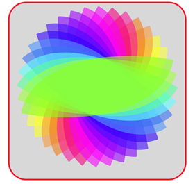
图2 18个叶片组成的图案
现在让这18个叶片旋转起来,编写关键帧定义为:
@keyframes rotate
{
from { transform: rotate(var(--rotation)); }
to { transform: rotate(360deg); }
}
然后在.shape样式定义中加上一句“animation: rotate 3s alternate infinite ease-in-out;”,此时,18个叶片会旋转起来,收拢为1个叶片,之后又旋转展开为18个叶片,如图3所示。

图3 旋转后收拢并展开的叶片
由于定义关键帧@keyframes rotate中结束帧状态均是旋转360deg,因此18个叶片会收拢成1个叶片。若想让18个叶片各自旋转360°不收拢起来,可修改关键帧定义如下:
@keyframes rotate
{
from { transform: rotate(var(--rotation)); }
to { transform: rotate(calc(360deg + var(--rotation))); }
}
此时,在浏览器中呈现出如图4所示的效果。
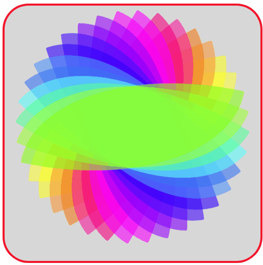
图4 旋转的叶片
图4中叶片较密,且不是绕一个方向匀速旋转。为此,去掉9个偶数项子层(即旋转角度为-10deg、-30deg、…、-170deg的子层),且修改动画属性定义语句为:
animation: rotate 3s linear infinite;
则呈现出如图5所示的动画效果。
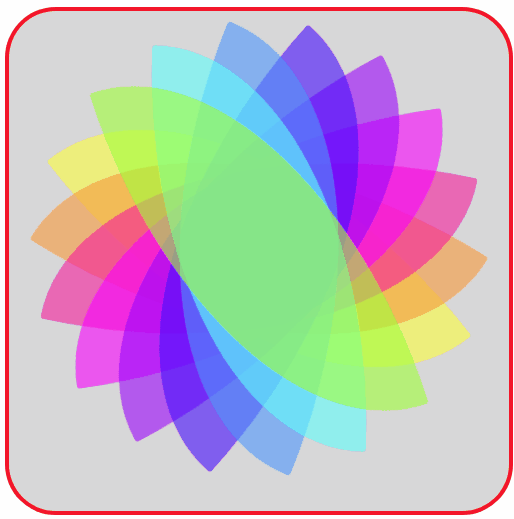
图5 绕一个方向匀速旋转的叶片
完整的HTML文件内容如下。
<!DOCTYPE html>
<html>
<head>
<title>旋转的叶片</title>
<style>
  .container
  {
     margin: 0 auto;
     width: 500px;
     height: 500px;
     position: relative;
     overflow: hidden;
     display: block;
     border: 4px solid rgba(255, 0, 0, 0.9);
     background:#d8d8d8;
     border-radius: 10%;
   }
   .shape
   {
     position: absolute;
     width: 80%;
     height: 45%;
     left: 10%;
     bottom:30%;
     border-radius: 100% 4px;
     opacity: 0.6;
     animation: rotate 3s linear infinite;
   }
   .shape:nth-child(1n+0)
   {
      background: var(--color);
      transform: rotate(var(--rotation));
   }
   @keyframes rotate
   {
       from { transform: rotate(var(--rotation)); }
       to   { transform: rotate(calc(360deg + var(--rotation)));  }
   }
</style>
</head>
<body>
<div class="container">
    <div class="shape" style="--rotation: 0deg;--color:#fffe33"></div>
    <div class="shape" style="--rotation: -20deg;--color:#ff9935"></div>
    <div class="shape" style="--rotation: -40deg;--color:#ff339c"></div>
    <div class="shape" style="--rotation: -60deg;--color:#ff34ff"></div>
    <div class="shape" style="--rotation: -80deg;--color:#9a34ff"></div>
    <div class="shape" style="--rotation: -100deg;--color:#3233ff"></div>
    <div class="shape" style="--rotation: -120deg;--color:#3399fe"></div>
    <div class="shape" style="--rotation: -140deg;--color:#33fffe"></div>
    <div class="shape" style="--rotation: -160deg;--color:#99ff32"></div>
</div>
</body>
</html>