2.条状型Loading
这类Loading动画的基本思想是:在呈现容器中定义一个或多个子层,再对每个子层进行样式定义,使得其显示为一个条形或方形,最后编写关键帧动画控制,使得各个条形(或方形)的大小、位置、填充色等发生变化或者进行旋转。
(1)多个竖条进行变化的加载效果。
例如,编写如下的HTML文件。


<!DOCTYPE html>
<html>
<head>
<title>Loading加载动画</title>
<style>
   .container
   {
      margin: 0 auto;
      width: 300px;
      height:300px;
      position: relative;
      display:flex;
      justify-content:center;
      align-items:center;
      background:#d8d8d8;
      border: 4px solid rgba(255, 0, 0, 0.9);
      border-radius: 10%;
   }
   .shape
   {
       width: 10px;
       height: 100px;
       margin: 5px;
       display: inline-block;
       border-radius: 4px;
       background-color: #00ff00;
       animation: loading 1s infinite ease;
   }
   .shape:nth-child(1n+0)
   {
      animation-delay:var(--delay);
   }
   @keyframes loading
   {
      0%,40%,100% { transform: scaleY(0.5); }
      20% { transform: scaleY(1); }
   }
</style>
</head>
<body>
<div  class="container">
    <div class="shape" style="--delay:0s;"></div>
    <div class="shape" style="--delay:0.2s;"></div>
    <div class="shape" style="--delay:0.4s;"></div>
    <div class="shape" style="--delay:0.6s;"></div>
    <div class="shape" style="--delay:0.8s;"></div>
</div>
</body>
</html>
在浏览器中打开包含这段HTML代码的html文件,可以呈现出如图16所示的Loading动画效果。

图16 Loading动画效果(11)
如将上面代码中的关键帧定义改写如下:
@keyframes loading
{
0%,100%
{
height: 50px;
background: #00ff00;
}
50%
{
height: 80px;
background: #0000ff;
}
}
则呈现出如图17所示的Loading动画效果。
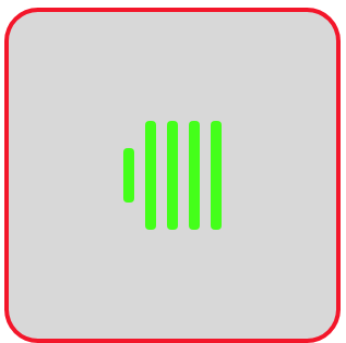
图17 Loading动画效果(12)
(2)方形3D旋转加载效果。
编写如下的HTML文件。
<!DOCTYPE html>
<html>
<head>
<title>Loading加载动画</title>
<style>
   .container
   {
      margin: 0 auto;
      width: 300px;
      height:300px;
      position: relative;
      display:flex;
      justify-content:center;
      align-items:center;
      background:#d8d8d8;
      border: 4px solid rgba(255, 0, 0, 0.9);
      border-radius: 10%;
   }
   .shape
   {
      width: 100px;
      height: 100px;
      background-color: #ffc800;
      animation: rotate 1.2s infinite ease-in-out;
   }
   @keyframes rotate
   {
      0%   {  transform: perspective(120px) rotateX(0deg) rotateY(0deg); }
      50%  {  transform: perspective(120px) rotateX(-180.1deg) rotateY(0deg); }
      100% {  transform: perspective(120px) rotateX(-180deg) rotateY(-179.9deg); }
   }
</style>
</head>
<body>
<div  class="container">
   <div class="shape"></div>
</div>
</body>
</html>
在浏览器中打开包含这段HTML代码的html文件,可以呈现出如图18所示的Loading动画效果。
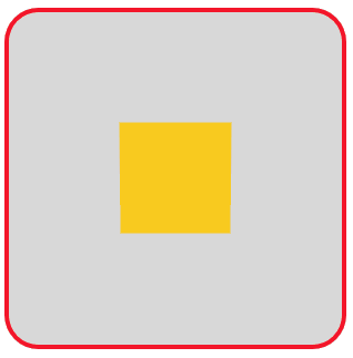
图18 Loading动画效果(13)
(3)两个方形平移并旋转变换。
编写如下的HTML文件。
<!DOCTYPE html>
<html>
<head>
<title>Loading加载动画</title>
<style>
   .container
   {
      margin: 0 auto;
      width: 300px;
      height:300px;
      position: relative;
      display:flex;
      justify-content:center;
      align-items:center;
      background:#d8d8d8;
      border: 4px solid rgba(255, 0, 0, 0.9);
      border-radius: 10%;
   }
   .shape
   {
      background-color: #ff8c00;
      width: 50px;
      height: 50px;
      position: absolute;
      animation: move 1.8s infinite ease-in-out;
   }
   .shape:nth-child(2)
   {
      animation-delay: -0.9s;
   }
   @keyframes move
   {
       25%  {  transform: translateX(52px) rotate(-90deg) scale(0.5);}
       50%  {  transform: translateX(52px) translateY(52px) rotate(-179deg); }
       50.1% { transform: translateX(52px) translateY(52px) rotate(-180deg);}
       75%   { transform: translateX(0px) translateY(52px) rotate(-270deg) scale(0.5);}
       100%  { transform: rotate(-360deg);}
   }
</style>
</head>
<body>
<div  class="container">
  <div class="shape"></div>
  <div class="shape"></div>
</div>
</body>
</html>
在浏览器中打开包含这段HTML代码的html文件,可以呈现出如图19所示的Loading动画效果。
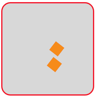
图19 Loading动画效果(14)
若在.shape的样式定义中加上一句“border-radius: 50%;”,使得显示的方形变成圆形,则呈现如图20所示的动画效果。
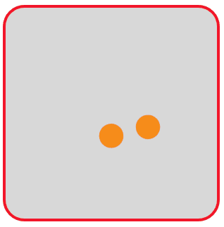
图20 Loading动画效果(15)
(4)利用box-shadow属性设置阴影图形。
一个方形通过在它的前面加阴影的方式可以得到两个方形。
例如,设页面中有<span class="shape"></span>,定义.shape的样式如下:
.shape
{
40px;
height:40px;
background-color:#f00;
box-shadow: -40px 0 0 #00f;
}
可在页面中显示如图21所示的图形,其中蓝色的正方形是通过box-shadow设置阴影得到的。
图21 两个正方形
定义关键帧使得阴影方形的颜色和方形背景颜色进行切换,切换的颜色之一采用黑色全透明色。编写HTML文件如下:
<!DOCTYPE html>
<html>
<head>
<title>Loading加载动画</title>
<style>
   .container
   {
      margin: 0 auto;
      width: 300px;
      height:300px;
      position: relative;
      display:flex;
      justify-content:center;
      align-items:center;
      background:#d8d8d8;
      border: 4px solid rgba(255, 0, 0, 0.9);
      border-radius: 10%;
   }
   .shape
   {
      width:40px;
      height:40px;
      display: block;
      position:relative;
      background-color:#ff8c0000;
      top: 0;
      bottom: 40px;
      box-shadow: -40px 0 0 #ff8c00;
      animation: anim 1s linear infinite;
   }
   .shape:nth-child(2)
   {
      left:-40px;
      top: 40px;
      bottom: 0;
      animation-delay: .25s;
   }
   @keyframes anim
   {
      0%, 100%
      {
          box-shadow: -40px 0 0 transparent;
          background-color: #ff8c00;
      }
      50%
      {
          box-shadow: -40px 0 0 #ff8c00;
          background-color: transparent;
      }
   }
</style>
</head>
<body>
<div  class="container">
    <span class="shape"></span>
    <span class="shape"></span>
</div>
</body>
</html>
在浏览器中打开包含这段HTML代码的html文件,可以呈现出如图22所示的Loading动画效果。
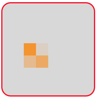
图22 Loading动画效果(16)
若将上面代码中.shape:nth-child(2)内的语句“left:-40px;”删除,其余保持不变,则呈现出如图23所示的Loading动画效果。
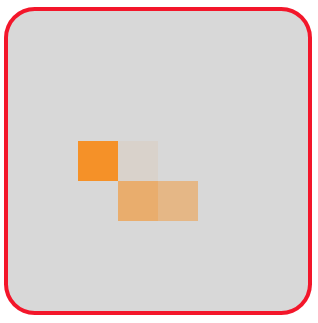
图23 Loading动画效果(17)
上面这个例子中通过box-shadow属性设置得到一个方形的思路是非常值得借鉴的。下面的这个例子采用box-shadow属性进行设置实现就显得简单容易多了。
设要实现的Loading动画效果如图24所示。
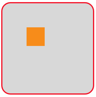
图24 Loading动画效果(18)
这个动画效果可描述为:一个正方形从左上角的位置出发,沿着右上角、右下角、左下角、左上角四个位置顺时针循环转圈,在其经过的位置如果没有正方形,则放置一个正方形;如果已有一个正方形,则移除该位置的正方形。
仔细体会图24的动画过程,发现一共有12个不同的关键帧需要描述。可以采用box-shadow属性设置4个阴影正方形的方法来实现关键帧的描述。编写如下的HTML文件。
<!DOCTYPE html>
<html>
<head>
<title>Loading加载动画</title>
<style>
  .container
  {
    margin: 0 auto;
    width: 300px;
    height:300px;
    position: relative;
    display:flex;
    justify-content:center;
    align-items:center;
    background:#d8d8d8;
    border: 4px solid rgba(255, 0, 0, 0.9);
    border-radius: 10%;
  }
  .shape
  {
    width:20px;
    height:20px;
    box-shadow: -40px -40px 0 20px #ff8c00, -40px -40px 0 20px #ff8c00,
                -40px -40px 0 20px #ff8c00, -40px -40px 0 20px #ff8c00;
    animation: anim 6s infinite;
  }
  @keyframes anim
  {
    0%,100%
    {
      box-shadow: -40px -40px 0 20px #ff8c00, -40px -40px 0 20px #ff8c00,
                  -40px -40px 0 20px #ff8c00, -40px -40px 0 20px #ff8c00;
    }
    8.33%
    {
      box-shadow: -40px -40px 0 20px #ff8c00, 40px -40px 0 20px #ff8c00,
                  40px -40px 0 20px #ff8c00, 40px -40px 0 20px #ff8c00;
    }
    16.66%
    {
      box-shadow: -40px -40px 0 20px #ff8c00, 40px -40px 0 20px #ff8c00,
                  40px 40px 0 20px #ff8c00, 40px 40px 0 20px #ff8c00;
    }
    24.99%
    {
      box-shadow: -40px -40px 0 20px #ff8c00, 40px -40px 0 20px #ff8c00,
                  40px 40px 0 20px #ff8c00, -40px 40px 0 20px #ff8c00;
    }
    33.32%
    {
      box-shadow: -40px -40px 0 20px #ff8c00, 40px -40px 0 20px #ff8c00,
                  40px 40px 0 20px #ff8c00, -40px -40px 0 20px #ff8c00;
    }
    41.65%
    {
      box-shadow: 40px -40px 0 20px #ff8c00, 40px -40px 0 20px #ff8c00,
                  40px 40px 0 20px #ff8c00, 40px -40px 0 20px #ff8c00;
    }
    49.98%
    {
      box-shadow: 40px 40px 0 20px #ff8c00, 40px 40px 0 20px #ff8c00,
                  40px 40px 0 20px #ff8c00, 40px 40px 0 20px #ff8c00;
    }
    58.31%
    {
      box-shadow: -40px 40px 0 20px #ff8c00, -40px 40px 0 20px #ff8c00,
                  40px 40px 0 20px #ff8c00, -40px 40px 0 20px #ff8c00;
    }
    66.64%
    {
      box-shadow: -40px -40px 0 20px #ff8c00, -40px -40px 0 20px #ff8c00,
                  40px 40px 0 20px #ff8c00, -40px 40px 0 20px #ff8c00;
    }
    74.97%
    {
      box-shadow: -40px -40px 0 20px #ff8c00, 40px -40px 0 20px #ff8c00,
                  40px 40px 0 20px #ff8c00, -40px 40px 0 20px #ff8c00;
    }
    83.3%
    {
      box-shadow: -40px -40px 0 20px #ff8c00, 40px 40px 0 20px #ff8c00,
                  40px 40px 0 20px #ff8c00, -40px 40px 0 20px #ff8c00;
    }
    91.63%
    {
      box-shadow: -40px -40px 0 20px #ff8c00, -40px 40px 0 20px #ff8c00,
                  -40px 40px 0 20px #ff8c00, -40px 40px 0 20px #ff8c00;
    }
  }
</style>
</head>
<body>
<div  class="container">
    <div class="shape"></div>
</div>
</body>
</html>
在浏览器中打开包含这段HTML代码的html文件,可以呈现出如图24所示的Loading动画效果。
根据上面的动画思想,可以编写如下的HTML文件。
<!DOCTYPE html>
<html>
<head>
<title>Loading加载动画</title>
<style>
  .container
  {
    margin: 0 auto;
    width: 300px;
    height:300px;
    background:#d8d8d8;
    border: 4px solid rgba(255, 0, 0, 0.9);
    border-radius: 10%;
  }
  .loader
  {
    margin: 120px auto;
    width: 45px;
    height: 45px;
    animation: gw 1s ease-in-out infinite, rot 2.8s linear infinite;
  }
  @keyframes rot
  {
     to  { transform: rotate(360deg); }
  }
  @keyframes gw
  {
     0%,100%
     {
        box-shadow: 60px 60px 0 2px #2ecc71, -60px 60px 0 10px #9b59b6,
                    -60px -60px 0 15px #3498db, 60px -60px 0 10px #f1c40f;
     }
     25%
    {
        box-shadow: 60px 60px 0 10px #2ecc71, -60px 60px 0 15px #9b59b6,
                    -60px -60px 0 10px #3498db, 60px -60px 0 2px #f1c40f;
    }
    50%
    {
        box-shadow: 60px 60px 0 15px #2ecc71, -60px 60px 0 10px #9b59b6,
                    -60px -60px 0 2px #3498db, 60px -60px 0 10px #f1c40f;
    }
    75%
    {
        box-shadow: 60px 60px 0 10px #2ecc71, -60px 60px 0 2px #9b59b6,
                    -60px -60px 0 10px #3498db, 60px -60px 0 15px #f1c40f;
    }
  }
</style>
</head>
<body>
<div class="container">
  <div class="loader"></div>
</div>
</body>
</html>
在浏览器中打开包含这段HTML代码的html文件,可以呈现出如图25所示的Loading动画效果。在这个动画中,4个方块均通过阴影绘制,在旋转过程中,方块大小会发生改变,也是通过阴影进行设置的。
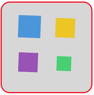
图25 Loading动画效果(19)
为了加深大家对box-shadow属性使用方法的理解,再看一个电池充电的例子。
通过.shape属性设置绘制出电池的形状,电池充电电量的动画关键帧采用简单地设置box-shadow属性来完成。编写如下的HTML文件。
<!DOCTYPE html>
<html>
<head>
<title>Loading加载动画</title>
<style>
  .container
  {
    margin: 0 auto;
    width: 300px;
    height:300px;
    position: relative;
    display:flex;
    justify-content:center;
    align-items:center;
    background:#d8d8d8;
    border: 4px solid rgba(255, 0, 0, 0.9);
    border-radius: 10%;
  }
  .shape
  {
    width:80px;
    height: 40px;
    border: 8px #b22222 solid;
    border-radius: 10%;
    position: relative;
    animation: anim 5s linear infinite;
  }
  .shape:after
  {
    width: 5.6px;
    height: 100%;
    background-color: #b22222;
    border-radius: 0px 40px 40px 0px;
    position: absolute;
    content: "";
    top: 0;
    left: calc(100% + 8px);
  }
  @keyframes anim
  {
     0%   { box-shadow: inset 0px 0px 0px #b22222;  }
     100% { box-shadow: inset 80px 0px 0px #b22222;  }
  }
</style>
</head>
<body>
<div  class="container">
    <div class="shape"></div>
</div>
</body>
</html>
在浏览器中打开包含这段HTML代码的html文件,可以呈现出如图26所示的Loading动画效果。
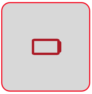
图26 Loading动画效果(20)
(5)条形旋转。
可以使条形旋转起来,实现类似时钟指针旋转的效果。编写如下的HTML文件。
<!DOCTYPE html>
<html>
<head>
<title>Loading加载动画</title>
<style>
  .container
  {
    margin: 0 auto;
    width: 300px;
    height:300px;
    position: relative;
    display:flex;
    justify-content:center;
    align-items:center;
    background:#d8d8d8;
    border: 4px solid rgba(255, 0, 0, 0.9);
    border-radius: 10%;
  }
  .shape
  {
    position: absolute;
    left:150px;
    height:20px;
    width:100px;
    background:#ff8c00;
    transform-origin: left center;
    animation: anim 2s linear infinite;
  }
  .shape:nth-child(2)
  {
    width:80px;
    animation: anim 8s linear infinite;
  }
  @keyframes anim
  {
      0% { transform: rotate(0deg);  }
      100% { transform: rotate(360deg); }
  }
</style>
</head>
<body>
<div  class="container">
    <div class="shape"></div>
    <div class="shape"></div>
</div>
</body>
</html>
在浏览器中打开包含这段HTML代码的html文件,可以呈现出如图27所示的Loading动画效果。

图26 Loading动画效果(21)