一、普通背景模糊
代码:
<Style>
        html,
        body {
             100%;
            height: 100%;
        }

        * {
            margin: 0;
            padding: 0;
        }

        /*背景模糊*/
        .bg {
             100%;
            height: 100%;
            position: relative;
            background: url("./bg.jpg") no-repeat fixed;
            background-size: cover;
            box-sizing: border-box;
            filter: blur(2px);
            z-index: 1;
        }

        .content {
            position: absolute;
            left: 50%;
            top: 50%;
            transform: translate(-50%, -50%);
             200px;
            height: 200px;
            text-align: center;
            z-index: 2;
        }
    </Style>
</head>

<body>
    <div class="bg">
        <div class="content">背景模糊</div>
    </div>
</body>
效果如下所示:

这样写会使整个div的后代模糊并且还会出现白边,导致页面非常不美观,要想解决这个问题,我们可以使用伪元素,因为伪元素的模糊度不会被父元素的子代继承。
代码:
<Style>
        html,
        body {
             100%;
            height: 100%;
        }

        * {
            margin: 0;
            padding: 0;
        }

        /*背景模糊*/
        .bg {
             100%;
            height: 100%;
            position: relative;
            background: url("./bg.jpg") no-repeat fixed;
            background-size: cover;
            box-sizing: border-box;
            z-index: 1;
        }

        .bg:after {
            content: "";
             100%;
            height: 100%;
            position: absolute;
            left: 0;
            top: 0;
            /* 从父元素继承 background 属性的设置 */
            background: inherit;
            filter: blur(2px);
            z-index: 2;
        }


        .content {
            position: absolute;
            left: 50%;
            top: 50%;
            transform: translate(-50%, -50%);
             200px;
            height: 200px;
            text-align: center;
            z-index: 3;
        }
    </Style>
</head>

<body>
    <div class="bg">
        <div class="content">背景模糊</div>
    </div>
</body>
效果如下所示:

二、背景局部模糊
上一个效果会了之后,局部模糊效果就比较简单了。
代码:
<Style>
        html,
        body {
             100%;
            height: 100%;
        }

        * {
            margin: 0;
            padding: 0;
        }

        /*背景模糊*/
        .bg {
             100%;
            height: 100%;
            position: relative;
            background: url("./bg.jpg") no-repeat fixed;
            background-size: cover;
            box-sizing: border-box;
            z-index: 1;
        }

        .content {
            position: absolute;
            left: 50%;
            top: 50%;
            transform: translate(-50%, -50%);
             200px;
            height: 200px;
            background: inherit;
            z-index: 2;
        }

        .content:after {
            content: "";
             100%;
            height: 100%;
            position: absolute;
            left: 0;
            top: 0;
            background: inherit;
            filter: blur(15px);
            /*为了模糊更明显,调高模糊度*/
            z-index: 3;
        }

        .content>div {
             100%;
            height: 100%;
            text-align: center;
            line-height: 200px;
            position: absolute;
            left: 0;
            top: 0;
            z-index: 4;
        }
    </Style>
</head>

<body>
    <div class="bg">
        <div class="content">
            <div>背景局部模糊</div>
        </div>
    </div>
</body>
效果如下图所示:

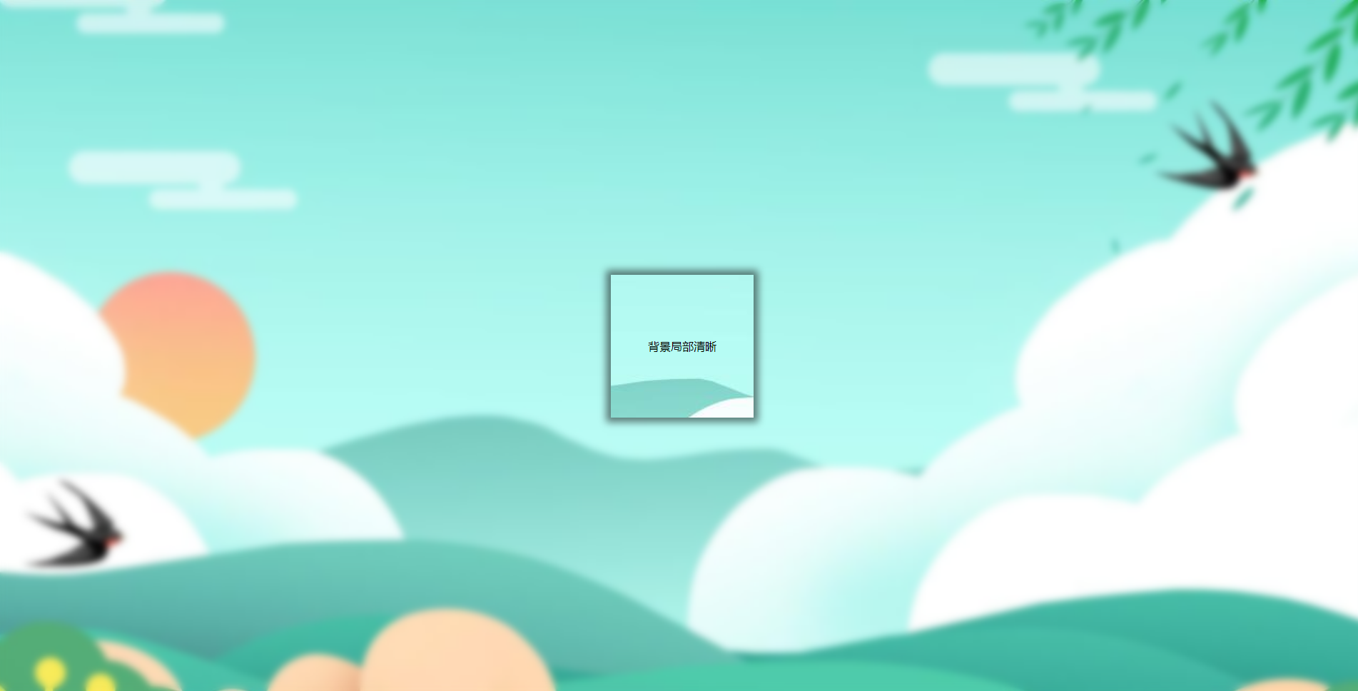
三、背景局部清晰
代码:
<Style>
        html,
        body {
             100%;
            height: 100%;
        }

        * {
            margin: 0;
            padding: 0;
        }

        /*背景模糊*/
        .bg {
             100%;
            height: 100%;
            position: relative;
            background: url("./bg.jpg") no-repeat fixed;
            background-size: cover;
            box-sizing: border-box;
            z-index: 1;
        }

        .bg:after {
            content: "";
             100%;
            height: 100%;
            position: absolute;
            left: 0;
            top: 0;
            background: inherit;
            filter: blur(5px);
            z-index: 2;
        }

        .content {
            position: absolute;
            left: 50%;
            top: 50%;
            transform: translate(-50%, -50%);
             200px;
            line-height: 200px;
            text-align: center;
            background: inherit;
            z-index: 3;
            box-shadow: 0 0 10px 6px rgba(0, 0, 0, .5);
        }
    </Style>
</head>

<body>
    <div class="bg">
        <div class="content">
            <div>背景局部清晰</div>
        </div>
    </div>
</body>
效果如下图所示: