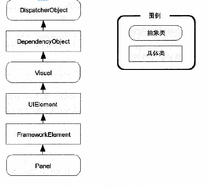
首先要认识到wpf所有的布局控件都继承自Panel类,Panel类又继承自其他类。继承关系如下:
一、StackPanel布局面板
1、该面板在单行或者单列中以堆栈的形式放置其子元素。
默认情况下,StackPanel按自上而下的顺序排列,使每个元素的高度适合它的内容。
通过设置Orientation属性,StackPanel面板也可以用于水平排列元素。<StackPanel Orientation="Horizontal">
2、当StackPanel中布局是垂直方向的时候,VerticalAlignement属性不起作用。HorizontalAlignment属性非常重要,它决定了各个元素在行的什么位置。
对于Label控件,HorizontalAlignment属性的值默认为Left;
对于Button控件,HorizontalAligenment属性的值默认为Stretch。(这也是为什么每个按钮的宽度被调整为整列的宽度的原因所在。)
StackPanel面板也有自己的HorizontalAlignment和VerticalAlignment属性。这两个属性都被设置为Stretch。
Tips(这些一般也适用于其他布局面板):
1、给控件设置外边距,在XAML中Margin属性,如Margin=“5”。在代码中用cmd.Margin = new Thickness(5);//cmd是控件的Name属性的值。即Name=“cmd”
2、给元素设置尺寸,应该使用最大尺寸属性和最小尺寸属性。避免设置固定的width和height
3、如果用代码检查窗口中某个元素的尺寸,应该用ActualHeight和ActualWidth属性得到用于渲染元素的实际尺寸。
4、可以设置窗口的SizeToContent属性值为WidthAndHeight,这样窗口就会让自身的尺寸适应其中所包含的内容。
二、Border控件。
Border是装饰元素,用于在对象周围添加某些种类的图形装饰。
所有装饰元素都继承自System.Windows.Controls.Decorator类。
Border类的属性:
1、Background,设置边框中所有内容后面的背景。
2、BorderBrush和BorderThickness,这两个属性同时使用,可以设置边框的宽度和颜色。
3、CornerRadius,设置边框的圆角。
4、Padding。设置边框和内部内容之间的距离。
三、WrapPanel面板
1、WrapPanel面板在可能的空间中,以一次一行或一列的方式布置控件。
2、默认情况下,WrapPanel.Orientation属性设置为Horizonal。
3、WrapPanel面板水平地创建行,每一行的高度都被设置为所包含元素中最高元素的高度,其他控件可能被拉伸以适应这一高度。或者根据VerticalAlignment属性的设置进行对齐。
Tips:
1、WrapPanel面板是唯一一个不能通过灵活使用Grid面板代替的面板。
四、DockPanel面板
1、它沿着一条外边缘来拉伸所包含的控件。
2、如果将一个按钮停靠在DockPanel面板的顶部,该按钮会被拉伸至DockPanel面板的整个宽度,那么位于它后面声明的元素控件就没法占据它已经占据的空间。
如果将一个按钮停靠在DockPanel面板的左边,该按钮会被拉伸至DockPanel面板的整个高度。
3、停靠多个元素控件时,按照标记中声明的顺序停靠。
4、可以用maring、VerticalAlignment、HorizonalAlignment属性改变空间分割或者拉伸行为。
五、Grid面板
1、布局舍入。<Grid UseLayoutRounding="True">
2、分割窗口。GridSplitter对象。用户可以改变分割的窗口之间的比例大小。类似与window资源管理器中用户可以拖动分离的窗口改变窗口占据的大小。
代码示例:
 1 <Grid UseLayoutRounding="True">
 2         <Grid.RowDefinitions>
 3             <RowDefinition></RowDefinition>
 4             <RowDefinition></RowDefinition>
 5         </Grid.RowDefinitions>
 6         <Grid.ColumnDefinitions>
 7             <ColumnDefinition MinWidth="100"></ColumnDefinition>
 8             <ColumnDefinition Width="Auto"></ColumnDefinition>
 9             <ColumnDefinition MinWidth="50"></ColumnDefinition>
10         </Grid.ColumnDefinitions>
11
12         <Button Grid.Row="0" Grid.Column="0" Margin="3">Left</Button>
13         <Button Grid.Row="0" Grid.Column="2" Margin="3">Right</Button>
14         <Button Grid.Row="1" Grid.Column="0" Margin="3">Left</Button>
15         <Button Grid.Row="1" Grid.Column="2" Margin="3">Right</Button>
16
17         <GridSplitter Grid.Row="0" Grid.Column="1" Grid.RowSpan="2" Width="3" VerticalAlignment="Stretch"
18                       HorizontalAlignment="Center" ShowsPreview="False"></GridSplitter>
19
20     </Grid>
其中ShowsPreview属性设置为false,效果是当把分割条从一边拖到另一边时,会立即改变列的尺寸。如果设置为true,当拖动分割条时就会看到一个灰色的阴影跟随鼠标指针,,用于显示将在何处进行分割,知道释放了鼠标之后列的尺寸才改变。
还可以调整DragIncrement属性,使得分割条以指定的幅度(如每次10个单位)移动。