效果如图
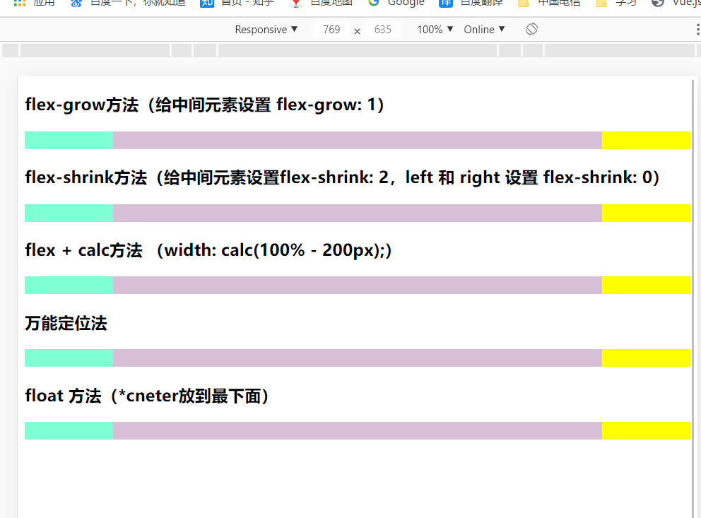
<!DOCTYPE html>
<html lang="en">
<head>
  <meta charset="UTF-8">
  <meta name="viewport" content="width=device-width, initial-scale=1.0">
  <title>Document</title>
</head>

<style>
  /* .main {
     600px;
    margin: auto;
  } */
  .left {
    width: 100px;
    height: 20px;
    background-color: aquamarine;
  }
  .center {
    height: 20px;
    background-color: thistle;
  }
  .right {
    width: 100px;
    height: 20px;
    background-color: yellow;
  }
  .flex {
    display: flex;
  }
  .grow-box .center {
    flex-grow: 1;
  }
  /*shrink*/
  .shrink-box div {
    flex-shrink: 0;
  }
  .shrink-box .center {
    width: 100%;
    flex-shrink: 2;
  }
  /*calc*/
  .calc-box {
    display: flex;
  }
  .calc-box .center {
    width: calc(100% - 200px);
  }
  /*position*/
  .position-box {
    justify-content: space-between;
    position: relative;
  }
  .position-box .center {
    position: absolute;
    left: 100px;
    right: 100px;
  }
  /*float*/
  .float-box {
    clear: both;
    overflow: hidden;
  }
  .float-box .left {
    float: left;
  }
  .float-box .right {
    float: right;
  }
</style>
<body>
  <div class="main">
    <h3>flex-grow方法(给中间元素设置 flex-grow: 1)</h3>
    <div class="flex grow-box">
      <div class="left"></div>
      <div class="center"></div>
      <div class="right"></div>
    </div>
  </div>
  <div class="main">
    <h3>flex-shrink方法(给中间元素设置flex-shrink: 2,left 和 right 设置 flex-shrink: 0)</h3>
    <div class="flex shrink-box">
      <div class="left"></div>
      <div class="center"></div>
      <div class="right"></div>
    </div>
  </div>
  <div class="main">
    <h3>flex + calc方法 ( calc(100% - 200px);)</h3>
    <div class="flex calc-box">
      <div class="left"></div>
      <div class="center"></div>
      <div class="right"></div>
    </div>
  </div>
  <div class="main">
    <h3>万能定位法</h3>
    <div class="flex position-box">
      <div class="left"></div>
      <div class="center"></div>
      <div class="right"></div>
    </div>
  </div>
  <div class="main">
    <h3>float 方法(*cneter放到最下面)</h3>
    <div class="float-box">
      <div class="left"></div>
      <div class="right"></div>
      <div class="center"></div>
    </div>
  </div>
</body>
</html>