HTML5 第三天
一、 认识 3D 转换
-
3D的特点- 近大远小
- 物体和面遮挡不可见
-
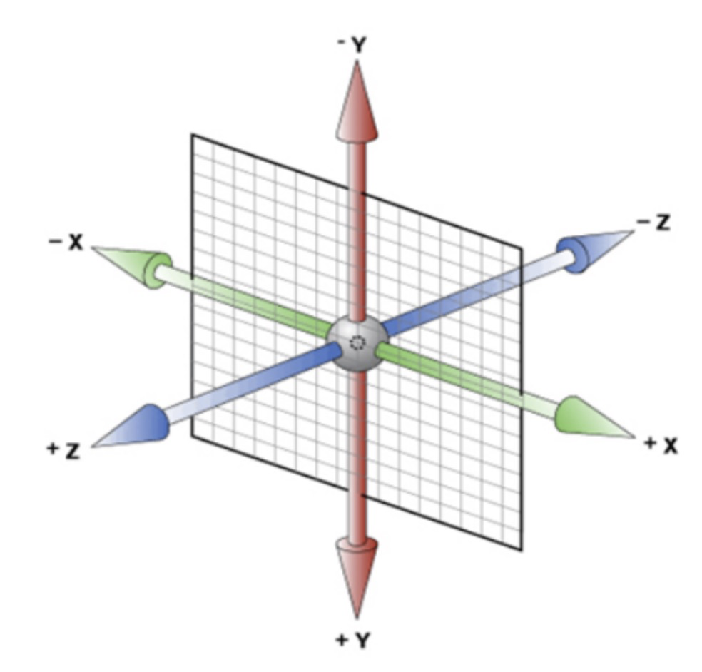
三维坐标系
-
x 轴:水平向右 -- 注意:x 轴右边是正值,左边是负值
-
y 轴:垂直向下 -- 注意:y 轴下面是正值,上面是负值
-
z 轴:垂直屏幕 -- 注意:往外边的是正值,往里面的是负值
-
二、3D 转换
-
3D转换知识要点3D位移:translate3d(x, y, z)3D旋转:rotate3d(x, y, z)- 透视:
perspctive 3D呈现transfrom-style
-
3D移动translate3d3D移动就是在2D移动的基础上多加了一个可以移动的方向,就是 z 轴方向transform: translateX(100px):仅仅是在 x 轴上移动transform: translateY(100px):仅仅是在 y 轴上移动transform: translateZ(100px):仅仅是在 z 轴上移动transform: translate3d(x, y, z):其中x、y、z 分别指要移动的轴的方向的距离- 注意:x, y, z 对应的值不能省略,不需要填写用 0 进行填充
-
语法
transform: translate3d(x, y, z) -
代码演示
transform: translate3d(100px, 100px, 100px)
/* 注意:x, y, z 对应的值不能省略,不需要填写用 0 进行填充 */
transform: translate3d(100px, 100px, 0)
三、透视 perspective
-
知识点讲解
- 如果想要网页产生
3D效果需要透视(理解成3D物体投影的2D平面上) - 实际上模仿人类的视觉位置,可视为安排一直眼睛去看
- 透视也称为视距,所谓的视距就是人的眼睛到屏幕的距离
- 距离视觉点越近的在电脑平面成像越大,越远成像越小
- 透视的单位是像素
- 如果想要网页产生
-
知识要点
-
透视需要写在被视察元素的父盒子上面
-
注意下方图片
-
d:就是视距,视距就是指人的眼睛到屏幕的距离
-
z:就是 z 轴,z 轴越大(正值),我们看到的物体就越大

-
-
-
代码演示
body {
  perspective: 1000px;
}
四、 translateZ
translateZ与perspecitve的区别perspecitve给父级进行设置,translateZ给 子元素进行设置不同的大小
五、3D 旋转rotateX
3D 旋转指可以让元素在三维平面内沿着 x 轴、y 轴、z 轴 或者自定义轴进行旋转
-
语法
transform: rotateX(45deg)-- 沿着 x 轴正方向旋转 45 度transform: rotateY(45deg)-- 沿着 y 轴正方向旋转 45 度transform: rotateZ(45deg)-- 沿着 z 轴正方向旋转 45 度transform: rotate3d(x, y, z, 45deg)-- 沿着自定义轴旋转 45 deg 为角度
-
代码案例
div { perspective: 300px; } img { display: block; margin: 100px auto; transition: all 1s; } img:hover { transform: rotateX(-45deg) } -
左手准则
-
左手的手拇指指向 x 轴的正方向(拇指朝右)
-
其余手指的弯曲方向就是该元素沿着 x 轴旋转的方向

-
六、3D 旋转 rotateY
-
代码演示
div { perspective: 500px; } img { display: block; margin: 100px auto; transition: all 1s; } img:hover { transform: rotateY(180deg) } -
左手准则
-
左手的拇指指向 y 轴的正方向(拇指朝下)
-
其余的手指弯曲方向就是该元素沿着 y 轴旋转的方向(正值)

-
七、 3D 旋转 rotateZ
-
代码演示
div { perspective: 500px; } img { display: block; margin: 100px auto; transition: all 1s; } img:hover { transform: rotateZ(180deg) } -
rotate3dtransform: rotate3d(x, y, z, deg)-- 沿着自定义轴旋转 deg 为角度- x, y, z 表示旋转轴的矢量,是标识你是否希望沿着该轴进行旋转,最后一个标识旋转的角度
transform: rotate3d(1, 1, 0, 180deg)-- 沿着对角线旋转 180degtransform: rotate3d(1, 0, 0, 180deg)-- 沿着 x 轴旋转 180deg
-
代码演示
div {
  perspective: 500px;
}

img {
  display: block;
  margin: 100px auto;
  transition: all 1s;
}

img:hover {
  transform: rotate3d(1, 1, 0, 180deg)
}
八、
3D呈现transform-style-
transform-style-
☆☆☆☆☆
-
控制子元素是否开启三维立体环境
-
transform-style: flat代表子元素不开启3D立体空间,默认的 -
transform-style: preserve-3d子元素开启立体空间 -
代码写给父级,但是影响的是子盒子
-
-
代码演示
-
<!DOCTYPE html>
<html lang="en">

<head>
    <meta charset="UTF-8">
    <meta name="viewport" content="width=device-width, initial-scale=1.0">
    <meta http-equiv="X-UA-Compatible" content="ie=edge">
    <title>Document</title>
    <style>
        body {
            perspective: 500px;
        }

        .box {
            position: relative;
             200px;
            height: 200px;
            margin: 100px auto;
            transition: all 2s;
            /* 让子元素保持3d立体空间环境 */
            transform-style: preserve-3d;
        }

        .box:hover {
            transform: rotateY(60deg);
        }

        .box div {
            position: absolute;
            top: 0;
            left: 0;
             100%;
            height: 100%;
            background-color: pink;
        }

        .box div:last-child {
            background-color: purple;
            transform: rotateX(60deg);
        }
    </style>
</head>

<body>
    <div class="box">
        <div></div>
        <div></div>
    </div>
</body>

</html>
练习
-
两面反转的盒子
<!DOCTYPE html> <html lang="en"> <head> <meta charset="UTF-8"> <meta name="viewport" content="width=device-width, initial-scale=1.0"> <meta http-equiv="X-UA-Compatible" content="ie=edge"> <title>Document</title> <style> body { perspective: 400px; } .box { position: relative; 300px; height: 300px; margin: 100px auto; transition: all .5s; /* 让背面的紫色盒子保留立体空间 给父级添加的 */ transform-style: preserve-3d; } .box:hover { transform: rotateY(180deg); } .front, .back { position: absolute; top: 0; left: 0; 100%; height: 100%; border-radius: 50%; font-size: 30px; color: #fff; text-align: center; line-height: 300px; backface-visibility:hidden; /*隐藏被旋转的 div 元素的背面*/ -webkit-backface-visibility:hidden; /* Chrome 和 Safari */ -moz-backface-visibility:hidden; /* Firefox */ -ms-backface-visibility:hidden; /* Internet Explorer */ } .front { background-color: pink; z-index: 1; } .back { background-color: purple; /* 像手机一样 背靠背 旋转 */ transform: rotateY(180deg); } </style> </head> <body> <div class="box"> <div class="front">程序员</div> <div class="back">我们在这里等你</div> </div> </body> </html> -
翻牌子
<!DOCTYPE html> <html lang="en"> <head> <meta charset="UTF-8"> <meta name="viewport" content="width=device-width, initial-scale=1.0"> <meta http-equiv="X-UA-Compatible" content="ie=edge"> <title>Document</title> <style> * { margin: 0; padding: 0; } ul { margin: 100px; } ul li { float: left; margin: 0 5px; 120px; height: 35px; list-style: none; /* 一会我们需要给box 旋转 也需要透视 干脆给li加 里面的子盒子都有透视效果 */ perspective: 500px; } .box { position: relative; 100%; height: 100%; transform-style: preserve-3d; transition: all .4s; } .box:hover { transform: rotateX(90deg); } .front, .bottom { position: absolute; left: 0; top: 0; 100%; height: 100%; } .front { background-color: pink; z-index: 1; transform: translateZ(17.5px); } .bottom { background-color: purple; /* 这个x轴一定是负值 */ /* 我们如果有移动 或者其他样式,必须先写我们的移动 */ transform: translateY(17.5px) rotateX(-90deg); } </style> </head> <body> <ul> <li> <div class="box"> <div class="front">翻牌子</div> <div class="bottom">舒敬轩</div> </div> </li> <li> <div class="box"> <div class="front">翻牌子</div> <div class="bottom">华沐苑</div> </div> </li> </ul> </body> </html> -
旋转木马
<!DOCTYPE html>
<html lang="en">

<head>
    <meta charset="UTF-8">
    <meta name="viewport" content="width=device-width, initial-scale=1.0">
    <meta http-equiv="X-UA-Compatible" content="ie=edge">
    <title>Document</title>
    <style>
        body {
            perspective: 1000px;
        }

        section {
            position: relative;
             300px;
            height: 200px;
            margin: 150px auto;
            transform-style: preserve-3d;
            /* 添加动画效果 */
            animation: rotate 10s linear infinite;
            background: url(media/pig.jpg) no-repeat;
        }

        section:hover {
            /* 鼠标放入section 停止动画 */
            animation-play-state: paused;
        }

        @keyframes rotate {
            0% {
                transform: rotateY(0);
            }
            100% {
                transform: rotateY(360deg);
            }
        }

        section div {
            position: absolute;
            top: 0;
            left: 0;
             100%;
            height: 100%;
            background: url(media/dog.jpg) no-repeat;
        }

        section div:nth-child(1) {
            transform: rotateY(0) translateZ(300px);
        }

        section div:nth-child(2) {
            /* 先旋转好了再 移动距离 */
            transform: rotateY(60deg) translateZ(300px);
        }

        section div:nth-child(3) {
            /* 先旋转好了再 移动距离 */
            transform: rotateY(120deg) translateZ(300px);
        }

        section div:nth-child(4) {
            /* 先旋转好了再 移动距离 */
            transform: rotateY(180deg) translateZ(300px);
        }

        section div:nth-child(5) {
            /* 先旋转好了再 移动距离 */
            transform: rotateY(240deg) translateZ(300px);
        }

        section div:nth-child(6) {
            /* 先旋转好了再 移动距离 */
            transform: rotateY(300deg) translateZ(300px);
        }
    </style>
</head>

<body>
    <section>
        <div></div>
        <div></div>
        <div></div>
        <div></div>
        <div></div>
        <div></div>
    </section>
</body>

</html>