
这些都是引入组件,使用,然后显示的。
我把两个button的界面组件的文件放出来把。这个是wxml
<view class="wx-popup" hidden="{{flag}}">
  <view class='popup-container'>

    <view class="wx-popup-con">{{content}}</view>
    <view class="wx-popup-btn">
      <text class="btn-no" bindtap='_error'>{{btn_no}}</text>
      <text class="btn-ok" bindtap='_success'>{{btn_ok}}</text>
    </view>
  </view>
</view>
组件是显示整个界面的。
这个是json文件
{
  "component": true,
  "usingComponents": {}
}
component为true的意思是,注册改组件的意思。
usingComponents,在这个组件里面使用其他组件。
下面的是该组件的css文件
/* components/popup/popup.wxss */


/* component/popup.wxss */

.wx-popup {
    position: absolute;
    left: 0;
    top: 0;
     100%;
    height: 100%;
    background: rgba(0, 0, 0, .5);
    z-index: 999;
}

.popup-container {
    position: absolute;
    left: 50%;
    top: 50%;
     560rpx;
    height: 248rpx;
    max- 600rpx;
    border: 2rpx solid #ccc;
    border-radius: 20rpx;
    box-sizing: bordre-box;
    transform: translate(-50%, -50%);
    overflow: hidden;
    background: rgba(255, 255, 255, 1);
    z-index: 1000;
}


/* .wx-popup-title {
     100%;
    padding: 20rpx;
    text-align: center;
    font-size: 40rpx;
    border-bottom: 2rpx solid red;
} */

.wx-popup-con {
    display: block;
    margin: 60rpx 10rpx;
    text-align: center;
    font-size: 26rpx;
    font-family: PingFang-SC-Medium;
    font-weight: 500;
}

.wx-popup-btn {
    display: flex;
    justify-content: space-around;
    margin-bottom: 62rpx;
}

.wx-popup-btn text {
    display: block;
    align-items: center;
    justify-content: center;
     200rpx;
    height: 60rpx;
    border: none;
    border-radius: 30rpx;
    text-align: center;
    line-height: 60rpx;
    font-size: 30rpx;
    color: #fff;
    background: -webkit-gradient(linear, left top, left bottom, from(#F98A59), to(#F97059));
    background: -moz-linear-gradient(top, #F98A59, #F97059);
    /* bottom: 62rpx;
    left: 55rpx;
    right: 55rpx; */
}

.btn-no {
    background: rgba(255, 255, 255, 1)!important;
    border: 1rpx solid rgba(249, 112, 89, 1)!important;
    color: rgba(249, 113, 89, 1)!important;
}
下面是该组件的js文件
Component({
    options: {
        multipleSlots: true // 在组件定义时的选项中启用多slot支持
    },
    /**
     * 组件的属性列表
     */
    properties: {
        title: { // 属性名
            type: String, // 类型(必填),目前接受的类型包括:String, Number, Boolean, Object, Array, null(表示任意类型)
            value: '标题' // 属性初始值(可选),如果未指定则会根据类型选择一个
        },
        // 弹窗内容
        content: {
            type: String,
            value: '内容'
        },
        // 弹窗取消按钮文字
        btn_no: {
            type: String,
            value: '取消'
        },
        // 弹窗确认按钮文字
        btn_ok: {
            type: String,
            value: '确定'
        }
    },

    /**
     * 组件的初始数据
     */
    data: {
        flag: true,
    },

    /**
     * 组件的方法列表
     */
    methods: {
        //隐藏弹框
        hidePopup: function() {
            this.setData({
                flag: !this.data.flag
            })
        },
        //展示弹框
        showPopup() {
            this.setData({
                flag: !this.data.flag
            })
        },
        /*
         * 内部私有方法建议以下划线开头
         * triggerEvent 用于触发事件
         */
        _error() {
            //触发取消回调
            this.triggerEvent("error")
        },
        _success() {
            //触发成功回调
            this.triggerEvent("success");
        }
    }
})
下面的图片是,组件放置的路径

然后在其他界面,应用改组件的使用呢,首先在json文件里面,引入路径,类似与html引入js的方式,要自定义组件的名字。
如图,左边是自定义的组件名字。

然后在这个界面的onLoad方法里面,加载获取组件。
//获得popup组件
        this.popup = this.selectComponent("#popup");
然后这是在这个界面调的js、方法
showDialog() {
        this.dialog.showDialog();
    },

    //取消事件
    _cancelEvent() {
        console.log('你点击了取消');
        this.dialog.hideDialog();
    },
    //确认事件
    _confirmEvent() {
        console.log('你点击了确定');
        this.dialog.hideDialog();
    },
这个是这个界面的wxml
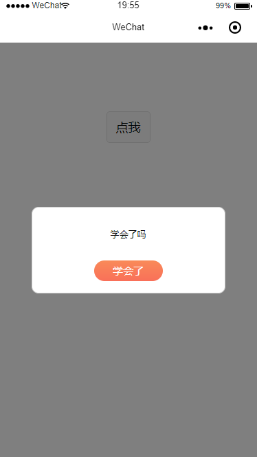
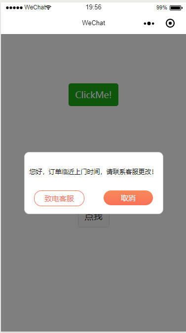
<!--index.wxml-->
<view class="container">
  <view class="userinfo">
    <button bindtap="showPopup"> 点我 </button>
  </view>
  <popup id='popup'
      content='您好,订单临近上门时间,请联系客服更改!'
      btn_no='致电客服'
      btn_ok='取消'
      bind:error="_error"
      bind:success="_success">
  </popup>
</view>