中心极限定理
从这里开始直到高斯分布课程结尾的内容皆为选修部分。
这一部分介绍了高斯分布的由来。如果你想深入学习高斯分布背后的理论,那么请继续。如果你不想,也可以直接跳到机器人定位课程。
总体
总体中包含了数据集中的所有值。在这一课中,我们将用到的数据就像下面这样:

Population Distribution
例如,值 15 在总体中大概出现了 160 次,值 50 在总体中大概出现了 70 次。这个总体中一共有 10,000 个数据点。
随机从这一分布中抽取 100 个数据点,并将这 100 个数据点称为一个样本。接着计算该样本的均值。如果你照此方法反复抽取样本,得到的均值将呈高斯分布。
随着大量样本均值的计算,看着人口分布逐渐向高斯分布靠近,这是一件十分神奇的事。
在本课程的下一部分,我们将为你呈现如何使用 Python 代码做到这一点。
在本节中,我们将向你介绍如何运用中心极限定理。我们将:
- 从总体中生成随机样本
- 获取样本均值
- 将结果均值可视化
你会看到,虽然总体不遵循高斯分布,但样本均值的结果分布确实看起来符合高斯分布。
要开始整个任务,请运行下面的代码单元格。这个单元格将通过运行一个辅助函数来创建总体数据,然后将总体数据可视化,并计算总体数据的平均值。总人口中有10,000个数据点。
如果多次运行该单元格,你会发现分布稍有变化;但是,总体形状保持不变。
import helpers
import numpy as np
%matplotlib inline

population_data = helpers.distribution(50, 10000, 100)
helpers.histogram_visualization(population_data)
print('population mean ', np.mean(population_data))
从人口中抽样
下一个代码单元格将随机从总体中选择N个数据点。这N个数据点将被称为样本。我们使用numpy库的random.choice方法随机选择N个值,你可以在 这里 读取这些值。
运行下面的代码单元格,查看一些示例输出。该代码从总体中随机抽取10个数据点,制作一个大小为10的样本。
def random_sample(population_data, sample_size):
    return np.random.choice(population_data, size = sample_size)

random_sample(population_data, 10)
array([33, 40, 29, 13, 48, 7, 41, 11, 32, 1])
计算样本均值
接下来我们将使用numpy库来计算每个随机生成的样本的平均值。
def sample_mean(sample):
    return np.mean(sample)

# take a sample from the population
example_sample = random_sample(population_data, 10)

# calculate the mean of the sample and output the results
sample_mean(example_sample)
29.300000000000001
中心极限定理结果
现在,我们将使用random_sample()函数和sample_mean()函数来演示中心极限定理是如何运用的。
下面的代码包含一个for循环,该循环会制作一个大小为N的随机样本,然后取样本的均值,并将该均值存储在列表中。 for循环的每次迭代都会有一个不同的随机样本。研究下面的代码,然后运行该单元格。
###
# Code for showing how the central limit theorem works.
# The function inputs:
# population - population data
# n - sample size
# iterations - number of times to draw random samples

def central_limit_theorem(population, n, iterations):
    sample_means_results = []
    for i in range(iterations):
        # get a random sample from the population of size n
        sample = random_sample(population, n)

        # calculate the mean of the random sample
        # and append the mean to the results list
        sample_means_results.append(sample_mean(sample))
    return sample_means_results

print('Means of all the samples ')
central_limit_theorem(population_data, 10, 10000)
[25.600000000000001,
 22.800000000000001,
 30.0,
 28.899999999999999,
 32.200000000000003,
 29.399999999999999,
 32.0,
 35.299999999999997,
 25.600000000000001,
35.5,
 31.300000000000001,
 24.5,
 28.300000000000001,
 23.300000000000001,
 ...]
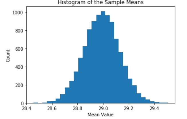
将结果可视化 —— 样本容量= 30
下一个单元格将计算每个大小为30的一万个样本的均值,然后使用直方图将样本均值可视化。需要注意的是,这个可视化结果大致与高斯分布类似。
import matplotlib.pyplot as plt

def visualize_results(sample_means):

plt.hist(sample_means, bins = 30)
plt.title('Histogram of the Sample Means')
plt.xlabel('Mean Value')
plt.ylabel('Count')

# Take random sample and calculate the means
sample_means_results = central_limit_theorem(population_data, 30, 10000)

# Visualize the results
visualize_results(sample_means_results)

所以我们刚开始使用的人口样本肯定不符合高斯分布。但是,通过对分布样本进行抽样并计算样本均值,我们最终会看到一些看起来像高斯分布的东西。
将结果可视化 —— 样本容量= 1
根据中心极限定理,样本容量需要足够大。一般的经验法则是样本容量应该大于或等于30。让我们尝试使用不同的样本容量来查看会有什么不同的结果。
一个比较夸张的情况是样本容量为1。它的分布应该与原始人口的分布类似。运行下面的代码,查看结果。
# Take random sample and calculate the means
sample_means_results = central_limit_theorem(population_data, 1, 10000)

# Visualize the results
visualize_results(sample_means_results)
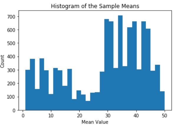
将结果可视化 ——样本容量= 10
现在,我们使用建议的最小样本容量,即30,看看会发生什么。
# Take random sample and calculate the means
sample_means_results = central_limit_theorem(population_data, 10, 10000)

# Visualize the results
visualize_results(sample_means_results)

样本容量为10时,样本均值的分布看起来类似高斯分布。
将结果可视化 —— 样本容量= 1000
让我们继续尝试,并使用更大的样本容量:这次为1000。
# Take random sample and calculate the means
sample_means_results = central_limit_theorem(population_data, 1000, 10000)

# Visualize the results
visualize_results(sample_means_results)

将结果可视化 —— 样本容量= 10000
如果样本容量等于人口数量,会发生什么情况?因为我们随机抽样进行替换,所以其中一个样本不太可能是完全的人口数据;然而,由于每个样本可能与人口相似,因此标准差应该进一步降低。
# Take random sample and calculate the means
sample_means_results = central_limit_theorem(population_data, 10000, 10000)

# Visualize the results
visualize_results(sample_means_results)
结论
我们还要注意,这些分布的中心接近原始人口均值。
想一想是否要收集现实世界中的数据。如果你想找到世界各地人口的身高分布,你可以测量每个人的身高并分析结果。如果使用该结果的均值,那么你将获得真实的人体高度平均值;然而,要使用这个办法去衡量整个世界人口是不可行的。
相反,你可以使用身高的一个样本。如果只测量了三十人,你的抽样均值可能会与人口平均值相差较大。但是,如果测量了20亿个随机选择的人,那么样本均值可能更接近人口均值。你的样本越大,样本均值就越可能与真实的人口均值相匹配。