课程地址
https://www.imooc.com/video/22707
第一章 课程简介

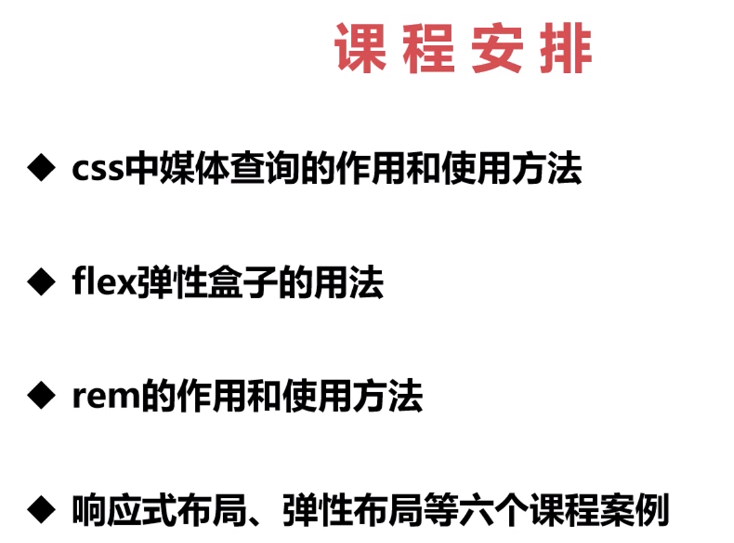


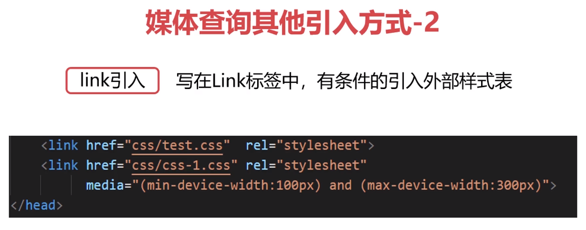
第二章 媒体查询
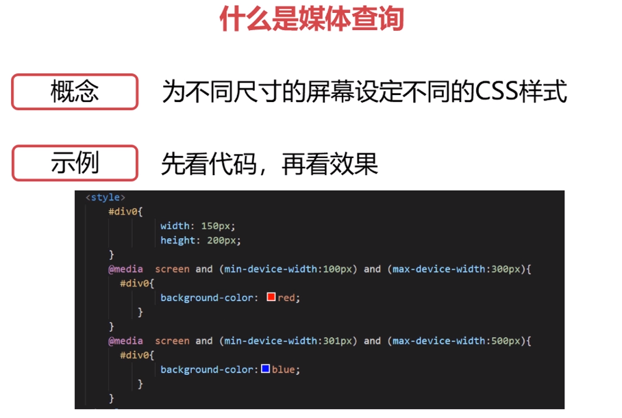
<!doctype html>
<html lang="en">
<head>
    <meta charset="UTF-8">
    <meta name="viewport"
          content="width=device-width, user-scalable=no, initial-scale=1.0, maximum-scale=1.0, minimum-scale=1.0">
    <meta http-equiv="X-UA-Compatible" content="ie=edge">
    <title>媒体查询</title>
    <style>
        .box {
             200px;
            height: 200px;
            background: #00B506;
        }
        /* 300-600之间 背景色变成 红色 */
        @media screen and (min- 300px) and (max- 600px) {
            .box {
                background: red;
            }
        }
    </style>
</head>
<body>
<div class="box">123</div>
</body>
</html>
<!doctype html>
<html lang="en">
<head>
    <meta charset="UTF-8">
    <meta name="viewport"
          content="width=device-width, user-scalable=no, initial-scale=1.0, maximum-scale=1.0, minimum-scale=1.0">
    <meta http-equiv="X-UA-Compatible" content="ie=edge">
    <title>媒体查询基本使用</title>
    <style>
        .box {
             100%;
            height: 500px;
        }

        .box div {
            height: 100px;
            float: left;
        }
        .box div:nth-child(1) {
            background: red;
        }
        .box div:nth-child(2){
            background: blue;
        }
        .box div:nth-child(3) {
            background: green;
        }

        @media screen and (min-device- 500px) {
            .box div {
                 33.3%;
            }
        }

        @media screen and (min-device- 300px) and (max-device- 499px) {
            .box div {
                 50%;
            }
        }

        @media screen and (min-device- 200px) and (max-device- 299px) {
            .box div {
                 100%;
            }
        }
    </style>
</head>
<body>
<div class="box">
    <div></div>
    <div></div>
    <div></div>
</div>
</body>
</html>
基本使用  500以上 一行显示三个
300-500  一行显示2个
200-300  一行显示一个


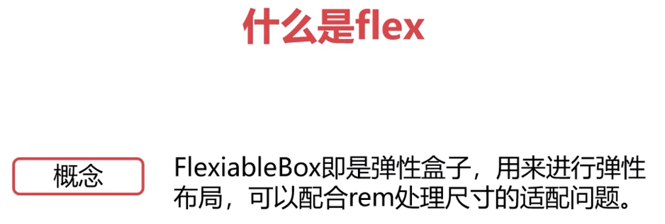
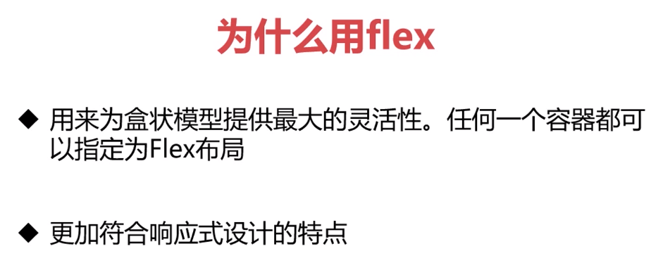
第三章 flex弹性布局
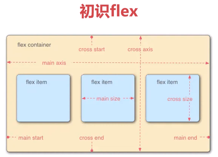
flex-direction 设置子元素在父元素中的排列方式

flex-wrap 设置 子元素大小超出父元素后 是否换行


---------------------上面的都是给父元素设置的 下面的是给子元素设置的----------------------------------------------------


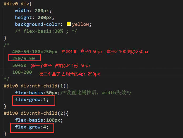

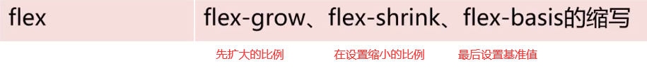
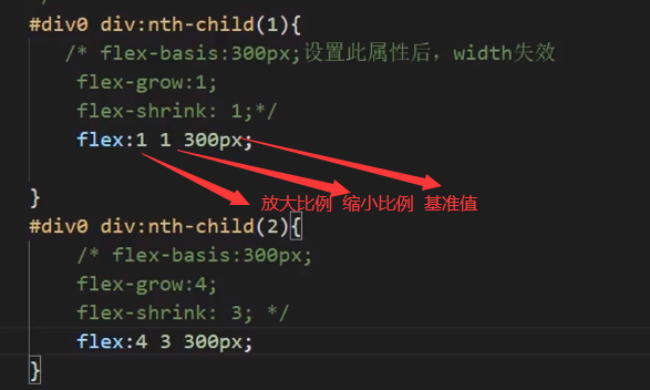
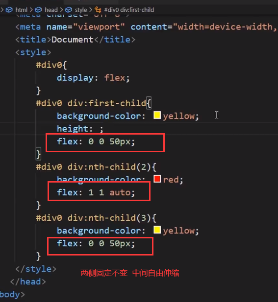
//大于等于1的数字 代表允许 扩大或缩小
0 代表固定值 是不变的
第四章 常用布局

js实现 尺寸没发生一次改变 就会改变fontsize大小

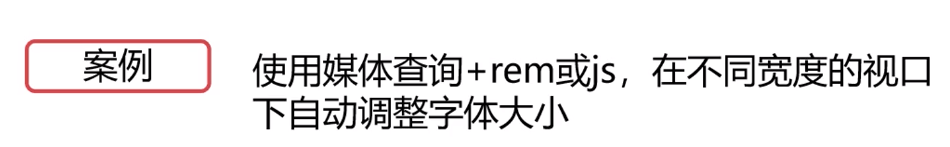
现在重点是 局部自适应 配合 配合媒体查询来使用