zoukankan      html  css  js  c++  java
  • 一个常见下拉菜单的样式:一体化小三角(纯css手写解决)

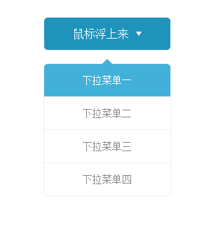
       类似下拉菜单2个一体化小三角,习惯上用字体图标加jQuery处理,比较方便,但是下面纯css手写解决方式,效果也还不错,对CSS知识也是一个比较好的孔固。

      小三角用了2种不同处理方式:1、利用border属性;2、利用正方形旋转45度。

    <!DOCTYPE html>
    <html>
        <head>
            <meta charset="utf-8">
            <title>下拉菜单</title>
            <style>
                *{
                    margin: 0;
                    padding: 0;
                }
                .select {
                    margin: 50px auto;/*居中*/
                     180px;
                    text-align: center;
                }
                .select a {
                    color: #fff;
                    text-decoration: none;
                }
                .select ul,.select li {
                    list-style: none;
                }
                .select span {
                    line-height: 46px;
                    background-color: #41b1d9;
                    display: block;
                    margin-bottom: 20px;
                    position: relative;
                    z-index: 2;
                    border-radius: 5px;
                    -webkit-transition: all .2s ease-in;
                    transition: all .2s ease-in;
                }
                .select span a:after{
                    content: " ";
                    display: inline-block;
                     0;
                    height: 0;
                    font-size: 0;
                    line-height: 0;
                    border-bottom: solid 6px #fff;
                    border-left: solid 4px transparent;
                    border-right: solid 4px transparent;
                    vertical-align: 3px;
                    margin-left: 10px;
                    -webkit-transition: all .2s ease-in;
                    transition: all .2s ease-in;
                }
                /*给以整体的阴影和圆角 但是不能overflow*/
                .drop {
                    left: 0;
                    right: 0;
                    top: -9999px;
                    box-shadow: 0 0 2px 0 rgba(0, 0, 0, 0.2);
                    border-radius: 5px;
                    position: absolute;
                    z-index: 1;
                    -webkit-transform: translateY(-50px);/*y轴方向平移*/
                    transform: translateY(-50px);
                    opacity: 0;
                    -webkit-transition: all .2s ease-in;/*平移时间0.2s*/
                    transition: all .2s ease-in;
                }
                /*给送个下拉助攻*/
                .select:hover span{
                    background-color: #1f93bc;
                }
                .select:hover span a:after{
                    -webkit-transform: rotate(180deg);/*旋转180度*/
                    transform: rotate(180deg);
                }
                .select:hover .drop{
                    position: static;
                    opacity: 1;
                    -webkit-transform: translateY(0);
                    transform: translateY(0);
                }
                /*一个很重要的三角形*/
                .drop li:first-child:before {
                    content: " ";
                    font-size: 0;
                    line-height: 0;
                    margin: 0 auto;/*居中*/
                    display: block;/*独占一行*/
                    box-shadow: 0 0 2px 0 rgba(0, 0, 0, 0.2); /*配合整体一样的投影*/
                    background-color: #fff;
                     10px;
                    height: 10px;
                    -webkit-transform: rotate(45deg); 
                    transform: rotate(45deg); /*一个正方形倾斜四十五度就是三角了但是要把下半部分藏起来*/
                    position: relative;
                    top: -5px; /*果断的露出上半部分*/
                    z-index: 1; /*果断的隐藏下半部分*/
                    -webkit-transition: all .2s ease-in;
                    transition: all .2s ease-in;
                }
                .drop li a {
                    color: #888;
                    line-height: 46px;
                    border-bottom: solid 1px #eee;
                    font-size: 14px;
                    display: block;
                    background-color: #fff; /*要有背景色才能盖住呀*/
                    position: relative;
                    z-index: 2; /*这里很重要 要挡住三角形的下半部分*/
                    -webkit-transition: all .2s ease-in;
                    transition: all .2s ease-in;
                }
                /*以下两块:控制第一个和最后一个li要圆角,因为最外边的div没有overflow 也不可以overflow*/
                .drop li:first-child a{
                    border-top-left-radius: 5px;
                    border-top-right-radius: 5px;
                    margin-top: -10px;
                }
                .drop li:last-child a{
                    border-bottom-left-radius: 5px;
                    border-bottom-right-radius: 5px;
                    border-bottom: none;
                }
                /*hover事件给了li,先改变三角 再改变a*/
                .drop li:hover:before{
                    background-color: #41b1d9;
                }
                .drop li:hover a {
                    background-color: #41b1d9;
                    color: #fff;
                }
            </style>
        </head>
        <body>
            <div class="select">
                <span><a href="javascript:void(0);">鼠标浮上来</a></span>
                <div class="drop">
                    <ul>
                        <li>
                            <a href="javascript:void(0);">下拉菜单一</a>
                        </li>
                        <li>
                            <a href="javascript:void(0);">下拉菜单二</a>
                        </li>
                        <li>
                            <a href="javascript:void(0);">下拉菜单三</a>
                        </li>
                        <li>
                            <a href="javascript:void(0);">下拉菜单四</a>
                        </li>
                    </ul>
                </div>
            </div>
        </body>
    </html>

    效果如下:

  • 相关阅读:
    hdu1238 Substrings
    CCF试题:高速公路(Targin)
    hdu 1269 迷宫城堡(Targin算法)
    hdu 1253 胜利大逃亡
    NYOJ 55 懒省事的小明
    HDU 1024 Max Sum Plus Plus
    HDU 1087 Super Jumping! Jumping! Jumping!
    HDU 1257 最少拦截系统
    HDU 1069 Monkey and Banana
    HDU 1104 Remainder
  • 原文地址:https://www.cnblogs.com/goloving/p/7198093.html
Copyright © 2011-2022 走看看