这篇文章将会按照如下思路展开:
一、水平居中
1. 行内元素水平居中
2. block元素水平居中
3. 多个块级元素水平居中
二、垂直居中
1. 行内元素水平居中
2. block元素水平居中
3. 用flexbox
三、水平和垂直居中
1.元素是都有定宽定高
2.元素宽高不定
3.用flexbox
了解了文章的架构,就让我们追条击破!
一、水平居中
1. 行内元素水平居中
.center-children {
  text-align: center;
}
该方法适用于inline, inline-block, inline-table, inline-flex
2. block元素水平居中
.center-me {
  margin: 0 auto;
}
3. 多个块级元素水平居中
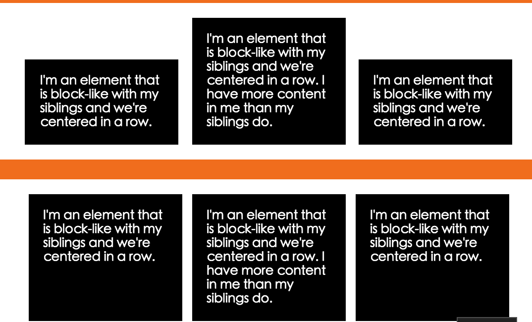
如果有两个或更多的块级元素需要在一行中水平居中,那么可能会更好地使它们成为不同的显示类型。 这里有一个使它们inline-block和flexbox的例子:
.inline-block-center {
  text-align: center;
  display:inline-block;
}
或
.flex-center{
  display:flex;
  justify-content:center;
}
结果如图
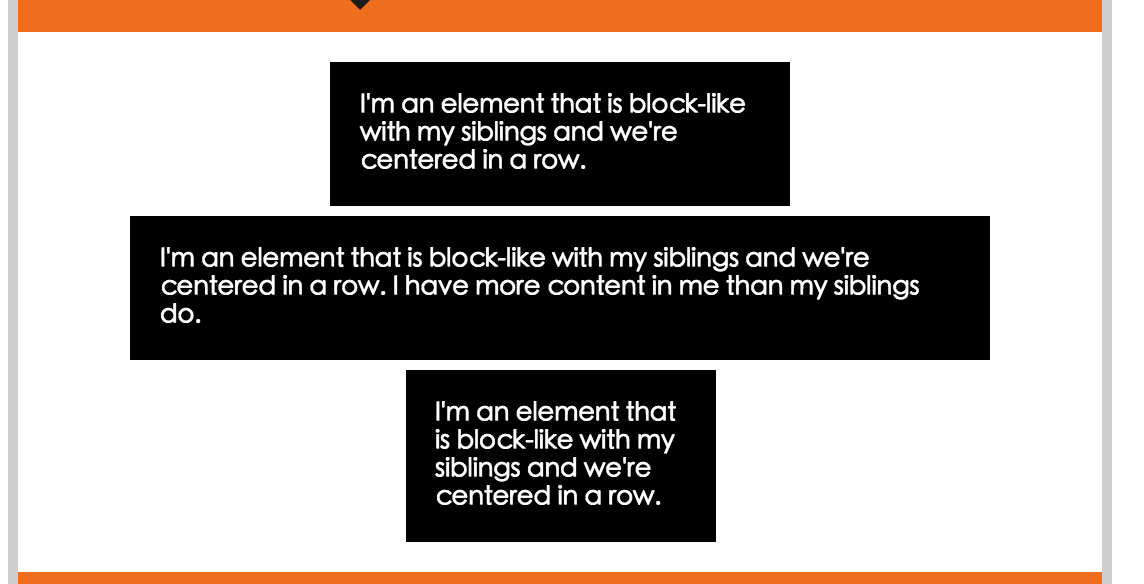
如果有多个块级元素堆叠在彼此的顶部,在这种情况下,auto margin就很好。
main div {
  background: black;
  margin: 0 auto;
  color: white;
  padding: 15px;
  margin: 5px auto;
}
结果如图:
二、垂直居中
1. 行内元素垂直
1.1 单独一行
它们的上和下有相等的padding
.link {
  padding-top: 30px;
  padding-bottom: 30px;
}
如果padding由于某种原因不是一个选项,并且你试图居中一些nowrap的文本,有一个窍门是使line-height等于文本高度。
.center-text-trick {
  height: 100px;
  line-height: 100px;
  white-space: nowrap;
}
1.2 多行
上下padding相等同样适用。但有时文本是table cell 就不适用了。但是我们还有法宝,vertical-align可以解决这个问题。
.center-table {
  display: table;
  height: 250px;
  background: white;
  width: 240px;
  margin: 20px;
}
.center-table p {
  display: table-cell;
  margin: 0;
  background: black;
  color: white;
  padding: 20px;
  border: 10px solid white;
  vertical-align: middle;
}
或者 flex大神
//这是父元素
.flex-center-vertically {
  display: flex;
  justify-content: center;
  flex-direction: column;
  height: 400px;
}
注意,只有父容器具有固定高度(px,%等),这才是真正相关的,这就是为什么这里的容器有一个高度。
如果这两种技术都出来了,你可以使用“ghost element”技术,其中全高度伪元素被放置在容器内,文本与该元素垂直对齐。
.ghost-center {
  position: relative;
}
.ghost-center::before {
  content: " ";
  display: inline-block;
  height: 100%;
  width: 1%;
  vertical-align: middle;
}
.ghost-center p {
  display: inline-block;
  vertical-align: middle;
}
2. block元素垂直居中
2.1 元素高度已知
.parent {
  position: relative;
}
.child {
  position: absolute;
  top: 50%;
  height: 100px;
  margin-top: -50px; /* account for padding and border if not using box-sizing: border-box; */
}
2.2 元素高度未知
.parent {
  position: relative;
}
.child {
  position: absolute;
  top: 50%;
  transform: translateY(-50%);
}
3.用flexbox
.parent {
  display: flex;
  flex-direction: column;
  justify-content: center;
}
三、水平和垂直居中
1.元素是都有定宽定高
.parent {
  position: relative;
}

.child {
  width: 300px;
  height: 100px;
  padding: 20px;

  position: absolute;
  top: 50%;
  left: 50%;

  margin: -70px 0 0 -170px;
}
2.元素宽高不定
.parent {
  position: relative;
}
.child {
  position: absolute;
  top: 50%;
  left: 50%;
  transform: translate(-50%, -50%);
}
3.用flexbox
.parent {
  display: flex;
  justify-content: center;
  align-items: center;
}
四、结论