animation 动画
animation-duration
代码实例:
<!DOCTYPE html>
<html>
<head>
<meta charset="utf-8">
<title>动画</title>
<style type="text/css">
.animation_duration{
left:10px;
top:100px;
position:absolute;
-webkit-animation:0.5s ease 1 forwards;
-webkit-animation-duration:2s;
-webkit-animation-name:demo;
-moz-animation:0.5s ease 1 forwards;
-moz-animation-name:demo;
-moz-animation-duration:2s;
}
@-webkit-keyframes demo{
0%{left:10px;}
100%{left:400px;}
}
</style>
</head>
<body>
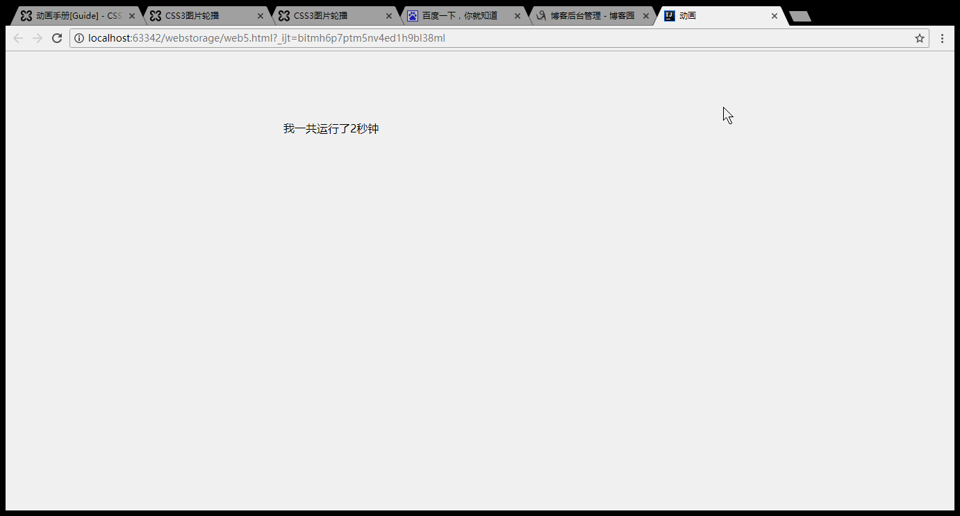
<div class="demo_box animation_duration">我一共运行了2秒钟</div>
</body>
</html>
效果:
animation-name
代码实例:
<!DOCTYPE html>
<html>
<head>
    <meta charset="utf-8">
    <title>动画</title>
    <style type="text/css">
        .animation_name{
            left:0;
            top:100px;
            position:absolute;
            -webkit-animation:0.5s 0.5s ease infinite alternate;
            -webkit-animation-name:demo;
            -moz-animation:0.5s 0.5s ease infinite alternate;
            -moz-animation-name:demo;
        }
        @-webkit-keyframes demo{
            0%{left:0;}
            100%{left:400px;}
        }
    </style>
</head>
<body>
<div class="demo_box animation_name">看我没事来回跑</div>
</body>
</html>
效果:

animation-timing-function
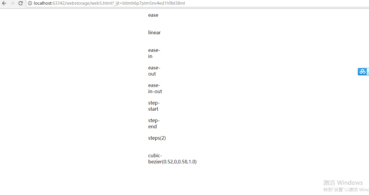
语法animation-timing-function: linear | ease | ease-in |
 ease-out | ease-in-out | step-start | step-end |
steps(<number>[, [ start | end ] ]?) | cubic-bezier(<number>, <number>, <number>, <number>)
[, linear | ease | ease-in | ease-out | ease-in-out | step-start | step-end | steps(<number>[, [ start | end ] ]?) | cubic-bezier(<number>, <number>, <number>, <number>) ]*; 指定对象动画的持续时间 。
ease:缓解效果,等同于cubic-bezier(0.25,0.1,0.25,1.0)函数,既立方贝塞尔。
linear:线性效果,等同于cubic-bezier(0.0,0.0,1.0,1.0)函数。
ease-in:渐显效果,等同于cubic-bezier(0.42,0,1.0,1.0)函数。
ease-out:渐隐效果,等同于cubic-bezier(0,0,0.58,1.0)函数。
ease-in-out:渐显渐隐效果,等同于cubic-bezier(0.42,0,0.58,1.0)函数。
step-start:马上转跳到动画结束状态。
step-end:保持动画开始状态,直到动画执行时间结束,马上转跳到动画结束状态。
steps(<number>[, [ start | end ] ]?):第一个参数number为指定的间隔数,即把动画分为n步阶段性展示,第二个参数默认为end,设置最后一步的状态,start为结束时的状态,end为开始时的状态,若设置与animation-fill-mode的效果冲突,而以animation-fill-mode的设置为动画结束的状态。
cubic-bezier(<number>, <number>, <number>, <number>):特殊的立方贝塞尔曲线效果。
代码实例:
<!DOCTYPE html>
<html>
<head>
    <meta charset="utf-8">
    <title>动画</title>
    <style type="text/css">

        .demo_box{
            -webkit-animation:f1 3s 0.5s forwards;
            -moz-animation:f1 3s 0.5s forwards;
            position:relative;
            left:10px;
            50px;
            height:50px;

            margin:10px 0;

        }
        .ease{
            -webkit-animation-timing-function:ease;
            -moz-animation-timing-function:ease;
        }
        .linear{
            -webkit-animation-timing-function:linear;
            -moz-animation-timing-function:linear;
        }
        .ease-in{
            -webkit-animation-timing-function:ease-in;
            -moz-animation-timing-function:ease-in;
        }
        .ease-out{
            -webkit-animation-timing-function:ease-out;
            -moz-animation-timing-function:ease-out;
        }
        .ease-in-out{
            -webkit-animation-timing-function:ease-in-out;
            -moz-animation-timing-function:ease-in-out;
        }
        .step-start{
            -webkit-animation-timing-function:step-start;
            -moz-animation-timing-function:step-start
        }
        .step-end{
            -webkit-animation-timing-function:step-end;
            -moz-animation-timing-function:step-end;
        }
        .steps{
            -webkit-animation-timing-function:steps(2);
            -moz-animation-timing-function:steps(2)
        }
        .cubic-bezier{
            -webkit-animation-timing-function:cubic-bezier(0.52,0,0.58,1.0);
            -moz-animation-timing-function:cubic-bezier(0.52,0,0.58,1.0);
        }
        @-webkit-keyframes f1{
            0%{left:10px;}
            100%{left:500px;}
        }
        @-moz-keyframes f1{
            0%{left:10px;}
            100%{left:500px;background:#f00}
        }


    </style>
</head>
<body>
<div class="demo_box ease">ease</div>
<div class="demo_box linear">linear</div>
<div class="demo_box ease-in">ease-in</div>
<div class="demo_box ease-out">ease-out</div>
<div class="demo_box ease-in-out">ease-in-out</div>
<div class="demo_box step-start">step-start</div>
<div class="demo_box step-end">step-end</div>
<div class="demo_box steps">steps(2)</div>
<div class="demo_box cubic-bezier">cubic-bezier(0.52,0,0.58,1.0)</div>
</body>
</html>
效果:
animation-delay
语法
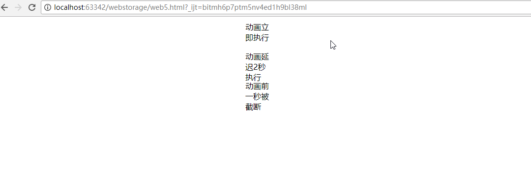
0:不延迟,立即执行。
正数:按照设置的时间延迟。
负数:设置时间前的动画将被截断
代码实例:
<!DOCTYPE html>
<html>
<head>
    <meta charset="utf-8">
    <title>动画</title>
    <style type="text/css">

        .demo_box{
            -webkit-animation:f1 3s  forwards;
            -moz-animation:f1 3s  forwards;
            position:relative;
            left:10px;
            50px;
            height:50px;

            margin:10px 0;

        }
         .no_delay {
             -webkit-animation-delay: 0s;
             -moz-animation-delay: 0s;
         }
         .delay_2s{
             -webkit-animation-delay: 2s;
             -moz-animation-delay: 2s;
         }
        .delay_-1s{
            -webkit-animation-delay:-1s;
            -moz-animation-delay:-1s;
        }
        @-webkit-keyframes f1{
            0%{left:10px;}
            100%{left:500px;}
        }
        @-moz-keyframes f1{
            0%{left:10px;}
            100%{left:500px;background:#f00}
        }


    </style>
</head>
<body>
<div class="demo_box no_delay">动画立即执行</div>
<div class="demo_box delay_2s">动画延迟2秒执行</div>
<div class="demo_box delay_-1s">动画前一秒被截断</div>

</body>
</html>
效果:
animation-direction
语法
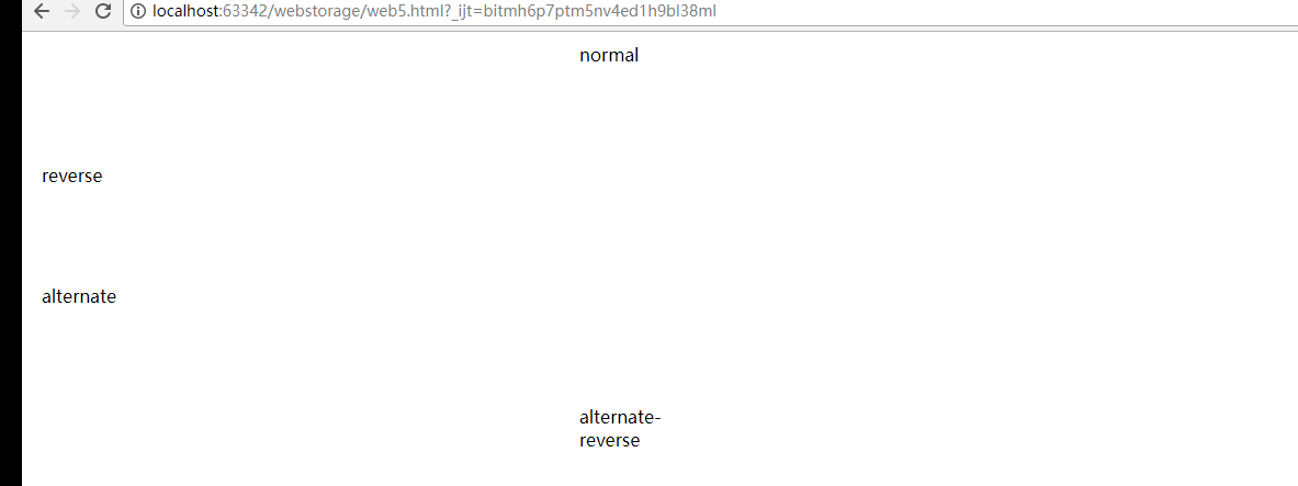
animation-direction: normal | reverse | alternate | alternate-reverse [, normal | reverse | alternate | alternate-reverse ]*; 指定对象动画运动的方向。
normal:正常方向。
reverse:动画反向运行,方向始终与normal相反。(FF14.0.1以下不支持)
alternate:动画会循环正反方向交替运动,奇数次(1、3、5……)会正常运动,偶数次(2、4、6……)会反向运动,即所有相关联的值都会反向。
alternate-reverse:动画从反向开始,再正反方向交替运动,运动方向始终与alternate定义的相反。(FF14.0.1以下不支持)
语法
animation-direction: normal | reverse | alternate | alternate-reverse [, normal | reverse | alternate | alternate-reverse ]*; 指定对象动画运动的方向。
normal:正常方向。
reverse:动画反向运行,方向始终与normal相反。(FF14.0.1以下不支持)
alternate:动画会循环正反方向交替运动,奇数次(1、3、5……)会正常运动,偶数次(2、4、6……)会反向运动,即所有相关联的值都会反向。
alternate-reverse:动画从反向开始,再正反方向交替运动,运动方向始终与alternate定义的相反。(FF14.0.1以下不支持)
代码实例:
<!DOCTYPE html>
<html>
<head>
    <meta charset="utf-8">
    <title>动画</title>
    <style type="text/css">

        .demo_box{
            -webkit-animation:f1 2s 0.5s 10 forwards linear;
            -moz-animation:f1 2s 0.5s 10 forwards linear;
            position:relative;
            left:10px;
            100px;
            height:100px;
            margin:10px 0;
            overflow:hidden;
        }
        .normal{
            -webkit-animation-direction:normal;
            -moz-animation-direction:normal;
        }
        .reverse{
            -webkit-animation-direction:reverse;
            -moz-animation-direction:reverse;
        }
        .alternate{
            -webkit-animation-direction:alternate;
            -moz-animation-direction:alternate;
        }
        .alternate-reverse{
            -webkit-animation-direction:alternate-reverse;
            -moz-animation-direction:alternate-reverse;
        }
        @-webkit-keyframes f1{
            0%{left:10px;}
            100%{left:500px;}
        }
        @-moz-keyframes f1{
            0%{left:10px;}
            100%{left:500px;}
        }

    </style>
</head>
<body>
<div class="demo_box normal">normal</div>
<div class="demo_box reverse">reverse</div>
<div class="demo_box alternate">alternate</div>
<div class="demo_box alternate-reverse">alternate-reverse</div>
</body>
</html>
效果:
animation-iteration-count
代码实例:
<!DOCTYPE html>
<html>
<head>
<meta charset="utf-8">
<title>动画</title>
<style type="text/css">
.demo_box{
-webkit-animation:f1 3s 0.5s forwards linear;
-moz-animation:f1 3s 0.5s forwards linear;
position:relative;
left:10px;
50px;
height:50px;
margin:10px 0;
}
.one {
-moz-animation-iteration-count: 1;
-webkit-animation-iteration-count: 1;
}
.infinite{
-moz-animation-iteration-count: infinite;
-webkit-animation-iteration-count: infinite;
}
.some {
-moz-animation-iteration-count: 2,1;
-webkit-animation-iteration-count:2,1;
}
@-webkit-keyframes f1{
0%{left:10px;}
100%{left:500px;}
}
@-moz-keyframes f1{
0%{left:10px;}
100%{left:500px;}
}
</style>
</head>
<body>
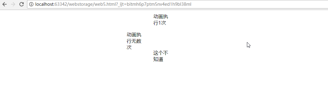
<div class="demo_box one">动画执行1次</div>
<div class="demo_box infinite">动画执行无数次</div>
<div class="demo_box some">这个不知道</div>
</body>
</html>
效果:
animation-fill-mode
语法
animation-fill-mode: none | forwards | backwards | both; 检索或设置对象动画时间之外的状态。
none:默认值。不设置对象动画之外的状态
forwards:结束后保持动画结束时的状态,但当animation-direction为0,则动画不执行,持续保持动画开始时的状态
backwards:结束后返回动画开始时的状态
both:结束后可遵循forwards和backwards两个规则。
代码实例:
<!DOCTYPE html>
<html>
<head>
<meta charset="utf-8">
<title>动画</title>
<style type="text/css">
.demo_box{
-webkit-animation:f1 2s 0.5s 1 forwards linear;
-moz-animation:f1 2s 0.5s 1 forwards linear;
position:relative;
left:10px;
100px;
height:100px;
margin:10px 0;
overflow:hidden;
}
.forwards{
-webkit-animation-fill-mode:forwards;
-moz-animation-fill-mode:forwards;
}
.backwards{
-webkit-animation-fill-mode:backwards;
-moz-animation-fill-mode:backwards;
}
@-webkit-keyframes f1{
0%{left:10px;}
100%{left:500px;}
}
@-moz-keyframes f1{
0%{left:10px;}
100%{left:500px;}
}
</style>
</head>
<body>
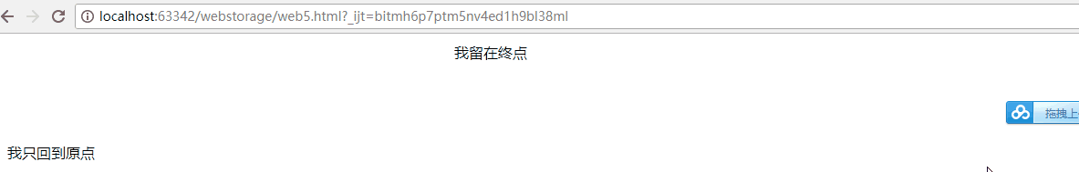
<div class="demo_box forwards">我留在终点</div>
<div class="demo_box backwards">我只回到原点</div>
</body>
</html>
效果:
animation-play-state2017-08-22
语法
<!DOCTYPE html>
<html>
<head>
<meta charset="utf-8">
<title>动画</title>
<style type="text/css">
.demo_box{
-webkit-animation:f1 2s 0.5s 10 linear forwards alternate;
-moz-animation:f1 2s 0.5s 10 linear forwards alternate;
position:relative;
left:10px;
100px;
height:100px;
margin:10px 0;
overflow:hidden;
}
.play-state:hover{
-webkit-animation-play-state:paused;
-moz-animation-play-state:paused;
}
@-webkit-keyframes f1{
0%{left:10px;}
100%{left:500px;}
}
@-moz-keyframes f1{
0%{left:10px;}
100%{left:500px;}
}
</style>
</head>
<body>
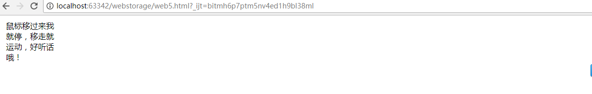
<div class="demo_box play-state">鼠标移过来我就停,移走就运动,好听话哦!</div>
</body>
</html>
效果:
转载:http://isux.tencent.com/css3
16:47:48 16:47:53