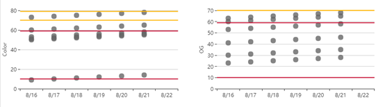
场景:不同类别每天都会录入一些监控的数据,其中包括黄色、红色警戒区,需通过图表展示不同种类数据每天的分布情况
一、基础处理
1、设置 y轴标题与y轴平行
yAxis: {
name:'y轴标题',
position: 'left',//y轴位置
nameLocation: 'middle', //坐标轴名称显示位置
nameGap:30//与y轴间距}
2、设置数据圆点的大小
symbolSize: 15,//点的大小(使用百分比无效)
3、去掉y坐标轴轴线
yAxis: {
axisLine:{show:false},
},
4、添加平行于x轴的警戒线
markLine: {
symbol: ['none', 'none'],//去掉箭头
itemStyle: {
normal: {
lineStyle: { //全局的样式
type: 'solid',
2
}
,label: { show: false, position:'left' } }
},
data: [
{
yAxis: 6.5 //平行于x轴且y轴值为6.5的标线
}]
}
5、设置警戒线颜色
data: [
{
yAxis: 6.5 //平行于x轴且y轴值为6.5的标线
itemStyle: {
normal: { color: '#ffb400' } //线条颜色
}
}]
6、指定y轴的最大值
yAxis: {
max:20//最大值
}
二、DEMO
1、源码
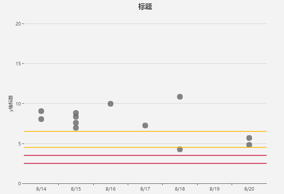
option = {
    title: {
        text: '标题',
        x: 'center'
    },
    tooltip: {
        trigger: 'axis'
    },
    xAxis: {
        data : ['8/14','8/15','8/16','8/17','8/18','8/19','8/20']
    },
    yAxis: {
        axisLine:{show:false},
        name:'y轴标题',
        position: 'left',//y轴位置
        nameLocation: 'middle', //坐标轴名称显示位置
        type: 'value',
        max:20,//最大值
        nameGap:30//与y轴间距
    },
    series: [{
        itemStyle:{
            normal:{
                color:'#666666'
            }
        },
        symbolSize: 15,//点的大小
        data: [
            [x='8/14', y=8.04],
            [x='8/14', y=9.04],
            ['8/15', 6.95],
            ['8/15', 7.58],
            ['8/15', 8.81],
            ['8/15', 8.33],
            ['8/16', 9.96],
            ['8/17', 7.24],
            ['8/18', 4.26],
            ['8/18', 10.84],
            ['8/20', 4.82],
            ['8/20', 5.68]
        ],
        type: 'scatter',
        markLine: {
                symbol: ['none', 'none'],//去掉箭头
                itemStyle: {
                    normal: {
                        lineStyle: { //全局的样式
                            type: 'solid',
                             2
                        }
                        ,label: { show: false, position:'left' } }
                },
                data: [{
                        yAxis: 2.5,
                        itemStyle: {
                            normal: { color: '#c60c30' }
                        }
                },
                {
                        yAxis: 3.5,
                        itemStyle: {
                            normal: { color: '#c60c30' }
                        }
                }
                ,
                {
                        yAxis: 4.5,
                        itemStyle: {
                            normal: { color: '#ffb400' }
                        }
                },
                {
                        yAxis: 6.5,
                        itemStyle: {
                            normal: { color: '#ffb400' }
                        }
                }]
        }
    }
]
};
2、效果
3、实践效果
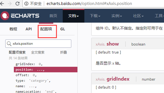
注:遇到问题多查echarts的官方文档,尤其是“配置项”
http://echarts.baidu.com/option.html#xAxis.position