Android Drawable
标签(空格分隔): Android
Android的drawable有很多种类型,
- Bitmap File
- Nine-Patch File
- Layer List
- State List
- Level List
- Transition Drawable
- Inset Drawable
- Clip Drawable
- Scale Drawable
- Shape Drawable
Bitmap Xml
bitmap标签的一般格式为:
<?xml version="1.0" encoding="utf-8"?>
<bitmap
    xmlns:android="http://schemas.android.com/apk/res/android"
    android:src="@[package:]drawable/drawable_resource"
    android:antialias=["true" | "false"]
    android:dither=["true" | "false"]
    android:filter=["true" | "false"]
    android:gravity=["top" | "bottom" | "left" | "right" | "center_vertical" |
                      "fill_vertical" | "center_horizontal" |  "fill_horizontal" |
                      "center" | "fill" | "clip_vertical" | "clip_horizontal"]
android:mipMap=["true" | "false"]
android:tileMode=["disabled" | "clamp" | "repeat" | "mirror"]
    android:tint="@[package:]color/color_resource"
    android:tintMode=["add" | "multyplay" | "screen" | "src_atop" | "src_in" | "src_over"]/>
src:必须的属性,可以是一个drawable资源。
filter:如果设为true,适应View的大小而拉伸。
gravity:在View中的位置。
tileMode, tileModeX, tielModeY:平铺形式,设置平铺之后,filter和gravity失效。
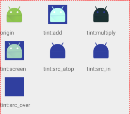
tint:可以理解为给图片染色。应用中有些图片是纯色的,可以只切一张白色的图,然后加入不同的tint。比起去切图更方便,而且白色图片的体积更小。特别是应用图标需要随着主题变颜色的时候。
tintMode:一般使用src_top。
不同的tintMode产生的结果,原图是origin,tint是蓝色
后来才发现,tint这个属性在API Guide里面并没有提到,因为这个在5.0以下是不支持的,不会报错,但是不会有tint的效果。但是我们可以这么做:
drawable = DrawableCompat.wrap(drawable);
DrawableCompat.setTint(drawable, color);
先取出drawable,然后设置tint,再设置回去。
State-list
<?xml version="1.0" encoding="utf-8"?>
<selector xmlns:android="http://schemas.android.com/apk/res/android"
    android:constantSize=["true" | "false"]
    android:dither=["true" | "false"]
    android:variablePadding=["true" | "false"] >
    <item
        android:drawable="@[package:]drawable/drawable_resource"
        android:state_pressed=["true" | "false"]
        android:state_focused=["true" | "false"]
        android:state_hovered=["true" | "false"]
        android:state_selected=["true" | "false"]
        android:state_checkable=["true" | "false"]
        android:state_checked=["true" | "false"]
        android:state_enabled=["true" | "false"]
        android:state_activated=["true" | "false"]
        android:state_window_focused=["true" | "false"] />
</selector>
Layer List
<?xml version="1.0" encoding="utf-8"?>
<layer-list
    xmlns:android="http://schemas.android.com/apk/res/android" >
    <item
        android:drawable="@[package:]drawable/drawable_resource"
        android:id="@[+][package:]id/resource_name"
        android:top="dimension"
        android:right="dimension"
        android:bottom="dimension"
        android:left="dimension" />
</layer-list>
当把layer-list作为ImageView的src使用的时候,配合scaleType可以让里面的图片不被拉伸。当把layer-list作为background使用的时候,如果直接把图片放在item的drawable里面,会被拉伸,为了防止拉伸,可以在drawable里面放上bitmap的xml资源,或者在item里面包一层bitmap,比如:
<item
    android:left="0dp"
    android:top="0dp">
    <bitmap
        android:gravity="center"
        android:src="@drawable/ic_launcher"
        android:alpha="0.5"
        android:tint="#0f0"/>
</item>
item里面也可以是selector,这样,在一个background里面就可以有多个触摸反馈。简单的应用场景可以是这样的,一个button,不点击的时候是背景是的绿色,中间一个圆形的灰色,点击之后变为背景是红色,中间变为蓝色多的方形。像这种需要多个变化的背景,用layer-list就可以很方便的解决,不需要设计出图,有利于减小安装包的大小。
color-list
作用和用法类似于state-list,格式为:
<?xml version="1.0" encoding="utf-8"?>
<selector xmlns:android="http://schemas.android.com/apk/res/android" >
    <item
        android:color="hex_color"
        android:state_pressed=["true" | "false"]
        android:state_focused=["true" | "false"]
        android:state_selected=["true" | "false"]
        android:state_checkable=["true" | "false"]
        android:state_checked=["true" | "false"]
        android:state_enabled=["true" | "false"]
        android:state_window_focused=["true" | "false"] />
</selector>
基本上只是把item里面的drawable改为了color。与state-list最大的区别就是,state-list得到的是drawable资源文件,而color-list得到的是color资源文件。可以直接给textColor使用,这样就可以在点击的时候改变字体颜色。
Transition Drawable
<?xml version="1.0" encoding="utf-8"?>
<transition
xmlns:android="http://schemas.android.com/apk/res/android" >
    <item
        android:drawable="@[package:]drawable/drawable_resource"
        android:id="@[+][package:]id/resource_name"
        android:top="dimension"
        android:right="dimension"
        android:bottom="dimension"
        android:left="dimension" />
</transition>
一般是设置两个item,通过View的方法,获取到drawable,然后调用startTrasition(int),drawable会从第一个item渐变到第二个item,但是第一个item并没有消失,第二个item的应该是调整alpha值从0到1。