用CSS实现元素的水平居中,比较简单,可以设置text-align center,或者设置 margin-left:auto; margin-right:auto 之类的即可。
主要麻烦的地方还是在垂直居中的处理上,所以接下来主要考虑垂直方向上的居中实现。
水平垂直居中主要包括三类:基本文本类,图像类,其他元素类
但,也是由一些方法可以实现的,下面就来谈谈了解到的10中方法。
方法一、使用 line-height
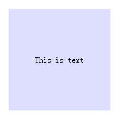
这种方式更多地用在 单行文字的情况,其中使用overflow:hidden的设置是为了防止内容超出容器或者产生自动换行,这样就达不到垂直居中效果了
<style type="text/css">
    html,body,div {margin: 0;padding: 0}
    .box {
        margin: 20px auto;
        width: 200px;
        height: 200px;

        background: #ddf;
    }
    .content {
        line-height: 200px;
        text-align: center;
       overflow: hidden;
    }
</style>

<div class="box">
    <div class="content">
        This is text
    </div>
</div>
单行文字的情况各浏览器都能兼容,多行文字就需要考虑其他方法了。
但如果是图片,IE6以上可以正常居中,以下(包括IE6)则不兼容。
(如果想通过行高让图片在块元素内垂直居中,ie6无效果,因为ie6中含有替换元素的行高会失效。)
二、使用 vertical-align
加上这个属性,不过line-height也不能丢
如果不加上那个line-height的属性的话,div会认为你vertical-align的是默认高度,而不是自定义设置的高度。
.box {
        margin: 20px auto;
        width: 200px;
        height: 200px;
        background: #ddf;
    }
    .content {
        line-height: 200px;
        vertical-align: middle;
        text-align: center;
        overflow: hidden;
    }
跟上述一样,IE6的图片还是有问题
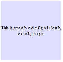
三、把容器当作表格单元
table可以设置vertical-align,自然能实现居中,所以我们可以模拟出一个table
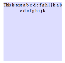
使用display:table和display:table-cell的方法,前者必须设置在父元素上,后者必须设置在子元素上,因此我们要为需要定位的文本再增加一个<div>元素:
<style type="text/css">
    html,body,div {margin: 0;padding: 0}
    .box {
        margin: 20px auto;
        display: table;
        width: 200px;
        height: 200px;
        background: #ddf;
    }
    .content {
        display: table-cell;
        vertical-align: middle;
        text-align: center;
    }

</style>

    <div class="box">
        <div class="content">
            This is test a b c d e f g h i j k a b c d e f g h i j k
        </div>
    </div>
多行文本能居中了,但IE6却还是老样子。图片的居中也同理。
四、IE6下的解决方案
IE6这么霸道..不过还是可以 以bug攻bug
在Internet Explorer 6及以下版本中,在高度的计算上存在着缺陷的。在Internet Explorer 6中对父元素进行定位后,如果再对子元素
进行百分比计算时,计算的基础似乎是有继承性的(如果定位的数值是绝对数值没有这个问题,但是使用百分比计算的基础将不再是该元素的
高度,而从父元素继承来的定位高度)
比如这
<div id="wrap">
 <div id="subwrap">
   <div id="content">
 </div>
</div>
</div>
如果我们对subwrap进行了绝对定位/相对定位,那么content也会继承了这个这个属性,虽然它不会在页面中马上显示出来,但是如果再对content进
行相对定位的时候,你使用的100%分比将不再是content原有的高度。
例如,我们设定了subwrap的position为top:40%,我们如果想使content的上边缘和wrap重合的话就必须设置top:-80%;
那么,如果我们设定subwrap的top:50%的话,我们必须使用-100%才能使content回到原来的位置上去,但是如果我们把content设置成-50%呢?
那么它就正好垂直居中了。所以我们可以使用这中方法来实现Internet Explorer 6中的垂直居中:
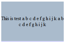
注意,要有三个层级才可以~ 喜欢hack的话就直接兼容进去了
<style type="text/css">
    html,body,div {margin: 0;padding: 0}
    .box {
        position: relative;
        margin: 20px auto;
        display: table;
        width: 200px;
        height: 200px;
        background: #ddf;
    }
    .content {
        _position: relative;
        _top:50%;
        display: table-cell;
        vertical-align: middle;
        text-align: center;
    }
    .content > div {
        _position: relative;
        _top: -50%;
    }
</style>
    <div class="box">
        <div class="content">
            <div>This is test a b c d e f g h i j k a b c d e f g h i j k</div>
        </div>
    </div>
五、负边距margin的使用
这个方法主要用于块的居中,首先绝对定位到50% ,然后通过负边距拉回来(元素高的一半,宽的一半)
<style type="text/css">
    html,body,div {margin: 0;padding: 0}
    .box {
        position: relative;
        margin: 20px auto;
        width: 200px;
        height: 200px;
        background: #ddf;
    }
    .content {
        position: absolute;
        top:50%;
        left: 50%;
        margin-left: -60px; /* (width + padding)/2 */
        margin-top: -50px; /* (height + padding)/2 */
        padding: 10px;
        width: 100px;
        height: 80px;
        background: #abc;
    }
</style>

    <div class="box">
        <div class="content">
            This is test
        </div>
    </div>

六、css3中transform的使用
其实这种方式给负边距差不多,原理也是拉回来,不过因为css3的关系,IE8以下(包括IE8)还不支持
使用 transform: translate(-50%,-50%)拉回来
<style type="text/css">
    html,body,div {margin: 0;padding: 0}
    .box {
        position: relative;
        margin: 20px auto;
        width: 200px;
        height: 200px;
        background: #ddf;
    }
    .content {
        position: absolute;
        top:50%;
        left: 50%;
        -webkit-transform: translate(-50%,-50%);
            -ms-transform: translate(-50%,-50%);
                transform: translate(-50%,-50%);
        padding: 10px;
        width: 100px;
        height: 80px;
        background: #abc;
    }
</style>
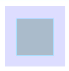
七、直接使用margin:auto
使用这个方式需要有一些知识 要了解
绝对定位元素不在普通内容流中渲染,因此margin:auto可以使内容在通过top: 0; left: 0; bottom: 0;right: 0;设置的边界内垂直居中。


优点:

1.支持跨浏览器,包括IE8-IE10.

2.无需其他特殊标记,CSS代码量少

3.支持百分比%属性值和min-/max-属性

4.只用这一个类可实现任何内容块居中

5.不论是否设置padding都可居中(在不使用box-sizing属性的前提下)

6.内容块可以被重绘。

7.完美支持图片居中。

缺点:

1.必须声明高度(查看可变高度Variable Height)。

2.建议设置overflow:auto来防止内容越界溢出。(查看溢出Overflow)。

3.在Windows Phone设备上不起作用。

浏览器兼容性:

Chrome,Firefox, Safari, Mobile Safari, IE8-10.

绝对定位方法在最新版的Chrome,Firefox, Safari, Mobile Safari, IE8-10.上均测试通过。

对比表格:

绝对居中法并不是唯一的实现方法,实现垂直居中还有些其他的方法,并各有各的优势。采用哪种技术取决于你的浏览器是否支持和你使用的语言标记。这个对照表有助于你根据自己的需求做出正确的选择。


解释:

绝对居中(AbsoluteCentering)的工作机理可以阐述如下:

1、在普通内容流(normal content flow)中,margin:auto的效果等同于margin-top:0;margin-bottom:0。
W3C中写道If 'margin-top', or'margin-bottom' are 'auto', their used value is 0.

2、position:absolute使绝对定位块跳出了内容流,内容流中的其余部分渲染时绝对定位部分不进行渲染。

Developer.mozilla.org:...an element that is positioned absolutely is taken out of the flow and thustakes up no space

3、为块区域设置top: 0; left: 0; bottom: 0; right: 0;将给浏览器重新分配一个边界框,此时该块block将填充其父元素的所有可用空间,父元素一般为body或者声明为position:relative;的容器。

Developer.mozilla.org:For absolutely positioned elements, the top, right, bottom, and left propertiesspecify offsets from the edge of the element's containing block (what theelement is positioned relative to).

4、  给内容块设置一个高度height或宽度width,能够防止内容块占据所有的可用空间,促使浏览器根据新的边界框重新计算margin:auto

Developer.mozilla.org: The margin of the[absolutely positioned] element is then positioned inside these offsets.

5、由于内容块被绝对定位,脱离了正常的内容流,浏览器会给margin-top,margin-bottom相同的值,使元素块在先前定义的边界内居中。
W3.org: If none of the three [top, bottom,height] are 'auto': If both 'margin-top' and 'margin-bottom' are 'auto', solvethe equation under the extra constraint that the two margins get equal values.AKA: center the block vertically

这么看来, margin:auto似乎生来就是为绝对居中(Absolute Centering)设计的,所以绝对居中(Absolute Centering)应该都兼容符合标准的现代浏览器。

简而言之(TL;DR):绝对定位元素不在普通内容流中渲染,因此margin:auto可以使内容在通过top: 0; left: 0; bottom: 0;right: 0;设置的边界内垂直居中
这样一来,就可以直接居中了,不过IE6还是不能兼容到
<style type="text/css">
    html,body,div {margin: 0;padding: 0}
    .box {
        position: relative;
        margin: 20px auto;
        width: 200px;
        height: 200px;
        background: #ddf;
    }
    .content {
        position: absolute;
        top: 0;
        right: 0;
        bottom: 0;
        left: 0;
        margin: auto;
        width: 100px;
        height: 80px;
        background: #abc;
    }
</style>
    <div class="box">
        <div class="content">
            This is test
        </div>
    </div>
八、上下padding相等的模拟
一般用于 父元素高度不确定的文本、图片等的垂直居中
    .content {
        padding-top: 25px;
        padding-bottom: 25px;
        background: #abc;
        text-align: center;
    }
<div class="content">
<p>This is test a b c d e f g h i j k a b c d e f g h i j k </p>
</div>
不过块级元素就有点问题了,第二行开始就不会左右居中了
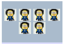
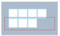
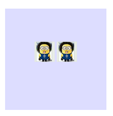
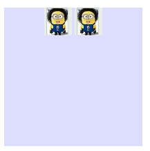
九、使用css3的Flex布局
Flex布局用法见 上文 flex对IE而言 IE10+ 才支持
比如我想让box中那几个div都水平垂直居中,只要简单设置一下即可。
<style type="text/css">
    html,body,div {margin: 0;padding: 0}
    .box {
        margin: 20px auto;
        padding: 10px;
        display: flex;
        display: -webkit-flex;
        flex-wrap: wrap;
        justify-content: center;
        /* align-content: flex-start; */
        align-items: center;
        width: 200px;
        height: 200px;
        background: #ddf;
    }
    .content {
        width: 50px;
        height: 50px;
        border: 2px solid #adf;
        background: #abc;
    }

</style>

    <div class="box">
        <div class="content"></div>
        <div class="content"></div>
        <div class="content"></div>
        <div class="content"></div>
        <div class="content"></div>
        <div class="content"></div>
        <div class="content"></div>
    </div>
得到结果为左图,因为默认align-content是stretch已经完全撑开了,如果想得到右图连接在一起就 把上头的 注释取消即可


十、在 content 元素外插入一个 div
并设置此 div height:50%; margin-bottom: -(contentheight + padding)/2;。
比如content高度为100px,总padding为20px ,则margin-bottom: -60px 将content挤下去
<style type="text/css">
    html,body,div {margin: 0;padding: 0}
    .box {
        margin: 20px auto;
        width: 200px;
        height: 200px;
        background: #ddf;
    }
    .floater {
        height: 50%;
        margin-bottom: -60px;
     }
    .content {
        position: relative;
        margin: 0 auto;
        padding: 10px;
        width: 100px;
        height: 100px;
        border: 2px solid #adf;
        background: #abc;
    }

</style>

    <div class="box">
        <div class="floater"></div>
        <div class="content"></div>
    </div>
缺点就是增加了无意义的标签,但优点是简便而且IE6也得到兼容
当然,还有很多方法可以实现水平垂直居中,见到了再添加吧。