二、正文
设计师设计了一个图片上传圆环loading进度效果。如下截图:
首先,CSS3是可以实现的,以前写过一篇转大饼的文章:“CSS3实现鸡蛋饼饼状图loading等待转转转”。原理跟这个一模一样,两个半区的矩形,然后不同时机巧妙显隐实现。
但是呢,CSS3实现不太好理解,进度控制也不容易,最好直接数值变一变,进度效果就出来。
有没有其他方法呢?
哈,当然有,可以使用同样IE9+支持的SVG.
我们只需要一个实线背景圆,一个虚线变化圆两个圆就可以了。
百闻不如一见,您可以狠狠地点击这里:SVG实现圆环loading进度效果demo
拖动demo下面的range区域选择控件(0-100%)就会发现蓝色高亮圆环跟着一起变化了: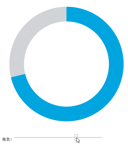
SVG代码非常简单,如下示意:
<svg width="440" height="440">
    <circle cx="220" cy="220" r="170" stroke-width="50" stroke="#D1D3D7" fill="none"></circle>
    <circle cx="220" cy="220" r="170" stroke-width="50" stroke="#00A5E0" fill="none" transform="matrix(0,-1,1,0,0,440)" stroke-dasharray="0 1069"></circle>
</svg>
其中,上面红色加粗的就是效果实现的关键。
stroke-dasharray在SVG中表示描边是虚线,两个值,第一个是虚线的宽度,第二个是虚线之间的间距。下面就是一些虚线数据值以及最后的效果表现(实时,非截图,IE9+浏览):
<?xml version="1.0"?>
<svg width="200" height="200" viewPort="0 0 200 300" version="1.1" xmlns="http://www.w3.org/2000/svg">

    <line stroke-dasharray="5, 5"              x1="10" y1="10" x2="190" y2="10" />
    <line stroke-dasharray="5, 10"             x1="10" y1="30" x2="190" y2="30" />
    <line stroke-dasharray="10, 5"             x1="10" y1="50" x2="190" y2="50" />
    <line stroke-dasharray="5, 1"              x1="10" y1="70" x2="190" y2="70" />
    <line stroke-dasharray="1, 5"              x1="10" y1="90" x2="190" y2="90" />
    <line stroke-dasharray="0.9"               x1="10" y1="110" x2="190" y2="110" />
    <line stroke-dasharray="15, 10, 5"         x1="10" y1="130" x2="190" y2="130" />
    <line stroke-dasharray="15, 10, 5, 10"     x1="10" y1="150" x2="190" y2="150" />
    <line stroke-dasharray="15, 10, 5, 10, 15" x1="10" y1="170" x2="190" y2="170" />
    <line stroke-dasharray="5, 5, 1, 5"        x1="10" y1="190" x2="190" y2="190" />

<style><![CDATA[
line{
    stroke: black;
    stroke-width: 2;
}
]]></style>
</svg>
之前写了篇“纯CSS实现帅气的SVG路径描边动画效果”,就是stroke-dasharray的妙用。
这里也是类似原理。
理解了stroke-dasharray,我们的事情就简单了,我们只需要让间距永远不小于圆的周长,然后,虚线的长度 = 百分比值 * 圆的周长就可以了。
简单,超乎想象:
// 假设周长是1068, percent是百分比值
circle.setAttribute('stroke-dasharray', 1068 * percent + " 1069");
就OK了。
哦~~差点忘了。默认stroke-dasharray的起始位置在右侧,而不是上方,因此,偶们需要使用transform逆时针旋转90°, 这就是第二个circle元素上面transform="matrix(0,-1,1,0,0,440)"的由来。