EasyUI Panel 面板
通过 $.fn.panel.defaults 重写默认的 defaults。
面板(panel)当做其他内容的容器使用。它是创建其他组件(比如:Layout 布局、Tabs 标签页/选项卡、Accordion 折叠面板,等等)的基础组件。它也提供内置的可折叠、可关闭、可最大化、可最小化的行为以及其他自定义行为。面板(panel)可以简单地嵌入到网页的任何位置。
用法
创建面板(Panel)
1、通过标记创建面板(Panel)
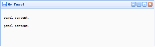
从标记创建面板(Panel)更容易。把 'easyui-panel' class 添加到 <div> 标记。
<div id="p" class="easyui-panel" title="My Panel"
    style="500px;height:150px;padding:10px;background:#fafafa;"
    data-options="iconCls:'icon-save',closable:true,
    collapsible:true,minimizable:true,maximizable:true">
    <p>panel content.</p>
    <p>panel content.</p>
</div>
2、编程创建面板(Panel)
让我们创建带右上角工具栏的面板(Panel)。
<div id="p" style="padding:10px;">
    <p>panel content.</p>
    <p>panel content.</p>
</div>
$('#p').panel({
    500,
    height:150,
    title:'My Panel',
    tools:[{
    iconCls:'icon-add',
    handler:function(){alert('new')}
    },{
    iconCls:'icon-save',
    handler:function(){alert('save')}
    }]
});
移动面板(Panel)
调用 'move' 方法把面板(Panel)移动到新位置。
$('#p').panel('move',{
    left:100,
    top:100
});
加载内容
让我们通过 ajax 加载面板(panel)内容并且当加载成功时显示一些信息。
$('#p').panel({
    href:'content_url.php',
    onLoad:function(){
        alert('loaded successfully');
    }
});
属性
| 名称 | 类型 | 描述 | 默认值 |
|---|---|---|---|
| id | string | 面板(panel)的 id 属性。 | null |
| title | string | 显示在面板(panel)头部的标题文字。 | null |
| iconCls | string | 在面板(panel)里显示一个 16x16 图标的 CSS class。 | null |
| width | number | 设置面板(panel)的宽度。 | auto |
| height | number | 设置面板(panel)的高度。 | auto |
| left | number | 设置面板(panel)的左边位置。 | null |
| top | number | 设置面板(panel)的顶部位置。 | null |
| cls | string | 给面板(panel)添加一个 CSS class。 | null |
| headerCls | string | 给面板(panel)头部添加一个 CSS class。 | null |
| bodyCls | string | 给面板(panel)主体添加一个 CSS class。 | null |
| style | object | 给面板(panel)添加自定义格式的样式。 改变面板(panel)边框宽度的代码实例:
|
{} |
| fit | boolean | 当设置为 true 时,面板(panel)的尺寸就适应它的父容器。下面的实例演示了自动调整尺寸到它的父容器的最大内部尺寸的面板(panel)。
|
false |
| border | boolean | 定义了是否显示面板(panel)的边框。 | true |
| doSize | boolean | 如果设置为 true,创建时面板(panel)就调整尺寸并做成布局。 | true |
| noheader | boolean | 如果设置为 true,面板(panel)的头部将不会被创建。 | false |
| content | string | 面板(panel)主体内容。 | null |
| collapsible | boolean | 定义是否显示折叠按钮。 | false |
| minimizable | boolean | 定义是否显示最小化按钮。 | false |
| maximizable | boolean | 定义是否显示最大化按钮。 | false |
| closable | boolean | 定义是否显示关闭按钮。 | false |
| tools | array,selector | 自定义工具组,可能的值: 1、数组,每个元素包含 iconCls 和 handler 两个属性。 2、选择器,指示工具组。 面板(panel)工具组可通过已存在 <div> 标签声明:
|
[] |
| collapsed | boolean | 定义初始化面板(panel)是不是折叠的。 | false |
| minimized | boolean | 定义初始化面板(panel)是不是最小化的。 | false |
| maximized | boolean | 定义初始化面板(panel)是不是最大化的。 | false |
| closed | boolean | 定义初始化面板(panel)是不是关闭的。 | false |
| href | string | 一个 URL,用它加载远程数据并且显示在面板(panel)里。请注意,除非面板(panel)打开,否则内容不会被加载。这对创建一个惰性加载的面板(panel)很有用:
|
null |
| cache | boolean | 设置为 true 就缓存从 href 加载的面板(panel)内容。 | true |
| loadingMessage | string | 当加载远程数据时在面板(panel)里显示一条信息。 | Loading… |
| extractor | function | 定义如何从 ajax 响应中提取内容,返回提取的数据。
|
事件
| 名称 | 参数 | 描述 |
|---|---|---|
| onLoad | none | 当远程数据被加载时触发。 |
| onBeforeOpen | none | 面板(panel)打开前触发,返回 false 就停止打开。 |
| onOpen | none | 面板(panel)打开后触发。 |
| onBeforeClose | none | 面板(panel)关闭前触发,返回 false 就取消关闭。下面声明的面板(panel)不会关闭。
|
| onClose | none | 面板(panel)关闭后触发。 |
| onBeforeDestroy | none | 面板(panel)销毁前触发,返回false就取消销毁。 |
| onDestroy | none | 面板(panel)销毁后触发。 |
| onBeforeCollapse | none | 面板(panel)折叠前触发,返回false就停止折叠。 |
| onCollapse | none | 面板(panel)折叠后触发。 |
| onBeforeExpand | none | 面板(panel)展开前触发,返回false就停止展开。 |
| onExpand | none | 面板(panel)展开后触发。 |
| onResize | width, height | 面板(panel)调整尺寸后触发。 width:新的外部宽度 height:新的外部高度 |
| onMove | left,top | 面板(panel)移动后触发。 left:新的左边位置 top:新的顶部位置 |
| onMaximize | none | 窗口最大化后触发。 |
| onRestore | none | 窗口还原为它的原始尺寸后触发。 |
| onMinimize | none | 窗口最小化后触发。 |
方法
| 名称 | 参数 | 描述 |
|---|---|---|
| options | none | 返回选项(options)属性(property)。 |
| panel | none | 返回外部面板(panel)对象。 |
| header | none | 返回面板(panel)头部对象。 |
| body | none | 返回面板(panel)主体对象。 |
| setTitle | title | 设置头部的标题文本。 |
| open | forceOpen | 当 forceOpen 参数设置为 true 时,就绕过 onBeforeOpen 回调函数打开面板(panel)。 |
| close | forceClose | 当 forceClose 参数设置为 true 时,就绕过 onBeforeClose 回调函数关闭面板(panel)。 |
| destroy | forceDestroy | 当 forceDestroy 参数设置为 true 时,就绕过 onBeforeDestroy 回调函数销毁面板(panel)。 |
| refresh | href | 刷新面板(panel)加载远程数据。如果分配了 'href' 参数,将重写旧的 'href' 属性。 代码实例:
|
| resize | options | 设置面板(panel)尺寸并做布局。Options 对象包含下列属性: width:新的面板(panel)宽度 height:新的面板(panel)宽度 left:新的面板(panel)左边位置 top:新的面板(panel)顶部位置 代码实例:
|
| move | options | 移动面板(panel)到新位置。Options 对象包含下列属性: left:新的面板(panel)左边位置 top:新的面板(panel)顶部位置 |
| maximize | none | 面板(panel)适应它的容器的尺寸。 |
| minimize | none | 最小化面板(panel)。 |
| restore | none | 把最大化的面板(panel)还原为它原来的尺寸和位置。 |
| collapse | animate | 折叠面板(panel)主体。 |
| expand | animate | 展开面板(panel)主体。 |
EasyUI Tabs 标签页/选项卡
通过 $.fn.tabs.defaults 重写默认的 defaults。
The tabs display a collection of panel. It shows only one tab panel at a time. Each tab panel has the header title and some mini button tools, including close button and other customized buttons.
依赖
- panel
- linkbutton
用法
创建标签页(Tabs)
1、通过标记创建标签页(Tabs)
从标记创建标签页(Tabs)更容易,我们不需要写任何 JavaScript 代码。记住把 'easyui-tabs' class 添加到 <div> 标记。每个标签页面板(tab panel)通过子 <div> 标记被创建,其用法与面板(panel)一样。
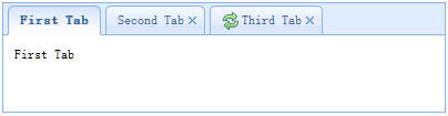
<div id="tt" class="easyui-tabs" style="500px;height:250px;">
    <div title="Tab1" style="padding:20px;display:none;">
        tab1
    </div>
    <div title="Tab2" data-options="closable:true" style="overflow:auto;padding:20px;display:none;">
        tab2
    </div>
    <div title="Tab3" data-options="iconCls:'icon-reload',closable:true" style="padding:20px;display:none;">
        tab3
    </div>
</div>
2、编程创建标签页(Tabs)
现在我们编程创建标签页(Tabs),我们同时捕捉 'onSelect' 事件。
$('#tt').tabs({
    border:false,
    onSelect:function(title){
        alert(title+' is selected');
    }
});
添加新的标签页面板(tab panel)
通过迷你工具添加一个新的标签页面板(tab panel),迷你工具图标(8x8)放置在关闭按钮前。
// 添加一个新的标签页面板(tab panel)
$('#tt').tabs('add',{
    title:'New Tab',
    content:'Tab Body',
    closable:true,
    tools:[{
        iconCls:'icon-mini-refresh',
        handler:function(){
            alert('refresh');
        }
    }]
});
获取选中的标签页(Tab)
// 获取选中的标签页面板(tab panel)和它的标签页(tab)对象
var pp = $('#tt').tabs('getSelected');
var tab = pp.panel('options').tab; // 相应的标签页(tab)对象
属性
| 名称 | 类型 | 描述 | 默认值 |
|---|---|---|---|
| width | number | 标签页(Tabs)容器的宽度。 | auto |
| height | number | 标签页(Tabs)容器的高度。 | auto |
| plain | boolean | 当设置为 true 时,就不用背景容器图片来呈现 tab 条。 | false |
| fit | boolean | 当设置为 true 时,就设置标签页(Tabs)容器的尺寸以适应它的父容器。 | false |
| border | boolean | 当设置为 true 时,就显示标签页(Tabs)容器边框。 | true |
| scrollIncrement | number | 每按一次 tab 滚动按钮,滚动的像素数。 | 100 |
| scrollDuration | number | 每一个滚动动画应该持续的毫秒数。 | 400 |
| tools | array,selector | 放置在头部的左侧或右侧的工具栏,可能的值: 1、数组,指示工具组,每个工具选项都和链接按钮(Linkbutton)一样。 2、选择器,指示包含工具的 <div>。 代码实例: 通过数组定义工具。
|
null |
| toolPosition | string | 工具栏位置。可能的值:'left'、'right'。该属性自版本 1.3.2 起可用。 | right |
| tabPosition | string | 标签页(tab)位置。可能的值:'top'、'bottom'、'left'、'right'。该属性自版本 1.3.2 起可用。 | top |
| headerWidth | number | 标签页(tab)头部宽度,只有当 tabPosition 设置为 'left' 或 'right' 时才有效。该属性自版本 1.3.2 起可用。 | 150 |
| tabWidth | number | tab 条的宽度。该属性自版本 1.3.4 起可用。 | auto |
| tabHeight | number | tab 条的高度。该属性自版本 1.3.4 起可用。 | 27 |
| selected | number | 初始化选定的标签页索引。该属性自版本 1.3.5 起可用。 | 0 |
| showHeader | boolean | 当设置为 true 时,显示标签页(tab)头部。该属性自版本 1.3.5 起可用。 | true |
事件
| 名称 | 参数 | 描述 |
|---|---|---|
| onLoad | panel | 当一个 ajax 标签页面板(tab panel)完成加载远程数据时触发。 |
| onSelect | title,index | 当用户选择一个标签页面板(tab panel)时触发。 |
| onUnselect | title,index | 当用户未选择一个标签页面板(tab panel)时触发。该事件自版本 1.3.5 起可用。 |
| onBeforeClose | title,index | 当一个标签页面板(tab panel)被关闭前触发,返回 false 就取消关闭动作。下面的实例演示如何在关闭标签页面板(tab panel)前显示确认对话框。
|
| onClose | title,index | 当用户关闭一个标签页面板(tab panel)时触发。 |
| onAdd | title,index | 当一个新的标签页面板(tab panel)被添加时触发。 |
| onUpdate | title,index | 当一个标签页面板(tab panel)被更新时触发。 |
| onContextMenu | e, title,index | 当一个标签页面板(tab panel)被右键点击时触发。 |
方法
| 名称 | 参数 | 描述 |
|---|---|---|
| options | none | 返回标签页(tabs)选项(options)。 |
| tabs | none | 返回全部的标签页面板(tab panel)。 |
| resize | none | 调整标签页(tabs)容器的尺寸并做布局。 |
| add | options | 添加一个新的标签页面板(tab panel),options 参数是一个配置对象,更多详细信息请参见标签页面板(tab panel)属性。 当添加一个新的标签页面板(tab panel)时,它将被选中。 如需添加一个未选中的标签页面板(tab panel),请记得设置 'selected' 属性为 false。
|
| close | which | 关闭一个标签页面板(tab panel),'which' 参数可以是要被关闭的标签页面板(tab panel)的标题(title)或索引(index)。 |
| getTab | which | 获取指定的标签页面板(tab panel),'which' 参数可以是标签页面板(tab panel)的标题(title)或索引(index)。 |
| getTabIndex | tab | 获取指定的标签页面板(tab panel)索引。 |
| getSelected | none | 获取选中的标签页面板(tab panel)。下面的实例演示如何获取选中的标签页面板(tab panel)的索引。
|
| select | which | 选择一个标签页面板(tab panel),'which' 参数可以是标签页面板(tab panel)的标题(title)或索引(index)。 |
| unselect | which | 选择一个标签页面板(tab panel),'which' 参数可以是标签页面板(tab panel)的标题(title)或索引(index)。该方法自版本 1.3.5 起可用。 |
| showHeader | none | 显示标签页(tabs)头部。该方法自版本 1.3.5 起可用。 |
| hideHeader | none | 隐藏标签页(tabs)头部。该方法自版本 1.3.5 起可用。 |
| exists | which | 指示指定的面板是否已存在,'which' 参数可以是标签页面板(tab panel)的标题(title)或索引(index)。 |
| update | param | 更新指定的标签页面板(tab panel),param 参数包含两个属性: tab:被更新的标签页面板(tab panel)。 options:面板(panel)的选项(options)。 代码实例:
|
| enableTab | which | 启用指定的标签页面板(tab panel),'which' 参数可以是标签页面板(tab panel)的标题(title)或索引(index)。该方法自版本 1.3 起可用。 代码实例:
|
| disableTab | which | 禁用指定的标签页面板(tab panel),'which' 参数可以是标签页面板(tab panel)的标题(title)或索引(index)。该方法自版本 1.3 起可用。 代码实例:
|
| scrollBy | deltaX | 通过指定的像素数滚动标签页(tab)头部,负值表示滚动到右边,正值表示滚动到左边。该方法自版本 1.3.2 起可用。 代码实例:
|
标签页面板(Tab Panel)
标签页面板(tab panel)属性被定义在面板(panel)组件里,下面是一些常用的属性。
| 名称 | 类型 | 描述 | 默认值 |
|---|---|---|---|
| id | string | 标签页面板(tab panel)的 id 属性。 | null |
| title | string | 标签页面板(tab panel)的标题文字。 | |
| content | string | 标签页面板(tab panel)的内容。 | |
| href | string | 加载远程内容来填充标签页面板(tab panel)的 URL。 | null |
| cache | boolean | 当设置为 true 时,在设定了有效的 href 特性时缓存这个标签页面板(tab panel)。 | true |
| iconCls | string | 显示在标签页面板(tab panel)标题上的图标的 CSS class。 | null |
| width | number | 标签页面板(tab panel)的宽度。 | auto |
| height | number | 标签页面板(tab panel)的高度。 | auto |
| collapsible | boolean | 当设置为 true 时,允许标签页面板(tab panel)可折叠。 | false |
一些附加的属性。
| 名称 | 类型 | 描述 | 默认值 |
|---|---|---|---|
| closable | boolean | 当设置为 true 时,标签页面板(tab panel)将显示一个关闭按钮,点击它就能关闭这个标签页面板(tab panel)。 | false |
| selected | boolean | 当设置为 true 时,标签页面板(tab panel)将被选中。 | false |
EasyUI Accordion 折叠面板
通过 $.fn.accordion.defaults 重写默认的 defaults。
折叠面板(accordion)允许您提供多个面板(panel),同时显示一个或多个面板(panel)。每个面板(panel)都有展开和折叠的内建支持。点击面板(panel)头部可展开或折叠面板(panel)主体。面板(panel)内容可通过 ajax 指定 'href' 属性来加载。用户可定义被选中的面板(panel)。如果为指定,则默认选中第一个面板(panel)。
依赖
- panel
用法
创建折叠面板(Accordion)
通过标记创建折叠面板(Accordion),添加 'easyui-accordion' class 到 <div> 标记。
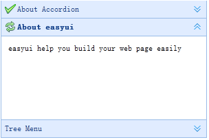
<div id="aa" class="easyui-accordion" style="300px;height:200px;">
    <div title="Title1" data-options="iconCls:'icon-save'" style="overflow:auto;padding:10px;">
        <h3 style="color:#0099FF;">Accordion for jQuery</h3>
        <p>Accordion is a part of easyui framework for jQuery.
        It lets you define your accordion component on web page more easily.</p>
    </div>
    <div title="Title2" data-options="iconCls:'icon-reload',selected:true" style="padding:10px;">
        content2
    </div>
    <div title="Title3">
        content3
    </div>
</div>
我们可以改变或重建折叠面板(Accordion)后,修改某些特性。
$('#aa').accordion({
    animate:false
});
刷新折叠面板(Accordion Panel)内容
调用 'getSelected' 方法来获取当前面板(panel),然后我们可以调用面板(panel)的 'refresh' 方法来加载新内容。
var pp = $('#aa').accordion('getSelected'); // 获取选中的面板(panel)
if (pp){
    pp.panel('refresh','new_content.php'); // 调用 'refresh' 方法加载新内容
}
容器选项
| 名称 | 类型 | 描述 | 默认值 |
|---|---|---|---|
| width | number | 折叠面板(Accordion)容器的宽度。 | auto |
| height | number | 折叠面板(Accordion)容器的高度。 | auto |
| fit | boolean | 设置为 true,就使折叠面板(Accordion)容器的尺寸适应它的父容器。 | false |
| border | boolean | 定义是否显示边框。 | true |
| animate | boolean | 定义当展开或折叠面板(panel)时是否显示动画效果。 | true |
| multiple | boolean | 设置为 true,则可同时展开多个面板(panel)。该属性自版本 1.3.5 起可用。 | false |
| selected | number | 初始化选中的面板(panel)索引。该属性自版本 1.3.5 起可用。 | 0 |
面板(Panel)选项
折叠面板(Accordion)的面板(panel)选项继承自面板(panel),下面是附加的属性:
| 名称 | 类型 | 描述 | 默认值 |
|---|---|---|---|
| selected | boolean | 设置为 true 就展开面板(panel)。 | false |
| collapsible | boolean | 定义是否显示可折叠按钮。如果设置为 false,将不能通过点击来展开/折叠面板(panel)。 | true |
事件
| 名称 | 参数 | 描述 |
|---|---|---|
| onSelect | title,index | 当面板(panel)被选中时触发。 |
| onUnselect | title,index | 当面板(panel)未被选中时触发。该事件自版本 1.3.5 起可用。 |
| onAdd | title,index | 当添加一个新面板(panel)时触发。 |
| onBeforeRemove | title,index | 当移除一个面板(panel)之前触发,返回 false 就取消移除动作。 |
| onRemove | title,index | 当移除一个面板(panel)时触发。 |
方法
| 名称 | 参数 | 描述 |
|---|---|---|
| options | none | 返回折叠面板(accordion)的选项。 |
| panels | none | 获取全部的面板(panel)。 |
| resize | none | 调整折叠面板(accordion)的尺寸。 |
| getSelected | none | 获取第一个选中的面板(panel)。 |
| getSelections | none | 过去所有选中的面板(panel)。该方法自版本 1.3.5 起可用。 |
| getPanel | which | 获取指定的面板(panel)。'which' 参数可以是面板(panel)的标题(title)或索引(index)。 |
| getPanelIndex | panel | 获取指定的面板(panel)索引。该方法自版本 1.3 起可用。 下面的实例显示如何获取选中的面板(panel)索引。
|
| select | which | 选择指定的面板(panel)。'which' 参数可以是面板(panel)的标题(title)或索引(index)。 |
| unselect | which | 未选择指定的面板(panel)。'which' 参数可以是面板(panel)的标题(title)或索引(index)。该方法自版本 1.3.5 起可用。 |
| add | options | 添加一个新的面板(panel)。默认情况下,新添加的面板(panel)会被选中。如需添加一个未被选中的新面板(panel),请传递 'selected' 属性,并将其设置为 false。 代码实例:
|
| remove | which | 移除指定的面板(panel)。'which' 参数可以是面板(panel)的标题(title)或索引(index)。 |
EasyUI Layout 布局
通过 $.fn.layout.defaults 重写默认的 defaults。
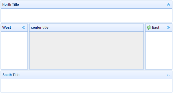
布局(layout)是有五个区域(北区 north、南区 south、东区 east、西区 west 和中区 center)的容器。中间的区域面板是必需的,边缘区域面板是可选的。每个边缘区域面板可通过拖拽边框调整尺寸,也可以通过点击折叠触发器来折叠面板。布局(layout)可以嵌套,因此用户可建立复杂的布局。
依赖
- panel
- resizable
用法
创建布局(Layout)
1、通过标记创建布局(Layout)。
添加 'easyui-layout' class 到 <div> 标记。
<div id="cc" class="easyui-layout" style="600px;height:400px;">
    <div data-options="region:'north',title:'North Title',split:true" style="height:100px;"></div>
    <div data-options="region:'south',title:'South Title',split:true" style="height:100px;"></div>
    <div data-options="region:'east',title:'East',split:true" style="100px;"></div>
    <div data-options="region:'west',title:'West',split:true" style="100px;"></div>
    <div data-options="region:'center',title:'center title'" style="padding:5px;background:#eee;"></div>
</div>
2、在整个页面上创建布局(Layout)。
<body class="easyui-layout">
    <div data-options="region:'north',title:'North Title',split:true" style="height:100px;"></div>
    <div data-options="region:'south',title:'South Title',split:true" style="height:100px;"></div>
    <div data-options="region:'east',title:'East',split:true" style="100px;"></div>
    <div data-options="region:'west',title:'West',split:true" style="100px;"></div>
    <div data-options="region:'center',title:'center title'" style="padding:5px;background:#eee;"></div>
</body>
3、创建嵌套布局。
请注意,内部布局的西区面板是折叠的。
<body class="easyui-layout">
    <div data-options="region:'north'" style="height:100px"></div>
    <div data-options="region:'center'">
        <div class="easyui-layout" data-options="fit:true">
            <div data-options="region:'west',collapsed:true" style="180px"></div>
            <div data-options="region:'center'"></div>
        </div>
    </div>
</body>
4、通过 ajax 加载内容。
布局(layout)是基于面板(panel)创建的。各区域面板提供从 URL 动态加载内容的内建支持。使用动态加载技术,用户可以让他们的布局页面更快地显示。
<body class="easyui-layout">
    <div data-options="region:'west',href:'west_content.php'" style="180px" ></div>
    <div data-options="region:'center',href:'center_content.php'" ></div>
</body>
折叠布局面板(Collpase Layout Panel)
$('#cc').layout();
// collapse the west panel
$('#cc').layout('collapse','west');
通过工具按钮添加西区面板
$('#cc').layout('add',{
    region: 'west',
     180,
    title: 'West Title',
    split: true,
    tools: [{
        iconCls:'icon-add',
        handler:function(){alert('add')}
    },{
        iconCls:'icon-remove',
        handler:function(){alert('remove')}
    }]
});
布局选项(Layout Options)
| 名称 | 类型 | 描述 | 默认值 |
|---|---|---|---|
| fit | boolean | 当设置为 true 时,就设置布局(layout)的尺寸适应它的父容器。当在 'body' 标签上创建布局(layout)时,它将自动最大化到整个页面的全部尺寸。 | false |
区域面板选项(Region Panel Options)
区域面板选项(Region Panel Options)是定义在面板(panel)组件中,下面是一些共同的和新增的属性:
| 名称 | 类型 | 描述 | 默认值 |
|---|---|---|---|
| title | string | 布局面板(layout panel)的标题文本。 | null |
| region | string | 定义布局面板(layout panel)的位置,其值是下列之一:north、south、east、west、center。 | |
| border | boolean | 当设置为 true 时,就显示布局面板(layout panel)的边框。 | true |
| split | boolean | 当设置为 true 时,就显示拆分栏,用户可以用它改变面板(panel)的尺寸。 | false |
| iconCls | string | 在面板(panel)头部显示一个图标的 CSS class。 | null |
| href | string | 从远程站点加载数据的 URL 。 | null |
| collapsible | boolean | 定义是否显示可折叠按钮。 | true |
| minWidth | number | 面板(panel)最小宽度。 | 10 |
| minHeight | number | 面板(panel)最小高度。 | 10 |
| maxWidth | number | 面板(panel)最大宽度。 | 10000 |
| maxHeight | number | 面板(panel)最大高度。 | 10000 |
方法
| 名称 | 参数 | 描述 |
|---|---|---|
| resize | none | 设置布局(layout)的尺寸。 |
| panel | region | 返回指定的面板(panel),'region' 参数可能的值是:'north'、'south'、'east'、'west'、'center'。 |
| collapse | region | 折叠指定的面板(panel),'region' 参数可能的值是:'north'、'south'、'east'、'west'。 |
| expand | region | 展开指定的面板(panel),'region' 参数可能的值是:'north'、'south'、'east'、'west'。 |
| add | options | 添加一个指定的面板(panel),options 参数一个配置对象,更多细节请参阅标签页面板(tab panel)属性。 |
| remove | region | 移除指定的面板(panel),'region' 参数可能的值:'north'、'south'、'east'、'west'。 |