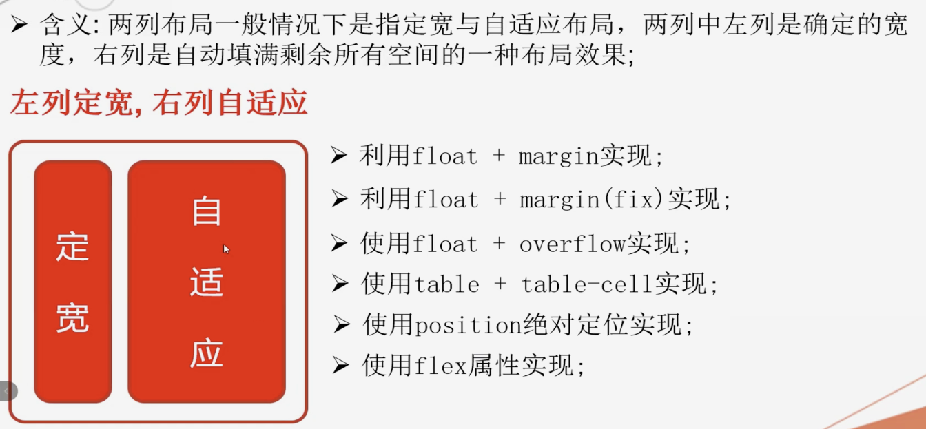
两列布局一般情况下是指定宽与自适应布局,两列中左列是确定的宽度,右列是自动填满剩余所有空间的一种布局效果;
左列定宽, 右列自适应
- float + margin属性实现;
- 优点:实现方式简单
- 缺点:自适应元素margin属性值需要与定宽元素的width属性值保持一致;
定宽元素浮动与自适应元素不浮动导致浏览器兼容性不好;
右列自适应元素中定义的了加clear:both的子级元素会出问题;
- float + margin(fix) 实现;
- float + overflow属性实现;
- 优点: 简单易用 全兼容
- 缺点: overflow属性不仅解决了两列布局问题,同时设置了内容溢出的情况;
- display属性的table相关值实现;
- 优点: 浏览器兼容比较好
- 缺点: 将所有元素的display属性设置为table相关值,受到相应制约;
- 使用绝对定位实现;
- 使用flex实现;
- 使用Grid实现;
左列自适应, 右列定宽
- float + margin属性实现;
- float + overflow属性实现;
- display属性的table相关值实现;
- 使用绝对定位实现;
- 使用flex实现;
- 使用Grid实现;
一列不定宽,一列自适应
- float + margin属性实现;
- 使用flex实现;
- 使用Grid实现;
<!DOCTYPE html>
<html lang="en">

<head>
  <meta charset="UTF-8">
  <meta name="viewport" content="width=device-width, initial-scale=1.0">
  <meta http-equiv="X-UA-Compatible" content="ie=edge">
  <title>两列布局解决方案1 - float + margin</title>
  <style>
    * {
      margin: 0;
      padding: 0;
    }

    #left {
       400px;
      height: 300px;
      background-color: #c9394a;
      /* 定宽容器  - 浮动 */
      float: left;
    }

    #right {
      height: 400px;
      background-color: #cccccc;
      /* margin加间距 */
      margin-left: 410px;
    }

    #inner {
      height: 300px;
      background-color: green;
      /* 清楚浮动属性 clear:both */
      clear: both
    }
  </style>
</head>

<body>
  <!-- 定宽 -->
  <div id="left"></div>
  <!-- 自适应容器 -->
  <div id="right">
    <div id="inner"></div>
  </div>
</body>

</html>
<!DOCTYPE html>
<html lang="en">

<head>
  <meta charset="UTF-8">
  <meta name="viewport" content="width=device-width, initial-scale=1.0">
  <meta http-equiv="X-UA-Compatible" content="ie=edge">
  <title>两列布局解决方案2 - float + margin(fix)</title>
  <style>
    * {
      margin: 0;
      padding: 0;
    }

    #left {
       400px;
      /* 定宽 */
      height: 300px;
      background-color: #c9394a;
      float: left;

    }

    #right-fix {
       100%;
      /* 浮动 */
      float: right;
      margin-left: -400px;
    }

    #right {
      height: 400px;
      background-color: #cccccc;
      margin-left: 410px;
    }

    #inner {
      background-color: green;
      height: 300px;
      clear: both;
    }
  </style>
</head>

<body>
  <div id="left"></div>
  <!-- 为自适应元素定位父级元素 -->
  <div id="right-fix">
    <div id="right">
      <div id="inner"></div>
    </div>
  </div>
</body>

</html>
<!DOCTYPE html>
<html lang="en">

<head>
  <meta charset="UTF-8">
  <meta name="viewport" content="width=device-width, initial-scale=1.0">
  <meta http-equiv="X-UA-Compatible" content="ie=edge">
  <title>两列布局解决方案3 - float + overflow</title>
  <style>
    * {
      margin: 0;
      padding: 0;
    }

    #left {
       400px;
      /* 定宽 */
      height: 300px;
      background-color: #c9394a;
      float: left;
    }

    #right {
      height: 400px;
      background-color: #cccccc;

      /* 1.溢出隐藏  2.清楚浮动  3.触发BFC(封闭的容器)的一个条件
          BFC => 两列布局
       */
      overflow: hidden;
      margin-left: 410px;
    }
  </style>
</head>

<body>
  <div id="left"></div>
  <div id="right"></div>
</body>

</html>
<!DOCTYPE html>
<html lang="en">

<head>
  <meta charset="UTF-8">
  <meta name="viewport" content="width=device-width, initial-scale=1.0">
  <meta http-equiv="X-UA-Compatible" content="ie=edge">
  <title>两列布局解决方案4- table + table-cell</title>
  <style>
    * {
      margin: 0;
      padding: 0;
    }

    #parent {
       100%;
      height: 400px;
      /* table 【把元素转为table】 */
      display: table;
    }

    #left {
      /* 定宽 */
       400px;
      height: 300px;
      background-color: #c9394a;

      /* td 【把元素转为单元格td】 */
      display: table-cell;
    }

    #right {
      /* 不设宽度 */
      height: 400px;
      background-color: #cccccc;

      /* td */
      display: table-cell;
    }
  </style>
</head>

<body>
  <div id="parent">
    <div id="left"></div>
    <div id="right"></div>
  </div>
</body>

</html>
<!DOCTYPE html>
<html lang="en">

<head>
  <meta charset="UTF-8">
  <meta name="viewport" content="width=device-width, initial-scale=1.0">
  <meta http-equiv="X-UA-Compatible" content="ie=edge">
  <title>两列布局解决方案5 - 绝对定位</title>
  <style>
    * {
      margin: 0;
      padding: 0;
    }

    #parent {
      /* 开启定位  子元素就会以这个父容器为参照物 */
      position: relative;
    }

    #left {
       400px;
      /* 定宽 */
      height: 400px;
      background-color: #c9394a;

      /* 定位在父容器的左边 */
      position: absolute;
      top: 0;
      left: 0;
    }

    #right {
      height: 500px;
      background-color: #cccccc;
      /* 定位在父容器的右边 */
      position: absolute;
      top: 0;
      left: 410px;
      right: 0;
    }
  </style>
</head>

<body>
  <div id="parent">
    <div id="left"></div>
    <div id="right"></div>
  </div>
</body>

</html>
<!DOCTYPE html>
<html lang="en">

<head>
  <meta charset="UTF-8">
  <meta name="viewport" content="width=device-width, initial-scale=1.0">
  <meta http-equiv="X-UA-Compatible" content="ie=edge">
  <title>两列布局解决方案6 - flex弹性盒模型</title>
  <style>
    * {
      margin: 0;
      padding: 0;
    }

    #parent {
       100%;
      height: 500px;
      /* flex 控制子元素的排列  默认:水平排列 */
      display: flex;
    }

    #left {
       400px;
      /* 定宽 */
      height: 400px;
      background-color: #c9394a;
    }

    #right {
      /* 占的大小 = 100% - 400 = flex:1;  剩下的大小 */
      flex: 1;
      height: 500px;
      background-color: #cccccc;
    }
  </style>
</head>

<body>
  <div id="parent">
    <div id="left"></div>
    <div id="right"></div>
  </div>
</body>

</html>
<!DOCTYPE html>
<html lang="en">

<head>
  <meta charset="UTF-8">
  <meta name="viewport" content="width=device-width, initial-scale=1.0">
  <meta http-equiv="X-UA-Compatible" content="ie=edge">
  <title>两列布局解决方案7 - Grid网格布局</title>
  <style>
    * {
      margin: 0;
      padding: 0;
    }

    #parent {
       100%;
      height: 500px;
      /* display:grid */
      display: grid;
      /* 左边 400px  右边 auto  自适应 */
      grid-template-columns: 400px auto;
    }

    #left {
      height: 400px;
      background-color: #c9394a;
    }

    #right {
      height: 500px;
      background-color: #cccccc;
    }
  </style>
</head>

<body>
  <div id="parent">
    <div id="left"></div>
    <div id="right"></div>
  </div>
</body>

</html>