移动端布局,div按比例布局,宽度为百分比,让高度和宽度一样,即让div为正方形
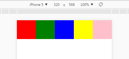
最近在写一个小程序,遇到了一个布局问题:一个div宽度比例20%,比如是屏幕宽度的20%,想让高度和宽度一样,即让这个div是正方形,怎么实现呢?因为做的是移动端,屏幕宽度不定,又想让这个div盒子宽高一样,呈现为正方形。效果如下:

现在将查询到的方案汇总一下:
方案一:JavaScript/jQuery方法:
 <style>
    *{
        margin: 0;
        padding: 0;
    }
    html,body{
         100%;
        height: 100%;
    }
    ul{
         100%;
        list-style: none;
    }
    li{
         20%;
        float: left;
    }
    li:first-child{
        background: red;
    }
    li:nth-child(2){
        background: green;
    }
    li:nth-child(3){
        background: blue;
    }
    li:nth-child(4){
        background: yellow;
    }
    li:nth-child(5){
        background: pink;
    }
</style>
</head>
<body>
<ul>
    <li></li>
    <li></li>
    <li></li>
    <li></li>
    <li></li>
</ul>
<script src="wjs/lib/jquery/jquery.min.js"></script>
<script type="text/javascript">
    $(document).ready(function(){
        $(window).on('resize', function () {
            $('li').css('height',$('li').css('width'));
        }).trigger('resize');
    })
</script>
方案二:通过CSS中的padding-top或padding-bottom将盒子撑起来
<style>
    *{
        margin: 0;
        padding: 0;
    }
    html,body{
         100%;
        height: 100%;
    }
    ul{
         100%;
        list-style: none;
    }
    li{
         20%;
        float: left;
        padding-top: 20%;
    }
    li:first-child{
        background: red;
    }
    li:nth-child(2){
        background: green;
    }
    li:nth-child(3){
        background: blue;
    }
    li:nth-child(4){
        background: yellow;
    }
    li:nth-child(5){
        background: pink;
    }
</style>
</head>
<body>
<ul>
    <li></li>
    <li></li>
    <li></li>
    <li></li>
    <li></li>
</ul>
方案三: 使用 vw/vh 单位,但是需要注意的是vw/vh单位是将当前视口的宽度/高度平均分成100份的长度,并非父级盒子,所有需要计算一下
<style>
    *{
        margin: 0;
        padding: 0;
    }
    html,body{
         100%;
        height: 100%;
    }
    ul{
         80%;
        margin: 0 auto;
        list-style: none;
    }
    li{
         16vw;
        height: 16vw;
        float: left;

    }
    li:first-child{
        background: red;
    }
    li:nth-child(2){
        background: green;
    }
    li:nth-child(3){
        background: blue;
    }
    li:nth-child(4){
        background: yellow;
    }
    li:nth-child(5){
        background: pink;
    }
</style>
</head>
<body>
<ul>
    <li></li>
    <li></li>
    <li></li>
    <li></li>
    <li></li>
</ul>
</body>
总结: vw/vh 单位的出现无疑让现在适应各种宽度的屏幕又有了一个更好的解决方案,但是可能在某些机型上不支持,所有有的时候还是各取所需吧!