在web开发的时候,有时候会遇见一些自适应布局,而且是一屏内自适应,特别是写一些后台管理系统界面,都是一屏显示,而且显示内容布局有固定的,也有不固定的,如果用css3的弹性盒子来解决的话,当然会很容易,但是呢,css3的弹性盒子在PC端的支持并不是那么的好,尤其是万恶的IE浏览器(做web开发的都懂)。同时,使用后台管理系统的计算机浏览器版本一般情况下都不会很高,这时候更要考虑浏览器的兼容问题了。不多说,直接上代码。
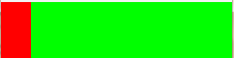
1、自适应左右两栏(左边宽度固定,右边宽度自适应)
 1  <style>
 2         *{margin: 0;padding: 0;}
 3         html,body{width: 100%;height: 100%}
 4         .left{width:100px;height:100%;float: left;background: #f00;}
 5         .right{height: 100%;background: #0f0;overflow: hidden;}
 6     </style>
 7 </head>
 8 <body>
 9     <div class="left"></div>
10     <div class="right"></div>
11 </body>
12 </html>
13
14 /*利用BFC的原理解决,但是此处只能写overflow,属性不为visible*/
2、自适应上下两栏布局(上边高度,下边内容自适应)
 1 <style>
 2         /* *{margin: 0;padding: 0;}
 3         html,body,.wrap{ 100%;height: 100%;}
 4         .wrap{position: relative;}
 5         .top{height: 100px; 100%;background: #f00;}
 6         .bottom{ 100%;position: absolute;top: 100px;bottom: 0;background: #0f0;} */
 7         *{margin: 0;padding: 0;}
 8         html,body,.wrap{width: 100%;height: 100%;}
 9         .wrap{padding-top: 100px;box-sizing: border-box;position: relative;}
10         .top{height: 100px;width: 100%;background: #f00;position: absolute;top: 0;}
11         .bottom{width: 100%;height: 100%;background: #0f0;}
12     </style>
13 </head>
14 <body>
15     <div class="wrap">
16         <div class="top"></div>
17         <div class="bottom"></div>
18     </div>
19 </body>
20 </html>
21 /*此处写了两种方法,第一种利用定位的原理,将下边的盒子高度拉伸到适应剩下的屏幕。第二种修改盒模型的解析规则,利用padding将下边盒子向下推移上边盒子的高度,刚好适应整个屏幕。*/

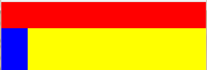
3、上下(左右)三栏布局(上边高度固定,左边宽度固定,右边内容区自适应)
 1 <style>
 2             *{margin: 0;padding: 0;}
 3             html,body,.wrap{width: 100%;height: 100%;}
 4             .wrap{position: relative;}
 5             .top{height: 100px;width: 100%;background: #f00;}
 6             .main{width: 100%;position: absolute;top: 100px;bottom: 0;}
 7             .left{height: 100%;width: 100px;float: left;background: #00f;}
 8             .right{height: 100%;overflow: hidden;background: #ff0;}
 9
10     </style>
11 </head>
12 <body>
13     <div class="wrap">
14         <div class="top"></div>
15         <div class="main">
16             <div class="left"></div>
17             <div class="right"></div>
18         </div>
19     </div>
20 </body>
21 </html>
22 /*先上下两栏布局,然后在下边的盒子里自由两栏布局*/
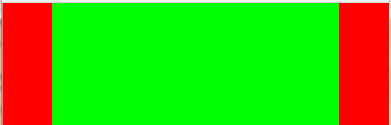
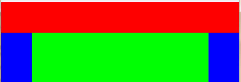
4、左中右三栏布局(左右两边固定,中间自适应)
 <style>
        *{margin: 0;padding: 0}
        html,body,.wrap{width:100%;height: 100%;}
        .left{width: 100px;height: 100%;float: left;background: #f00;}
        .right{width:100px;height: 100%;float:right;background: #f00;}
        .center{height: 100%;overflow: hidden;background: #0f0;}
    </style>
</head>
<body>
    <div class="wrap">
        <div class="left"></div>
        <div class="right"></div>
        <div class="center"></div>
    </div>
</body>
</html>
/*根据HTML页面自上而下的解析规则,在页面结构上,将右边的盒子放在中间盒子的上边,先将左右两边的盒子固定好,然后剩下的空间,中间的盒子去自适应占满。如果中间的盒子不放在最后边,那么将不能实现这种效果,页面解析到中间盒子的时候,就自动将左边盒子的右边剩余的空间占满,然后右边的盒子就在第二屏出现。*/
5、上下(左中右)四栏布局(上边盒子高度固定,左右两边盒子宽度固定)
 <style>
      *{margin: 0;padding: 0;}
      html,body,.wrap{width: 100%;height: 100%;}
      .top{width: 100%;height: 100px;background: #f00;}
      .main{width: 100%;position: absolute;top: 100px;bottom: 0px;}
      .left{width: 100px;height: 100%;float: left;background: #00f;}
      .right{width: 100px;height: 100%;float: right;background: #00f;}
      .center{height: 100%;overflow: hidden;background: #0f0;}
    </style>
</head>
<body>
    <div class="wrap">
        <div class="top"></div>
        <div class="main">
            <div class="left"></div>
            <divb class="right"></divb>
            <div class="center"></div>
        </div>
    </div>
</body>
</html>
/*先将屏幕分为上下两栏,然后将下边的盒子分为左中右三栏*/
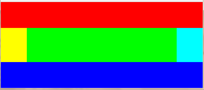
6、上左中右下五栏布局(中间区域自适应)
<style>
        *{margin: 0;padding: 0;}
        html,body,.wrap{width:100%;height: 100%;}
        .wrap{position: relative;}
        .top{height: 100px;width: 100%;background: #f00;}
        .main{width: 100%;position: absolute;top: 100px;bottom: 100px;}
        .bottom{width: 100%;height: 100px;position: absolute;bottom: 0;background: #00f;}
        .left{width:100px;height: 100%;float: left;background: #ff0;}
        .right{width: 100px; height: 100%;float: right;background: #0ff;}
        .center{height: 100%;overflow: hidden;background: #0f0;}
    </style>
</head>
<body>
    <div class="wrap">
        <div class="top"></div>
        <div class="main">
            <div class="left"></div>
            <div class="right"></div>
            <div class="center"></div>
        </div>
        <div class="bottom"></div>
    </div>
</body>
</html>
/*先写上中下三栏布局,然后写左中右三栏*/