这里的控件是显示的元素
1、Item:一切的基类
Item {
      Image {
          source: "tile.png"
      }
      Image {
          x: 80
           100
          height: 100
          source: "tile.png"
      }
      Image {
          x: 190
           100
          height: 100
          fillMode: Image.Tile
          source: "tile.png"
      }
  }
2、Rectangle:矩形
Rectangle{
    300;
    height:200;
    color:"#C0C0C0";
    focus:true;
    Keys.enabled:true;
    Keys.onEscapePressed:Qt.quit();
    Keys.onBackPressed:Qt.quit();
    Keys.onPressed:{
        switch(event.key){
        case Qt.Key_0:
        case Qt.Key_1:
        case Qt.Key_2:
        case Qt.Key_3:
        case Qt.Key_4:
        case Qt.Key_5:
        case Qt.Key_6:
        case Qt.Key_7:
        case Qt.Key_8:
        case Qt.Key_9:
            event.accepted=true;
            keyView.text = event.key-Qt.Key_0;
            break;
        }
    }
3、Text:字
Text{
        id:keyView;
        font.bold:true;
        font.pixelSize:24;
        text:"Waiting";
        anchors.centerIn:parent;
        color:"#FF0000";
    }
4、Glow:光影
Glow{
        anchors.fill:keyView;
        radius:8;
        samples:17;
        color:"white";
        source:keyView;
    }
5、PushButton:按钮
 Button{
        id:openBtn;//id
        text:"OPEN";//显示字
        anchors.left: parent.left;
        anchors.leftMargin: 8;
        anchors.bottom: parent.bottom;
        anchors.bottomMargin: 8;
        style:ButtonStyle{
            background: Rectangle{
                implicitWidth: 70;
                implicitHeight: 25;
                color:"#FFFFFF";
                border. control.pressed?2:1;
                border.color: (control.hovered || control.pressed)?"green":"#888888";
            }
        }
        onClicked:{
       //点击信号回调
       //fileDialog.open();
        }
    }
6、TabView,用TabViewStyle定制外观,注意手册中TabView没有style属性【实际上有,只是没有加上去】
main.qml:

import QtQuick 2.6
import QtQuick.Window 2.2
import QtQuick.Controls 2.0
import QtQuick.Controls 1.4
Window {
    visible: true
     640
    height: 480
    title: qsTr("Hello World")

    TabView{
        anchors.fill: parent;
        style: TabViewStyle {
            frameOverlap: 1
            tabsAlignment: Qt.AlignHCenter
            tab: Rectangle {
                color: styleData.selected ? "steelblue" :"lightsteelblue"
                border.color:  "steelblue"
                implicitWidth: Math.max(text.width + 4, 80)
                implicitHeight: 20
                radius: 2
                Text {
                    id: text
                    anchors.centerIn: parent
                    text: styleData.title
                    color: styleData.selected ? "white" : "black"
                }
            }
            frame: Rectangle { color: "steelblue" }
        }
        Tab {
            source:"tab.qml";
        }
        Tab {
            title: "Blue"
            Rectangle { color: "blue" }
        }
        Tab {
            title: "Green"
            Rectangle { color: "green" }
        }
    }
}
tab.qml:

import QtQuick 2.0
import QtQuick.Controls 1.4
Rectangle{
    Button{
        id:btn1;
        text: "123";
    }
    Button{
        anchors.left: btn1.right;
        text: "456";
    }
}
7、行编辑:TextInput,TextField【比TextInput多了背景颜色设置】
8、块编辑:TextEdit,TextArea【比TextEdit多了背景颜色设置】
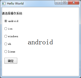
9、ExclusiveGroup,互斥分组,可以在里面放入RadioButton、CheckBox、Action等元素
import QtQuick 2.6
import QtQuick.Window 2.2
import QtQuick.Controls 1.4
Window {
    visible: true
     640
    height: 480
    title: qsTr("Hello World")

    Text {
        id: toptext;
        text: qsTr("请选择操作系统:");
        anchors.top: parent.top;
        anchors.topMargin: 20;
    }
    Text{
        id:maintext;
        anchors.centerIn: parent;
        font.pixelSize: 30;
        text:"no section";
        z:2;
    }

    ExclusiveGroup{
        id:eg;
    }
    RadioButton{
        id:btn1;
        text: "android";
        anchors.top:toptext.bottom;
        anchors.left: parent.left;
        anchors.leftMargin: 10;
        exclusiveGroup: eg;
        anchors.topMargin: 20;
    }
    RadioButton{
        id:btn2;
        text: "ios";
        anchors.top:btn1.bottom;
        anchors.left: parent.left;
        anchors.leftMargin: 10;
        exclusiveGroup: eg;
        anchors.topMargin: 20;
    }
    RadioButton{
        id:btn3;
        text: "windows";
        anchors.top:btn2.bottom;
        anchors.left: parent.left;
        anchors.leftMargin: 10;
        exclusiveGroup: eg;
        anchors.topMargin: 20;
    }
    RadioButton{
        id:btn4;
        text: "wh";
        anchors.top:btn3.bottom;
        anchors.left: parent.left;
        anchors.leftMargin: 10;
        exclusiveGroup: eg;
        anchors.topMargin: 20;
    }
    RadioButton{
        id:btn5;
        text: "linux";
        anchors.top:btn4.bottom;
        anchors.left: parent.left;
        anchors.leftMargin: 10;
        exclusiveGroup: eg;
        anchors.topMargin: 20;
    }
    Button{
        id:btn;
        text:"确定";
        anchors.top:btn5.bottom;
        anchors.left: parent.left;
        anchors.leftMargin: 10;
        anchors.topMargin: 20;
        onClicked: {
            maintext.text = eg.current.text;
        }
    }
}
10、RadioButton,单旋按钮,使用RadioButtonStyle来设置风格
11、CheckBox,复选按钮,使用CheckBoxStyle来设置风格
partiallyCheckedEnabled:用来表示可以部分选中
    CheckBox{
        id:btn5;
        text: "linux";
        partiallyCheckedEnabled: true;
        anchors.top:btn4.bottom;
        anchors.left: parent.left;
        anchors.leftMargin: 10;
        anchors.topMargin: 20;
    }

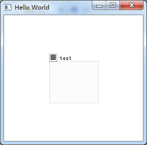
12、GroupBox
import QtQuick 2.6
import QtQuick.Window 2.2
import QtQuick.Controls 1.4
Window {
    visible: true
     640
    height: 480
    title: qsTr("Hello World")

    GroupBox{
        id:gb;
        title: "test";
        anchors.centerIn: parent;
         100;
        height: 100;
        checkable: true;//是否可选
        flat: false;//是否有边框
    }
}
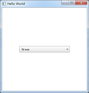
13、ComboBox
import QtQuick 2.6
import QtQuick.Window 2.2
import QtQuick.Controls 1.4
Window {
    visible: true
     640
    height: 480
    title: qsTr("Hello World")

    ComboBox {
        anchors.centerIn: parent;
        currentIndex: 0;
        //model: [ "Banana", "Apple", "Coconut" ]方式一
        model: ListModel {//方式二
            id: cbItems;
            ListElement { text: "Banana"; color: "Yellow" }
            ListElement { text: "Apple"; color: "Green" }
            ListElement { text: "Coconut"; color: "Brown" }
        }
        textRole: "color";//使用text或者color来显示
         200;
        onCurrentIndexChanged: {
            console.debug(cbItems.get(currentIndex).text + ", " + cbItems.get(currentIndex).color);//获取当前内容
        }
    }
}
14、ProgressBar
import QtQuick 2.6
import QtQuick.Window 2.2
import QtQuick.Controls 1.4
Window {
    visible: true
     640
    height: 480
    title: qsTr("Hello World")
    Column {
        anchors.centerIn: parent;
        ProgressBar {
            value: 0.5//当前值
        }
        ProgressBar {
            indeterminate: true//忙
        }
    }
}
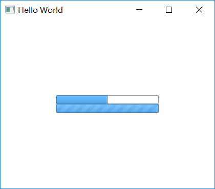
用ProgressBarStyle设置风格
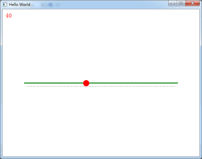
15、Slider,使用SliderStyle来设置风格
Slider由四个部分组成,都可以定义
import QtQuick 2.6
import QtQuick.Window 2.2
import QtQuick.Controls 1.4
import QtQuick.Controls.Styles 1.4
Window {
    visible: true
     640
    height: 480
    title: qsTr("Hello World")

    Text{
        id:text;
        anchors.top:parent.top;
        anchors.topMargin: 10;
        anchors.left: parent.left;
        anchors.leftMargin: 10;
        font.pixelSize: 20;
        color:"red";
        text:"noooooo";
    }

    Slider {
        anchors.centerIn: parent;
        500;
        value: 0;
        maximumValue: 100;
        stepSize: 1;
        tickmarksEnabled: true;
        onValueChanged: {//这个信号没有找到
            text.text=value;
        }
        style:SliderStyle{
            groove: Rectangle{
                 500;
                height: 3;
                radius: 4;
                color: "green";
            }
            handle: Rectangle{
                 20;
                height: 20;
                radius: 10;
                color: "red";
            }
        }
    }
}
16、Flickable
17、Canvas
import QtQuick 2.6
import QtQuick.Window 2.2
import QtQuick.Controls 1.4
import QtQuick.Controls.Styles 1.4
Window {
    visible: true
     640
    height: 480
    title: qsTr("Hello World")
    Canvas {
          id: mycanvas
           100
          height: 200
          onPaint: {
              var ctx = getContext("2d");
              ctx.fillStyle = Qt.rgba(1, 0, 0, 1);
              ctx.fillRect(0, 0, width, height);
          }
      }
}

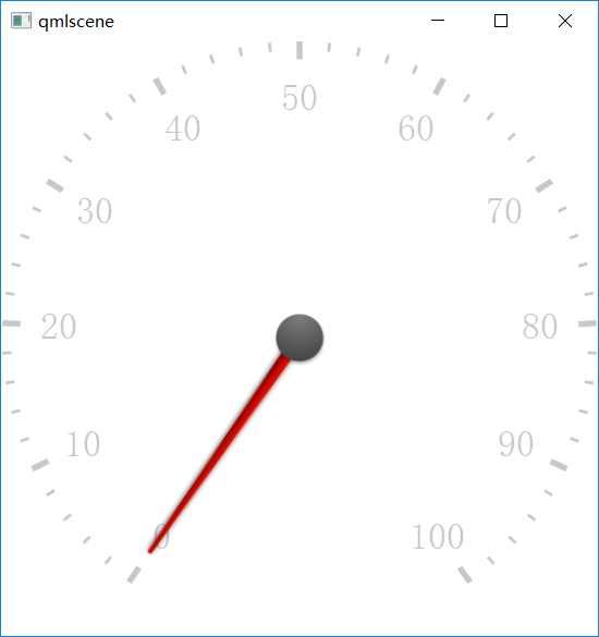
18、仪表盘CircularGauge
import QtQuick 2.5
import QtQuick.Controls 1.4
import QtQuick.Controls.Styles 1.4
import QtQuick.Extras 1.4
  CircularGauge {
      value: accelerating ? maximumValue : 0
      anchors.centerIn: parent

      property bool accelerating: false

      Keys.onSpacePressed: accelerating = true
      Keys.onReleased: {
          if (event.key === Qt.Key_Space) {
              accelerating = false;
              event.accepted = true;
          }
      }

      Component.onCompleted: forceActiveFocus()

      Behavior on value {
          NumberAnimation {
              duration: 1000
          }
      }
  }
19、GridLayout
GridLayout {
    id: grid
    rows:2
    columns: 2
     250
    height: 60
    columnSpacing: 10
    Text {
        id: textUsr
        text: qsTr("用户名")
        font.pointSize: 12
        color: "black"
    }
    TextField {
        id: filedUsr
        Layout.preferredHeight: 30
    }
    Text {
        id: textPaswd
        text: qsTr("密码")
        font.pointSize: 12
        color: "black"
    }
    TextField {
        id: filedPawd
        Layout.preferredHeight: 30
    }
}
20、Image
Image {
    id: rdJpg
    anchors.centerIn: parent
    smooth: true
    visible: false
    source: "qrc:/img/rd.jpg"
}
如果是将图片全部存到了资源里,然后Image使用资源里的这些图片,最后打包的程序不需要再打包这些图片,因为已经跟随资源编译到程序里了,所以耗内存