因为最近可能需要做移动端rem布局,因为rem布局需要将px转化成rem,如果次都需要拿计算器算就太low了,所以就想到用less和gulp。
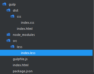
因为也是初学gulp,站点的文件结构还没想到太好,也只是demo下
用到gulp-less
gulp-watch
gulp-rev-append
首先是gulp代码
var gulp = require('gulp'),
    less = require('gulp-less'),
    rev = require('gulp-rev-append'),
    watch = require('gulp-watch');
    //liveReload = require('gulp-livereload');
//定义一个testless任务
gulp.task('testless',function(){
    gulp.src('src/less/index.less')
    .pipe(less())
    .pipe(gulp.dest('dist/css'));
//    .pipe(gulp.liveReload());
});

gulp.task('testRev',function(){
    gulp.src('index.html')
    .pipe(rev())
    .pipe(gulp.dest('dist/'));
})

gulp.task('testWatch',function(){
    gulp.watch('src/less/*.less',['testless']);//当less文件发生改变的时候,调用testless任务
})
html:动态设置像素比
<!DOCTYPE html>
<html lang="en">
<head>
    <meta charset="UTF-8">
    <title>html5</title>
    <link rel="stylesheet" href="dist/css/index.css?rev=@@hash" type="text/css">
    <script>
        var iScale = 1;
        iScale = iScale / window.devicePixelRatio;
        console.log(iScale);
        document.write('<meta name="viewport" content="width=device-width,user-scalable=no,initial-scale=' + iScale + ',minimum-scale=' + iScale + ',maximum-scale=' + iScale + '">');
        var iWidth = document.documentElement.clientWidth;
            iWidth=iWidth>1620?1620:iWidth;
            document.getElementsByTagName('html')[0].style.fontSize = iWidth/16 + 'px';
    </script>
</head>
<body>
    <div class="doc">
        <header></header>
        <section class="box">
            <div></div>
            <div></div>
            <div></div>
            <div></div>
            111<br />
            111<br />
            111<br />
css index.less unit()给计算结果添加rem单位 测试好用
@base:40;
@red : red;
@green:green;

html{ overflow:hidden;}
body{ overflow: auto;}
.doc{}
header{position:fixed;top:0;left:0; width:100%; height:unit(70/@base,rem); background: @red;}
.box{
    width:100%;
    height:unit(2000/@base,rem);
    padding-top:unit(70/@base,rem);
    div{ width:50%; height:unit(190/@base,rem); background: @green; border: 1px solid @red; float: left; box-sizing: border-box; }
}
footer{position:fixed;bottom:0;left:0; width:100%; height:unit(70/@base,rem); background: @green;}
至于复杂高森的gulp用法还没研究,暂时就这么多了。