animation 动画效果组成
-
通过类似Flash动画中的关键帧来声明一个动画
-
在animation属性中调用关键帧声明的动画,从而实现一个更为复杂的动画效果
animation的子属性
-
animation-name : 主要用来指定一个关键帧动画的名字,这个动画名必须对应一个@keyframes规则。CSS加载时会应用animation-name指定的动画,从而执行动画。
-
animation-duration : 主要用来设置动画播放所需时间,一般以秒为单位
-
animation-timing-functoin : 主要用来设置动画的播放方式,与transition-timing-function类似
-
animation-delay : 主要用来指定动画开始时间,一般以秒为单位
-
animation-iteration-count : 主要用来指定动画播放的循环次数
-
animation-direction : 主要用赤指定动画的播放方向
-
animation-play-state : 主要用赤控制动画的播放状态
-
animation-fill-mode : 主要用来设置动画的时间外属性
animation 语法
 1 animation :
 2 [<animation-name> ||
 3 <animation-duration > ||
 4 <animation-timing-functoin > ||
 5 <animation-delay > ||
 6 <animation-iteration-count > ||
 7 <animation-direction > ||
 8 <animation-play-state > ||
 9 <animation-fill-mode>]
10 *
关键帧
@keyframes语法
 1 @keyframes IDENT{
 2     from {
 3         /* CSS 样式写在这里 */
 4     }
 5
 6     percentage {
 7         /* CSS 样式写在这里 */
 8     }
 9
10     to {
11         /* CSS 样式写在这里 */
12     }
13 }
其中 from 和 to 也可以换成 0% 和 100%,需要注意的是 0%的 ‘%’ 不能省略
其中IDENT就是一个动画名称,可以取一个任意定义的动画名称,当然语义化一点会更好。percentage是一个百分比值,用来定义某个时间段的动画效果,可以有多个。
animation 子属性详解
animation-name
-
IDENT : 是由@keyframes创建的动画名称,换句话说此处的IDENT需要和@keyframes中的IDENT一致,如果不一致则没有任何动画效果
-
none :默认值,可以用于覆盖任何动画
animation-duration
用于指定动画所持续的时间,也就是完成0%到100%一次动画所需要的时间,单位为s或ms
animation-timing-function
-
linear: 线性过渡。等同于贝塞尔曲线(0.0, 0.0, 1.0, 1.0)
-
ease: 平滑过渡。等同于贝塞尔曲线(0.25, 0.1, 0.25, 1.0)
-
ease-in: 由慢到快。等同于贝塞尔曲线(0.42, 0, 1.0, 1.0)
-
ease-out: 由快到慢。等同于贝塞尔曲线(0, 0, 0.58, 1.0)
-
ease-in-out: 由慢到快再到慢。等同于贝塞尔曲线(0.42, 0, 0.58, 1.0)
-
step-start: 等同于 steps(1, start)
-
step-end: 等同于 steps(1, end)
-
steps([, [ start | end ] ]?): 接受两个参数的步进函数。第一个参数必须为正整数,指定函数的步数。第二个参数取值可以是start或end,指定每一步的值发生变化的时间点。第二个参数是可选的,默认值为end。
-
cubic-bezier(, , , ): 特定的贝塞尔曲线类型,4个数值需在[0, 1]区间内
animation-delay
用来定义动画开始播放的时间、是延迟还是提前等
animation-iteration-count
用来定义动画的播放次数
-
infinite : 无限循环
-
number : 具体次数
animation-direction
用来设置动画的播放方向
-
normal: 正常方向
-
reverse: 反方向运行
-
alternate: 动画先正常运行再反方向运行,并持续交替运行
-
alternate-reverse: 动画先反运行再正方向运行,并持续交替运行
animation-play-state
用来控制动画的播放状态
- running: 运动
- paused: 暂停
animation-fill-mode
定义动画开始之前和结束之后发生的操作
-
none: 默认值。不设置对象动画之外的状态
-
forwards: 设置对象状态为动画结束时的状态
-
backwards: 设置对象状态为动画开始时的状态
-
both: 设置对象状态为动画结束或开始的状态
CSS3动画示例
简单示例 1
 1 <!DOCTYPE html>
 2 <html lang="en">
 3 <head>
 4     <meta charset="UTF-8">
 5     <title>Title</title>
 6
 7     <link rel="stylesheet" type="text/css" href="../assets/css/reset.css" />
 8
 9     <style type="text/css">
10
11         body{
12             padding: 30px;
13         }
14
15         @keyframes myfirst{
16             from{
17                 background-color: red;
18             }
19             to{
20                 background-color: yellow;
21             }
22         }
23         #one{
24             width: 200px;
25             height: 200px;
26             background-color: red;
27             animation: myfirst 5s;
28             animation-name: myfirst;
29             animation-duration: 5s;
30             animation-iteration-count: infinite;
31         }
32     </style>
33
34 </head>
35 <body>
36
37 <div id="one"></div>
38
39 </body>
40 </html>
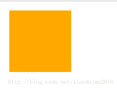
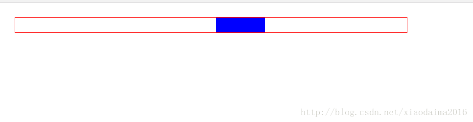
其效果是div的颜色在红色与黄色之间不断变化
简单示例 2
 1 <!DOCTYPE html>
 2 <html lang="en">
 3 <head>
 4     <meta charset="UTF-8">
 5     <title>Title</title>
 6
 7     <link rel="stylesheet" type="text/css" href="../assets/css/reset.css" />
 8
 9     <style type="text/css">
10
11         body{
12             padding: 30px;
13         }
14
15         #two-container{
16             position: absolute;
17             width: 800px;
18             height: 30px;
19             border: 1px solid red;
20             overflow: hidden;
21         }
22
23         @keyframes mytwo {
24             from{
25                 left: -100px;
26             }
27
28             to{
29                 left: 800px;
30             }
31         }
32
33         #two{
34             height: 100%;
35             width: 100px;
36             background: blue;
37             position: relative;
38             left: -100px;
39             animation-name: mytwo;
40             animation-duration: 5s;
41             animation-iteration-count: infinite;
42             animation-timing-function: linear;
43         }
44     </style>
45
46 </head>
47 <body>
48
49
50 <div id="two-container">
51     <div id="two"></div>
52 </div>
53
54 </body>
55 </html>