1.边框渐变
如:
.arrow div {transition: border-color 0.5s ease-in-out; }
.arrow div:hover {border-color: #009688; }
flex的兼容性在pc端还算阔以,但是在移动端,那就呵呵了。今天我们只是学习学习,忽略一些不重要的东西。
首先flex的使用需要有一个父容器,父容器中有几个items.
父容器:container
属性:
display:flex;/*flex块级,inline-flex:行内快*/
justify-content:space-around;/*center:水平居中,flex-start:靠左;flex-end:靠右;space-between:两边的向两边靠,中间等分;space-around:完美的平均分配*/
align-items:stretch;/*center:垂直居中、flex-start:至顶、flex-end:至底、space-between、space-around*/
flex-direction: row;/*column从上向下的排列,column-reverse、row:从左到右,row-reverse:从右向左*/
flex-wrap:wrap;/*wrap多行显示(父容器不够显示的时候,从上到下)、nowrap(当容器不够宽的时候,子元素会平分父容器的宽或者高)、wrap-reverse:从下向上*/
/*flex-flow是flex-direction、flex-wrap的缩写*/
这里给出一个简单的demo:
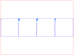
<!doctype html>
<html lang="en">
 <head>
  <meta charset="UTF-8">
  <meta name="Generator" content="EditPlus®">
  <style>
    .container{
       width:600px;
       height:400px;
       border:1px solid #000;
       display:flex;/*flex块级,inline-flex:行内快*/
       justify-content:space-around;/*center:水平居中,flex-start:靠左;flex-end:靠右;space-between:两边的向两边靠,中间等分;space-around:完美的平均分配*/
       align-items:stretch;/*center:垂直居中、flex-start,至顶,flex-end:至底*,space-between、space-around*/
       flex-direction: row;/*column从上向下的排列,column-reverse,,,,row:从左到右,row-reverse:从右向左*/
       flex-wrap:wrap;/*wrap多行显示(父容器不够显示的时候,从上到下)、nowrap(当容器不够宽的时候,子元素会平分父容器的宽或者高)、wrap-reverse:从下向上*/
       /*flex-flow是flex-direction、flex-wrap的缩写*/
    }
    .box{
      width:200px;
       height:100px;
        border:1px solid #000;
     }
   </style>
 </head>
 <body>
     <div class="container">
       <div class="box">这是中间的box1</div>
         <div class="box">这是中间的box2</div>
   </div>
 </body>
</html>
子元素的属性:
order:设置元素的顺序
例如:我么想要将本来第二个元素排在第一,将排在第一的元素设置为第二。
我们可以设置他们的order值。
.box1{order:1;}
.box2{order:0;}

   <div class="container">
    <div class="box box1">这是中间的box1</div>
    <div class="box box2">这是中间的box2</div>
 </div>
flex:指定可伸缩长度的部件,是flex-shrink,flex-grow,flex-basis这三个属性的缩写。
他可以指定一个子元素的占据父元素的宽度或者高度的比例。(前提是在子元素还没有占满父级元素的情况下)
demo:
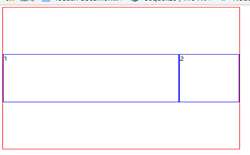
<style>
   .container{
       width:800px;
       height:600px;
       border:1px solid red;
       display:flex;
       align-items:center;
       justify-content:center;
       flex-direction:row;
       flex-wrap:wrap;
   }
   .box{
       width:200px;
       height:200px;
       border:1px solid blue;
   }
   .box1{
     flex:2
   }
 </style>
</head>
<body>
   <div class="container">
       <div class= " box box1">1</div>
       <div class="box box2">2</div>
       <div class="box box3">3</div>
       <div class="box box4">4</div>
   </div>
</body>
最终效果如下:因为子元素占满父级元素。
进一步验证:
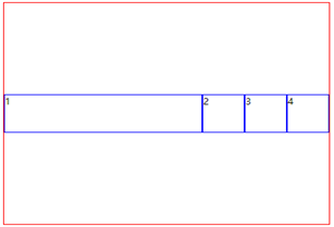
<style>
    .container{
        width:800px;
        height:600px;
        border:1px solid red;
        display:flex;
        align-items:center;
        justify-content:center;
        flex-direction:row;
        flex-wrap:wrap;
    }
    .box{
        width:200px;
        height:200px;
        border:1px solid blue;
    }
    .box1{
      flex:2
    }
  </style>
 </head>
 <body>
    <div class="container">
        <div class= " box box1">1</div>
        <div class="box box2">2</div>
    </div>
 </body>
很明显的阔以看到,box1占据了600px宽度
align-self:用来单独设置子元素的对齐方式(可将默认的对齐方式进行覆盖)
例如:我们已经在父元素中设置了align-items:center.(将子元素设置为垂直居中显示)
这个时候我们想单独更改某个子元素的对齐方式,就可以使用align-self
<style>
    .container{
        width:800px;
        height:600px;
        border:1px solid red;
        display:flex;
        align-items:center;
        justify-content:center;
        flex-direction:row;
        flex-wrap:wrap;
    }
    .box{
        width:100px;
        height:100px;
        border:1px solid blue;
    }
    .box1{
      flex:2
    }
/* .box4{
        align-self:flex-end;
    } */
  </style>
 </head>
 <body>
    <div class="container">
        <div class= " box box1">1</div>
        <div class="box box2">2</div>
        <div class="box box3">3</div>
        <div class="box box4">4</div>
    </div>
 </body>
假如我们设置 box4:align-self:flex-end;呢
.box4{
 align-self:flex-end;
 }
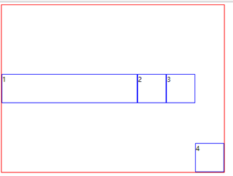
好了,已经改变了box4的对齐方式。
如果想兼容更多的浏览器,可以采用优雅降级的方式,例如sass-flex-mixin