个人博客首页博文卡片的实现
最近,在用React全家桶+go+ant做一个个人博客项目,在首页,我想要实现一个博文卡片,既不失美观,又能完整体现一篇文章的简述,所以,就有了下面GIF里的这个博文卡片:
具体代码如下:
//图片引入
const images = {
    test: require('../../images/dog.png'),
    list1: require('../../images/list-1.jpg'),
    list2: require('../../images/list-2.jpg'),
    list3: require('../../images/list-3.jpg')
}
//jsx代码
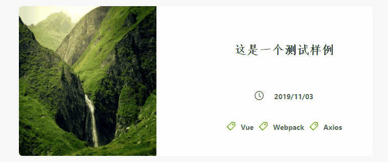
<li className="card">
<div className="right-scroll-wrapper">
<div className="top-text">
<img src={images.list2} alt="list1"/>
<p>每一个你不满意的现在,都有一个你没有努力的曾经。</p>
</div>
</div>
<div className="right-content-description">
<div className="top-title">
<p><Link to="/about">这是一个测试样例</Link></p>
</div>
<div className="bottom-complex">
<div className="time">
<Icon type="clock-circle" />
<p>2019/11/03</p>
</div>
<div className="tags">
<ul>
<li>
<Icon type="tag" theme="twoTone" twoToneColor="#52c41a"/>
<p>Vue</p>
</li>
<li>
<Icon type="tag" theme="twoTone" twoToneColor="#52c41a"/>
<p>Webpack</p>
</li>
<li>
<Icon type="tag" theme="twoTone" twoToneColor="#52c41a"/>
<p>Axios</p>
</li>
</ul>
</div>
</div>
</div>
</li>
//scss
.card {
        list-style: none;
         36vw;
        min- 320px;
        height: 30vh;
        min-height: 293px;
        float: left;
        margin-left: 1vw;
        margin-right: 0.8vw;
        border-radius: 7px;
        background-color: #fff;
        box-shadow: 0;
        transition: box-shadow 0.5s;
        margin-bottom: 30px;
        .right-scroll-wrapper {
            position: relative;
            float: left;
             14vw;
            height: 30vh;
            min-height: 293px;
            background-color: rgba(13, 161, 219, 0.3);
            border-radius: 7px 0 0 7px;
            transition: width 1s ease, height 1s ease;
            -webkit-transition: width 1s ease, height 1s ease; /* Safari */
            .top-text {
                position: relative;
                 100%;
                height: 100%;
                img {
                     100%;
                    height: 100%;
                    border-radius: 7px 0 0 7px;
                }
                p {
                    display: none;

                }
            }
        }
        .right-content-description {
            float: right;
             18vw;
            height: 30vh;
            .top-title {
                height: 30px;
                line-height: 30px;
                margin-top: 70px;
                p {
                    display: block;
                    color: black;
                    font-size: 24px;
                    font-family: 仿宋;
                    font-weight: bold;
                    transition: color 0.3s;
                    cursor: pointer;
                    a {
                        color: black;
                    }
                }
                p:hover {
                    transition: color 0.3s;
                    a {
                        color: #40A9FF;
                    }
                }
            }
            .bottom-complex {
                margin-top: 60px;
                 100%;
                height: 133px;
                .time {
                     50%;
                    height: 30px;
                    margin-left: auto;
                    margin-right: auto;
                    line-height: 30px;
                    i {

                        font-size: 18px;
                        line-height: 34px;
                    }
                    p {
                        display: inline;
                        margin-left: 20px;
                        font-weight: bold;
                    }
                }
                .tags {
                    margin-top: 30px;
                     100%;
                    height: 73px;
                    ul {
                         100%;
                        height: 73px;
                        padding-left: 50px;
                        padding-right: 50px;
                        li {
                            float: left;
                            text-align: center;
                             auto;
                            height:30px;
                            margin-left: 10px;
                            line-height: 30px;
                            list-style: none;
                            i {
                                font-size: 18px;
                                line-height: 34px;
                            }
                            p {
                                display: inline;
                                margin-left: 10px;
                                font-weight: bold;
                             }
                        }
                    }
                }
            }
        }
    }
    .card:hover {
         36vw;
        min- 320px;
        height: 30vh;
        min-height: 293px;
        box-shadow: 0 5px 5px #ddd;
        transition: box-shadow 0.5s;
        border-radius: 7px;
        .right-scroll-wrapper {
            float: left;
             18vw;
            height: 30vh;
            min-height: 293px;
            border-radius: 7px 0 0 7px;
            background-color: rgba(13, 161, 219, 0.3);
            transition: width 1s ease, height 1s ease;
            -webkit-transition: width 1s ease, height 1s ease; /* Safari */
            .top-text {
                position: relative;
                 100%;
                height: 100%;
                img {
                     100%;
                    height: 100%;
                    border-radius: 7px 0 0 7px;
                }
                p {
                    background-color: rgba(0, 0, 0, 0.4);
                    position: absolute;
                    display: block;
                     100%;
                    height: 100%;
                    top: 0;
                    text-align: left;
                    padding: 30% 20px 0;
                    color: #eee;
                    font-size: 14px;
                    border-radius: 7px 0 0 7px;
                }
            }
        }
    }