CSS3 基础入门(一)
说明
CSS3 中相对于CSS2来说,新增加了很多的内容,其中较为常用的包括下面几点:
- 选择器
- 自定义字体(嵌入字体)和字体图标
- 边框属性
- 背景属性
- 文本阴影和盒子阴影
- 颜色属性
- 渐变(线性渐变、径向渐变、重复渐变)
- 过渡
- 2d变换
- 3d变换
- 动画
- 新的布局方案(flex 布局、多列布局、移动端布局、grid布局)
在本篇文章当中,列出的都是一些css3当中新增加的较为常用并且兼容性较好的属性。
选择器
在这里主要说的是两部分选择器:
- 属性选择器
- 伪类选择器
属性选择器
常用的属性选择器如下:
- E[attr] 选择具有attr属性的元素
- E[attr=value] 选择具有attr属性并且属性值等于value 的元素
- E[attr^=value] 选择具有attr属性并且以value 属性开头的元素
- E[attr$=value] 选择具有attr属性并且以value属性结束的元素
- E[attr*=value] 选择具有attr属性并且属性值中包含value的元素
- E[attr~=value] 具有attr属性并且属性列表中包含有value这个属性值的元素
- E[attr|=value] 选择具有attr属性并且属性值以value 或者value-开头的属性
下面是示例的demo:
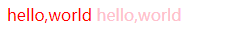
- E[attr] 和 E[attr=value]
html代码:
<div class="box1">
    <span class="s1">hello,world</span>
    <span class="s2">hello,world</span>
</div>
css代码:
<style>
    .box1 span[class] {
        color: pink;
    }
    .box1 span[class='s1'] {
        color: red;
    }
</style>
实际的效果:
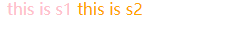
- E[attr^=value] 和 E[attr$=value]
html代码
<div class="box2">
    <span title="hello">this is s1</span>
    <span title="world">this is s2</span>
</div>

css代码:
<style>
    .box2 span[title^='he'] {
        color: pink
    }
    .box2 span[title$='ld'] {
        color: orange;
    }
</style>
实际的效果:
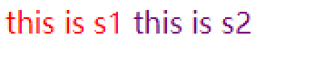
- E[attr*=value] 和 E[attr~=value]
html代码
<div class="box3">
    <span class="hellos1">this is s1</span>
    <span class="hello s2">this is s2</span>
</div>

css代码
 <style>
     .box3 span[class*='hello'] {
         color: red;
     }
     .box3 span[class~='hello'] {
         color: purple;
     }
</style>
实际的效果:
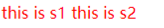
- E[attr|=value]
html代码
 <div class="box4">
     <span class="hello-s1">this is s1</span>
     <span class="hello">this is s2</span>
</div>

css代码
 <style>
     .box4 span[class|='hello'] {
         color: red;
     }
</style>
实际的效果:
伪类选择器
常用的伪类选择器可以分为下面的几类:
- 结构伪类选择器
- 目标伪类选择器
- UI元素状态伪类选择器
- 否定伪类选择器
- 动态伪类选择器(css2)
下面将会针对这几类的伪类选择器进行梳理。
结构伪类选择器
常用的结构伪类选择器如下:
- E:first-child 选择匹配到的第一个子元素。
- E:last-child 选择匹配到的最后一个子元素。
- E:nth-child(n) 选择匹配到的第n个子元素。
- E:only-child 选择唯一的一个子元素。
- E:nth-of-type(n) 选择匹配同类型中的第n个同级兄弟元素。
- E:only-of-type 匹配属于同类型中唯一的兄弟元素。
- E:first-of-type 匹配同级兄弟元素中第一个兄弟元素。
- E:nth-last-child(n) 从子元素列表的最后开始查找第n个子元素。
- E:nth-last-of-type(n) 从同级兄弟元素列表的最后开始查找第n个元素。
- :root 匹配根元素
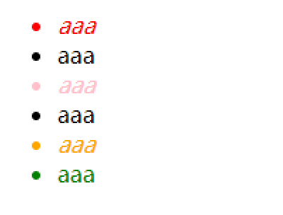
实例代码:
html代码:
<ul>
    <li>aaa</li>
    <li>aaa</li>
    <li>aaa</li>
    <li>aaa</li>
    <li>aaa</li>
    <li>aaa</li>
</ul>

css代码:
<style>
    ul > li:first-child {
        color: red;
    }

    ul > li:last-child {
        color: green;
    }
    /* odd 奇数行 */
    ul > li:nth-child(odd) {
        font-style: italic;
    }
    /* even 偶数行 */
    ul> li:nth-child(even) {
        font-style: normal;
    }

    ul > li:nth-child(3) {
        color: pink;
    }

    ul > li:nth-child(5) {
        color: orange;
    }
</style>
实际效果:
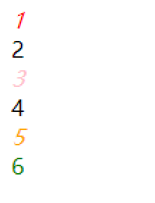
html代码:
<div>1</div>
<div>2</div>
<div>3</div>
<div>4</div>
<div>5</div>
<div>6</div>

css代码:
<style>
    div:first-of-type {
        color: red;
    }

    div:last-of-type {
        color: green;
    }

    div:nth-of-type(odd) {
        font-style: italic;
    }

    div:nth-of-type(even) {
        font-style: normal;
    }

    div:nth-of-type(3) {
        color: pink;
    }

    div:nth-of-type(5) {
        color: orange;
    }
</style>
实例效果:
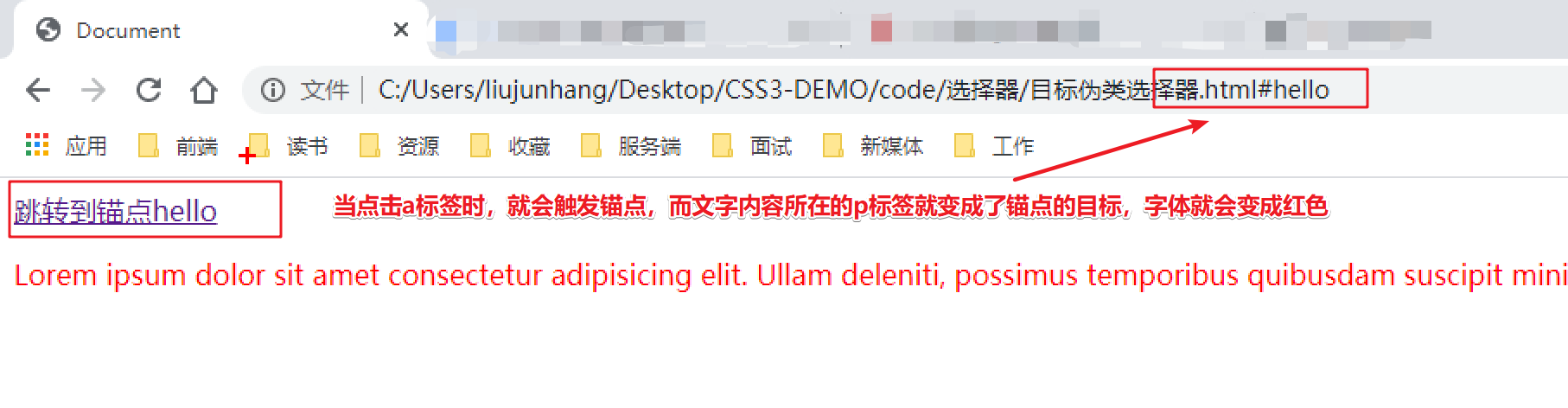
目标伪类选择器
常用的目标伪类选择器如下:
- E:target 选择器可用于选取当前活动的目标元素(URL 带有后面跟有锚名称 #,指向文档内某个具体的元素。这个被链接的元素就是目标元素(target element))。
示例代码:
html代码:
<a href="#hello">跳转到锚点hello</a>
<p class="hello" id="hello">
    Lorem ipsum dolor sit amet consectetur adipisicing elit. Ullam deleniti, possimus temporibus quibusdam suscipit minima fuga provident. Aliquid distinctio iste tenetur odio! Molestias beatae possimus voluptatem. Error ab ratione totam!
</p>

css代码:
<style>
    .hello:target {
        color: red;
    }
</style>
实际效果:
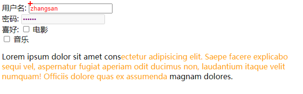
UI元素状态伪类选择器
常用的UI元素状态伪类选择器如下:
- E:enabled 匹配用户界面上处于可用状态的元素
- E:disabled 匹配用户界面中处于禁用状态的元素
- E:checked 匹配用户界面中处于选中状态的元素
- E:selection 匹配用户界面中处于被用户选中或者处于高亮状态元素
下面是示例代码:
html代码:
<div>
    用户名: <input type="text" name="user_name" value="zhangsan">
</div>
<div>
    密码: <input type="password" name="pass_word" value="abc123" disabled="disabled">
</div>
<div>
    喜好: <input type="checkbox" name="like" > <span>电影</span> <br>
    <input type="checkbox" name="like" > <span>音乐</span> <br>
</div>

<p>
    Lorem ipsum dolor sit amet consectetur adipisicing elit. Saepe facere explicabo sequi vel, aspernatur fugiat aperiam odit ducimus non, laudantium itaque velit numquam! Officiis dolore quas ex assumenda magnam dolores.
</p>

CSS代码:
<style>
    input:enabled {
        color: red;
    }
    input:disabled {
        color: purple;
    }
    input:checked + span {
        color: pink;
    }
    p::selection {
        color: orange;
        /* user-select: none; 禁止用户选中 */
    }
</style>
实际效果:
否定伪类选择器
常用的否定伪类选择器如下:
- E:not() 匹配除了括号内条件的元素
html代码:
<p class="p1">this is p1</p>
<p class="p2">this is p2</p>

css代码:
<style>
    p:not(.p1) {
        color: red;
    }
</style>
动态伪类选择器
动态伪类选择器是css2中就已经存在的选择器,包括下面的几个:
- E:link
- E:visited
- E:hover
- E:active
自定义字体(嵌入字体)和字体图标
自定义字体(嵌入字体)
设置自定义字体(嵌入字体)可以通过下面的语法来实现:
@font-face {
	font-family: "字体名称";
	src: url(字体位置)
}
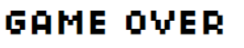
例如,
html代码:
<h1>GAME OVER</h1>

css代码:
<style>
    @font-face {
        font-family: game;
        src: url(./Retrograde/Retrograde-Regular.otf);
    }

    h1 {
        font-family: game;
    }
</style>
实际的效果:
字体图标
在网页使用字体图标可以减少http的请求次数,并且可以更加快速的修改和维护。
在本篇文章中使用的字体图标是阿里的字体图标,首先,需要去官网选择自己需要的字体图标进行下载。

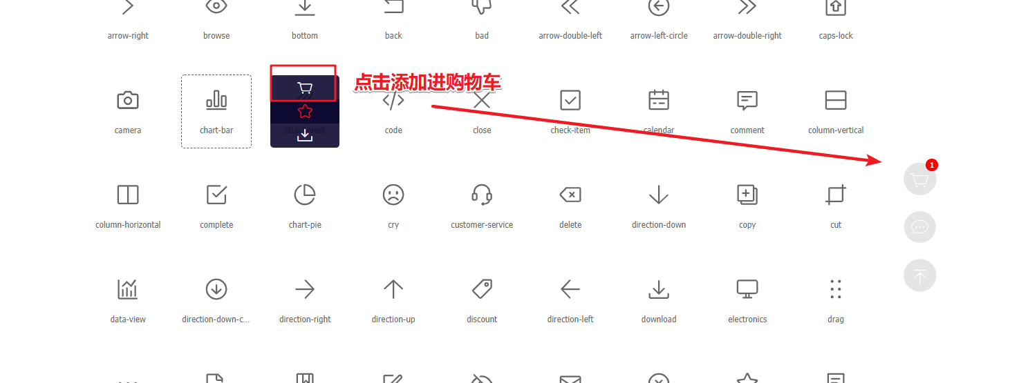
选择需要的图标然后添加进购物车,下载即可。
下载完成后,会在本地出现一个压缩包,解压之后既是字体图标。
可以点击demo_index.html查看图标的使用说明。
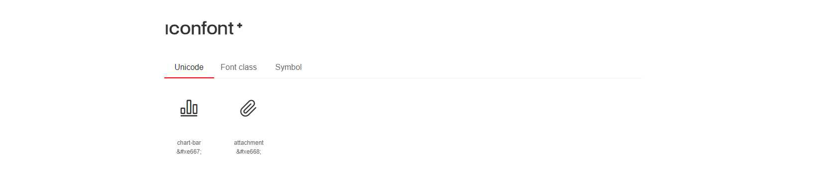
在demo中,一共提供了三种使用方式,分别为:
- Unicode方式引入
- Font class方式引入
- Symbol方式引入
在示例网页的下方,都列出了具体的使用方式:
-
Unicode 使用方式:
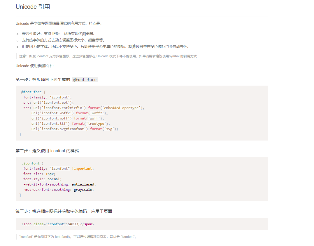
-
Font class使用方式
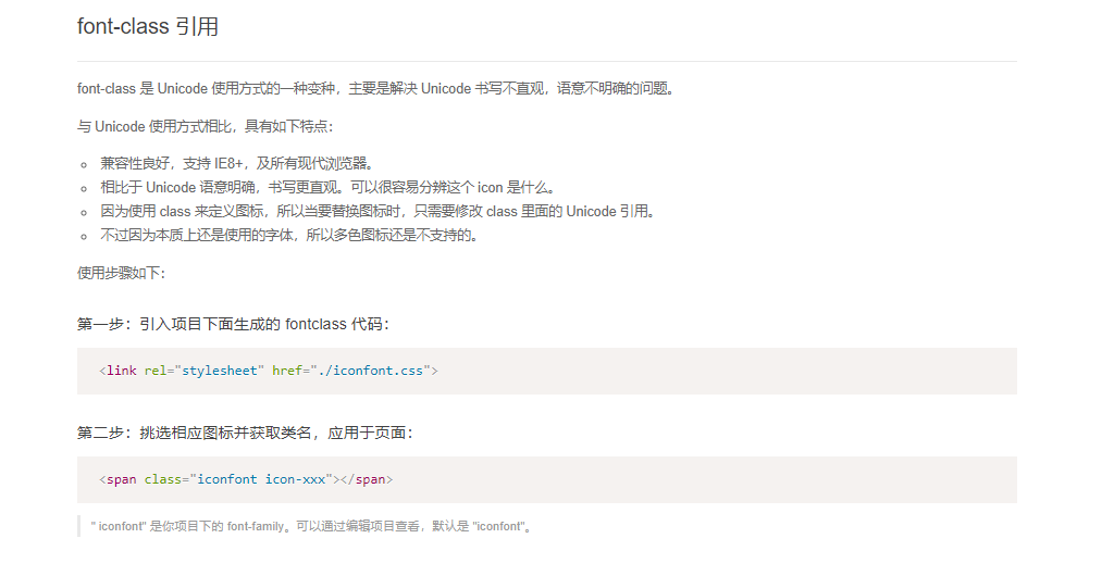
-
Symbol 使用方式:
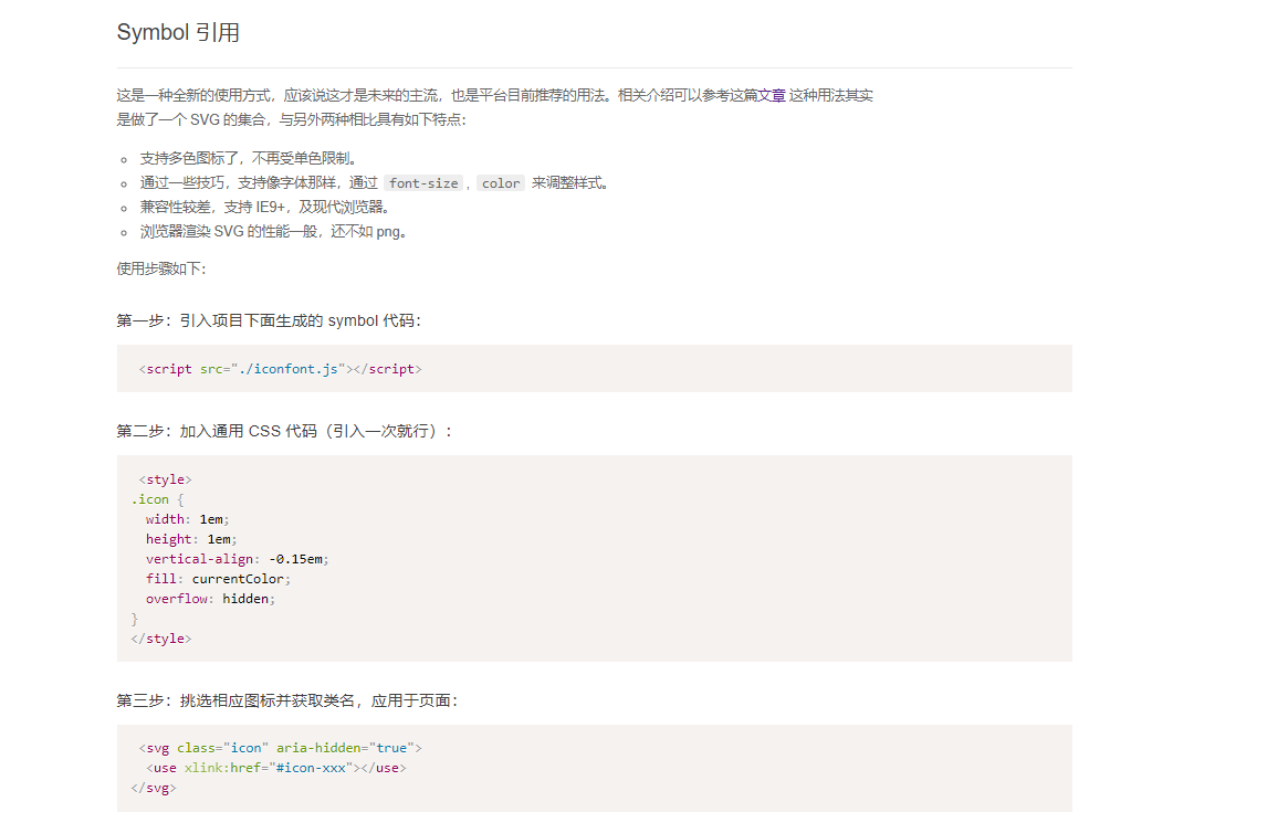
三种方式各有好坏,下面的示例代码中,使用的Font class 的引用方式:
html代码:
<span class="iconfont chart-bar icon-chart-bar"></span>

css代码:
<link rel="stylesheet" href="./iconfont.css">
<style>
    .icon-chart-bar {
        font-size: 30px;
        color: lightblue
    }
</style>
实际效果:
边框属性
在css3中,边框属性主要包括下面的两个属性:
- border-radius 边框圆角
- border-image 边框图片
边框圆角
通过border-radius属性可以实现边框圆角的设置。既可以一次性设置四个角的圆角程度,也可以分别设置不同的角。
语法格式如下:
border-radius: 1-4 length|% / 1-4 length|%;
- length 定义圆形半径或椭圆的半长轴,半短轴。负值无效。
- % 使用百分数定义圆形半径或椭圆的半长轴,半短轴。水平半轴相对于盒模型的宽度;垂直半轴相对于盒模型的高度。负值无效。
当然,除了使用简写属性以外,还可以采用单独设置的方式来设置不同角的圆角值:
- border-top-left
- border-top-right
- border-bottom-left
- border-bottom-right
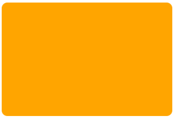
示例代码:
html代码:
<div class="d1"></div>

css代码:
<style>
    .d1 {
         300px;
        height: 200px;
        border-radius: 10px;
        background-color: orange;
    }
</style>
实际的效果:
当border-radius的值超过50%时或者超过宽度一半的时候,元素就会变成圆。如果元素是一个正方形,最终就会变成正圆,如果元素是一个长方形,最终就会变成椭圆。
即使元素没有边框,圆角可以应用到background上,具体效果要收到background-clip的影响。
具体细节可以点击这里查看。
边框图片
通过border-image 属性,可以用来给网页元素的边框设置图片。
border-image是一个简写属性,一共包括下面的几个属性:
- border-image-source 这个属性主要是用来给标签引入边框图片。
- border-image-slice 通过这个属性,可以指定边框图像顶部、右侧、底部、左侧内偏移量。没有具体的单位值,只可以使用数字或者百分比。
- border-image-width 设置边框图片宽度,代替盒子本身的边框宽度。
- border-image-outset 通过这个属性,可以让边框属性延伸到盒子外部。
- border-image-repeat 通过这个属性,可以设置边框背景是否重复。
border-image-source
通过border-image-source属性可以引入边框图片。语法如下:
border-image-source: none | url;
- url 图片地址
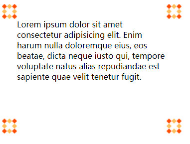
示例如下:
html代码:
<div class="content">
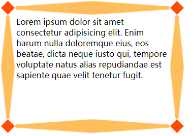
Lorem ipsum dolor sit amet consectetur adipisicing elit. Enim harum nulla doloremque eius, eos beatae, dicta neque iusto qui, tempore voluptate natus alias repudiandae est sapiente quae velit tenetur fugit.
</div>
css代码:
<style>
.content {
300px;
height: 200px;
border: 30px solid transparent;
border-image-source: url(./img/border.png);
}
</style>
实际效果:
border-image-slice
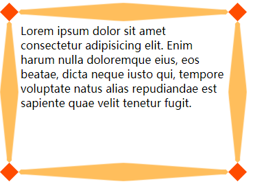
通过border-image-source引入边框图片之后,border-image-slice属性会将图片分隔为9个区域: 四个角、四个边以及中心区域。四条切片线,从它们各自的侧面设置给定距离,控制区域的大小。
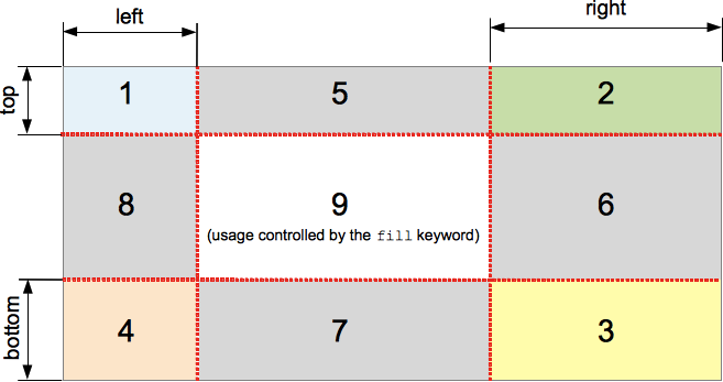
在上面的图像中,说明了每个区域的位置:
中间的区域将不会被边框使用,但当设置有 fill 关键词时将会被作为 background-image。这个关键词可以被设置在属性的任何一个位置(前面、后面或者两个值之间)。
语法格式如下:
border-image-slice: <number-percentage>{1,4} && fill?
where
<number-percentage> = <number> | <percentage>
示例代码:
html代码:
<div class="content">
    Lorem ipsum dolor sit amet consectetur adipisicing elit. Enim harum nulla doloremque eius, eos beatae, dicta neque iusto qui, tempore voluptate natus alias repudiandae est sapiente quae velit tenetur fugit.
</div>

css代码:
<style>
    .content {
         300px;
        height: 200px;
        border: 30px solid transparent;
        border-image-source: url(./img/border.png);
        border-image-slice: 30;
    }
</style>
实际效果:
border-image-width
通过border-image-width属性可以设置边界图像的宽度。
语法格式如下:
border-image- <length-percentage> | number | auto
<length-percentage>边界的宽度,可以使用<length>或者<percentage>来指定,百分比是相较于水平(垂直)方向上的边框图像区域宽度(高度)的偏移量,不能为负。<number>边框宽度,指定为 border-width 的相应倍数,不能为负。- auto 将等同于内部对应的 border-image-slice 的宽或高(可用的话)。如果图像没有需要的相应的属性,将相对于 border-width 进行指定。
当设置border-image-width的属性值时,可以按照以下的方式进行设定:
- 当指定 一个 值时,它将作用到 四个方向 ;
- 当指定 两个 值时,它将分别作用到 垂直方向 和 水平方向 ;
- 当指定 三个 值时,它将分别作用到 上方、水平方向、和下方;
- 当指定 三个 值时,它将分别作用到 上方、右方、下方和左方。
示例代码:
html代码:
<div class="content">
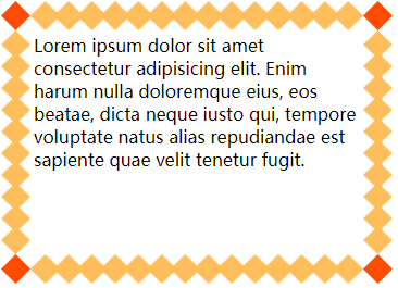
Lorem ipsum dolor sit amet consectetur adipisicing elit. Enim harum nulla doloremque eius, eos beatae, dicta neque iusto qui, tempore voluptate natus alias repudiandae est sapiente quae velit tenetur fugit.
</div>
css代码:
<style>
.content {
300px;
height: 200px;
border: 30px solid transparent;
border-image-source: url(./img/border.png);
border-image-slice: 30;
border-image- 30px;
}
</style>
实际效果:
border-image-repeat
border-image-repeat 定义图片如何填充边框。或为单个值,设置所有的边框;或为两个值,分别设置水平与垂直的边框。
语法格式如下:
border-image-repeat: [ stretch | repeat | round | space ]{1,2}
- stretch 拉伸图片以填充边框(默认值)。
- repeat 平铺图片以填充边框。
- round 平铺图像。当不能整数次平铺时,根据情况放大或缩小图像。
- space 平铺图像 。当不能整数次平铺时,会用空白间隙填充在图像周围(不会放大或缩小图像)
示例代码:
html代码:
<div class="content">
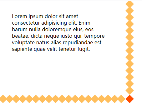
Lorem ipsum dolor sit amet consectetur adipisicing elit. Enim harum nulla doloremque eius, eos beatae, dicta neque iusto qui, tempore voluptate natus alias repudiandae est sapiente quae velit tenetur fugit.
</div>
css代码:
<style>
.content {
300px;
height: 200px;
border: 30px solid transparent;
border-image-source: url(./img/border.png);
border-image-slice: 30;
border-image- 30px;
border-image-repeat: round;
}
</style>
实际效果:
border-image-outset
border-image-outset属性定义边框图像可超出边框盒的大小。
语法格式:
border-image-outset: [ <length> | <number> ]{1,4}
示例代码:
html代码:
<div class="content">
    Lorem ipsum dolor sit amet consectetur adipisicing elit. Enim harum nulla doloremque eius, eos beatae, dicta neque iusto qui, tempore voluptate natus alias repudiandae est sapiente quae velit tenetur fugit.
</div>

css代码:
<style>
    .content {
         300px;
        height: 200px;
        border: 30px solid transparent;
        border-image-source: url(./img/border.png);
        border-image-slice: 30;
        border-image- 30px;
        border-image-repeat: round;
        border-image-outset: 2;
    }
</style>
实际效果:
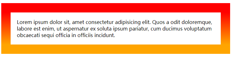
border-image除了使用图片以外,还可以使用渐变来填充。
示例代码如下:
html代码:
<p class="p1">
    Lorem ipsum dolor sit, amet consectetur adipisicing elit. Quos a odit doloremque, labore est enim, ut aspernatur ex soluta ipsum pariatur, cum ducimus voluptatum obcaecati sequi officia in officiis incidunt.
</p>

css代码:
<style>
    .p1 {
        border: 30px solid transparent;
        border-image: linear-gradient(red, orange) 10;
        padding: 20px;
    }
</style>
实际效果:
背景属性
css3中新增加的背景属性如下:
- background-origin 背景图像的填充位置
- background-clip 背景图像的裁切位置
- background-size 设置背景图像的尺寸
- 多背景设置
background-origin
通过background-origin 属性,可以设置背景图像的填充位置。
属性值:
- padding-box 背景图像填充框的相对位置(默认值)
- border-box 背景图像边界框的相对位置
- content-box 背景图像的相对位置的内容框
示例代码:
html代码:
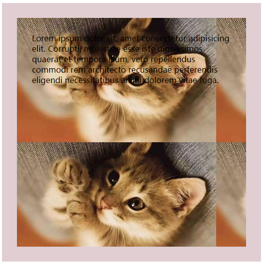
<div class="content">
Lorem ipsum dolor sit, amet consectetur adipisicing elit. Corrupti, molestiae esse iste dignissimos quaerat et tempora illum, vero repellendus commodi rem architecto recusandae perferendis eligendi necessitatibus animi dolorem vitae fuga.
</div>
css代码:
<style>
.content {
400px;
height: 400px;
padding: 30px;
border: 30px solid rgba(100,10,30,.2);
background: url(./img/bg.jpg) no-repeat;
background-origin: border-box;
}
</style>
实际效果:

通过设置background-origin:border-box 图片直接可以覆盖到border。
background-clip
通过background-clip 属性,可以设置背景图像的裁切位置。常用的属性值如下:
- border-box 背景被裁切到边框位置(默认值)
- padding-box 背景被裁切到padding
- content-box 背景被裁切到content
示例代码:
html代码:
<div class="content">
    Lorem ipsum dolor sit, amet consectetur adipisicing elit. Corrupti, molestiae esse iste dignissimos quaerat et tempora illum, vero repellendus commodi rem architecto recusandae perferendis eligendi necessitatibus animi dolorem vitae fuga.
</div>

css代码:
<style>
    .content {
         400px;
        height: 400px;
        padding: 30px;
        border: 30px solid rgba(100,10,30,.2);
        background: url(./img/bg.jpg);
        background-clip: padding-box;
    }
</style>
实际效果:
background-size
可以通过background-size属性来设置背景图像的尺寸。
基础语法:
background-size: length | percentage | cover | contain | auto;
- length ,指定背景图片大小,不能为负值
- percentage 指定背景图片相对背景区(background positioning area)的百分比。
- cover 缩放背景图片以完全覆盖背景区,可能背景图片部分看不见。
- contain 缩放背景图片以完全装入背景区,可能背景区部分空白。当背景图和容器的大小的不同时,容器的空白区域(上/下或者左/右)会显示由 background-color 设置的背景颜色。
背景图片的大小计算方式:
当通过宽度和高度值来设定尺寸时,你可以提供一或者两个数值:
- 如果仅有一个数值被给定,这个数值将作为宽度值大小,高度值将被设定为
auto。 - 如果有两个数值被给定,第一个将作为宽度值大小,第二个作为高度值大小。
每个值可以是<length>, 是 <percentage>, 或者 auto.
可以通过
background-size: 6px, auto, contain代码来设置多个背景图大小。
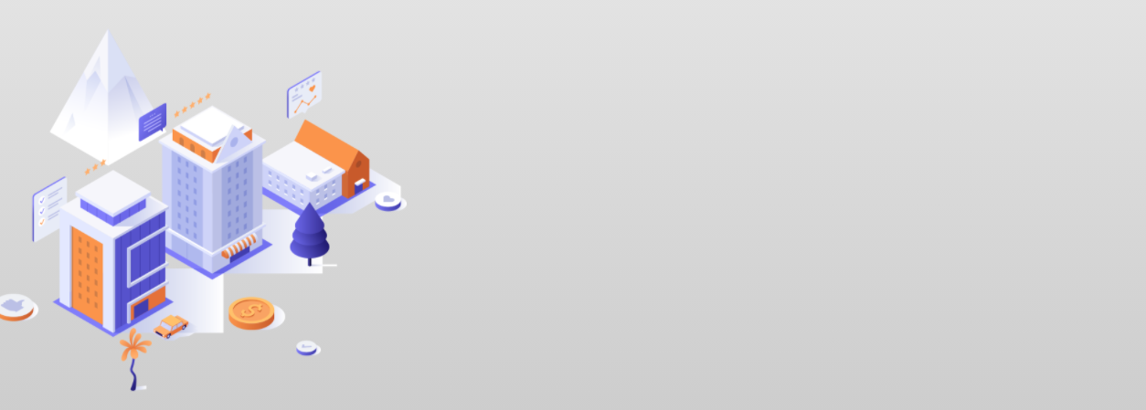
多背景
在css3中,新增加了多背景,可以直接在background-image中设置多个背景图。
示例代码:
html代码:
<div class="banner"></div>

css代码:
<style>
    * {
        margin: 0;
        padding: 0;
    }
    .banner {
        height: 400px;
        background-image: url(./img/Hotel.png),linear-gradient(#e3e3e3, #ccc);
        background-size: contain,contain;
        background-repeat: no-repeat;
        padding: 40px;
    }

</style>
实际效果:
文本阴影和盒子阴影
在css3中可以对文本和盒子进行阴影的设置。
- text-shadow 文本阴影
- box-shadow 盒子阴影
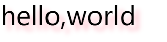
文本阴影
可以通过text-shadow属性来设置文本阴影,文本阴影的属性值如下:
- h-shadow 水平阴影的位置,允许负值
- v-shadow 垂直阴影的位置,允许负值
- blur 模糊距离
- color 阴影的颜色
示例代码:
html代码:
<span>hello,world</span>

css代码:
<style>
    span {
        font-size: 50px;
        text-shadow: 10px 10px 10px pink;
    }
</style>
实际效果:
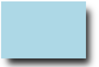
盒子阴影
css3当中可以通过box-shadow属性来设置盒子阴影,属性值如下:
- h-shadow 水平阴影的位置,允许负值
- v-shadow 垂直阴影的位置,允许负值
- blur 模糊距离
- spread 设置阴影的大小
- color 设置阴影的颜色、
- inset 将处于元素外部的阴影转换为元素内部的阴影
示例代码:
html代码:
<div class="content"></div>

css代码:
<style>
    .content {
         300px;
        height: 200px;
        background-color: lightblue;
        box-shadow: 18px 25px 24px -6px #222;
    }
</style>
实际效果:
颜色属性
css3中新增加了几种关于设置颜色的内容:
- rgba
- opacity
- hsla
在新增加的颜色模式中,无论是rgba还是hsla,都是在原有基础上新增加了alpha不透明度通道,通过最后一个值a的设置,来让颜色可以实现不透明度的效果。值的范围介于0-1之间。
opacity的效果同样是不透明度,但是通过opacity设置的不透明度,会导致元素上的内容也随之变得透明。
渐变
css3中新增加了渐变的效果,一般来说,渐变可以分成三种类型:
- 线性渐变(从一个方向到另外一个方向)
- 径向渐变(从一个点向四周扩散)
- 重复渐变(重复线性渐变、重复径向渐变)
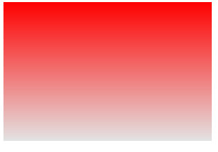
线性渐变
在css3中,可以通过linear-gradient属性来实现线性渐变。该属性的语法如下:
linear-gradient: point | angle color percentage;
- point表示方向,angle表示角度。
- color表示颜色,一般分为起始颜色、过渡颜色和结束颜色。
- percentage表示百分比,一般表示颜色渐变过程中的百分比。
示例代码:
html代码:
<div class="content"></div>

css代码:
<style>
    .content {
         300px;
        height: 200px;
        background-image: linear-gradient(red, #e3e3e3);
    }
</style>
实际效果:
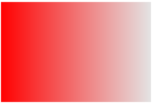
可以通过设置方向来调整渐变的方向。
示例代码:
html代码:
<div class="content"></div>

css代码:
<style>
    .content {
         300px;
        height: 200px;
        background-image: linear-gradient(to right,red, #e3e3e3);
    }
</style>
实际效果:
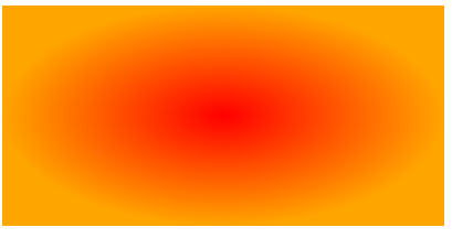
径向渐变
通过radial-gradient可以设置径向渐变,基础语法如下:
radial-gradient(shape size at position, start-color, ..., last-color);
- shape 渐变的形状,ellipse 表示椭圆形,circle 表示圆形。默认是ellipse ,如果元素为正方形,则圆形和椭圆形显示一样。
- size 渐变的大小,包括四个值,closest-side:最近边; farthest-side:最远边; closest-corner:最近角; farthest-corner:最远角
- color 变化的颜色
示例代码:
html代码:
<div class="content"></div>

css代码:
<style>
    .content {
         400px;
        height: 200px;
        background-image: radial-gradient(closest-side ellipse,red, orange);
    }
</style>
实际效果:
也可以通过多背景来设置多个径向渐变。
示例代码:
html代码:
<div class="content"></div>
css代码:
<style>
.content {
400px;
height: 600px;
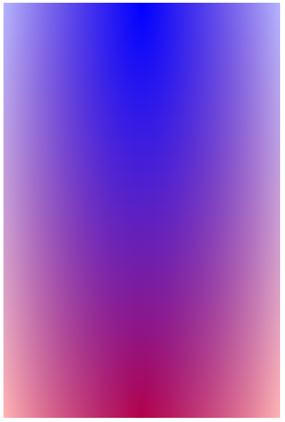
background: radial-gradient(ellipse at top, blue,transparent),
radial-gradient(ellipse at bottom, red, transparent);
}
</style>
实际效果:
重复渐变
重复渐变主要分为:
- repeating-linear-gradient() 重复线性渐变
- repeating-radial-gradient() 重复径向渐变
过渡
通过transition属性即可完成过渡效果。
基础语法格式如下:
transition: property duration timing-function delay;
- property 规定应用过度的css属性名称
- duration 定义过渡效果需要时间 单位s|ms
- timing-function 规定过渡效果的时间曲线,默认是“ease”
- cubic-bezier (n,n,n,n) 贝塞尔曲线 https://cubic-bezier.com/
- linear 规定以相同速度开始至结束的过渡效果(等于 cubic-bezier(0,0,1,1))
- ease 规定慢速开始,然后变快,然后慢速结束的过渡效果(cubic-bezier(0.25,0.1,0.25,1))
- ease-in 规定以慢速开始的过渡效果(等于 cubic-bezier(0.42,0,1,1))
- ease-out 慢速结束过渡效果 等于 cubic-bezier(0,0,0.58,1)
- ease-in-out 规定以慢速开始和结束的过渡效果(等于 cubic-bezier(0.42,0,0.58,1))
- delay 延迟 单位 s|ms
给不同的属性设置过渡: transition: width 2s 1s,height 2s 2s,background-color 3s 1s;