目的:
通过探索文件pseudo_facebook.tsv数据来学会多个变量的分析流程
通过探索diamonds数据集来探索多个变量
通过酸奶数据集探索多变量数据
知识点:
散点图
dplyr汇总数据
比例图
第三个变量加入到图形中
简介:
如果在探索多变量的时候,我们通常会把额外的变量用多维的图形来进行展示,例如性别,年份等
案例分析:
一:facebook数据集分析
思路:根据性别进行划分数据集,x轴为年龄,y轴为好友数,然后根据中位数进行绘制
或根据数据进行划分来进行绘制
1.分析男性,女性的不同年龄段的好友的中位数(设想的受众规模)
library(ggplot2)
pf <- read.csv('pseudo_facebook.tsv',sep='	')
#1.查看年龄和性别的的箱线图
ggplot(aes(x = gender, y = age),
       data = subset(pf, !is.na(gender))) + geom_boxplot()
#2.根据性别查看年龄和好友数的中位数比较
ggplot(aes(x=age,y=friend_count),
       data=subset(pf,!is.na(gender)))+
  geom_line(aes(color=gender),stat = 'summary',fun.y=median)
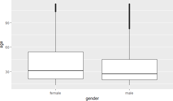

图1 图2
图1表示女性的年龄比男性要高
图2反应了在60岁之前女性的好友数要多于男性
2.整合数据框架
library(dplyr)
pf.fc_by_age_gender <- pf %>%
  filter(!is.na(gender)) %>%
  group_by(age,gender) %>%
  summarise(mean_friend_count = mean(friend_count),
            median_friend_count = median(friend_count),
            n = n()) %>%
  ungroup() %>%
  arrange(age)
3.绘制图形
ggplot(aes(x=age,y=median_friend_count),data=pf.fc_by_age_gender)+
  geom_line(aes(color=gender))

图3
图3反应了在60岁之前女性的好友数要多于男性
4.男性女性好友数量的比例
#将年龄按照性别进行横排列
library(reshape2)
pf.fc_by_age_gender.wide <- dcast(pf.fc_by_age_gender,
                                  age ~ gender,
                                  value.var = 'median_friend_count')
ggplot(aes(x=age,y=female/male),
       data = pf.fc_by_age_gender.wide)+
  geom_line()+
  geom_hline(yintercept = 1,alpha=0.3,linetype=2)
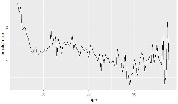
图4
根据图4可以反应出在20岁左右女性好友的数量是男性的2倍多,在60岁的女性的数量任然是超过男性的,65岁之后女性的好友的数量低于男性
5.分析每个年份加入的好友数量
思路:创建年份变量然后,根据年份进行分组,最后再根据年龄和好友数进行绘制
#1.计算加入的年份加在数据集上
#2.将年份进行切分
#3.绘制每个区间的图形
pf$year_joined <- floor(with(pf,2014-tenure/365))
pf$year_joined.bucket <- cut(pf$year_joined,
                             c(2004,2009,2011,2012,2014))
ggplot(aes(x=age,y=friend_count),
       data=subset(pf,!is.na(year_joined.bucket)))+
  geom_line(aes(color=year_joined.bucket),stat = 'summary',func.y=median)
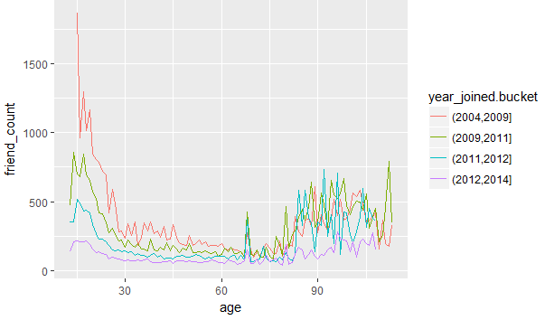
图5
图5可以反应出2004,2009年使用faceboo的年轻人所占的好友数量是相当多的
6.分析好友率(使用天数和新的申请好友的关系)
#1.friendships_initiated/tenure表示使用期和新的好友的比例
#2.划分数据集,找出至少使用一天的用户
#3.根据年份的区间进行绘制
#4.做出年份区间的大致趋势
ggplot(aes(x=tenure,y=friendships_initiated/tenure),
       data=subset(pf,tenure>=1))+
  geom_line(aes(color=year_joined.bucket),stat='summary',fun.y=mean)

ggplot(aes(x=tenure,y=friendships_initiated/tenure),
       data=subset(pf,tenure>=1))+
  geom_smooth(aes(color=year_joined.bucket))


图6 图7
图6和图7反应了使用的时间越久所得到的的好友数量就越少
二:分析酸奶数据集(找出酸奶的口味,时间,价格的关系)
1.做出价格的直方图
yo <- read.csv('yogurt.csv')
yo$id <- factor(yo$id)

ggplot(aes(x=price),data=yo)+
  geom_histogram()
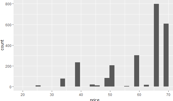
图8
图8反应了价格越高的酸奶数量越多
2.分析大部分家庭一次性购买多少份酸奶
#将所有的口味的数量全部整合起来生成一个新的变量all.purchase
yo <- transform(yo,all.purchases=strawberry+blueberry+plain+pina.colada+mixed.berry)
qplot(x=all.purchases,data=yo,fill=I('#099dd9'),binwidth=1)
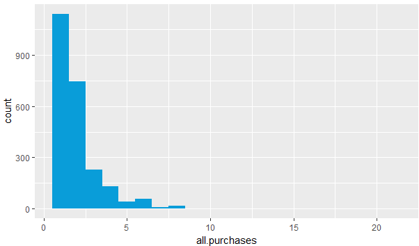
图9
图9反应了大多数家庭一次性购买了1,2份酸奶
3.分析价格和时间的关系
ggplot(aes(x=time,y=price),data=yo)+
  geom_point(alpha=1/4,shape=21,fill=I('#f79420'),position = 'jitter')

图10
图10反应了随着时间的增长,价格也随之增长
4.分析抽样家庭的样本购买情况
#1.设置种子起始
#2.从总量中获取16个随机的家庭id
#3.根据获取的随机id进行绘制
set.seed(4230)
sample.ids <- sample(levels(yo$id),16)
ggplot(aes(x=time,y=price),
       data=subset(yo,id %in% sample.ids))+
  facet_wrap(~ id)+
  geom_line()+
  geom_point(aes(size=all.purchases),pch=1)
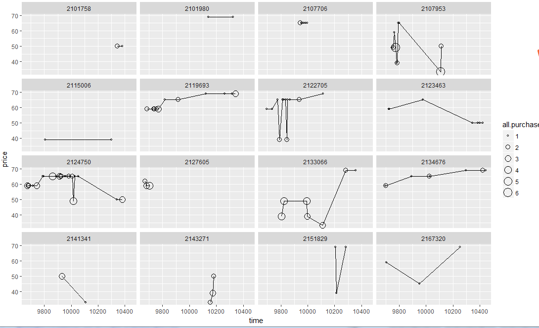
图11
图11反应了家庭在购买酸奶习惯
5.做出散点矩阵图,在该图中可以找到每一个变量和其他变量之间的联系
library('GGally')
theme_set(theme_minimal(20))

set.seed(1836)
pf_subset <- pf[,c(2:15)]
ggpairs(pf_subset[sample.int(nrow(pf_subset),1000),])
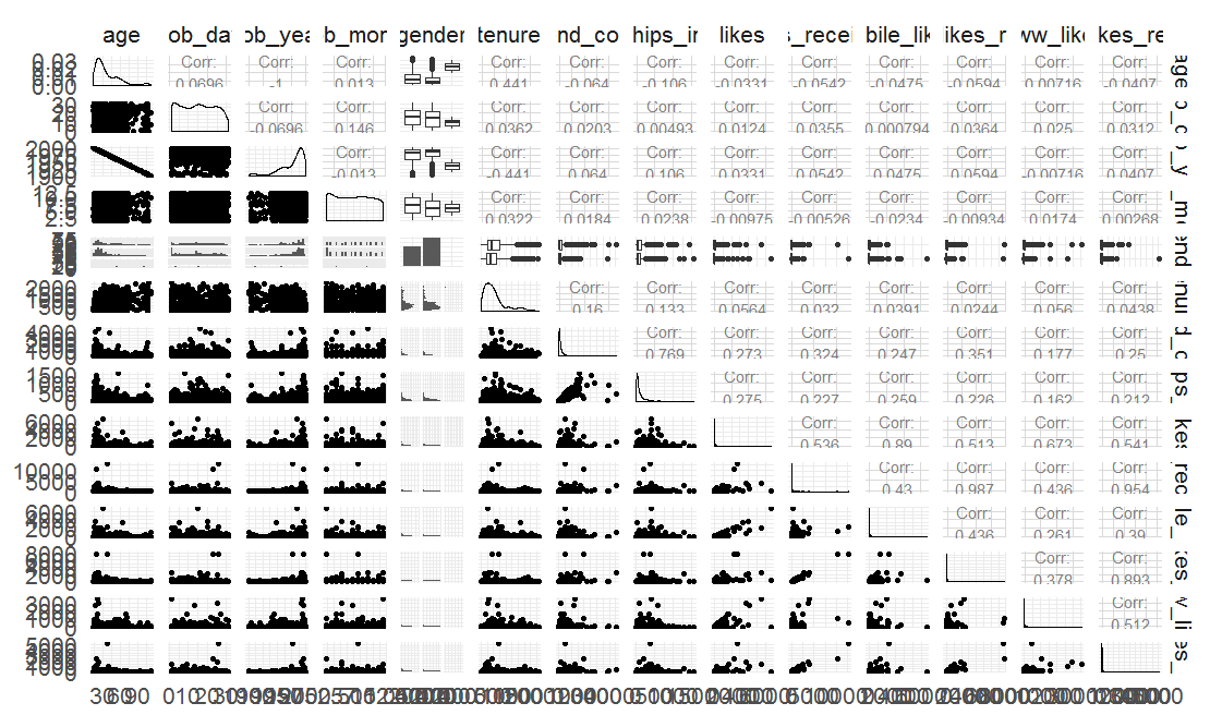
图12
图12中有直方图,散点图,线图,和每个变量和其他变量之间的联系,具有很多细节的参考价值
三:分析钻石数据集
1.重量(克拉)和价格的关系
#在x轴和y轴上去掉1%的异常数据
ggplot(aes(x=carat,y=price),data=diamonds)+
  scale_x_continuous(lim=c(0,quantile(diamonds$carat,0.99)))+
  scale_y_continuous(lim=c(0,quantile(diamonds$price,0.99)))+
  geom_point(alpha=1/4,color='#f79420')+
  geom_smooth(method = 'lm')
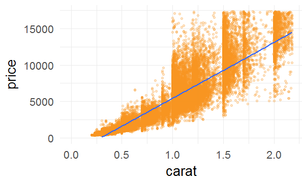
图12
图12基本上反应出重量越重价格越高,但是由于渐近线并没有吻合数据集的开头的结尾,如果尝试去做预测,会错过些关键数据
2.钻石销售总体的关系
library(ggplot2)
library(GGally)
library(scales)
library(memisc)

# 从数据集获取10000个样本数据进行分析
set.seed(20022012)
diamond_samp <- diamonds[sample(1:length(diamonds$price), 10000), ]
ggpairs(diamond_samp,lower= list(continuous = wrap("points", shape = I('.'))),
        upper = list(combo = wrap("box", outlier.shape = I('.'))))
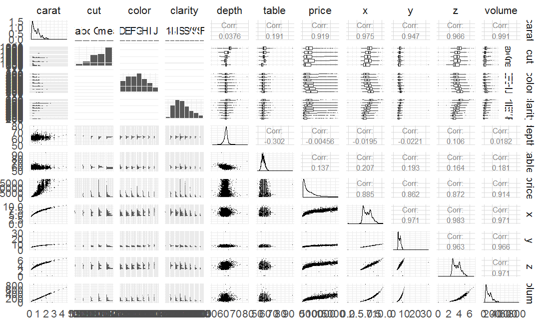
图13
图13反应了钻石市场的基本信息
3.钻石的需求
library(gridExtra)
p1 <- ggplot(aes(x=price,fill=I('#099dd9')),data=diamonds)+
  geom_histogram(binwidth=100)
p2 <- ggplot(aes(x=price,fill=I('#f79420')),data=diamonds)+
  geom_histogram(binwidth=0.01)+
  scale_x_log10()
grid.arrange(p1,p2,ncol=1)

图14
图14的下图反应了在1000,10000美金之间的钻石的销售是最多的
4.价格和净度的关系
#1.转换克拉变量
cuberoot_trans = function() trans_new('cuberoot',
                                      transform = function(x) x^(1/3),
                                      inverse = function(x) x^3)

library(RColorBrewer)
ggplot(aes(x = carat, y = price,color=clarity), data = diamonds) +
  geom_point(alpha = 0.5, size = 1, position = 'jitter') +
  scale_color_brewer(type = 'div',
    guide = guide_legend(title = 'Clarity', reverse = T,
    override.aes = list(alpha = 1, size = 2))) +
  scale_x_continuous(trans = cuberoot_trans(), limits = c(0.2, 3),
    breaks = c(0.2, 0.5, 1, 2, 3)) +
  scale_y_continuous(trans = log10_trans(), limits = c(350, 15000),
    breaks = c(350, 1000, 5000, 10000, 15000)) +
  ggtitle('Price (log10) by Cube-Root of Carat and Clarity')

图15
图15反应了净度越高价格也就越高
5.价格和切工的关系
ggplot(aes(x = carat, y = price, color = cut), data = diamonds) +
  geom_point(alpha = 0.5, size = 1, position = 'jitter') +
  scale_color_brewer(type = 'div',
                     guide = guide_legend(title = 'Clarity', reverse = T,
                                          override.aes = list(alpha = 1, size = 2))) +
  scale_x_continuous(trans = cuberoot_trans(), limits = c(0.2, 3),
                     breaks = c(0.2, 0.5, 1, 2, 3)) +
  scale_y_continuous(trans = log10_trans(), limits = c(350, 15000),
                     breaks = c(350, 1000, 5000, 10000, 15000)) +
  ggtitle('Price (log10) by Cube-Root of Carat and Clarity')

图16
图16反应了切工和价格没有关系
6.价格和颜色的关系
ggplot(aes(x = carat, y = price, color = color), data = diamonds) +
  geom_point(alpha = 0.5, size = 1, position = 'jitter') +
  scale_color_brewer(type = 'div',
                     guide = guide_legend(title = 'Color', reverse = F,
                                          override.aes = list(alpha = 1, size = 2))) +
  scale_x_continuous(trans = cuberoot_trans(), limits = c(0.2, 3),
                     breaks = c(0.2, 0.5, 1, 2, 3)) +
  scale_y_continuous(trans = log10_trans(), limits = c(350, 15000),
                     breaks = c(350, 1000, 5000, 10000, 15000)) +
  ggtitle('Price (log10) by Cube-Root of Carat and color')
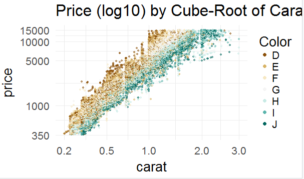
图17
图17反应了颜色和价格的关系,价格上D>E>F>G>H>I>J
7.线性模型,可以通过线性模型对数据进行查看
#在lm(x~y)中,x是解释变量,y是结果变量
#I表示使用R内部的表达式,再将其用于递归
#可以添加更多的变量来扩展该模型
m1 <- lm(I(log(price)) ~ I(carat^(1/3)), data = diamonds)
m2 <- update(m1, ~ . + carat)
m3 <- update(m2, ~ . + cut)
m4 <- update(m3, ~ . + color)
m5 <- update(m4, ~ . + clarity)
mtable(m1, m2, m3, m4, m5)
#1.构建新的钻石线性模型来进行分析
#2.数据集只采用价格小于10000和GIA认证的钻石
#3.额外添加重量,切工,颜色,净度进行分析
load('BigDiamonds.Rda')
diamondsbig$logprice = log(diamondsbig$price)
m1 <- lm(logprice ~ I(carat^(1/3)),
         data=diamondsbig[diamondsbig$price<10000
                          &diamondsbig$cert == 'GIA',])
m2 <- update(m1,~ . + carat)
m3 <- update(m2,~ . + cut)
m4 <- update(m3,~ . + color)
m5 <- update(m4,~ . + clarity)
mtable(m1,m2,m3,m4,m5)