2019-11-08 13:01:21
一丶实现水平+垂直居中的两种方式
1.使用display+margin实现水平方向居中,使用table-cell+vertical-align实现垂直方向居中
2.absolute+transform实现水平加垂直方向居中
二丶代码
第一种
代码
<!DOCTYPE html>
<html lang="en">
<head>
    <meta charset="UTF-8">
    <meta name="viewport" content="width=device-width, initial-scale=1.0">
    <meta http-equiv="X-UA-Compatible" content="ie=edge">
    <title>Document</title>
    <style>
        .parent{
            width: 600px;
            height: 400px;
            background: cadetblue;
            display: table-cell;
            vertical-align: middle;
        }
        .child{
            width: 200px;
            height: 200px;
            background: coral;

            display: block;
            margin: 0 auto;
        }

    </style>
</head>
<body>
    <div class="parent">
        <div class="child"></div>
    </div>
</body>
</html>
效果
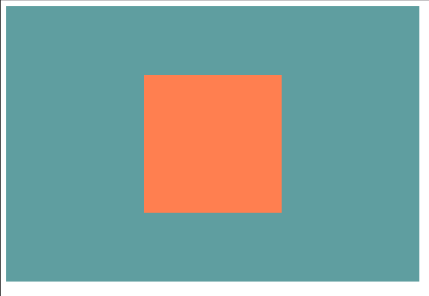
使用这种方式对浏览器的支持是比较好的,因为所用的样式在CSS2也是支持的
第二种:
<!DOCTYPE html>
<html lang="en">
<head>
    <meta charset="UTF-8">
    <meta name="viewport" content="width=device-width, initial-scale=1.0">
    <meta http-equiv="X-UA-Compatible" content="ie=edge">
    <title>Document</title>
    <style>
        .parent{
            width: 100%;
            height: 400px;
            position: relative;
            background: green;
        }
        .child{
            position: absolute;
            width: 200px;
            height: 200px;
            background: blue;
            left: 50%;
            top: 50%;
            transform: translate(-50%,-50%);
        }
    </style>
</head>
<body>
    <div class="parent">
        <div class="child"></div>
    </div>
</body>
</html>
实现效果:
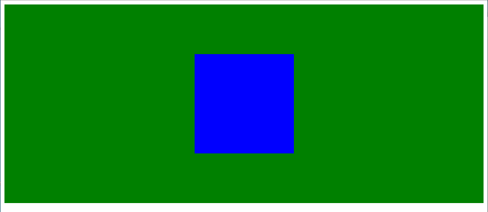
此处如果父级标签不开启定位的话,那么子级标签将会以body标签进行定位,如果父级标签开启了定位,那么子级标签将会相对于父级进行定位,代码可以把宽度改小,就能看见一样垂直水平的效果
transform属于CSS3的新属性,在老版本浏览器支持性不好,translate(-50%,-50%);表示的是将当前宽度/2,高度/2,反向移动,第一个是左右,第二个是上下移动,-50%表示左移动200px/2 = 100px,如果是正50%,就是向右移动100px,第二个同理
下篇
多列布局