一,概述
Flutter中拥有30多种预定义的布局widget,常用的有Container、Padding、Center、Flex、Row、Colum、ListView、GridView。按照《Flutter技术入门与实战》上面来说的话,大概分为四类
- 基础布局组件:Container(容器布局),Center(居中布局),Padding(填充布局),Align(对齐布局),Colum(垂直布局),Row(水平布局),Expanded(配合Colum,Row使用),FittedBox(缩放布局),Stack(堆叠布局),overflowBox(溢出父视图容器)。
- 宽高尺寸处理:SizedBox(设置具体尺寸),ConstrainedBox(限定最大最小宽高布局),LimitedBox(限定最大宽高布局),AspectRatio(调整宽高比),FractionallySizedBox(百分比布局)
- 列表和表格处理:ListView(列表),GridView(网格),Table(表格)
- 其它布局处理:Transform(矩阵转换),Baseline(基准线布局),Offstage(控制是否显示组件),Wrap(按宽高自动换行布局)
二,基础布局处理组件
- Container
- 介绍:
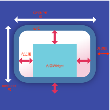
一个拥有绘制、定位、调整大小的widget,示意图如下:
- 组成
Container的组成如下:
- 最里层的是child元素;
- child元素首先会被padding包着;
- 然后添加额外的constraints限制;
- 最后添加margin。
Container的绘制的过程如下:
- 首先会绘制transform效果;
- 接着绘制decoration;
- 然后绘制child;
- 最后绘制foregroundDecoration。
Container自身尺寸的调节分两种情况:
- Container在没有子节点(children)的时候,会试图去变得足够大。除非constraints是unbounded限制,在这种情况下,Container会试图去变得足够小。
- 带子节点的Container,会根据子节点尺寸调节自身尺寸,但是Container构造器中如果包含了width、height以及constraints,则会按照构造器中的参数来进行尺寸的调节。
- 布局行为
由于Container组合了一系列的widget,这些widget都有自己的布局行为,因此Container的布局行为有时候是比较复杂的。
一般情况下,Container会遵循如下顺序去尝试布局:
- 对齐(alignment);
- 调节自身尺寸适合子节点;
- 采用width、height以及constraints布局;
- 扩展自身去适应父节点;
- 调节自身到足够小。
进一步说:
- 如果没有子节点、没有设置width、height以及constraints,并且父节点没有设置unbounded的限制,Container会将自身调整到足够小。
- 如果没有子节点、对齐方式(alignment),但是提供了width、height或者constraints,那么Container会根据自身以及父节点的限制,将自身调节到足够小。
- 如果没有子节点、width、height、constraints以及alignment,但是父节点提供了bounded限制,那么Container会按照父节点的限制,将自身调整到足够大。
- 如果有alignment,父节点提供了unbounded限制,那么Container将会调节自身尺寸来包住child;
- 如果有alignment,并且父节点提供了bounded限制,那么Container会将自身调整的足够大(在父节点的范围内),然后将child根据alignment调整位置;
- 含有child,但是没有width、height、constraints以及alignment,Container会将父节点的constraints传递给child,并且根据child调整自身。
另外,margin以及padding属性也会影响到布局。
- 继承关系
Object > Diagnosticable > DiagnosticableTree > Widget > StatelessWidget > Container
从继承关系可以看出,Container是一个StatelessWidget。Container并不是一个最基础的widget,它是由一系列的基础widget组合而成。
- 构造方法
Container({
    Key key,
    this.alignment,
    this.padding, //设置内边距
    Color color, //用来设置container背景色,如果foregroundDecoration设置的话,可能会遮盖color效果。container背景色和decoration不能同时设置,
    Decoration decoration, //边框、圆角、阴影、形状、渐变、背景图像
    this.foregroundDecoration, //decoration是背景,foregroundDecoration是前景。设置了foregroundDecoration可能会遮盖child内容,一般半透明遮盖(蒙层)效果使用!
    double width,
    double height,
    BoxConstraints constraints,
    this.margin, //设置外边距,container与父边框的距离
    this.transform,
    this.child, //孩子
  }) : assert(margin == null || margin.isNonNegative),
       assert(padding == null || padding.isNonNegative),
       assert(decoration == null || decoration.debugAssertIsValid()),
       assert(constraints == null || constraints.debugAssertIsValid()),
       assert(color == null || decoration == null,
         'Cannot provide both a color and a decoration
'
         'The color argument is just a shorthand for "decoration: new BoxDecoration(color: color)".'
       )
- 参数解析
key:Container唯一标识符,用于查找更新。
alignment:控制child的对齐方式,如果container或者container父节点尺寸大于child的尺寸,这个属性设置会起作用,有很多种对齐方式。
padding:decoration内部的空白区域,如果有child的话,child位于padding内部。padding与margin的不同之处在于,padding是包含在content内,而margin则是外部边界,设置点击事件的话,padding区域会响应,而margin区域不会响应。
color:用来设置container背景色,如果foregroundDecoration设置的话,可能会遮盖color效果。
decoration:绘制在child后面的装饰,设置了decoration的话,就不能设置color属性,否则会报错,此时应该在decoration中进行颜色的设置。decoration可以设置边框、背景色、背景图片、圆角等属性,非常实用。
foregroundDecoration:绘制在child前面的装饰。
width:container的宽度,设置为double.infinity可以强制在宽度上撑满,不设置,则根据child和父节点两者一起布局。
height:container的高度,设置为double.infinity可以强制在高度上撑满。
constraints:添加到child上额外的约束条件。
margin:围绕在decoration和child之外的空白区域,不属于内容区域。
transform:设置container的变换矩阵,类型为Matrix4。 对于transform这个属性,一般有过其他平台开发经验的,都大致了解,这种变换,一般不是变换的实际位置,而是变换的绘制效果,也就是说它的点击以及尺寸、间距等都是按照未变换前的。
child:container中的内容widget。
- 介绍:
- Center
- 介绍:将其子widget居中显示在自身内部的widget。只能有一个chlid,但是可以用container包含好多子child,继承自Align。
用于将其子项与其自身对齐,并根据子级的大小自行调整大小。示意图: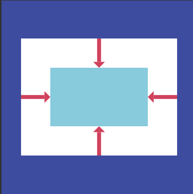
- 构造函数:
Center({
  Key key,
   double widthFactor, //宽度因子
   double heightFactor, //高度因子
   Widget child //
}): super(key: key, widthFactor: widthFactor, heightFactor: heightFactor, child: child); - 参数解析:
widthFactor:宽度因子
heightFactor:高度因子
child:子节点/孩子/子组件
(1)如果它的尺寸受到约束且[widthFactor]和[heightFactor]为空,则此窗口小部件将尽可能大。
(2)如果维度不受约束且相应的大小因子为null,则窗口小部件将匹配其在该维度中的子项大小(其实就是子view的宽高就是center容器的宽高)。
(3)如果尺寸因子为非null,则此center容器的相应尺寸将是子view的尺寸和尺寸因子的乘积。
例如,如果widthFactor是2.0,那么此小部件的宽度将始终是其子宽度的两倍,并且将子view居中,来看看下图吧。
- 介绍:将其子widget居中显示在自身内部的widget。只能有一个chlid,但是可以用container包含好多子child,继承自Align。
- Padding
- 介绍:
Padding在Flutter中用的也挺多的,作为一个基础的控件,功能非常单一,给子节点设置padding属性。写过其他端的都了解这个属性,就是设置内边距属性,内边距的空白区域,也是widget的一部分。
Flutter中并没有单独的Margin控件,在Container中有margin属性,看源码关于margin的实现。
if (margin != null)
  current = new Padding(padding: margin, child: current);
不难看出,Flutter中淡化了margin以及padding的区别,margin实质上也是由Padding实现的。
示意图如下: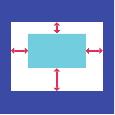
- 布局行为
Padding的布局分为两种情况:
- 当child为空的时候,会产生一个宽为left+right,高为top+bottom的区域;
- 当child不为空的时候,Padding会将布局约束传递给child,根据设置的padding属性,缩小child的布局尺寸。然后Padding将自己调整到child设置了padding属性的尺寸,在child周围创建空白区域。
- 继承关系
Object > Diagnosticable > DiagnosticableTree > Widget > RenderObjectWidget > SingleChildRenderObjectWidget > Padding
从继承关系可以看出,Padding控件是一个基础控件,不像Container这种组合控件。Container中的margin以及padding属性都是利用Padding控件去实现的。
- 构造函数
Padding({
    Key key,
    @required this.padding, //内边距
    Widget child,
  }) : assert(padding != null),
       super(key: key, child: child);
- 参数含义
padding: 类型为EdgeInsetsGeometry 填充值可以使用EdgeInsets方法,例如:edgeInsets.all(6.0)将容器上下左右填充设置为6.0,也可以用EdgeInsets.only方法单独设置某一边的间距
- 介绍:
- Align
- 介绍:在其他端的开发,Align一般都是当做一个控件的属性,并没有拿出来当做一个单独的控件。Align本身实现的功能并不复杂,设置child的对齐方式,例如居中、居左居右等,并根据child尺寸调节自身尺寸。

Align的布局行为分为两种情况:
-
当widthFactor和heightFactor为null的时候,当其有限制条件的时候,Align会根据限制条件尽量的扩展自己的尺寸,当没有限制条件的时候,会调整到child的尺寸;
-
当widthFactor或者heightFactor不为null的时候,Aligin会根据factor属性,扩展自己的尺寸,例如设置widthFactor为2.0的时候,那么,Align的宽度将会是child的两倍。
-
Align为什么会有这样的布局行为呢?
原因很简单,设置对齐方式的话,如果外层元素尺寸不确定的话,内部的对齐就无法确定。因此,会有宽高因子、根据外层限制扩大到最大尺寸、外层不确定时调整到child尺寸这些行为。 -
Center继承自Align,只不过是将alignment设置为Alignment.center,其他属性例如widthFactor、heightFactor,布局行为,都与Align完全一样,在这里就不再单独做介绍了。Center源码如下,没有设置alignment属性,是因为Align默认的对齐方式就是居中。
-
- 构造函数
const Align({
    Key key,
    this.alignment: Alignment.center,
    this.widthFactor, //宽度因子
    this.heightFactor, //高度因子
    Widget child
  })
- 参数的含义
-
alignment:对齐方式,一般会使用系统默认提供的9种方式,但是并不是说只有这9种,例如如下的定义。系统提供的9种方式只是预先定义好的。
/// The top left corner.
static const Alignment topLeft = const Alignment(-1.0, -1.0);
Alignment实际上是包含了两个属性的,其中第一个参数,-1.0是左边对齐,1.0是右边对齐,第二个参数,-1.0是顶部对齐,1.0是底部对齐。根据这个规则,我们也可以自定义我们需要的对齐方式,例如
/// 居右高于底部1/4处.
static const Alignment rightHalfBottom = alignment: const Alignment(1.0, 0.5),
-
widthFactor:宽度因子,如果设置的话,Align的宽度就是child的宽度乘以这个值,不能为负数。
-
heightFactor:高度因子,如果设置的话,Align的高度就是child的高度乘以这个值,不能为负数。
-
- 介绍:在其他端的开发,Align一般都是当做一个控件的属性,并没有拿出来当做一个单独的控件。Align本身实现的功能并不复杂,设置child的对齐方式,例如居中、居左居右等,并根据child尺寸调节自身尺寸。
- Colum
- 介绍:
Row和Column都是Flex的子类,只是direction参数不同。Column各方面同Row,可参考下面的Row
- 构造函数
Column({
    Key key,
    MainAxisAlignment mainAxisAlignment = MainAxisAlignment.start,
    MainAxisSize mainAxisSize = MainAxisSize.max,
    CrossAxisAlignment crossAxisAlignment = CrossAxisAlignment.center,
    TextDirection textDirection,
    VerticalDirection verticalDirection = VerticalDirection.down,
    TextBaseline textBaseline,
    List<Widget> children = const <Widget>[],
  }) : super(
    children: children,
    key: key,
    direction: Axis.vertical,
    mainAxisAlignment: mainAxisAlignment,
    mainAxisSize: mainAxisSize,
    crossAxisAlignment: crossAxisAlignment,
    textDirection: textDirection,
    verticalDirection: verticalDirection,
    textBaseline: textBaseline,
  );
- 参数的含义
(1)MainAxisSize: 控制自己的布局方式MainAxisSize.min 默认值,Column和Row自适应children; MainAxisSize.max Column填充父控件竖屏,Row填充父控件横屏;需要搭配MainAxisAlignment使用才有效果;(2)MainAxisAlignment: 控制子集的对齐方式,Column上下对齐,Row左右对齐MainAxisAlignment.start 默认值,Column靠上,Row靠左; MainAxisAlignment.center Column,Row居中; MainAxisAlignment.end Column靠下,Row靠右; MainAxisAlignment.spaceAround 自己填充,等份分配空间给子集,子集各自居中对齐; MainAxisAlignment.spaceBetween 自己填充,等份分配空间给子集,子集两侧对齐; MainAxisAlignment.spaceEvenly 自己填充,等份分配空间给子集,子集同一中线居中对齐;注:当设置MainAxisSize.max时才该值有效果。(3)CrossAxisAlignment: 控制子集各自的对齐方式,Column左右对齐,Row上下对齐
CrossAxisAlignment.strech Column中会使子控件宽度调到最大,Row则使子控件高度调到最大 CrossAxisAlignment.start Column中会使子控件向左对齐,Row中会使子控件向上对齐 CrossAxisAlignment.center 默认值,子控件居中 CrossAxisAlignment.end Column中会使子控件向右对齐,Row中会使子控件向下对齐 CrossAxisAlignment.baseline 按文本水平线对齐。与TextBaseline搭配使用(4)TextBaseline:TextBaseline.alphabetic 用于对齐字母字符底部的水平线。 TextBaseline.ideographic 用于对齐表意字符的水平线。(5)VerticalDirection: 控制子控件对齐方式是否相反方式
VerticalDirection.down  默认值,按照默认方式
VerticalDirection.up   CrossAxisAlignment.start跟CrossAxisAlignment.end对反
- 介绍:
- Row
- 介绍:
在Flutter中非常常见的一个多子节点控件,将children排列成一行。估计是借鉴了Web中Flex布局,所以很多属性和表现,都跟其相似。但是注意一点,自身不带滚动属性,如果超出了一行,在debug下面则会显示溢出的提示。
- 布局行为:Row的布局有六个步骤,这种布局表现来自Flex(Row和Column的父类):
- 首先按照不受限制的主轴(main axis)约束条件,对flex为null或者为0的child进行布局,然后按照交叉轴( cross axis)的约束,对child进行调整;
- 按照不为空的flex值,将主轴方向上剩余的空间分成相应的几等分;
- 对上述步骤flex值不为空的child,在交叉轴方向进行调整,在主轴方向使用最大约束条件,让其占满步骤2所分得的空间;
- Flex交叉轴的范围取自子节点的最大交叉轴;
- 主轴Flex的值是由mainAxisSize属性决定的,其中MainAxisSize可以取max、min以及具体的value值;
- 每一个child的位置是由mainAxisAlignment以及crossAxisAlignment所决定。
Row的布局行为表面上看有这么多个步骤,其实也还算是简单,可以完全参照web中的Flex布局,包括主轴、交叉轴等概念。
- 继承关系
Object > Diagnosticable > DiagnosticableTree > Widget > RenderObjectWidget > MultiChildRenderObjectWidget > Flex > Row
Row以及Column都是Flex的子类,它们的具体实现也都是由Flex完成,只是参数不同。
- 构造函数
Row({
  Key key,
  MainAxisAlignment mainAxisAlignment = MainAxisAlignment.start,
  MainAxisSize mainAxisSize = MainAxisSize.max,
  CrossAxisAlignment crossAxisAlignment = CrossAxisAlignment.center,
  TextDirection textDirection,
  VerticalDirection verticalDirection = VerticalDirection.down,
  TextBaseline textBaseline,
  List<Widget> children = const <Widget>[],
})
- 参数的含义
MainAxisAlignment:主轴方向上的对齐方式,会对child的位置起作用,默认是start。
其中MainAxisAlignment枚举值:
- center:将children放置在主轴的中心;
- end:将children放置在主轴的末尾;
- spaceAround:将主轴方向上的空白区域均分,使得children之间的空白区域相等,但是首尾child的空白区域为1/2;
- spaceBetween:将主轴方向上的空白区域均分,使得children之间的空白区域相等,首尾child都靠近首尾,没有间隙;
- spaceEvenly:将主轴方向上的空白区域均分,使得children之间的空白区域相等,包括首尾child;
- start:将children放置在主轴的起点;
其中spaceAround、spaceBetween以及spaceEvenly的区别,就是对待首尾child的方式。其距离首尾的距离分别是空白区域的1/2、0、1。
MainAxisSize:在主轴方向占有空间的值,默认是max。
MainAxisSize的取值有两种:
- max:根据传入的布局约束条件,最大化主轴方向的可用空间;
- min:与max相反,是最小化主轴方向的可用空间;
CrossAxisAlignment:children在交叉轴方向的对齐方式,与MainAxisAlignment略有不同。
CrossAxisAlignment枚举值有如下几种:
- baseline:在交叉轴方向,使得children的baseline对齐;
- center:children在交叉轴上居中展示;
- end:children在交叉轴上末尾展示;
- start:children在交叉轴上起点处展示;
- stretch:让children填满交叉轴方向;
TextDirection:阿拉伯语系的兼容设置,一般无需处理。
VerticalDirection:定义了children摆放顺序,默认是down。
VerticalDirection枚举值有两种:
- down:从top到bottom进行布局;
- up:从bottom到top进行布局。
top对应Row以及Column的话,就是左边和顶部,bottom的话,则是右边和底部。
TextBaseline:使用的TextBaseline的方式,有两种,前面已经介绍过。
- 介绍:
- Expanded
- 介绍:
Expanded组件可以使Row、Column、Fiex等子组件在其主轴上方向展开并填充可用的空间,这里注意:Expanded组件必须用在Row、Column、Fiex内,并且从Expanded到封装它的Row、Column、Flex的路径必须只包括StatelessWidgets或者StatefulWidgets(不能是其他类型的组件,像RenderObjectWidget,它是渲染对象,不再改变尺寸,因此Expanded不能放进RenderObjectWidget),示意图如下: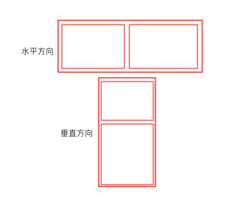
注意一点:在Row中使用Expanded的时候,无法指定Expanded中的子组件的宽度width,但可以指定其高度height。同理,在Column中使用Expanded的时候,无法指定Expanded中的子组件的高度height,可以指定宽度width。
- 构造函数
 const Expanded({
    Key key,
    int flex = 1,
    @required Widget child,
  }) : super(key: key, flex: flex, fit: FlexFit.tight, child: child);
- 介绍:
- FittedBox
- 介绍:
按照其官方的介绍,它主要做了两件事情,缩放(Scale)以及位置调整(Position)。
FittedBox会在自己的尺寸范围内缩放并且调整child位置,使得child适合其尺寸。做过移动端的,可能会联想到ImageView控件,它是将图片在其范围内,按照规则,进行缩放位置调整。FittedBox跟ImageView是有些类似的,可以猜测出,它肯定有一个类似于ScaleType的属性。
- 布局行为:
FittedBox的布局行为还算简单,官方没有给出说明,我在这里简单说一下。由于FittedBox是一个容器,需要让其child在其范围内缩放,因此其布局行为分两种情况:
- 如果外部有约束的话,按照外部约束调整自身尺寸,然后缩放调整child,按照指定的条件进行布局;
- 如果没有外部约束条件,则跟child尺寸一致,指定的缩放以及位置属性将不起作用。
- 继承关系
Object > Diagnosticable > DiagnosticableTree > Widget > RenderObjectWidget > SingleChildRenderObjectWidget > FittedBox
- 构造函数
const FittedBox({
Key key,
this.fit: BoxFit.contain,
this.alignment: Alignment.center,
Widget child,
})
- 参数的含义
fit:缩放的方式,默认的属性是
BoxFit.contain,child在FittedBox范围内,尽可能的大,但是不超出其尺寸。这里注意一点,contain是保持着child宽高比的大前提下,尽可能的填满,一般情况下,宽度或者高度达到最大值时,就会停止缩放。
alignment:对齐方式,默认的属性是
Alignment.center,居中显示child。 - 使用场景
FittedBox在目前的项目中还未用到过。对于需要缩放调整位置处理的,一般都是图片。笔者一般都是使用Container中的decoration属性去实现相应的效果。对于其他控件需要缩放以及调整位置的,目前还没有遇到使用场景,大家只需要知道有这么一个控件,可以实现这个功能即可。
- 介绍:
- Stack
- 介绍:
Stack可以类比web中的absolute,绝对布局。绝对布局一般在移动端开发中用的较少,但是在某些场景下,还是有其作用。当然,能用Stack绝对布局完成的,用其他控件组合也都能实现。 布局行为
布局行为
Stack的布局行为,根据child是positioned还是non-positioned来区分。
- 对于positioned的子节点,它们的位置会根据所设置的top、bottom、right以及left属性来确定,这几个值都是相对于Stack的左上角;
- 对于non-positioned的子节点,它们会根据Stack的aligment来设置位置。
对于绘制child的顺序,则是第一个child被绘制在最底端,后面的依次在前一个child的上面,类似于web中的z-index。如果想调整显示的顺序,则可以通过摆放child的顺序来进行。
- 继承关系
Object > Diagnosticable > DiagnosticableTree > Widget > RenderObjectWidget > MultiChildRenderObjectWidget > Stack
- 构造函数
Stack({
  Key key,
  this.alignment = AlignmentDirectional.topStart,
  this.textDirection,
  this.fit = StackFit.loose,
  this.overflow = Overflow.clip,
  List<Widget> children = const <Widget>[],
})
参数的含义
alignment:对齐方式,默认是左上角(topStart)。
textDirection:文本的方向,绝大部分不需要处理。
fit:定义如何设置non-positioned节点尺寸,默认为loose。
其中StackFit有如下几种:
- loose:子节点宽松的取值,可以从min到max的尺寸;
- expand:子节点尽可能的占用空间,取max尺寸;
- passthrough:不改变子节点的约束条件。
overflow:超过的部分是否裁剪掉(clipped)。
- 介绍:
- IndexedStack
- 介绍:
IndexedStack继承自Stack,它的作用是显示第index个child,其他child都是不可见的。所以IndexedStack的尺寸永远是跟最大的子节点尺寸一致。 - 构造函数
  IndexedStack({
    Key key,
    AlignmentGeometry alignment = AlignmentDirectional.topStart,
    TextDirection textDirection,
    StackFit sizing = StackFit.loose,
    this.index = 0,
    List<Widget> children = const <Widget>[],
  }) : super(key: key, alignment: alignment, textDirection: textDirection, fit: sizing, children: children);
- 参数的含义
- 介绍:
- OverflowBox
- 介绍:
OverflowBox这个控件,允许child超出parent的范围显示,当然不用这个控件,也有很多种方式实现类似的效果。 - 布局行为
当OverflowBox的最大尺寸大于child的时候,child可以完整显示,当其小于child的时候,则以最大尺寸为基准,当然,这个尺寸都是可以突破父节点的。最后加上对齐方式,完成布局。 - 继承关系
Object > Diagnosticable > DiagnosticableTree > Widget > RenderObjectWidget > SingleChildRenderObjectWidget > OverflowBox
- 构造函数
const OverflowBox({
    Key key,
    this.alignment = Alignment.center,
    this.minWidth,
    this.maxWidth,
    this.minHeight,
    this.maxHeight,
    Widget child,
  })
- 参数的含义
alignment:对齐方式。
minWidth:允许child的最小宽度。如果child宽度小于这个值,则按照最小宽度进行显示。
maxWidth:允许child的最大宽度。如果child宽度大于这个值,则按照最大宽度进行展示。
minHeight:允许child的最小高度。如果child高度小于这个值,则按照最小高度进行显示。
maxHeight:允许child的最大高度。如果child高度大于这个值,则按照最大高度进行展示。
其中,最小以及最大宽高度,如果为null的时候,就取父节点的constraint代替。
- 使用场景
有时候设计图上出现的角标,会超出整个模块,可以使用OverflowBox控件。但我们应该知道,不使用这种控件,也可以完成布局,在最外面包一层,也能达到一样的效果。具体实施起来哪个比较方便,同学们自行取舍。
- 介绍:
三,常用示例
- Container
/** * Container 组件 * */ class MyContainer extends StatelessWidget { @override Widget build(BuildContext context) { // TODO: implement build return new Center( child:new Container( child: new Text('Hellow,Flutter——Container'), //定位 padding: const EdgeInsets.all(8.0), alignment: Alignment.center, transform: new Matrix4.rotationZ(0.3), //绘制 decoration: new BoxDecoration( //边框 border: new Border.all( color: Colors.red, 5.0 ),
//背景颜色 color: Colors.grey,
//圆角 borderRadius: new BorderRadius.all(new Radius.circular(20.0)), image: new DecorationImage( image: new NetworkImage('http://h.hiphotos.baidu.com/zhidao/wh%3D450%2C600/sign=0d023672312ac65c67506e77cec29e27/9f2f070828381f30dea167bbad014c086e06f06c.jpg'), centerSlice: new Rect.fromLTRB(270.0, 280.0, 1360.0, 730.0), ), ), //尺寸 200, height: 200, ) , ) ; } }效果图:

源码解析:decoration = decoration ?? (color != null ? new BoxDecoration(color: color) : null),
可以看出,对于颜色的设置,最后都是转换为decoration来进行绘制的。如果同时包含decoration和color两种属性,则会报错。
@override
Widget build(BuildContext context) {
Widget current = child;

if (child == null && (constraints == null || !constraints.isTight)) {
  current = new LimitedBox(
  maxWidth: 0.0,
  maxHeight: 0.0,
  child: new ConstrainedBox(constraints: const BoxConstraints.expand())
 );
}

if (alignment != null)
 current = new Align(alignment: alignment, child: current);

final EdgeInsetsGeometry effectivePadding = _paddingIncludingDecoration;
if (effectivePadding != null)
 current = new Padding(padding: effectivePadding, child: current);

if (decoration != null)
 current = new DecoratedBox(decoration: decoration, child: current);

if (foregroundDecoration != null) {
   current = new DecoratedBox(
   decoration: foregroundDecoration,
   position: DecorationPosition.foreground,
   child: current
  );
}

if (constraints != null)
  current = new ConstrainedBox(constraints: constraints, child: current);

if (margin != null)
  current = new Padding(padding: margin, child: current);

if (transform != null)
  current = new Transform(transform: transform, child: current);

 return current;
}
Container的build函数不长,绘制也是一个线性的判断的过程,一层一层的包裹着widget,去实现不同的样式。
最里层的是child,如果为空或者其他约束条件,则最里层包含的为一个LimitedBox,然后依次是Align、Padding、DecoratedBox、前景DecoratedBox、ConstrainedBox、Padding(实现margin效果)、Transform。
Container的源码本身并不复杂,复杂的是它的各种布局表现。我们谨记住一点,如果内部不设置约束,则按照父节点尽可能的扩大,如果内部有约束,则按照内部来。
- Center
/**
 * Center
 */

class MyCenter extends StatelessWidget {
  //不用center组件
  Widget text = new Text(
      '不包含center'
  );
  //包含center组件
  Widget center = new Center(
    child: new Text(
      '包含center组件'
    ),
  );

  @override
  Widget build(BuildContext context) {
    // TODO: implement build
    return text;
  }
}
效果图:

源码解析:
Center继承自Align,只不过是将alignment设置为Alignment.center,其他属性例如widthFactor、heightFactor,布局行为,都与Align完全一样。Center源码如下,没有设置alignment属性,是因为Align默认的对齐方式就是居中。
class Center extends Align {
/// Creates a widget that centers its child.
const Center({ Key key, double widthFactor, double heightFactor, Widget child })
: super(key: key, widthFactor: widthFactor, heightFactor: heightFactor, child: child);
}
- Padding
/**
 * Padding
 */

class MyPadding extends StatelessWidget {
  @override
  Widget build(BuildContext context) {
    // TODO: implement build
    return new Padding(
      padding: new EdgeInsets.all(8.0),
      child: const Card(
        child: const Text('Flutter布局组件--Padding'),
      ),
    );
  }
}
效果图
源码解析: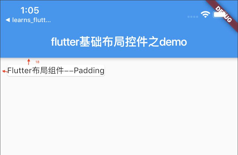
@override
 RenderPadding createRenderObject(BuildContext context) {
 return new RenderPadding(
   padding: padding,
   textDirection: Directionality.of(context),
 );
}
Padding的创建函数,实际上是由RenderPadding来进行的。
关于RenderPadding的实际布局表现,当child为null的时候:
if (child == null) {
 size = constraints.constrain(new Size(
 _resolvedPadding.left + _resolvedPadding.right,
 _resolvedPadding.top + _resolvedPadding.bottom
));
return;
}
返回一个宽为_resolvedPadding.left+_resolvedPadding.right,高为_resolvedPadding.top+_resolvedPadding.bottom的区域。
当child不为null的时候,经历了三个过程,即调整child尺寸、调整child位置以及调整Padding尺寸,最终达到实际的布局效果。
// 调整child尺寸
final BoxConstraints innerConstraints = constraints.deflate(_resolvedPadding);
child.layout(innerConstraints, parentUsesSize: true);

// 调整child位置
final BoxParentData childParentData = child.parentData;
childParentData.offset = new Offset(_resolvedPadding.left, _resolvedPadding.top);

// 调整Padding尺寸
size = constraints.constrain(new Size(
_resolvedPadding.left + child.size.width + _resolvedPadding.right,
_resolvedPadding.top + child.size.height + _resolvedPadding.bottom
));
到此处,上面介绍的padding布局行为就解释的通了。
- Align
/**
 * Align
 * 设置一个宽高为child两倍区域的Align,其child处在正中间。
 */
class MyAlign extends StatelessWidget {
  @override
  Widget build(BuildContext context) {
    // TODO: implement build
    return new Align(
      alignment: Alignment.center,
      widthFactor: 2.0,
      heightFactor: 2.0,
      child: new Text("flutter布局组件之Align"),
    );
  }
}
效果图:

源码解析:@override RenderPositionedBox createRenderObject(BuildContext context) { return new RenderPositionedBox( alignment: alignment, widthFactor: widthFactor, heightFactor: heightFactor, textDirection: Directionality.of(context), ); }
Align的实际构造调用的是RenderPositionedBox。
RenderPositionedBox的布局表现如下:
// 根据_widthFactor、_heightFactor以及限制因素来确定宽高
final bool shrinkWrapWidth = _widthFactor != null || constraints.maxWidth == double.infinity;
final bool shrinkWrapHeight = _heightFactor != null || constraints.maxHeight == double.infinity;

if (child != null) {
// 如果child不为null,则根据规则设置Align的宽高,如果需要缩放,则根据_widthFactor是否为null来进行缩放,如果不需要,则尽量扩展。
child.layout(constraints.loosen(), parentUsesSize: true);
size = constraints.constrain(new Size(shrinkWrapWidth ? child.size.width * (_widthFactor ?? 1.0) : double.infinity,
shrinkWrapHeight ? child.size.height * (_heightFactor ?? 1.0) : double.infinity));
alignChild();
} else {
// 如果child为null,如果需要缩放,则变为0,否则就尽量扩展
size = constraints.constrain(new Size(shrinkWrapWidth ? 0.0 : double.infinity,
shrinkWrapHeight ? 0.0 : double.infinity));
}
- Colum
/**
 * Column
 * 使用Expanded控件,将一行的宽度分成四个等分,第一、三个child占1/4的区域,第二个child占1/2区域,由flex属性控制。
 */

class MyColumn extends StatelessWidget  {
  @override
  Widget build(BuildContext context) {
    // TODO: implement build
    return new Column(
      children: <Widget>[
        new Expanded(
          child: new Container(
            color: Colors.red,
            padding: EdgeInsets.all(5.0),
          ),
          flex: 1,
        ),
        new Expanded(
          child: new Container(
            color: Colors.yellow,
            padding: EdgeInsets.all(5.0),
          ),
          flex: 2,
        ),
        new Expanded(
          child: new Container(
            color: Colors.blue,
            padding: EdgeInsets.all(5.0),
          ),
          flex: 1,
        )
      ],
    );
  }
}
效果图:
源码解析:
和Row类似,参考Row - Row
/**
 * Row
 *  使用Expanded控件,将水平方向一行的宽度分成四个等分,第一、三个child占1/4的区域,第二个child占1/2区域,由flex属性控制。
 */
class MyRow extends StatelessWidget {
  @override
  Widget build(BuildContext context) {
    // TODO: implement build
    return new Row(
      children: <Widget>[
        new Expanded(
          flex: 1,
          child: new Container(
            color: Colors.red,
            padding: EdgeInsets.all(5.0),
          ),
        ),
        new Expanded(
          flex: 2,
          child: new Container(
            color: Colors.yellow,
            padding: EdgeInsets.all(5.0),
          ) ,
        ),
        new Expanded(
          flex: 1,
          child: new Container(
            color: Colors.blue,
            padding: EdgeInsets.all(5.0),
          ),
        )
      ],
    );
  }
}
效果图:

原理图:Row以及Column的源代码就一个构造函数,具体的实现全部在它们的父类Flex中。
关于Flex的构造函数
Flex({
Key key,
@required this.direction,
this.mainAxisAlignment = MainAxisAlignment.start,
this.mainAxisSize = MainAxisSize.max,
this.crossAxisAlignment = CrossAxisAlignment.center,
this.textDirection,
this.verticalDirection = VerticalDirection.down,
this.textBaseline,
List<Widget> children = const <Widget>[],
})
可以看出,Flex的构造函数就比Row和Column的多了一个参数。Row跟Column的区别,正是这个direction参数的不同。当为Axis.horizontal的时候,则是Row,当为Axis.vertical的时候,则是Column。
我们来看下Flex的布局函数,由于布局函数比较多,因此分段来讲解:
while (child != null) {
 final FlexParentData childParentData = child.parentData;
 totalChildren++;
 final int flex = _getFlex(child);
if (flex > 0) {
  totalFlex += childParentData.flex;
  lastFlexChild = child;
} else {
 BoxConstraints innerConstraints;
 if (crossAxisAlignment == CrossAxisAlignment.stretch) {
  switch (_direction) {
   case Axis.horizontal:
    innerConstraints = new BoxConstraints(minHeight: constraints.maxHeight,
    maxHeight: constraints.maxHeight);
    break;
   case Axis.vertical:
    innerConstraints = new BoxConstraints(minWidth: constraints.maxWidth,
    maxWidth: constraints.maxWidth);
   break;
 }
} else {
 switch (_direction) {
  case Axis.horizontal:
    innerConstraints = new BoxConstraints(maxHeight: constraints.maxHeight);
   break;
  case Axis.vertical:
  innerConstraints = new BoxConstraints(maxWidth: constraints.maxWidth);
   break;
 }
}
child.layout(innerConstraints, parentUsesSize: true);
allocatedSize += _getMainSize(child);
crossSize = math.max(crossSize, _getCrossSize(child));
}
child = childParentData.nextSibling;
}
上面这段代码,我把中间的一些assert以及错误信息之类的代码剔除了,不影响实际的理解。
在布局的开始,首先会遍历一遍child,遍历的作用有两点:
对于存在flex值的child,计算出flex的和,找到最后一个包含flex值的child。找到这个child,是因为主轴对齐方式,可能会对它的位置做调整,需要找出来;
对于不包含flex的child,根据交叉轴方向的设置,对child进行调整。final double freeSpace = math.max(0.0, (canFlex ? maxMainSize : 0.0) - allocatedSize); if (totalFlex > 0 || crossAxisAlignment == CrossAxisAlignment.baseline) { final double spacePerFlex = canFlex && totalFlex > 0 ? (freeSpace / totalFlex) : double.nan; child = firstChild; while (child != null) { final int flex = _getFlex(child); if (flex > 0) { final double maxChildExtent = canFlex ? (child == lastFlexChild ? (freeSpace - allocatedFlexSpace) : spacePerFlex * flex) : double.infinity; double minChildExtent; switch (_getFit(child)) { case FlexFit.tight: assert(maxChildExtent < double.infinity); minChildExtent = maxChildExtent; break; case FlexFit.loose: minChildExtent = 0.0; break; } BoxConstraints innerConstraints; if (crossAxisAlignment == CrossAxisAlignment.stretch) { switch (_direction) { case Axis.horizontal: innerConstraints = new BoxConstraints(minWidth: minChildExtent, maxWidth: maxChildExtent, minHeight: constraints.maxHeight, maxHeight: constraints.maxHeight); break; case Axis.vertical: innerConstraints = new BoxConstraints(minWidth: constraints.maxWidth, maxWidth: constraints.maxWidth, minHeight: minChildExtent, maxHeight: maxChildExtent); break; } } else { switch (_direction) { case Axis.horizontal: innerConstraints = new BoxConstraints(minWidth: minChildExtent, maxWidth: maxChildExtent, maxHeight: constraints.maxHeight); break; case Axis.vertical: innerConstraints = new BoxConstraints(maxWidth: constraints.maxWidth, minHeight: minChildExtent, maxHeight: maxChildExtent); break; } } child.layout(innerConstraints, parentUsesSize: true); final double childSize = _getMainSize(child); allocatedSize += childSize; allocatedFlexSpace += maxChildExtent; crossSize = math.max(crossSize, _getCrossSize(child)); } if (crossAxisAlignment == CrossAxisAlignment.baseline) { final double distance = child.getDistanceToBaseline(textBaseline, onlyReal: true); if (distance != null) maxBaselineDistance = math.max(maxBaselineDistance, distance); } final FlexParentData childParentData = child.parentData; child = childParentData.nextSibling; } }
上面的代码段所做的事情也有两点:
(1)为包含flex的child分配剩余的空间
(2)对于每份flex所对应的空间大小,它的计算方式如下:final double freeSpace = math.max(0.0, (canFlex ? maxMainSize : 0.0) - allocatedSize);
final double spacePerFlex = canFlex && totalFlex > 0 ? (freeSpace / totalFlex) : double.nan;
其中,allocatedSize是不包含flex所占用的空间。当每一份flex所占用的空间计算出来后,则根据交叉轴的设置,对包含flex的child进行调整。计算出baseline值
如果交叉轴的对齐方式为baseline,则计算出最大的baseline值,将其作为整体的baseline值。switch (_mainAxisAlignment) { case MainAxisAlignment.start: leadingSpace = 0.0; betweenSpace = 0.0; break; case MainAxisAlignment.end: leadingSpace = remainingSpace; betweenSpace = 0.0; break; case MainAxisAlignment.center: leadingSpace = remainingSpace / 2.0; betweenSpace = 0.0; break; case MainAxisAlignment.spaceBetween: leadingSpace = 0.0; betweenSpace = totalChildren > 1 ? remainingSpace / (totalChildren - 1) : 0.0; break; case MainAxisAlignment.spaceAround: betweenSpace = totalChildren > 0 ? remainingSpace / totalChildren : 0.0; leadingSpace = betweenSpace / 2.0; break; case MainAxisAlignment.spaceEvenly: betweenSpace = totalChildren > 0 ? remainingSpace / (totalChildren + 1) : 0.0; leadingSpace = betweenSpace; break; }
然后,就是将child在主轴方向上按照设置的对齐方式,进行位置调整。上面代码就是计算前后空白区域值的过程,可以看出spaceBetween、spaceAround以及spaceEvenly的差别。
double childMainPosition = flipMainAxis ? actualSize - leadingSpace : leadingSpace;
child = firstChild;
while (child != null) {
final FlexParentData childParentData = child.parentData;
double childCrossPosition;
switch (_crossAxisAlignment) {
case CrossAxisAlignment.start:
case CrossAxisAlignment.end:
childCrossPosition = _startIsTopLeft(flipAxis(direction), textDirection, verticalDirection)
== (_crossAxisAlignment == CrossAxisAlignment.start)
? 0.0
: crossSize - _getCrossSize(child);
break;
case CrossAxisAlignment.center:
childCrossPosition = crossSize / 2.0 - _getCrossSize(child) / 2.0;
break;
case CrossAxisAlignment.stretch:
childCrossPosition = 0.0;
break;
case CrossAxisAlignment.baseline:
childCrossPosition = 0.0;
if (_direction == Axis.horizontal) {
assert(textBaseline != null);
final double distance = child.getDistanceToBaseline(textBaseline, onlyReal: true);
if (distance != null)
childCrossPosition = maxBaselineDistance - distance;
}
break;
}
if (flipMainAxis)
childMainPosition -= _getMainSize(child);
switch (_direction) {
case Axis.horizontal:
childParentData.offset = new Offset(childMainPosition, childCrossPosition);
break;
case Axis.vertical:
childParentData.offset = new Offset(childCrossPosition, childMainPosition);
break;
}
if (flipMainAxis) {
childMainPosition -= betweenSpace;
} else {
childMainPosition += _getMainSize(child) + betweenSpace;
}
child = childParentData.nextSibling;
}
最后,则是根据交叉轴的对齐方式设置,对child进行位置调整,到此,布局结束。
我们可以顺一下整体的流程:
计算出flex的总和,并找到最后一个设置了flex的child;
对不包含flex的child,根据交叉轴对齐方式,对齐进行调整,并计算出主轴方向上所占区域大小;
计算出每一份flex所占用的空间,并根据交叉轴对齐方式,对包含flex的child进行调整;
如果交叉轴设置为baseline对齐,则计算出整体的baseline值;
按照主轴对齐方式,对child进行调整;
最后,根据交叉轴对齐方式,对所有child位置进行调整,完成布局。 - Expanded
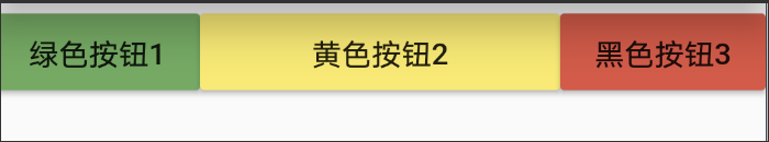
class MyHomePage extends StatelessWidget {
  ....
  body:new RowWidget(),
  ...
}
class RowWidget extends StatelessWidget{
  @override
  Widget build(BuildContext context){
    return Row(
        children: <Widget>[
          new RaisedButton(
              onPressed: (){

              },
              color:Colors.green,
              child:new Text('绿色按钮1')
          ),
          new Expanded(
            child:new RaisedButton(
              onPressed: (){

              },
              color:Colors.yellow,
              child:new Text('黄色按钮2')
            ),
          ),
          new RaisedButton(
              onPressed:(){

              },
              color:Colors.red,
              child:new Text('黑色按钮3')),
      ],
    );
  }
}
效果图:
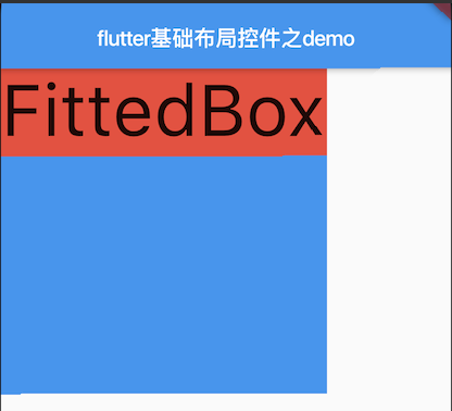
- FittedBox
/**
 * Fitted Box
 * 加入Container是为了加颜色显示两个区域,读者可以试着修改fit以及alignment查看其不同的效果。
 * 类似于其它移动端的imageView的contentView属性
 */

class MyFittedBox extends StatelessWidget  {
  @override
  Widget build(BuildContext context) {
    // TODO: implement build
    return new Container(
       300.0,
      height: 300.0,
      color: Colors.blue,
      child: new FittedBox(
        fit: BoxFit.contain,
        alignment: Alignment.topLeft,
        child: new Container(
          color: Colors.red,
          child: new Text('FittedBox'),
        ),
      ),
    );
  }
}
效果图:
源码解析:@override RenderFittedBox createRenderObject(BuildContext context) { return new RenderFittedBox( fit: fit, alignment: alignment, textDirection: Directionality.of(context), ); }
FittedBox具体实现是由RenderFittedBox进行的。不知道读者有没有发现,目前的一些基础控件,继承自RenderObjectWidget的,widget本身都只是存储了一些配置信息,真正的绘制渲染,则是由内部的createRenderObject所调用的RenderObject去实现的。
RenderFittedBox具体的布局代码如下:
if (child != null) {
  child.layout(const BoxConstraints(), parentUsesSize: true);
  // 如果child不为null,则按照child的尺寸比率缩放child的尺寸
  size = constraints.constrainSizeAndAttemptToPreserveAspectRatio(child.size);
  _clearPaintData();
 } else {
  // 如果child为null,则按照最小尺寸进行布局
  size = constraints.smallest;
}
- Stack
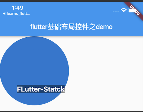
/**
 * Stack
 */

class MyStack extends StatelessWidget {
  @override
  Widget build(BuildContext context) {
    // TODO: implement build
    return new Stack(
      alignment: const Alignment(0.6, 0.6),
      children: <Widget>[
        new CircleAvatar(
          backgroundImage: AssetImage('a'),
          radius: 100.0,
        ),
        new Container(
          decoration: BoxDecoration(
            color: Colors.black45,
          ),
          child: new Text(
            'FLutter-Statck',
            style:new TextStyle(
              fontSize:20.0,
              fontWeight:FontWeight.bold,
              color:Colors.white
            ),
          ),
        )
      ],
    );
  }
}
效果图:
源码解析:
(1)Stack的布局代码有些长,在此分段进行讲解。
如果不包含子节点,则尺寸尽可能大。
if (childCount == 0) {
  size = constraints.biggest;
  return;
}
(2)根据fit属性,设置non-positioned子节点约束条件。
switch (fit) {
 case StackFit.loose:
   nonPositionedConstraints = constraints.loosen();
   break;
 case StackFit.expand:
   nonPositionedConstraints = new BoxConstraints.tight(constraints.biggest);
   break;
 case StackFit.passthrough:
   nonPositionedConstraints = constraints;
   break;
}
(3)对non-positioned子节点进行布局。
RenderBox child = firstChild;
while (child != null) {
final StackParentData childParentData = child.parentData;
if (!childParentData.isPositioned) {
  hasNonPositionedChildren = true;
  child.layout(nonPositionedConstraints, parentUsesSize: true);
  final Size childSize = child.size;
  width = math.max(width, childSize.width);
  height = math.max(height, childSize.height);
}
  child = childParentData.nextSibling;
}
(4).根据是否包含positioned子节点,对stack进行尺寸调整。
if (hasNonPositionedChildren) {
  size = new Size(width, height);
} else {
  size = constraints.biggest;
}
(5).最后对子节点位置的调整,这个调整过程中,则根据alignment、positioned节点的绝对位置等信息,对子节点进行布局。
第一步是根据positioned的绝对位置,计算出约束条件后进行布局。
if (childParentData.left != null && childParentData.right != null)
   childConstraints = childConstraints.tighten( size.width - childParentData.right - childParentData.left);
else if (childParentData.width != null)
   childConstraints = childConstraints.tighten( childParentData.width);

if (childParentData.top != null && childParentData.bottom != null)
   childConstraints = childConstraints.tighten(height: size.height - childParentData.bottom - childParentData.top);
else if (childParentData.height != null)
   childConstraints = childConstraints.tighten(height: childParentData.height);

child.layout(childConstraints, parentUsesSize: true);
第二步则是位置的调整,其中坐标的计算如下:
double x;
if (childParentData.left != null) {
  x = childParentData.left;
} else if (childParentData.right != null) {
  x = size.width - childParentData.right - child.size.width;
} else {
  x = _resolvedAlignment.alongOffset(size - child.size).dx;
}

if (x < 0.0 || x + child.size.width > size.width)
  _hasVisualOverflow = true;

double y;
if (childParentData.top != null) {
  y = childParentData.top;
} else if (childParentData.bottom != null) {
  y = size.height - childParentData.bottom - child.size.height;
} else {
  y = _resolvedAlignment.alongOffset(size - child.size).dy;
}

if (y < 0.0 || y + child.size.height > size.height)
 _hasVisualOverflow = true;

childParentData.offset = new Offset(x, y);
- IndexedStack
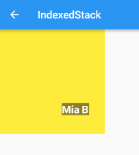
class MyIndexedStack extends StatelessWidget {
  @override
  Widget build(BuildContext context) {
    return new Container(
      color: Colors.yellow,
      child: IndexedStack(
        index: 1,
        alignment: const Alignment(0.6, 0.6),
        children: <Widget>[
          new CircleAvatar(
            backgroundImage: AssetImage('1'),
            radius: 100.0,
          ),
          new Container(
            decoration: new BoxDecoration(
              color: Colors.black45,
            ),
            child: new Text(
              'Flutter--Demo',
              style:new TextStyle(
                fontSize: 20.0,
                fontWeight: FontWeight.bold,
                color: Colors.white,
              )
            ),
          )
        ],
      ),
    );
  }
}
效果图:
源码分析:其绘制代码很简单,因为继承自Stack,布局方面表现基本一致,不同之处在于其绘制的时候,只是将第Index个child进行了绘制。
@override
void paintStack(PaintingContext context, Offset offset) {
 if (firstChild == null || index == null) return;
   final RenderBox child = _childAtIndex();
   final StackParentData childParentData = child.parentData;
   context.paintChild(child, childParentData.offset + offset);
}
- OverflowBox
Container(
  color: Colors.green,
   200.0,
  height: 200.0,
  padding: const EdgeInsets.all(5.0),
  child: OverflowBox(
    alignment: Alignment.topLeft,
    maxWidth: 300.0,
    maxHeight: 500.0,
    child: Container(
      color: Color(0x33FF00FF),
       400.0,
      height: 400.0,
    ),
  ),
)
效果图:
源码解析: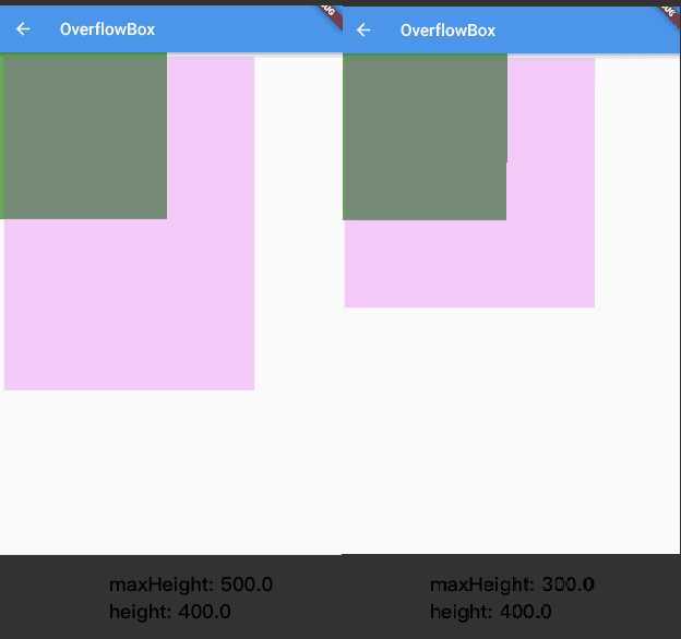
OverflowBox的源码很简单,我们先来看一下布局代码:
if (child != null) {
 child.layout(_getInnerConstraints(constraints), parentUsesSize: true);
 alignChild();
}
如果child不为null,child则会按照计算出的constraints进行尺寸的调整,然后对齐。
至于constraints的计算,则还是上面的逻辑,如果设置的有的话,就取这个值,如果没有的话,就拿父节点的。
四,参考
《Flutter学习之认知基础组件》
《Flutter布局》