美化盒子
一、美化文本
第一部分
1、字体大小:font-size
含义:字符框的高度,可继承,默认值:medium
取值:
1、预设值:medium:中等字号
larger:大字号
smaller:小字号
2、数值:px【常用】:绝对字体大小
em【常用】:相对于父元素的字体大小,若没有父元素,则使用基准字号
%:原理同em,例如200%,相当于2em,50%,相当于.5em
rem:相对于基准字号
2、加粗字体:font-weight
将font-weight 设置为 bold ,以加粗文字,该属性可继承
3、倾斜字体:font-style
将font-style设置为italic,以倾斜文字,该属性可继承
4、字间距:letter-spacing
设置letter-spacing的值为px或em,可控制文字间的间隙,该属性可继承
5、首行缩进:text-indent
可实现第一个文字向后缩进
6、给文字划线:text-decoration
设置text-decoration属性,可以给文字划线
text-decoration:none:默认值,没有下划线
text-decoration:overline:文字顶部划线
text-decoration:underline:文字底部划线
text-decoration:line-through 文字中部划线 删除线
del元素:用于表达不精确的内容。浏览器默认样式表中,对该元素会使用【text-decoration:line-through】
第二部分
1、修饰首行:伪元素选择器 ::first-line
::first-line可选中元素中的第一行文字
2、修饰选中文字:伪元素选择器 ::selection
::selection可选中被用户框选的文字
3、字体类型
概念:衬线字体和非衬线字体
非衬线字体(sans-serif)文字边缘未经过修饰,在电子设备上视觉效果
衬线字体(serif)文字边缘经过修饰,在纸张上视觉效果良好
修改字体类型font-family
该元素的字体设置:【font-family: "翩翩体-简","consolas","sans-serif"】
设置font-family的时候,可设置多个值
浏览器会依次读取设置的值,若一个值失效,则读取下一个值
因此,为了避免全部都失效的情况,通常将最后一个值设置为"sans-serif"或"serif"
由于font-family属性是可继承的属性,并且一个网页通常情况下字体都是统一的,因此,通常对body元素使用font-family属性即可
使用【@font-face指令】加载web字体
使用图标字体
二、美化边框
1、圆角边框border-radius
事实上,border-radius是一个速写属性,真实的属性如下:
border-top-left-radius:左上角样式
border-top-right-radius:右上角样式
border-bottom-left-radius:左下角样式
border-bottom-right-radius:右下角样式
但通常情况下,我们都是使用border-radius进行统一设置。
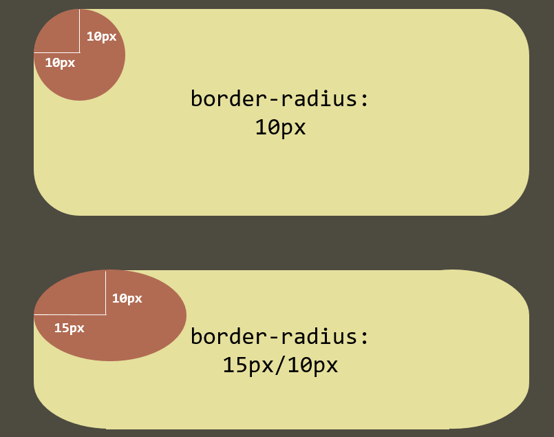
圆角边框原理图
2、使用圆角边框的常见场景
1、普通的圆角边框
2、圆形边框
3、圆形图片
三、美化背景
1、背景图:
1、使用【background-image】设置背景图片
2、使用【background-repeat】设置图片重复方式
1、repeat:【默认值】从左到右从上到下重复
2、no-repeat:不重复
3、repeat-x:仅在x轴方向上重复
4、repeat-y:仅在y轴方向上重复
3、使用【background-position】设置图片在边框盒中的位置
预设值:
background-position:left top;背景图位于左上
background-position:center bottom;背景图位于水平居中底部
background-position:center center;背景图居中
数值:
background-position:20px 10px;距离左边20px ,顶部10px
background-position:-20px 10px 超出左边20px 顶部10px
使用数值可实现从雪碧图(Sprite)中取得部分图像
4、使用【background-size】设置背景图尺寸
预设值:
background-size:contain;图片占满块的一边就停止
background-size:cover;图片占满整个块
background-size:200px 200px 图片长宽为200px
background-size:100% 100% 图片为占满整个块
background-size:100% auto 长度为块的长度,高度自适应
5、使用【background-attachment】固定背景图
scroll:【默认值】背景图跟随元素移动
fixed:背景图固定
6、使用速写属性【background】统一设置
background:背景图 位置 / 尺寸 重复方式 固定方式 背景颜色
7、使用多背景图
示例:
background:    url("imgs/scroll_top.jpg") no-repeat ,
url("imgs/scroll_middle.jpg") repeat-y,
url("imgs/scroll_bottom.jpg") no-repeat
;
2、背景渐变
1、线性渐变:【background-image:linear-gradient(...)】
2、径向渐变(圆形渐变):【background-image:radial-gradient(...)】
示例:
<style type="text/css">
p{clear: both;}
div{outline: 5px solid #000; width: 400px; height: 300px; float: left; margin: 10px; text-align: center; line-height: 2; font-size:20px; color:#fff;}
.c1{background-image:linear-gradient(to right, red, blue);}
.c2{background-image:linear-gradient(to bottom, red, blue);}
.c3{background-image:linear-gradient(45deg, red, blue);}
.c4{background-image:linear-gradient(to right, red, blue, green);}
.c5{background-image:linear-gradient(to right, red, blue 130px, green 200px);}
.c6{background-image:linear-gradient(to bottom, red, red 50%, blue 50%);}
.c7{background-image:repeating-linear-gradient(to right, red, blue 50px, red 100px);}
.c8{background-image:repeating-linear-gradient(to right, red, red 50px, blue 50px, blue 100px);}

</style>
</head>
<body>
<div class="c1">background-image:<br>linear-gradient(to right, red, blue);</div>
<div class="c2">background-image:<br>linear-gradient(to bottom, red, blue);</div>
<div class="c3">background-image:<br>linear-gradient(45deg, red, blue);
<br>
<img src="imgs/deg.png" style="300px;">
</div>
<p></p>
<div class="c4">background-image:<br>linear-gradient(to right, red, blue, green);</div>
<div class="c5">background-image:<br>linear-gradient(to right, <br>red, <br>blue 130px, <br>green 200px);</div>
<div class="c6">background-image:<br>linear-gradient(to bottom, <br>red, <br>blue 50%, <br>green 50%);</div>
<p></p>
<div class="c7">background-image:<br>repeating-linear-gradient(to right,<br>red, <br>blue 50px, <br>red 100px);</div>
<div class="c8">background-image:<br>repeating-linear-gradient(to right, <br>red, <br>red 50px, <br>blue 50px, <br>blue 100px)</div>

</body>
</html>
**四、透明度和鼠标样式**
1、透明度【opacity】和alpha通道
2、鼠标样式
示例:
<style type="text/css">
body{background:url("imgs/bg.jpg");}
div{border: 10px solid #000; width: 600px; float: left; height: 300px; margin: 10px; text-align: center; line-height: 2; font-size:20px; color:#fff; background: red;}
.c1{opacity: 0.5}
.c2{background:rgba(255,0,0,0.5);
border-color:rgba(0,0,0,0.6);
color:rgba(255,255,255,0.8);}
</style>
</head>
<body>
<div class="c1">
使用【opacity】属性,<br>
可调整整个盒子的透明度<br>
该属性的取值范围是0~1 <br>
其中,0表示全透明,1表示完全不透明
</div>
<div class="c2">
使用rgba颜色,可调整某个颜色的透明度,<br>
rgba分别表示:
r:red,g:green,b:blue,a:alpha<br>
书写格式为:rgba(red, green, blue, alpha)<br>
其中,alpha表示透明通道,取值是0~1之间<br>
0表示全透明,1表示完全不透明<br>
也可以用十六进制表示,例如rgba(0,0,0,0.5)可以写成#00000080
</div>
<div class="">

</div>

</body>
</html>
**五、阴影**
1、文字阴影【text-shadow】
text-shadow: 2px 2px 4px rgba(0,0,0,.5)
第1个参数:2px,表示阴影的位置向x轴方向(横坐标)的偏移量为2px
第2个参数:2px,表示阴影的位置向y轴方向(横坐标)的偏移量为2px
第3个参数:4px,表示阴影的模糊半径,该数值越大,阴影越模糊
第4个参数:rgba(0,0,0,.5),表示阴影的颜色
2、盒子阴影【box-shadow】
box-shadow: 4px 5px 6px rgba(0,0,0,.5)
box-shadow和text-shadow的用法非常类似
它的4个参数分别表示:x轴的偏移量、y轴的偏移量、模糊半径、阴影颜色
box-shadow: 4px 5px 6px 7px rgba(0,0,0,.5)
多了一个参数,最后一个 7px 表示阴影的扩散半径,该值越大,阴影越大
使用该方式可制作一个以盒子为中心的扩散阴影
box-shadow: 0px 0px 6px 7px rgba(0,0,0,.5)
box-shadow: inset 0px 0px 10px 5px rgba(0,0,0,.5)
加入 inset 关键字,可将阴影的扩散方向由向外变为向内