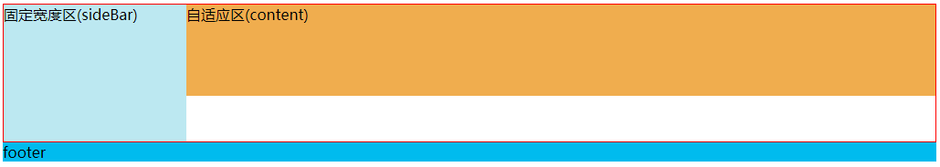
HTML布局:
<div class="outer">
    <div class="sidebar">固定宽度区(sideBar)</div>
     <div class="content">自适应区(content)</div>
</div>
<div class="footer">footer</div>
常见的方法:
1、将左侧div浮动,右侧div设置margin-left
/*方法1*/
.outer{overflow: hidden; border: 1px solid red;}
.sidebar{float: left;200px;height: 150px; background: #BCE8F1;}
.content{margin-left:200px;height:100px;background: #F0AD4E;}
2、固定区采用绝对定位,自适应区设置margin
/*方法2*/
.outer2{position: relative;height:150px; border: 1px solid red;}
.sidebar2{position: absolute;left: 0;top:0;200px;height:100%;background: #BCE8F1;}
.content2{margin-left:200px;height:100px;background: #F0AD4E;}
缺点:
使用了绝对定位,若是用在某个div中,需要更改父容器的position。
没有清除浮动的方法,若左侧盒子高于右侧盒子,就会超出父容器的高度。因此只能通过设置父容器的min-height来放置这种情况。
3、标准浏览器的方法
/*方法3*/
.outer3{display: table;100%; border: 1px solid red;}
.sidebar3{display:table-cell;200px;height:150px;background: #BCE8F1;}
.content3{display:table-cell;height:100px;background: #F0AD4E;}
4、双float + calc()计算属性
/*方法4*/
.outer4{overflow: hidden; border: 1px solid red;}
.sidebar4{float:left;200px;height:150px;background: #BCE8F1;}
.content4{float:left;calc(100% - 200px);height:100px;background: #F0AD4E;}
5、双inline-block + calc()计算属性
/*方法5*/
.outer5{box-sizing: content-box;font-size: 0; border: 1px solid red;}
.sidebar5,.content5{display: inline-block;vertical-align: top;box-sizing: border-box; 200px;
 height:150px; background: #BCE8F1;font-size: 14px;}
.outer5 .content5{calc(100% - 200px);height:100px;background: #F0AD4E;}
这种方法是通过 calc(100% - 140px)来动态计算右侧盒子的宽度。需要知道右侧盒子距离左边的距离,以及左侧盒子具体的
宽度(content+padding+border),以此计算父容器宽度的100%需要减去的数值。同时,还需要知道右侧盒子的宽度是否包含border
的宽度。
在这里,为了简单的计算右侧盒子准确的宽度,设置了子元素的box-sizing:border-box;以及父元素的box-sizing: content-box;。
同时,作为两个inline-block的盒子,必须设置vertical-align来使其顶端对齐。
另外,为了准确地应用计算出来的宽度,需要消除div之间的空格,需要通过设置父容器的font-size: 0;,或者用注释消除html中的空格等方法。
缺点:
需要知道左侧盒子的宽度,两个盒子的距离,还要设置各个元素的box-sizing
需要消除空格字符的影响
需要设置vertical-align: top满足顶端对齐。
6、float + BFC方法(理解CSS布局和BFC =》 https://www.w3cplus.com/css/understanding-css-layout-block-formatting-context.html)
/*方法6*/
.outer6{overflow: auto; border: 1px solid red;}
.sidebar6{float: left;height:150px;background: #BCE8F1;}
.content6{overflow:auto;height:100px;background: #F0AD4E;}
这个方案同样是利用了左侧浮动,但是右侧盒子通过overflow: auto;形成了BFC,因此右侧盒子不会与浮动的元素重叠。
7、flex
/*方法7*/
.outer7{display: flex; border: 1px solid red;}
.sidebar7{flex:0 0 200px;height:150px;background: #BCE8F1;}
.content7{flex: 1;height:100px;background: #F0AD4E;}
lex可以说是最好的方案了,代码少,使用简单。但存在兼容性,有朝一日,大家都改用现代浏览器,就可以使用了。
需要注意的是,flex容器的一个默认属性值:align-items: stretch;。这个属性导致了列等高的效果。
为了让两个盒子高度自动,需要设置: align-items: flex-start;