量化投资与Python——Matplotlib
简介

案例
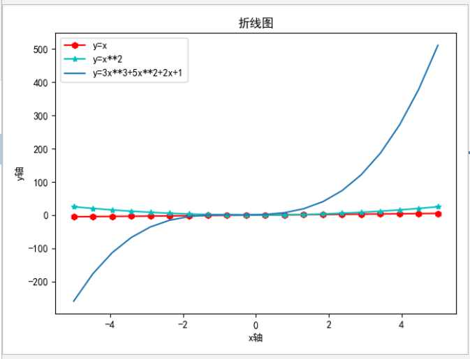
案例一:常用函数

import matplotlib.pyplot as plt
import numpy as np

plt.rcParams['font.sans-serif'] = ['SimHei']  # 用来正常显示中文标签
plt.rcParams['axes.unicode_minus'] = False  # 用来正常显示负号

x = np.linspace(-5, 5, 20)
y1 = x
y2 = x ** 2
y3 = 3 * x ** 3 + 5 * x ** 2 + 2 * x + 1
plt.plot(x, y1, 'h-r', label='y=x')
plt.plot(x, y2, '*-c', label='y=x**2')
plt.plot(x, y3, label='y=3x**3+5x**2+2x+1')
plt.title('折线图')
plt.xlabel('x轴')
plt.ylabel('y轴')
# plt.xlim(0, 10)  # x轴的范围
# plt.ylim(0, 10)  # x轴的范围
# plt.xticks(np.arange(0, 10, 3))  # 刻度、步长
# plt.yticks(np.arange(0, 10, 3))  # 刻度、步长
plt.legend()  # 设置曲线图例说明

plt.show()
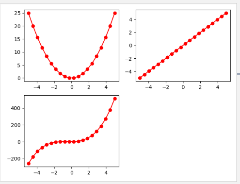
案例二:画布
x = np.linspace(-5, 5, 20)
y1 = x
y2 = x ** 2
y3 = 3 * x ** 3 + 5 * x ** 2 + 2 * x + 1
fig = plt.figure()
ax1 = fig.add_subplot(2, 2, 1)
ax1.plot(x, y2, 'o-r')
fig.show()

ax2 = fig.add_subplot(2, 2, 2)
ax2.plot(x, y1, 'o-r', label='y=x')
fig.show()

ax3 = fig.add_subplot(2, 2, 3)
ax3.plot(x, y3, 'o-r', label='y=x')
fig.show()
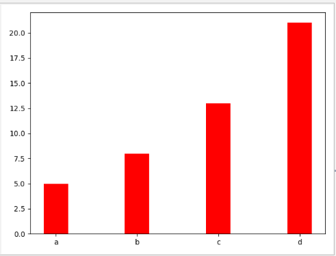
案例四:柱状图与饼状图 (bar、pie)
# 柱状图
data = [5, 8, 13, 21]
label = ['a', 'b', 'c', 'd']
plt.bar(np.arange(len(data)), data, align='center', color='red', width=0.3) # 默认 align='center' width=0.8
plt.xticks(np.arange(len(data)), labels=label)
plt.show()
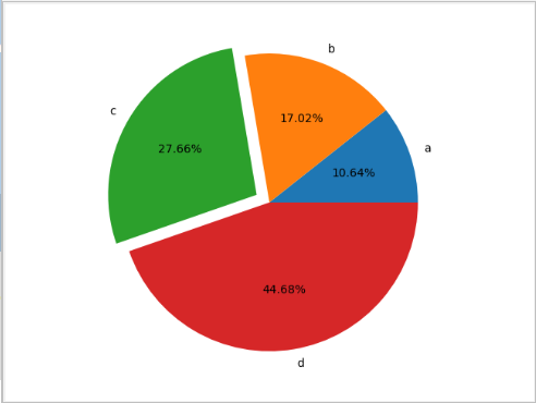
# 饼状图
data = [5, 8, 13, 21]
label = ['a', 'b', 'c', 'd']
plt.pie(data,labels=label,autopct='%.2f%%',explode=[0,0,0.1,0])# .2 表示保留两位小数
# plt.axis('equal') # 是图竖起来
plt.show()
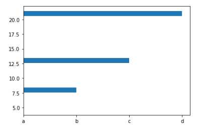
案例五:绘制横向柱状图 barh
import matplotlib.pyplot as plt
import numpy as np
x = [5, 8, 13, 21]
y = ['a', 'b', 'c', 'd']
plt.barh(x,y)
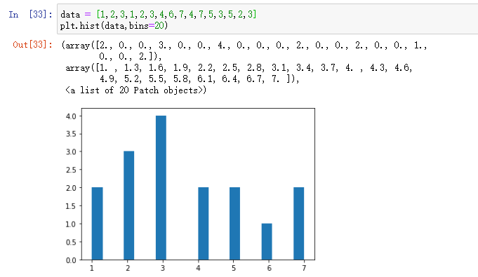
案例六:绘制直方图 hist
是一个特殊的柱状图,又叫做密度图
- plt.hist()的参数
+ bins
可以是一个bin数量的整数值,也可以是表示bin的一个序列。默认值为10
+ normed
如果值为True,直方图的值将进行归一化处理,形成概率密度,默认值为False
+ color
指定直方图的颜色。可以是单一颜色值或颜色的序列。如果指定了多个数据集合,例如DataFrame对象,颜色序列将会设置为相同的顺序。如果未指定,将会使用一个默认的线条颜色
+ orientation
通过设置orientation为horizontal创建水平直方图。默认值为vertical、
data = [1,2,3,1,2,3,4,6,7,4,7,5,3,5,2,3]
plt.hist(data,bins=20)
案例七:散点图 scatter
因变量随自变量而变化的大致趋势
import numpy  as np
x = np.array([4,5,6,1,8,4])
y = x **3
plt.scatter(x,y)

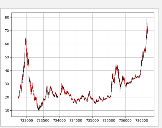
案例:绘制K线图
# mpl_finance 中有许多绘制金融相关的函数接口
# 绘制K线图:mpl_finance.candlestick_ochl 函数
import mpl_finance as fin
import pandas as pd
from matplotlib.dates import date2num

df = pd.read_csv('./601318.csv', parse_dates=['date'], index_col=['date'])[['open', 'close', 'high', 'low']]
df['time'] = date2num(df.index.to_pydatetime())
fig = plt.figure()
ax = fig.add_subplot(1, 1, 1)
arr = df[['time', 'open', 'close', 'high', 'low']].values
fin.candlestick_ochl(ax, arr)
plt.grid()
fig.show()
Matplotlib 线点颜色参数,来自源码
============= ===============================
character description
============= ===============================
``'.'`` point marker
``','`` pixel marker
``'o'`` circle marker
``'v'`` triangle_down marker
``'^'`` triangle_up marker
``'<'`` triangle_left marker
``'>'`` triangle_right marker
``'1'`` tri_down marker
``'2'`` tri_up marker
``'3'`` tri_left marker
``'4'`` tri_right marker
``'s'`` square marker
``'p'`` pentagon marker
``'*'`` star marker
``'h'`` hexagon1 marker
``'H'`` hexagon2 marker
``'+'`` plus marker
``'x'`` x marker
``'D'`` diamond marker
``'d'`` thin_diamond marker
``'|'`` vline marker
``'_'`` hline marker
============= ===============================
**Line Styles**
============= ===============================
character description
============= ===============================
``'-'`` solid line style
``'--'`` dashed line style
``'-.'`` dash-dot line style
``':'`` dotted line style
============= ===============================
Example format strings::
'b' # blue markers with default shape
'or' # red circles
'-g' # green solid line
'--' # dashed line with default color
'^k:' # black triangle_up markers connected by a dotted line
**Colors**
The supported color abbreviations are the single letter codes
============= ===============================
character color
============= ===============================
``'b'`` blue
``'g'`` green
``'r'`` red
``'c'`` cyan
``'m'`` magenta
``'y'`` yellow
``'k'`` black
``'w'`` white
============= ===============================