
老孟导读:Flutter中布局组件有水平 / 垂直布局组件( Row 和 Column )、叠加布局组件( Stack 和 IndexedStack )、流式布局组件( Wrap )和 自定义布局组件(Flow)。
水平、垂直布局组件
Row 是将子组件以水平方式布局的组件, Column 是将子组件以垂直方式布局的组件。项目中 90% 的页面布局都可以通过 Row 和 Column 来实现。
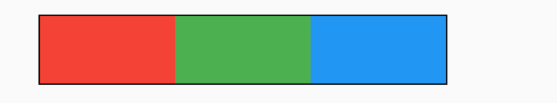
将3个组件水平排列:
Row(
  children: <Widget>[
    Container(
      height: 50,
       100,
      color: Colors.red,
    ),
    Container(
      height: 50,
       100,
      color: Colors.green,
    ),
    Container(
      height: 50,
       100,
      color: Colors.blue,
    ),
  ],
)

将3个组件垂直排列:
Column(
  mainAxisSize: MainAxisSize.min,
  children: <Widget>[
    Container(
      height: 50,
       100,
      color: Colors.red,
    ),
    Container(
      height: 50,
       100,
      color: Colors.green,
    ),
    Container(
      height: 50,
       100,
      color: Colors.blue,
    ),
  ],
)

在 Row 和 Column 中有一个非常重要的概念:主轴( MainAxis ) 和 交叉轴( CrossAxis ),主轴就是与组件布局方向一致的轴,交叉轴就是与主轴方向垂直的轴。
具体到 Row 组件,主轴 是水平方向,交叉轴 是垂直方向。而 Column 与 Row 正好相反,主轴 是垂直方向,交叉轴 是水平方向。
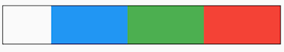
明白了 主轴 和 交叉轴 概念,我们来看下 mainAxisAlignment 属性,此属性表示主轴方向的对齐方式,默认值为 start,表示从组件的开始处布局,此处的开始位置和 textDirection 属性有关,textDirection 表示文本的布局方向,其值包括 ltr(从左到右) 和 rtl(从右到左),当 textDirection = ltr 时,start 表示左侧,当 textDirection = rtl 时,start 表示右侧,
Container(
  decoration: BoxDecoration(border: Border.all(color: Colors.black)),
  child: Row(
    children: <Widget>[
      Container(
        height: 50,
         100,
        color: Colors.red,
      ),
      Container(
        height: 50,
         100,
        color: Colors.green,
      ),
      Container(
        height: 50,
         100,
        color: Colors.blue,
      ),
    ],
  ),
)
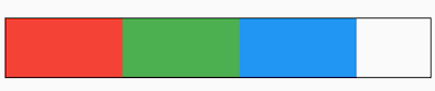
黑色边框是Row控件的范围,默认情况下Row铺满父组件。
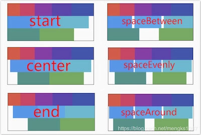
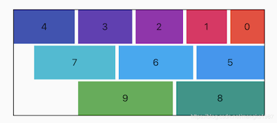
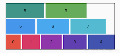
主轴对齐方式有6种,效果如下图:
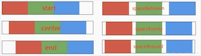
spaceAround 和 spaceEvenly 区别是:
- spaceAround :第一个子控件距开始位置和最后一个子控件距结尾位置是其他子控件间距的一半。
- spaceEvenly : 所有间距一样。
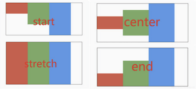
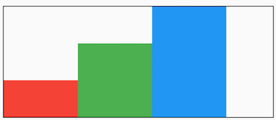
和主轴对齐方式相对应的就是交叉轴对齐方式 crossAxisAlignment ,交叉轴对齐方式默认是居中。Row控件的高度是依赖子控件高度,因此子控件高都一样时,Row的高和子控件高相同,此时是无法体现交叉轴对齐方式,修改3个颜色块高分别为50,100,150,这样Row的高是150,代码如下:
Container(
      decoration: BoxDecoration(border: Border.all(color: Colors.black)),
      child: Row(
        crossAxisAlignment: CrossAxisAlignment.center,
        children: <Widget>[
          Container(
            height: 50,
             100,
            color: Colors.red,
          ),
          Container(
            height: 100,
             100,
            color: Colors.green,
          ),
          Container(
            height: 150,
             100,
            color: Colors.blue,
          ),
        ],
      ),
    )
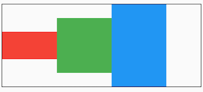
主轴对齐方式效果如下图:
mainAxisSize 表示主轴尺寸,有 min 和 max 两种方式,默认是 max。min 表示尽可能小,max 表示尽可能大。
Container(
	decoration: BoxDecoration(border: Border.all(color: Colors.black)),
	child: Row(
		mainAxisSize: MainAxisSize.min,
		...
	)
)
看黑色边框,正好包裹子组件,而 max 效果如下:

textDirection 表示子组件主轴布局方向,值包括 ltr(从左到右) 和 rtl(从右到左)
Container(
  decoration: BoxDecoration(border: Border.all(color: Colors.black)),
  child: Row(
    textDirection: TextDirection.rtl,
    children: <Widget>[
      ...
    ],
  ),
)
verticalDirection 表示子组件交叉轴布局方向:
- up :从底部开始,并垂直堆叠到顶部,对齐方式的 start 在底部,end 在顶部。
- down: 与 up 相反。
Container(
  decoration: BoxDecoration(border: Border.all(color: Colors.black)),
  child: Row(
    crossAxisAlignment: CrossAxisAlignment.start,
    verticalDirection: VerticalDirection.up,
    children: <Widget>[
      Container(
        height: 50,
         100,
        color: Colors.red,
      ),
      Container(
        height: 100,
         100,
        color: Colors.green,
      ),
      Container(
        height: 150,
         100,
        color: Colors.blue,
      ),
    ],
  ),
)
想一想这种效果完全可以通过对齐方式实现,那么为什么还要有 textDirection 和 verticalDirection 这两个属性,官方API文档已经解释了这个问题:
This is also used to disambiguate start and end values (e.g. [MainAxisAlignment.start] or [CrossAxisAlignment.end]).
用于消除 MainAxisAlignment.start 和 CrossAxisAlignment.end 值的歧义的。
叠加布局组件
叠加布局组件包含 Stack 和 IndexedStack,Stack 组件将子组件叠加显示,根据子组件的顺利依次向上叠加,用法如下:
Stack(
  children: <Widget>[
    Container(
      height: 200,
       200,
      color: Colors.red,
    ),
    Container(
      height: 170,
       170,
      color: Colors.blue,
    ),
    Container(
      height: 140,
       140,
      color: Colors.yellow,
    )
  ],
)
Stack 对未定位(不被 Positioned 包裹)子组件的大小由 fit 参数决定,默认值是 StackFit.loose ,表示子组件自己决定,StackFit.expand 表示尽可能的大,用法如下:
Stack(
  fit: StackFit.expand,
  children: <Widget>[
    Container(
      height: 200,
       200,
      color: Colors.red,
    ),
    Container(
      height: 170,
       170,
      color: Colors.blue,
    ),
    Container(
      height: 140,
       140,
      color: Colors.yellow,
    )
  ],
)
效果只有黄色(最后一个组件的颜色),并不是其他组件没有绘制,而是另外两个组件被黄色组件覆盖。
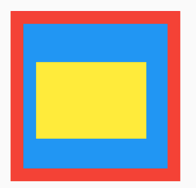
Stack 对未定位(不被 Positioned 包裹)子组件的对齐方式由 alignment 控制,默认左上角对齐,用法如下:
Stack(
  alignment: AlignmentDirectional.center,
  children: <Widget>[
    Container(
      height: 200,
       200,
      color: Colors.red,
    ),
    Container(
      height: 170,
       170,
      color: Colors.blue,
    ),
    Container(
      height: 140,
       140,
      color: Colors.yellow,
    )
  ],
)

通过 Positioned 定位的子组件:
Stack(
  alignment: AlignmentDirectional.center,
  children: <Widget>[
    Container(
      height: 200,
       200,
      color: Colors.red,
    ),
    Container(
      height: 170,
       170,
      color: Colors.blue,
    ),
    Positioned(
      left: 30,
      right: 40,
      bottom: 50,
      top: 60,
      child: Container(
        color: Colors.yellow,
      ),
    )
  ],
)
top 、bottom 、left 、right 四种定位属性,分别表示距离上下左右的距离。
如果子组件超过 Stack 边界由 overflow 控制,默认是裁剪,下面设置总是显示的用法:
Stack(
  overflow: Overflow.visible,
  children: <Widget>[
    Container(
      height: 200,
       200,
      color: Colors.red,
    ),
    Positioned(
      left: 100,
      top: 100,
      height: 150,
       150,
      child: Container(
        color: Colors.green,
      ),
    )
  ],
)

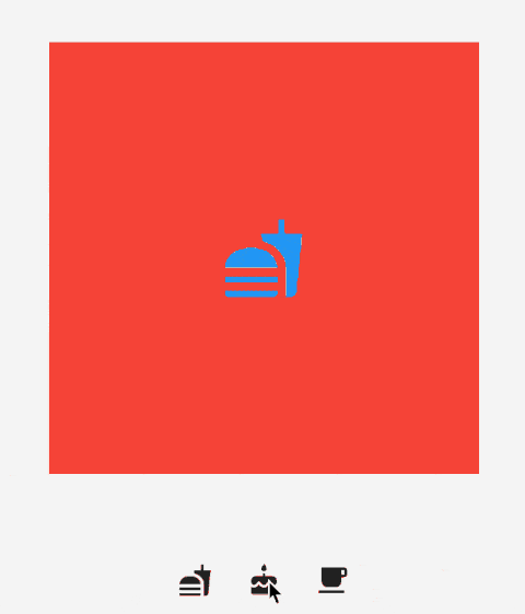
IndexedStack 是 Stack 的子类,Stack 是将所有的子组件叠加显示,而 IndexedStack 通过 index 只显示指定索引的子组件,用法如下:
class IndexedStackDemo extends StatefulWidget {
  @override
  _IndexedStackDemoState createState() => _IndexedStackDemoState();
}

class _IndexedStackDemoState extends State<IndexedStackDemo> {
  int _index = 0;

  @override
  Widget build(BuildContext context) {
    return Column(
      children: <Widget>[
        SizedBox(height: 50,),
        _buildIndexedStack(),
        SizedBox(height: 30,),
        _buildRow(),
      ],
    );
  }

  _buildIndexedStack() {
    return IndexedStack(
      index: _index,
      children: <Widget>[
        Center(
          child: Container(
            height: 300,
             300,
            color: Colors.red,
            alignment: Alignment.center,
            child: Icon(
              Icons.fastfood,
              size: 60,
              color: Colors.blue,
            ),
          ),
        ),
        Center(
          child: Container(
            height: 300,
             300,
            color: Colors.green,
            alignment: Alignment.center,
            child: Icon(
              Icons.cake,
              size: 60,
              color: Colors.blue,
            ),
          ),
        ),
        Center(
          child: Container(
            height: 300,
             300,
            color: Colors.yellow,
            alignment: Alignment.center,
            child: Icon(
              Icons.local_cafe,
              size: 60,
              color: Colors.blue,
            ),
          ),
        ),
      ],
    );
  }

  _buildRow() {
    return Row(
      mainAxisAlignment: MainAxisAlignment.center,
      children: <Widget>[
        IconButton(
          icon: Icon(Icons.fastfood),
          onPressed: () {
            setState(() {
              _index = 0;
            });
          },
        ),
        IconButton(
          icon: Icon(Icons.cake),
          onPressed: () {
            setState(() {
              _index = 1;
            });
          },
        ),
        IconButton(
          icon: Icon(Icons.local_cafe),
          onPressed: () {
            setState(() {
              _index = 2;
            });
          },
        ),
      ],
    );
  }
}
流式布局组件
Wrap 为子组件进行水平或者垂直方向布局,且当空间用完时,Wrap 会自动换行,也就是流式布局。
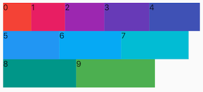
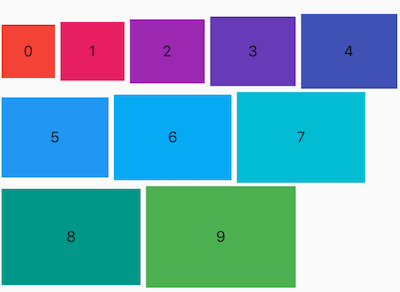
创建多个子控件做为 Wrap 的子控件,代码如下:
Wrap(
  children: List.generate(10, (i) {
    double w = 50.0 + 10 * i;
    return Container(
      color: Colors.primaries[i],
      height: 50,
       w,
      child: Text('$i'),
    );
  }),
)
direction 属性控制布局方向,默认为水平方向,设置方向为垂直代码如下:
Wrap(
  direction: Axis.vertical,
  children: List.generate(4, (i) {
    double w = 50.0 + 10 * i;
    return Container(
      color: Colors.primaries[i],
      height: 50,
       w,
      child: Text('$i'),
    );
  }),
)

alignment 属性控制主轴对齐方式,crossAxisAlignment 属性控制交叉轴对齐方式,对齐方式只对有剩余空间的行或者列起作用,例如水平方向上正好填充完整,则不管设置主轴对齐方式为什么,看上去的效果都是铺满。
说明 :主轴就是与当前组件方向一致的轴,而交叉轴就是与当前组件方向垂直的轴,如果Wrap的布局方向为水平方向 Axis.horizontal,那么主轴就是水平方向,反之布局方向为垂直方向 Axis.vertical ,主轴就是垂直方向。
Wrap(
	alignment: WrapAlignment.spaceBetween,
	...
)
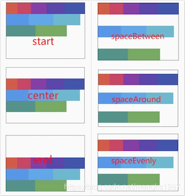
主轴对齐方式有6种,效果如下图:
spaceAround 和 spaceEvenly 区别是:
- spaceAround:第一个子控件距开始位置和最后一个子控件距结尾位置是其他子控件间距的一半。
- spaceEvenly:所有间距一样。
设置交叉轴对齐代码如下:
Wrap(
	crossAxisAlignment: WrapCrossAlignment.center,
	...
)
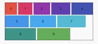
如果 Wrap 的主轴方向为水平方向,交叉轴方向则为垂直方向,如果想要看到交叉轴对齐方式的效果需要设置子控件的高不一样,代码如下:
Wrap(
  spacing: 5,
  runSpacing: 3,
  crossAxisAlignment: WrapCrossAlignment.center,
  children: List.generate(10, (i) {
    double w = 50.0 + 10 * i;
    double h = 50.0 + 5 * i;
    return Container(
      color: Colors.primaries[i],
      height: h,
      alignment: Alignment.center,
       w,
      child: Text('$i'),
    );
  }),
)
runAlignment 属性控制 Wrap 的交叉抽方向上每一行的对齐方式,下面直接看 runAlignment 6中方式对应的效果图,
runAlignment 和 alignment 的区别:
- alignment :是主轴方向上对齐方式,作用于每一行。
- runAlignment :是交叉轴方向上将每一行看作一个整体的对齐方式。
spacing 和 runSpacing 属性控制Wrap主轴方向和交叉轴方向子控件之间的间隙,代码如下:
Wrap(
	spacing: 5,
    runSpacing: 2,
	...
)
textDirection 属性表示 Wrap 主轴方向上子组件的方向,取值范围是 ltr(从左到右) 和 rtl(从右到左),下面是从右到左的代码:
Wrap(
	textDirection: TextDirection.rtl,
	...
)
verticalDirection 属性表示 Wrap 交叉轴方向上子组件的方向,取值范围是 up(向上) 和 down(向下),设置代码如下:
Wrap(
	verticalDirection: VerticalDirection.up,
	...
)
注意:文字为0的组件是在下面的。
自定义布局组件
大部分情况下,不会使用到 Flow ,但 Flow 可以调整子组件的位置和大小,结合Matrix4绘制出各种酷炫的效果。
Flow 组件对使用转换矩阵操作子组件经过系统优化,性能非常高效。
基本用法如下:
Flow(
  delegate: SimpleFlowDelegate(),
  children: List.generate(5, (index) {
    return Container(
      height: 100,
      color: Colors.primaries[index % Colors.primaries.length],
    );
  }),
)
delegate 控制子组件的位置和大小,定义如下 :
class SimpleFlowDelegate extends FlowDelegate {
  @override
  void paintChildren(FlowPaintingContext context) {
    for (int i = 0; i < context.childCount; ++i) {
      context.paintChild(i);
    }
  }

  @override
  bool shouldRepaint(SimpleFlowDelegate oldDelegate) {
    return false;
  }
}
delegate 要继承 FlowDelegate,重写 paintChildren 和 shouldRepaint 函数,上面直接绘制子组件,效果如下:
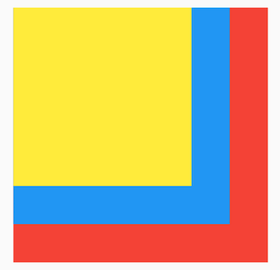
只看到一种颜色并不是只绘制了这一个,而是叠加覆盖了,和 Stack 类似,下面让每一个组件有一定的偏移,SimpleFlowDelegate 修改如下:
class SimpleFlowDelegate extends FlowDelegate {
  @override
  void paintChildren(FlowPaintingContext context) {
    for (int i = 0; i < context.childCount; ++i) {
      context.paintChild(i,transform: Matrix4.translationValues(0,i*30.0,0));
    }
  }

  @override
  bool shouldRepaint(SimpleFlowDelegate oldDelegate) {
    return false;
  }
}
每一个子组件比上一个组件向下偏移30。
仿 掘金-我的效果
效果如下:
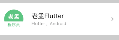
到拿到一个页面时,先要将其拆分,上面的效果拆分如下:
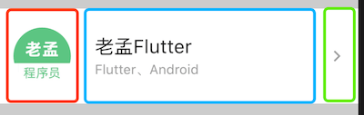
总体分为3个部分,水平布局,红色区域圆形头像代码如下:
_buildCircleImg() {
  return Container(
    height: 60,
     60,
    decoration: BoxDecoration(
        shape: BoxShape.circle,
        image: DecorationImage(image: AssetImage('assets/images/logo.png'))),
  );
}
蓝色区域代码如下:
_buildCenter() {
  return Column(
    mainAxisAlignment: MainAxisAlignment.center,
    crossAxisAlignment: CrossAxisAlignment.start,
    children: <Widget>[
      Text('老孟Flutter', style: TextStyle(fontSize: 20),),
      Text('Flutter、Android', style: TextStyle(color: Colors.grey),)
    ],
  );
}
绿色区域是一个图标,代码如下:
Icon(Icons.arrow_forward_ios,color: Colors.grey,size: 14,),
将这3部分组合在一起:
Container(
  color: Colors.grey.withOpacity(.5),
  alignment: Alignment.center,
  child: Container(
    height: 100,
    color: Colors.white,
    child: Row(
      children: <Widget>[
        SizedBox(
           15,
        ),
        _buildCircleImg(),
        SizedBox(
           25,
        ),
        Expanded(
          child: _buildCenter(),
        ),
        Icon(Icons.arrow_forward_ios,color: Colors.grey,size: 14,),
        SizedBox(
           15,
        ),
      ],
    ),
  ),
)
最终的效果就是开始我们看到的效果图。
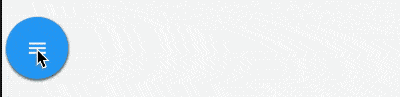
水平展开/收起菜单
使用Flow实现水平展开/收起菜单的功能,代码如下:
class DemoFlowPopMenu extends StatefulWidget {
  @override
  _DemoFlowPopMenuState createState() => _DemoFlowPopMenuState();
}

class _DemoFlowPopMenuState extends State<DemoFlowPopMenu>
    with SingleTickerProviderStateMixin {
  //动画必须要with这个类
  AnimationController _ctrlAnimationPopMenu; //定义动画的变量
  IconData lastTapped = Icons.notifications;
  final List<IconData> menuItems = <IconData>[
    //菜单的icon
    Icons.home,
    Icons.new_releases,
    Icons.notifications,
    Icons.settings,
    Icons.menu,
  ];

  void _updateMenu(IconData icon) {
    if (icon != Icons.menu) {
      setState(() => lastTapped = icon);
    } else {
      _ctrlAnimationPopMenu.status == AnimationStatus.completed
          ? _ctrlAnimationPopMenu.reverse() //展开和收拢的效果
          : _ctrlAnimationPopMenu.forward();
    }
  }

  @override
  void initState() {
    super.initState();
    _ctrlAnimationPopMenu = AnimationController(
      //必须初始化动画变量
      duration: const Duration(milliseconds: 250), //动画时长250毫秒
      vsync: this, //SingleTickerProviderStateMixin的作用
    );
  }

//生成Popmenu数据
  Widget flowMenuItem(IconData icon) {
    final double buttonDiameter =
        MediaQuery.of(context).size.width * 2 / (menuItems.length * 3);
    return Padding(
      padding: const EdgeInsets.symmetric(vertical: 8.0),
      child: RawMaterialButton(
        fillColor: lastTapped == icon ? Colors.amber[700] : Colors.blue,
        splashColor: Colors.amber[100],
        shape: CircleBorder(),
        constraints: BoxConstraints.tight(Size(buttonDiameter, buttonDiameter)),
        onPressed: () {
          _updateMenu(icon);
        },
        child: Icon(icon, color: Colors.white, size: 30.0),
      ),
    );
  }

  @override
  Widget build(BuildContext context) {
    return Center(
      child: Flow(
        delegate: FlowMenuDelegate(animation: _ctrlAnimationPopMenu),
        children: menuItems
            .map<Widget>((IconData icon) => flowMenuItem(icon))
            .toList(),
      ),
    );
  }
}
FlowMenuDelegate 定义如下:
class FlowMenuDelegate extends FlowDelegate {
  FlowMenuDelegate({this.animation}) : super(repaint: animation);
  final Animation<double> animation;

  @override
  void paintChildren(FlowPaintingContext context) {
    double x = 50.0; //起始位置
    double y = 50.0; //横向展开,y不变
    for (int i = 0; i < context.childCount; ++i) {
      x = context.getChildSize(i).width * i * animation.value;
      context.paintChild(
        i,
        transform: Matrix4.translationValues(x, y, 0),
      );
    }
  }

  @override
  bool shouldRepaint(FlowMenuDelegate oldDelegate) =>
      animation != oldDelegate.animation;
}
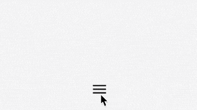
半圆菜单展开/收起
代码如下:
import 'dart:math';

import 'package:flutter/material.dart';

class DemoFlowMenu extends StatefulWidget {
  @override
  _DemoFlowMenuState createState() => _DemoFlowMenuState();
}

class _DemoFlowMenuState extends State<DemoFlowMenu>
    with TickerProviderStateMixin {
  //动画需要这个类来混合
  //动画变量,以及初始化和销毁
  AnimationController _ctrlAnimationCircle;

  @override
  void initState() {
    super.initState();
    _ctrlAnimationCircle = AnimationController(
        //初始化动画变量
        lowerBound: 0,
        upperBound: 80,
        duration: Duration(milliseconds: 300),
        vsync: this);
    _ctrlAnimationCircle.addListener(() => setState(() {}));
  }

  @override
  void dispose() {
    _ctrlAnimationCircle.dispose(); //销毁变量,释放资源
    super.dispose();
  }

  //生成Flow的数据
  List<Widget> _buildFlowChildren() {
    return List.generate(
        5,
        (index) => Container(
              child: Icon(
                index.isEven ? Icons.timer : Icons.ac_unit,
                color: Colors.primaries[index % Colors.primaries.length],
              ),
            ));
  }

  @override
  Widget build(BuildContext context) {
    return Stack(
      children: <Widget>[
        Positioned.fill(
          child: Flow(
            delegate: FlowAnimatedCircle(_ctrlAnimationCircle.value),
            children: _buildFlowChildren(),
          ),
        ),
        Positioned.fill(
          child: IconButton(
            icon: Icon(Icons.menu),
            onPressed: () {
              setState(() {
                //点击后让动画可前行或回退
                _ctrlAnimationCircle.status == AnimationStatus.completed
                    ? _ctrlAnimationCircle.reverse()
                    : _ctrlAnimationCircle.forward();
              });
            },
          ),
        ),
      ],
    );
  }
}
FlowAnimatedCircle 代码如下:
class FlowAnimatedCircle extends FlowDelegate {
  final double radius; //绑定半径,让圆动起来
  FlowAnimatedCircle(this.radius);

  @override
  void paintChildren(FlowPaintingContext context) {
    if (radius == 0) {
      return;
    }
    double x = 0; //开始(0,0)在父组件的中心
    double y = 0;
    for (int i = 0; i < context.childCount; i++) {
      x = radius * cos(i * pi / (context.childCount - 1)); //根据数学得出坐标
      y = radius * sin(i * pi / (context.childCount - 1)); //根据数学得出坐标
      context.paintChild(i, transform: Matrix4.translationValues(x, -y, 0));
    } //使用Matrix定位每个子组件
  }

  @override
  bool shouldRepaint(FlowDelegate oldDelegate) => true;
}
交流
老孟Flutter博客地址(330个控件用法):http://laomengit.com
欢迎加入Flutter交流群(微信:laomengit)、关注公众号【老孟Flutter】:
 |
 |