边 框
圆角效果 border-radius 除了px单位 还可以用%或者em
border-radius:10px; /* 所有角都使用半径为10px的圆角 */

border-radius: 5px 4px 3px 2px; /* 四个半径值分别是左上角、右上角、右下角和左下角,顺时针 */
阴影 box-shadow
box-shadow: X轴偏移量(可为负数) Y轴偏移量(可为负数)
[阴影模糊半径(可选,模糊距离)] [阴影扩展半径(可选,模糊大小)] [阴影颜色(可选,默认黑色)] [投影方式(可选,inset为内部阴影方式,省略为外阴影)];
.box_shadow(box-shadow:4px 2px 6px #ccc inset;)
.box_shadow(box-shadow:4px 2px 6px #f00,-4px -2px 6px #000,0px 0px 12px #33cc00 inset)/*多个阴影之前用逗号分隔*/
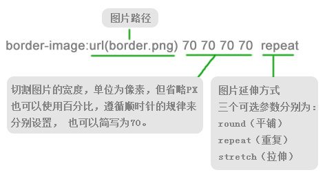
图片边框 border-image
颜 色
raba
background-color:rgba(255,255,255,0.5)/*透明度默认为1*/
Gradient之 线性渐变(linear)和径向渐变(radial)
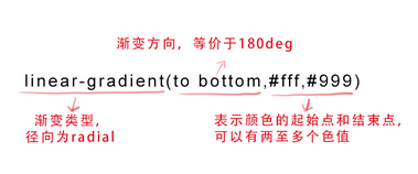
background-image:linear-gradient(to bottom,red, orange,yellow,green,blue,indigo,violet)
文字与字体
text-overflow与word-wrap 设置是否使用一个省略标记
text-overflow:clip(表示剪切)|ellipsis(表示显示省略标记)
word-wrap:normal(表示控制连续文本换行)|break-word(表示内容将在边界内换行)
text-overflow:ellipsis;/*文字溢出显示省略号*/
overflow:hidden;/*强制文本在一行内显示*/
white-space:nowrap;/*溢出文本显示省略号*/
嵌入字体@font-face
@font-face{font-family:字体名称;src:字体文件在服务器上的路径}
@font-face{font-family:"abc";src:url(...)}/*定义字体*/
.demo(font-family:"abc";) /*调用已定义字体*/
文本阴影 text-shadow
text-shadow:X-offset(水平偏移距离) Y-offset(垂直便宜距离) blur(阴影模糊程度,其值不能是负值) color(阴影颜色);
text-shadow(2px 1px 3px #ccc)
与背景相关样式
background-origin 原始起始位置
background-origin:border-box(边框)| padding-box(内边距)| content-box(内容区域)
* 如果背景不是no-repeat,这个属性无效,它会从边框开始显示。
background-clip 背景图片进行裁剪以适应实际需要
background-origin:border-box(边框)| padding-box(内边距)| content-box(内容区域)|no-clip(无剪切)
background-size 背景图片大小
background-size:auto | <长度值> | <百分比> | cover(覆盖,填满整个屏幕) | contain(等比例放置一边紧贴容器边缘)
multiple backgrounds 多个背景
css3选择器
<a href="xxx.pdf">我链接的是PDF文件</a>
<a href="#" class="icon">我类名是icon</a>
<a href="#" title="我的title是more">我的title是more</a>


a[class^=icon]{
  background: green;
  color:#fff;
}   /*类名为icon的样式*/
a[href$=pdf]{
  background: orange;
  color: #fff;
}  /*后缀为pdf的样式*/
a[title*=more]{
  background: blue;
  color: #fff;
}/*所有title里含more字符的样式*/
root 根选择器 在html文档中,根元素始终是<html>
:root{background:orange}与
html{background:orange}
效果相同。
not 否定选择器 选择除某个元素之外的所有元素
<form action="#">
  <div>
    <label for="name">Text Input:</label>
    <input type="text" name="name" id="name" placeholder="John Smith" />
  </div>
  <div>
    <label for="name">Password Input:</label>
    <input type="text" name="name" id="name" placeholder="John Smith" />
  </div>
  <div>
    <input type="submit" value="Submit" />
  </div>
</form>
对应css样式
form {
  width: 200px;
  margin: 20px auto;
}
div {
  margin-bottom: 20px;
}
input:not([type="submit"]){
  border:1px solid red;
}/*除提交按钮以外所有的元素*/
empty 选择没有任何内容的元素 哪怕是一个空格
<p>我是一个段落</p> <p> </p> <p></p>
对应css样式
p{ background: orange; min-height: 30px; } p:empty { display: none; } /*将第三个P标签隐藏*/
target 匹配文档的url的某个标志符的目标元素
<h2><a href="#brand">Brand</a></h2>
<div class="menuSection" id="brand">
    content for Brand
</div>
.menuSection{
  display: none;
}
:target{/*这里的:target就是指id="brand"的div对象*/
  display:block;
}
first-child 选择父元素的第一个子元素
<ol>
  <li><a href="##">Link1</a></li>
  <li><a href="##">Link2</a></li>
  <li><a href="##">link3</a></li>
</ol>
ol > li{
  font-size:20px;
  font-weight: bold;
  margin-bottom: 10px;
}

ol a {
  font-size: 16px;
  font-weight: normal;
}

ol > li:first-child{
  color: red;
}      /*将第一个li的序号变成红色*/
last-child 选择元素的最后一个子元素
<div class="post"> <p>第一段落</p> <p>第二段落</p> <p>第三段落</p> <p>第四段落</p> <p>第五段落</p> </div>
.post {
  padding: 10px;
  border: 1px solid #ccc;
  width: 200px;
  margin: 20px auto;
}
.post p {
  margin:0 0 15px 0;
}

.post p:last-child {
  margin-bottom:0;
}/*将最后一个P标签的bottom改为0*/
nth-child(n) 定位某个父元素的一个或多个特定的子元素
<ol> <li>item1</li> <li>item2</li> <li>item3</li> <li>item4</li> <li>item5</li> </ol>
对应css样式
ol > li:nth-child(2n){
  background: orange;
}
nth-last-child(n) 选择倒数第N个元素
<ol> <li>item1</li> <li>item2</li> <li>item3</li> <li>item4</li> <li>item5</li> <li>item6</li> </ol>
对应css样式
ol > li:nth-last-child(2){background: orange;} /*选择倒数第2个元素*/
first-of-type 选择指定类型的第一个元素
<div class="wrapper">
  <div>我是一个块元素,我是.wrapper的第一个子元素</div>
  <p>我是一个段落元素,我是不是.wrapper的第一个子元素,但是他的第一个段落元素</p>
  <p>我是一个段落元素</p>
  <div>我是一个块元素</div>
</div>
对应css样式
.wrapper {
  width: 500px;
  margin: 20px auto;
  padding: 10px;
  border: 1px solid #ccc;
  color: #fff;
}
.wrapper > div {
  background: green;
}
.wrapper > p {
  background: blue;
}
/*我要改变第一个段落的背景为橙色*/
.wrapper > p:first-of-type {
  background: orange;
}
nth-of-type(n) 选择指定类型的第N个元素
<div class="wrapper">
  <div>我是一个Div元素</div>
  <p>我是一个段落元素</p>
  <div>我是一个Div元素</div>
  <p>我是一个段落</p>
  <div>我是一个Div元素</div>
  <p>我是一个段落</p>
  <div>我是一个Div元素</div>
  <p>我是一个段落</p>
</div>
对应css样式
.wrapper > p:nth-of-type(2n){ background: orange;} /*改变偶数列P背景*/
last-of-type 选择指定类型的最后一个元素
<div class="wrapper">
  <p>我是第一个段落</p>
  <p>我是第二个段落</p>
  <p>我是第三个段落</p>
  <div>我是第一个Div元素</div>
  <div>我是第二个Div元素</div>
  <div>我是第三个Div元素</div>
</div>
对应的css样式
.wrapper > p:last-of-type{background: orange;} /*选择最后一个P标签,背景是橘色*/
nth-last-of-type(n) 选择指定类型的倒数第N个元素
<div class="wrapper">
  <p>我是第一个段落</p>
  <p>我是第二个段落</p>
  <p>我是第三个段落</p>
  <p>我是第四个段落</p>
  <p>我是第五个段落</p>
  <div>我是一个Div元素</div>
  <p>我是第六个段落</p>
  <p>我是第七个段落</p>
</div>
对应的css样式
.wrapper > p:nth-last-of-type(3){ background: orange;} /*选择倒数第三个P标签*/
only-child 选择仅有一个子元素的父元素
<div class="post">
  <p>我是一个段落</p>
  <p>我是一个段落</p>
</div>
<div class="post">
  <p>我是一个段落</p>
</div>
对应的css样式
.post p {
  background: green;
  color: #fff;
  padding: 10px;
}
.post p:only-child {
  background: orange;
}    /*选择只有一个P标签的父元素*/
css选择器
:enabled 元素可用 :disabled 元素不可用
:checked 选中状态
::selection 更改文字选中里的背景色
1、IE9+、Opera、Google Chrome 以及 Safari 中支持 ::selection 选择器。
2、Firefox 支持替代的 ::-moz-selection。
::selection{
  background: orange;
  color: white;
}
::-moz-selection{
  background: orange;
  color: white;
}    /*火狐浏览器下需要加前缀*/
:read_only选择器 设定处于只读状态元素的样式
input[type="text"]:-moz-read-only{
  border-color: #ccc;
}
input[type="text"]:read-only{
  border-color: #ccc;
}
read_writek选择器 指定当元素处于非只读状态时的样式
input[type="text"]:-moz-read-write{
  border-color: #f36;
}
input[type="text"]:read-write{
  border-color: #f36;
}
::before和::after 主要用来给元素的前面或者后面插入内容,这两个常和"content"配合使用
.clearfix::after {
    content: ".";
    display: block;
    height: 0;
    visibility: hidden;
}
css中的变形与动画
rotate()旋转 通过指定的角度参数使元素相对原点进行旋转
<div class="wrapper">
  <div></div>
</div>
对应css样式
.wrapper div {
  width: 200px;
  height: 200px;
  background: orange;
  -webkit-transform: rotate(45deg);   /*元素旋转45度*/
  transform: rotate(45deg);
}
skew(x,y) 能够让元素倾斜显示
可以将对象以其中心位置围绕X轴和Y轴按照一定的角度倾斜,这与rotate()函数的旋转不同,rotate()函数只是旋转,而不会改变元素的形状。skew()函数不会旋转,而只会改变元素的形状。
<div class="wrapper">
  <div>我变成平形四边形</div>
</div>
对应css样式
.wrapper div {
  width: 300px;
  height: 100px;
  line-height: 100px;
  text-align: center;
  color: #fff;
  background: orange;
  -webkit-transform: skew(45deg); /*元素X轴与Y轴同时扭曲45度*/
  -moz-transform:skew(45deg)
  transform:skew(45deg);
}
scale() 让元素根据中心原点对对象进行缩放。(scakleX() scaleY())
注意: scale()的取值默认的值为1,当值设置为0.01到0.99之间的任何值,作用使一个元素缩小;而任何大于或等于1.01的值,作用是让元素放大。
<div class="wrapper">
  <div>我将放大1.5倍</div>
</div>
对应css代码
.wrapper div:hover {
  opacity: .5;
  -webkit-transform: scale(1.5);   /*X、Y 同时放大1.5倍*/
  -moz-transform:scale(1.5)
  transform: scale(1.5);
}
translate() 位移 将元素向指定的方向移动 (translateX() translateY())
<div class="wrapper">
  <div>我向右向下移动</div>
</div>
.wrapper div {
  -webkit-transform: translate(50px,100px);  /*将元素向Y轴下方移动50px,X轴右方移动100px*/
  -moz-transform:translate(50px,100px);
  transform: translate(50px,100px);
}
matrix() 是一个含六个值的(a,b,c,d,e,f)变换矩阵,用来指定一个2D变换,相当于直接应用一个[a b c d e f]变换矩阵。
<div class="wrapper">
  <div></div>
</div>
.wrapper div {
  -webkit-transform: matrix(1,0,0,1,50,50);
  -moz-transform:matrix(1,0,0,1,50,50);
  transform: matrix(1,0,0,1,50,50);
}
原点 transform-origin 任何一个元素都有一个中心点,默认情况之下,其中心点是居于元素X轴和Y轴的50%处。
<div class="wrapper">
  <div>原点在默认位置处</div>
</div>
<div class="wrapper transform-origin">
  <div>原点重置到左上角</div>
</div
.transform-origin div {
  -webkit-transform-origin: left top;     /*将元素中心改到左上角*/
  transform-origin: left top;
}
transition 动画属性
transition: all 3s ease-in-out .8s;(所有属性,持续3秒,先加速再减速变化,延迟0.8秒再执行变化,对于零可以省略)
transtion-property 动画--过渡属性
transtion-duration 动画--过渡所需时间
transtion-timing-function 动画--过渡函数
(ease 由快到慢 linear 匀速 ease-in 越来越快 ease-out越来越慢 ease-in-out 先加速再减速)
transition-delay 动画-- 过渡延迟时间
Keyframes 关键帧
Keyframes 被称为关键帧,其类似于Flash中的关键帧。在CSS3中其主要以“@keyframes”开头,后面紧跟着是动画名称加上一对花括号“{…}”,括号中就是一些不同时间段样式规则。
@keyframes changecolor{
  0%{
   background: red;
  }
  100%{
    background: green;
  }
}
animation-nkame 属性主要用来调用@keyfrakmes 定义好的动画
注意: animation-name 调用的动画名需要和“@keyframes”定义的动画名称完全一致(区分大小写),如果不一致将不具有任何动画效果。
语法:
animation-name: none | IDENT
/*
1、IDENT是由 @keyframes 创建的动画名
2、none为默认值,当值为 none 时,将没有任何动画效果,这可以用于覆盖任何动画。
*/
注意:需要在 Chrome 和 Safari 上面的基础上加上-webkit-前缀,Firefox加上-moz-。
animation-duration 设置动画播放时间
语法:
animation-duration: <time>
animation-timing-function 设置动画播放方式
语法:
animation-timing-function:ease | linear | ease-in | ease-out | ease-in-out

/*
ease   由快到慢
linear  匀速
ease-in   越来越快
ease-out   越来越慢
ease-in-out   先加速再减速
*/
animation 设置动画开始播放的时间 和transition-delay属性一样,用于定义在浏览器开始执行动画之前等待的时间。
语法:
animation-delay:<time>
animation-iteration-count 用来定义动画的播放次数
注意:Chrome或Safari浏览器,需要加入-webkit-前缀!
animation-iteration-count: infinite | <number>
/*
1、其值通常为整数,但也可以使用带有小数的数字,其默认值为1,这意味着动画将从开始到结束只播放一次。
2、如果取值为infinite,动画将会无限次的播放。
*/
设置动画播放方向
animation-direction属性主要用来设置动画播放方向,其语法规则如下:
animation-direction:normal | alternate

/*
 1、normal是默认值,如果设置为normal时,动画的每次循环都是向前播放;
 2、另一个值是alternate,他的作用是,动画播放在第偶数次向前播放,第奇数次向反方向播放。
*/
注意:Chrome或Safari浏览器,需要加入-webkit-前缀!
设置动画的播放状态
animation-play-state属性主要用来控制元素动画的播放状态。
参数:
其主要有两个值:running和paused。
例如,页面加载时,动画不播放。代码如下:
animation-play-state:paused;
设置动画时间外属性
animation-fill-mode属性定义在动画开始之前和结束之后发生的操作。
none 默认值,表示动画将按预期进行和结束,动画到最后一帧时,动画会反转到初始帧处
forwards 表示动画结束时应用最后的关键帧的位置
backwards 元素应用动画样式时迅速应用动画的初始帧
both 元素动画同时具有forwards和backwards效果
布局
Columns 多列布局
语法:
columns:<column-width> || <column-count
/*多列布局columns属性参数主要就两个属性参数:列宽和列数*/
column-gap 列间距
column-gap主要用来设置列与列之间的间距,其语法规则如下:
column-gap: normal || <length>
normal 默认值,默值为1em(如果你的字号是px,其默认值为你的font-size值)。
<length> 此值用来设置列与列之间的距离,其可以使用px,em单位的任何整数值,但不能是负值。
column-rule 列表边框
语法规则:
column-rule:<column-rule-width>|<column-rule-style>|<column-rule-color>
column-span 跨列设置
column-span: none | all

/*
  none   此值为column-span的默认值,表示不跨越任何列。
  all       这个值跟none值刚好相反,表示的是元素跨越所有列,并定位在列的Z轴之上。
*/