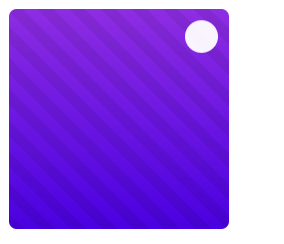
<!DOCTYPE html>
<html lang="zh">
<head>
<meta charset="UTF-8">
<meta http-equiv="X-UA-Compatible" content="IE=edge,chrome=1">
<meta name="viewport" content="width=device-width, initial-scale=1.0">
<title>CSS3鼠标滑过图片效果</title>

<!--响应式框架-->
<!--图标库-->
<!--主要样式-->
<style type="text/css">
    .box {
         200px;
        height: 200px;
        background: linear-gradient(#8E2DE2, #4A00E0);
        font-family:'Merriweather Sans', sans-serif;
        border-radius: 7px;
        position: relative;
        overflow: hidden;
    }
    .box:before {
        content:"";
        background: -webkit-repeating-linear-gradient(45deg, rgba(0, 0, 0, 0.1) 10px, transparent 10px, transparent 20px, rgba(0, 0, 0, 0.1) 20px, rgba(0, 0, 0, 0.1) 30px, transparent 30px, transparent 40px, rgba(0, 0, 0, 0.1) 40px, rgba(0, 0, 0, 0.1) 50px, transparent 50px, transparent 60px, rgba(0, 0, 0, 0.1) 60px, rgba(0, 0, 0, 0.1) 70px, transparent 70px, transparent 80px, rgba(0, 0, 0, 0.1) 80px, rgba(0, 0, 0, 0.1) 90px, transparent 90px);
         100%;
        height: 100%;
        opacity: 0;
        position: absolute;
        top: 0;
        left: 0;
        z-index: 0;
        transition: all 0.5s;
    }
    .box:hover:before {
        opacity:1;
    }
    .box:hover img {
        opacity: 0.5;
    }
    .box:hover .box-content {
        opacity: 1;
        transform: translateX(-50%) translateY(-50%) rotate(0deg);
    }
    .box .icon {
        padding: 0;
        margin: 0;
        list-style: none;
        opacity: 0;
        transform: rotateX(180deg);
        position: absolute;
        right: 10px;
        top: 10px;
        transition: all 0.3s;
    }
    .box:hover .icon {
        opacity: 1;
        transform: rotate(0);
    }
    .box .icon li a {
        color: #4A00E0;
        background-color: #fff;
        font-size: 17px;
        text-align: center;
        line-height: 30px;
         30px;
        height: 30px;
        margin: 0 0 7px;
        border-radius: 50%;
        display: block;
        transition: all .5s;
    }
    .box .icon li a:hover {
        color: #8E2DE2;
        box-shadow: 0 0 15px #fff;
    }
</style>

</head>
<body>


<div class="container">
    <div class="box">
        <img src="" style=" 200px;">
        <ul class="icon">
            <li><a href="#"><i class="fa fa-search"></i></a></li>
        </ul>
    </div>
</div>

</div>
</body>
</html>