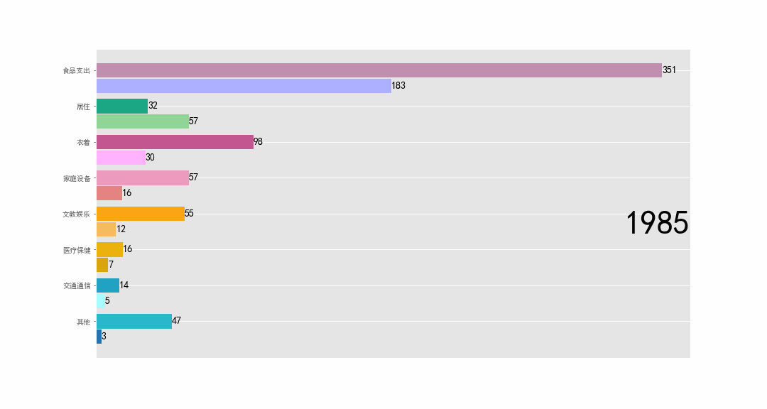
最近做一个数据的动态可视化,历史排名的柱状图变化,B站up见齐有开发一个基于js的模板,效果很好,但我的数据每一类有两个要并列显示,因此考虑了用matplotlib自己重新写一个(因为俺不会js,改不来源码)。效果如下:
matplotlib的animation模块实现了动画效果,并可以保存为gif和mp4文件。文档介绍https://matplotlib.org/api/animation_api.html
animation模块有两种制作动态图的方式,FuncAnimation和ArtistAnimation。前者比较简单,通过循环调用绘图函数实现动态显示。
from matplotlib.animation import FuncAnimation
animator = FuncAnimation(fig, func, frames=None, init_func=None, fargs=None, save_count=None, *, cache_frame_data=True, **kwargs)
FuncAnimation接收的几个重要参数:
- fig :画布
- func 定义的绘图函数
- frames 一个可迭代对象,通常是一个列表。它的作用是每次将其值送入func作为参数。如果frames是一个整数,则默认为range(frames),即func的输入依次是0到frames-1
- init_func 初始化画布的函数
- interval 整数,帧之间的延迟,单位毫秒,默认200
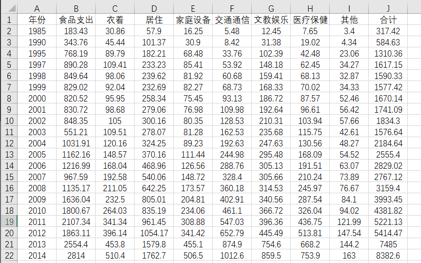
数据
要绘制的是1985-2018年的农村和城镇的人均消费情况柱状图。部分数据如下,来源:国家统计年鉴。
绘制
pandas读取数据,进行排序,然后绘制其柱状图。
import pandas as pd
import matplotlib.pyplot as plt
from matplotlib.animation import FuncAnimation
plt.style.use('ggplot')
plt.rcParams['font.sans-serif']=['SimHei']   #防止中文标签乱码,还有通过导入字体文件的方法
plt.rcParams['axes.unicode_minus'] = False

df1 = pd.read_excel("农村.xlsx",encoding="gbk")  # 读取数据
df2 = pd.read_excel("城镇.xlsx",encoding="gbk")

fig, ax = plt.subplots(figsize=(15, 8))
colors = dict(zip(
    ["食品支出", "衣着", "居住", "家庭设备", "交通通信", "文教娱乐", "医疗保健","其他"],
    ["#adb0ff", "#ffb3ff", "#90d595", "#e48381", "#aafbff", "#f7bb5f", "#d9a40e","#2474b5"]
))
colors2 = dict(zip(
    ["食品支出", "衣着", "居住", "家庭设备", "交通通信", "文教娱乐", "医疗保健","其他"],
    ["#c08eaf", "#c35691", "#1ba784", "#ec9abd", "#22a2c3", "#fba414", "#ebb10d","#29b7cb"]
))
def draw(year):
    dff1 = df1[df1['年份'].eq(year)].drop(['合计'],axis=1)  # 提取该年的数据,即某一行
    dff2 = df2[df2['年份'].eq(year)].drop(['合计'],axis=1)
    dff1.set_index('年份',inplace=True)
    dff2.set_index('年份',inplace=True)
    dff1 = dff1.sort_values(by=year,axis=1,ascending=True)  # 进行排序,以农村的数据为例进行排序。

    indexs = list(dff1.keys())  # 排序后的各项
    xx = list(range(len(dff1[indexs].values[0])))  # 纵向各柱子的位置
    rects = ax.barh([i-0.8 for i in xx], dff1[indexs].values[0],color=[colors[k] for k in indexs],height=0.4)  # 农村的数据绘制
    for i in range(len(xx)):
        xx[i] = xx[i]-0.37 # 城镇的数据挨着农村数据,类别顺序和农村排序的结果一样
    rects2 = ax.barh(xx,dff2[indexs].values[0],color=[colors2[k] for k in indexs],height=0.4,tick_label=indexs)

    for rect in rects:  # 给柱子进行标注
        w = rect.get_width()  # 宽度
        ax.text(w, rect.get_y()+rect.get_height()/2,'%d'%(int(w)),size=14,ha='left',va='center')
    for rect in rects2:
        w = rect.get_width()  # 宽度
        ax.text(w, rect.get_y()+rect.get_height()/2,'%d'%(int(w)),size=14,ha='left',va='center')
    ax.text(1, 0.4, year, transform=ax.transAxes, size=46, ha='right')  #
    ax.set_xticks([])
    #plt.box(False)

years = [1985,1990,1995].extend(list(range(1996,2019)))
animator = FuncAnimation(fig, draw, frames=years)
animator.save('bar.gif',writer='pillow')   # 保存文件 writer可以是FFmpeg或者ImageMagick 存储支持gif,mp4,html等格式