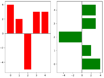
1.画两个条形图,bar和barh, 同时axes[0].axhline画一条横线,axes[1].axvline画一条竖线
import numpy as np
import matplotlib.pyplot as plt

np.random.seed(0)
x = np.arange(5)
y = np.random.randint(-5, 5, 5)
# 分成两个方框,一行两列
fig,axes = plt.subplots(ncols=2)
# 对第一个方框进行画图bar
axes[0].bar(x, y, color='r')
# 对第二个方框进行画图barh
axes[1].barh(x, y, color='g')
# 对第一个方框画一条横线,axhline
axes[0].axhline(0, color='grey', linewidth=2)
# 对第二个方框画一条竖线, axvline
axes[1].axvline(0, color='grey', linewidth=2)

plt.show()
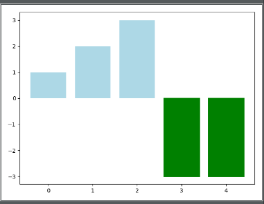
2.根据条形图y的大小设置每个条形图的颜色
np.random.seed(0)
fig, ax = plt.subplots()
v_bars = ax.bar(x, y, color='lightblue')
for bars, height in zip(v_bars, y):
    if height < 0:
        bars.set(edgecolor='darkred', color='green', linewidth=2)
plt.show()
3.fill_between 进行填充操作, .consum 表示的是进行累加操作,将前一个值累加到当前值
x = np.random.randn(100).cumsum()
y = np.linspace(0, 100, 100)
fig, ax = plt.subplots()
ax.fill_between(x, y, color='lightblue')
plt.show()
4. fill_between 对两个函数之间进行填充操作
x = np.linspace(0, 10, 200)
y1 = 2*x + 1
y2 = 3*x + 1.2
y_mean = 0.5*x*np.cos(2*x) + 2.5*x + 1.1
fig, ax = plt.subplots()
# 填充函数之间的值
ax.fill_between(x, y1, y2, color='red')
plt.plot(x, y_mean, color='black')
plt.show()

5. 误差棒的设置plt.bar(yerr=variance) # variance表示误差的大小
mean_values = [1, 2, 3]
# variance表示误差
variance = [0.2, 0.4, 0.5]
bar_label = ['bar1', 'bar2', 'bar3']
# 设置x轴的范围
x_pos = list(range(len(mean_values)))
# yerr用来设置误差棒
plt.bar(x_pos, mean_values, color='r', yerr=variance)
max_y = max(zip(mean_values, variance))
# 设置y轴的显示范围
plt.ylim([0, (max_y[0] + max_y[1]) * 1.2])
# 设置x轴的标签,x_pos表示标签的位置,bar_label表示标签名
plt.xticks(x_pos, bar_label)
plt.ylabel('variable_y')
plt.show()
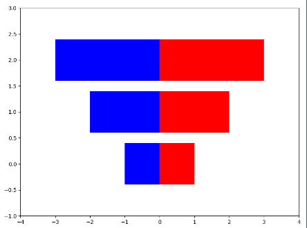
6. 画横向并排的条形图
x1 = np.array([1, 2, 3])
x2 = np.array([1, 2, 3])

bar_label = ['bar1', 'bar2', 'bar3']
fig = plt.figure(figsize=[8, 6])
y_pos = list(np.arange(len(x1)))
plt.barh(y_pos, x1, color='r',)
plt.barh(y_pos, -x2, color='b',)
# 为了使得图形美观,设置xlim和ylim的范围
plt.xlim([-max(x2)-1, max(x1) + 1])
plt.ylim(-1, max(y_pos) + 1)
plt.show()
7.设置位置的宽度进行并排
green_data = [1, 2, 3]
blue_data = [3, 2, 1]
red_data = [2, 3, 3]
labels = ['group1', 'group2', 'group3']
# 设置x_pos的位置
x_pos = list(range(len(green_data)))
print(x_pos)
width = 0.2
plt.bar(x_pos, green_data, width=width, color='g', label=labels[0], alpha=0.6)
plt.bar([x+width for x in x_pos], blue_data, width=width, color='b', label=labels[1], alpha=0.6)
plt.bar([x+2*width for x in x_pos], red_data, width=width, color='r', label=labels[2], alpha=0.6)
plt.legend(loc='best', framealpha=0.05)
plt.show()
8. 在画的条形图上加竖线ax.axvline(data.min()) 在条形图的后面加上%plt.text 通过获得每个条形图的位置信息
data = np.arange(200, 225, 5)
bar_labels = ['a', 'b', 'c', 'd', 'e']
y_pos = list(np.arange(len(data)))
fig, ax = plt.subplots()
# ax.spines['top'].set_visible(False)
# 去除右边的框图
ax.spines['right'].set_visible(False)
plt.yticks(y_pos, bar_labels)
v_bars = plt.barh(y_pos, data)
# 加横线
ax.axvline(data.min(), linestyle='--', color='k')
# 进行对每一个条形块文本标注
for b, d in zip(v_bars, data):
    plt.text(b.get_width(), b.get_y()+b.get_height()/2, '{0:.2%}'.format(d/min(data)))
plt.show()

9. 构造colormap来建立条形图的颜色 使用colormap构造条形图cm.ScalarMappable(col.Normalize())
import matplotlib.colors as col
import matplotlib.cm as cm
mean_values = range(10, 18)
x_pos = range(len(mean_values))
# 构造colormap, cm.hot表示风格
cmap1 = cm.ScalarMappable(col.Normalize(min(mean_values), max(mean_values), cm.hot))
cmap2 = cm.ScalarMappable(col.Normalize(0, 20, cm.hot))
plt.subplot(121)
# cmap1.to_rgba(mean_values) # 将color_map使用到mean_values
plt.bar(x_pos, mean_values, color=cmap1.to_rgba(mean_values))
plt.subplot(122)
plt.bar(x_pos, mean_values, color=cmap2.to_rgba(mean_values))
plt.show()
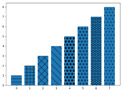
10. b.set_hatch('o') # 画出不同填充风格的条形图
patterns = ('-', '+', 'x', '\', '*', 'o', 'O', '.')
data = range(1, len(patterns) + 1 )
x_pow = range(len(data))

bars = plt.bar(x_pow, data)
for b, p in zip(bars, patterns):
    b.set_hatch(p)

plt.show()