在上一个博客中,我们构建了随机森林温度预测的基础模型,并且研究了特征重要性。
在这个博客中,我们将从两方面来研究数据对预测结果的影响
第一方面:特征不变,只增加样本的数据
第二方面:增加特征数,增加样本的数据
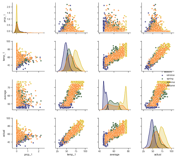
1.sns.pairplot 画出两个变量的关系图,用于研究变量之间的线性相关性,sns.pattle([color]) 用于设置调色板, 有点像scatter_matrix
2.MSE round(abs(pred - test_y).mean(), 2) 研究预测值与真实值之差的平均值
3.MAPE round(100 -abs(pred-test_y)/test_y*100, 2) (1 - 误差与真实值的比值)的平均值
代码:
第一步:载入数据
第二步:使用datetime.datetime.strptime() 将年月日进行组合,构造出日期的标签
第三步: 对数据中的温度特征进行画图
第四步:对新增的特征进行画图
第五步:sns.pairplot进行两两变量的关系画图,使用sns.pattle()生成颜色的调色板
第六步:建立随机森林模型,研究新增加的数据对预测精度的影响,不加入新增的特征
第七步:建立随机森林模型,研究新增加的数据对预测精度的影响,加入新增的特征
import datetime
import numpy as np
import matplotlib.pyplot as plt
import pandas as pd


# 第一步:导入数据
features = pd.read_csv('data/temps_extended.csv')
print(features.describe())
print(features.columns)

# 第二步:使用datetime.datetime.strptime将字符串转换为日期类型
years = features['year']
months = features['month']
days = features['day']
# 先转换为字符串类型
dates = [str(int(year)) + '-' + str(int(month)) + '-' + str(int(day)) for year, month, day in zip(years, months, days)]
# 字符串类型转换为日期类型
dates = [datetime.datetime.strptime(date, '%Y-%m-%d') for date in dates]

# 第三步对温度特征进行画图操作

fig, ((ax1, ax2), (ax3, ax4)) = plt.subplots(ncols=2, nrows=2, figsize=(12, 12))
fig.autofmt_xdate(rotation=60)

ax1.plot(dates, features['temp_2'], linewidth=4)
ax1.set_xlabel(''); ax1.set_ylabel('temperature'); ax1.set_title('pre two max')

ax2.plot(dates, features['temp_1'], linewidth=4)
ax2.set_xlabel(''); ax2.set_ylabel('temperature'); ax2.set_title('pre max')

ax3.plot(dates, features['actual'], linewidth=4)
ax3.set_xlabel(''); ax3.set_ylabel('temperature'); ax3.set_title('today max')

ax4.plot(dates, features['friend'], linewidth=4)
ax4.set_xlabel(''); ax4.set_ylabel('temperature'); ax4.set_title('friend max')

plt.show()

# 第四步:对新增的特征和平均温度进行作图

fig, ((ax1, ax2), (ax3, ax4)) = plt.subplots(ncols=2, nrows=2, figsize=(12, 12))
fig.autofmt_xdate(rotation=60)

ax1.plot(dates, features['average'])
ax1.set_xlabel(''); ax1.set_ylabel('temperature'); ax1.set_title('average')

ax2.plot(dates, features['ws_1'], 'r-')
ax2.set_xlabel(''); ax2.set_ylabel('temperature'); ax2.set_title('WS')

ax3.plot(dates, features['prcp_1'], 'r-')
ax3.set_xlabel(''); ax3.set_ylabel('temperature'); ax3.set_title('Prcp')

ax4.plot(dates, features['snwd_1'], 'ro')
ax4.set_xlabel(''); ax4.set_ylabel('temperature'); ax4.set_title('Snwd')

plt.show()


# 第五步:使用sns.pairplot画两两关系的散点图
# 新增加季节特征,用做画图时的区分
season = []
for month in months:
    if month in [12, 1, 2]:
        season.append('window')
    elif month in [3, 4, 5]:
        season.append('spring')
    elif month in [6, 7, 8]:
        season.append('summer')
    else:
        season.append('Autumn')

feature_matrix = features[['prcp_1', 'temp_1', 'average', 'actual']]
feature_matrix['season'] = season

import  seaborn as sns

sns.set(style='ticks', color_codes=True)

palette = sns.xkcd_palette(['dark blue', 'dark green', 'gold', 'orange'])
# hue表示通过什么进行分类
sns.pairplot(feature_matrix, hue='season', palette=palette, plot_kws=dict(alpha=0.7), diag_kind='kde',
             diag_kws=dict(shade=True))
plt.show()
# 第六步使用增加的数据进行随机森林的建模,不添加新增的特征
feature_names = list(features.columns)
feature_indices = [feature_names.index(feature_name) for feature_name in feature_names
    if feature_names not in ['ws_1', 'prcp_1', 'snwd_1']]
print(feature_indices)
# 使用pd.get_dummies 将week的文本标签转换为one-hot编码
features = pd.get_dummies(features)
# 提取特征和标签
X = features.iloc[:, feature_indices]
y = np.array(features['actual'])
X = X.drop('actual', axis=1)
X = np.array(X)
# 使用train_test_split 进行训练集和测试集的分开
from sklearn.model_selection import train_test_split
train_x, test_x, train_y, test_y = train_test_split(X, y, test_size=0.3, random_state=42)
# 构建随机森林模型进行预测
from sklearn.ensemble import RandomForestRegressor

rf = RandomForestRegressor(n_estimators=1000, random_state=42)
rf.fit(train_x, train_y)
pred_y = rf.predict(test_x)

# 使用MAE指标
MAE = round(abs(pred_y - test_y).mean(), 2)

# 使用MAPE指标
MAPE = round(((1-abs(pred_y-test_y)/test_y)*100).mean(), 2)

print(MAE, MAPE)

# 探讨原来数据的MAE和MAPE
# 使用pd.get_dummies 将week的文本标签转换为one-hot编码
features = pd.read_csv('data/temps.csv')
features = pd.get_dummies(features)
# 提取特征和标签
y = np.array(features['actual'])
X = features.drop('actual', axis=1)
X = np.array(X)
# 使用train_test_split 进行训练集和测试集的分开
from sklearn.model_selection import train_test_split
train_x, test_x, train_y, test_y = train_test_split(X, y, test_size=0.3, random_state=42)
# 构建随机森林模型进行预测
from sklearn.ensemble import RandomForestRegressor

rf = RandomForestRegressor(n_estimators=1000, random_state=42)
rf.fit(train_x, train_y)
pred_y = rf.predict(test_x)

# 使用MAE指标
MAE = round(abs(pred_y - test_y).mean(), 2)

# 使用MAPE指标
MAPE = round(((1-abs(pred_y-test_y)/test_y)*100).mean(), 2)

print(MAE, MAPE)

# 第七步: 探讨将新增加的指标也加入对数据结果的影响
features = pd.read_csv('data/temps_extended.csv')
features = pd.get_dummies(features)
# 提取特征和标签
y = np.array(features['actual'])
X = features.drop('actual', axis=1)
X = np.array(X)
# 使用train_test_split 进行训练集和测试集的分开
from sklearn.model_selection import train_test_split
train_x, test_x, train_y, test_y = train_test_split(X, y, test_size=0.3, random_state=42)
# 构建随机森林模型进行预测
from sklearn.ensemble import RandomForestRegressor

rf = RandomForestRegressor(n_estimators=1000, random_state=42)
rf.fit(train_x, train_y)
pred_y = rf.predict(test_x)

# 使用MAE指标
MAE = round(abs(pred_y - test_y).mean(), 2)

# 使用MAPE指标
MAPE = round(((1-abs(pred_y-test_y)/test_y)*100).mean(), 2)

print(MAE, MAPE)
原始数据的MAE,MAPE 3.87 93.96
只增加数据量的MAE, MAPE 3.73 93.72
增加数据量增加特征的MAE,MAPE 3.71 93.76
从上面可以看出增加数据量和样本特征对结果还是能产生正面的影响