1、推荐商品类的编写
这个类接收一个List参数,就是推荐商品的列表,这个列表是可以左右滚动的。
/*商品推荐*/
class Recommend extends StatelessWidget {
  final List  recommendList;

  Recommend({Key key, this.recommendList}) : super(key: key);
}
2、推荐标题内部方法的编写
实际开发中,要尽量减少嵌套,我们需要把复杂的组件,单独拿出一个方法进行编写。这里就把商品推荐标题单独拿出一个方法进行编写。
/*推荐商品标题*/
Widget _titleWidget(){
 return Container(
   alignment: Alignment.centerLeft,
   padding: EdgeInsets.fromLTRB(10.0, 2.0, 0,5.0),
   decoration: BoxDecoration(
     color:Colors.white,
     border: Border(
       bottom: BorderSide(0.5,color:Colors.black12)
     )
   ),
   child:Text(
     '商品推荐',
     style:TextStyle(color:Colors.pink)
     )
 );
}
3、推荐商品单独项编写
把推荐商品的每一个子项我们也分离出来。每一个子项都使用InkWell,这样为以后的页面导航作准备。里边使用了Column,把内容分成三行。
先不充关于InkWel的使用
InkWell有的叫溅墨效果,有的叫水波纹效果。使用场景是给一些无点击事件的部件添加点击事件时使用(也支持长按、双击等事件),同时你也可以去修改它的颜色和形状。
InkWell(
  borderRadius: BorderRadius.circular(8.0), /*圆角*/
  splashColor: Colors.transparent, /*溅墨色(波纹色)*/
  highlightColor: Colors.transparent, /*点击时的背景色(高亮色)*/
  onTap: () {},/*点击事件*/
  child: Container(),
);
再回访推荐商品的编写
Widget _item(index){
    return InkWell(
      onTap: (){},
      child: Container(
        height: ScreenUtil().setHeight(330),
         ScreenUtil().setWidth(250),
        padding: EdgeInsets.all(8.0),
        decoration:BoxDecoration(
          color:Colors.white,
          border:Border(
            left: BorderSide(0.5,color:Colors.black12)
          )
        ),
        child: Column(
          children: <Widget>[
            Image.network(recommendList[index]['image']),
            Text('¥${recommendList[index]['mallPrice']}'),
            Text(
              '¥${recommendList[index]['price']}',
              style: TextStyle(
                decoration: TextDecoration.lineThrough,
                color:Colors.grey
              ),
            )
          ],
        ),
      ),
    );
}
4、横向列表组件的编写
横向列表组件也进行单独编写,以减少嵌套,这样我们就把每一个重要的部分都进行了分离。
Widget _recommedList(){

  return Container(
    height: ScreenUtil().setHeight(330),
    child: ListView.builder(
      scrollDirection: Axis.horizontal,
      itemCount: recommendList.length,
      itemBuilder: (context,index){
        return _item(index);
      },
    ),
  );
}
有了这三个基本组件,最后我们在build方法里进行组合,形成商品推荐区域。
@override
Widget build(BuildContext context) {
return Container(
   height: ScreenUtil().setHeight(380),
   margin: EdgeInsets.only(top: 10.0),
   child: Column(
     children: <Widget>[
       _titleWidget(),
       _recommedList()
     ],
   ),
);
}
5、整个组件的类代码如下
商品推荐
class Recommend extends StatelessWidget {
  final List  recommendList;

  Recommend({Key key, this.recommendList}) : super(key: key);

  @override
  Widget build(BuildContext context) {
    return Container(
       height: ScreenUtil().setHeight(380),
       margin: EdgeInsets.only(top: 10.0),
       child: Column(
         children: <Widget>[
           _titleWidget(),
           _recommedList()
         ],
       ),
    );
  }

推荐商品标题
  Widget _titleWidget(){
     return Container(
       alignment: Alignment.centerLeft,
       padding: EdgeInsets.fromLTRB(10.0, 2.0, 0,5.0),
       decoration: BoxDecoration(
         color:Colors.white,
         border: Border(
           bottom: BorderSide(0.5,color:Colors.black12)
         )
       ),
       child:Text(
         '商品推荐',
         style:TextStyle(color:Colors.pink)
         )
     );
  }

  Widget _recommedList(){

      return Container(
        height: ScreenUtil().setHeight(330),
        child: ListView.builder(
          scrollDirection: Axis.horizontal,
          itemCount: recommendList.length,
          itemBuilder: (context,index){
            return _item(index);
          },
        ),
      );
  }

  Widget _item(index){
    return InkWell(
      onTap: (){},
      child: Container(
        height: ScreenUtil().setHeight(330),
         ScreenUtil().setWidth(250),
        padding: EdgeInsets.all(8.0),
        decoration:BoxDecoration(
          color:Colors.white,
          border:Border(
            left: BorderSide(0.5,color:Colors.black12)
          )
        ),
        child: Column(
          children: <Widget>[
            Image.network(recommendList[index]['image']),
            Text('¥${recommendList[index]['mallPrice']}'),
            Text(
              '¥${recommendList[index]['price']}',
              style: TextStyle(
                decoration: TextDecoration.lineThrough,
                color:Colors.grey
              ),
            )
          ],
        ),
      ),
    );
  }
}
6、准备数据并进行调用
在 HomePage build 中继续添加:
List<Map> recommendList = (data['data']['recommend'] as List).cast();
 Recommend(recommendList:recommendList),
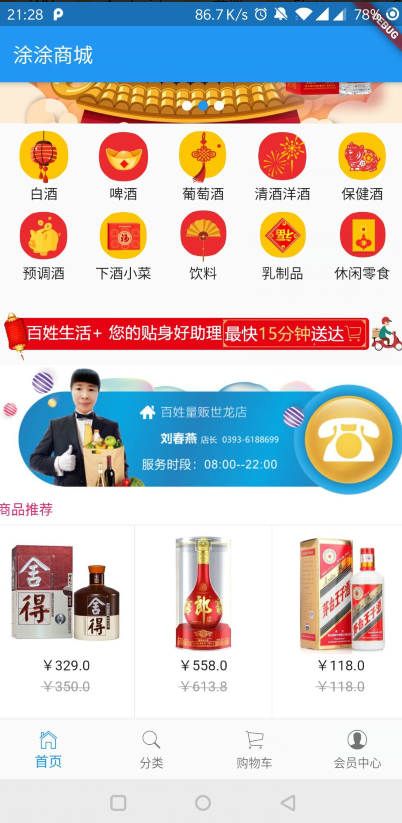
效果图: