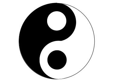
太极图可以理解为一个一半黑一半白的半圆,上面放置着两个圆形,一个黑色边框白色芯,一个白色边框黑色芯。
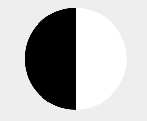
1、实现黑白各半的圆形。
    .box{
        width:200px;height:200px; border-radius:50%;
        background:linear-gradient(90deg,black 50%,white 50%);
        margin:50px auto;position:relative;
    }
2、用:before伪类实现一个黑色边框白色芯的园。
.box:before{
        content:" ";
        position:absolute;
        width:0px;height:0px;
        padding:25px;
        border:25px solid black;
        border-radius: 50%;
        background:white;
        left:50px;
    }

3、用:after伪类实现一个白色边框黑色芯的圆。
.box:after{
        content:" ";
        width:0px;height:0px;
        padding:25px;
        border:25px solid white;
        border-radius: 50%;
        background:black;
        position: absolute;
        left:50px;top:100px;
    }

CSS实现旋转太极图
<!DOCTYPE html>
<html lang="en">
<head>
    <meta charset="UTF-8">
    <title>太极图</title>
    <style>
    *{
        margin:0;padding:0;
    }
    body{
        background: #eee
    }
    .box{
        width:200px;height:200px;
        border-radius:50%;
        background: linear-gradient(90deg,black 50%,white 50%);
        margin:50px auto;
        position:relative;
        animation: tj 3s infinite linear ;}
        .box:before{
        content:" ";
        position:absolute;
        width:0px;
        height:0px;
        padding:25px;
        border:25px solid black;
        border-radius: 50%;
        background:white;
        left:50px;
    }
    .box:after{
        content:" ";
        width:0px;height:0px;
        padding:25px;
        border:25px solid white;
        border-radius: 50%;
        background:black;
        position: absolute;
        left:50px;top:100px;
    }
    @keyframes tj{
        from {transform:rotate(0deg);}
        to{transform:rotate(360deg);}
    }
    </style>
</head>
<body>
    <div class="box"></div>
</body>
</html>
JS实现旋转太极图(鼠标悬停转动,移开停止旋转效果)
<!DOCTYPE html>
<html lang="en">
<head>
    <meta charset="UTF-8">
    <title>太极图</title>
    <style>
        *{
            padding: 0;
            margin: 0;
        }
    body{
        background: #eee
    }
    .tjt{
        width:200px;height:200px;
        border-radius:50%;
        background: linear-gradient(90deg,black 50%,white 50%);
        margin:50px auto;
        position:relative;
    }
        .tjt:before{
        content:" ";
        position:absolute;
        width:0px;
        height:0px;
        padding:25px;
        border:25px solid black;
        border-radius: 50%;
        background:white;
        left:50px;
    }
   .tjt:after{
        content:" ";
        width:0px;height:0px;
        padding:25px;
        border:25px solid white;
        border-radius: 50%;
        background:black;
        position: absolute;
        left:50px;top:100px;
    }
    </style>
</head>
<body>
    <div id="tj" class="tjt" onmouseover="xz()" onmouseout="clearInterval(zh)"></div>
<script>
    var x=0;
    var zh;
    function xz(){
                        clearInterval(zh)
        zh=setInterval(function(){
        x=x+1;
        document.getElementById("tj").style.transform='rotate(' + x + 'deg)';
    },10)
}
</script>
</body>
</html>