# ProgressBar
ProgressBar继承与View类,直接子类有AbsSeekBar和ContentLoadingProgressBar, 其中AbsSeekBar的子类有SeekBar和RatingBar,可见这二者也是基于
ProgressBar实现的。
常用属性讲解
常用属性详解:
android:max:进度条的最大值
android:progress:进度条已完成进度值
android:progressDrawable:设置轨道对应的Drawable对象
android:indeterminate:如果设置成true,则进度条不精确显示进度
android:indeterminateDrawable:设置不显示进度的进度条的Drawable对象
android:indeterminateDuration:设置不精确显示进度的持续时间
android:secondaryProgress:二级进度条,类似于视频播放的一条是当前播放进度,一条是缓冲进度,前者通过progress属性进行设置!
对应的在Java中我们可调用下述方法:
getMax():返回这个进度条的范围的上限
getProgress():返回进度
getSecondaryProgress():返回次要进度
incrementProgressBy(int diff):指定增加的进度
isIndeterminate():指示进度条是否在不确定模式下
setIndeterminate(boolean indeterminate):设置不确定模式下
系统默认进度条使用实例:
<LinearLayout xmlns:android="http://schemas.android.com/apk/res/android"
    xmlns:tools="http://schemas.android.com/tools"
    android:layout_width="match_parent"
    android:layout_height="match_parent"
    android:orientation="vertical"
    tools:context=".MainActivity">
    <!-- 系统提供的圆形进度条,依次是大中小 -->
    <ProgressBar
        style="@android:style/Widget.ProgressBar.Small"
        android:layout_width="wrap_content"
        android:layout_height="wrap_content" />
    <ProgressBar
        android:layout_width="wrap_content"
        android:layout_height="wrap_content" />
    <ProgressBar
        style="@android:style/Widget.ProgressBar.Large"
        android:layout_width="wrap_content"
        android:layout_height="wrap_content" />
    <!--系统提供的水平进度条-->
    <ProgressBar
        style="@android:style/Widget.ProgressBar.Horizontal"
        android:layout_width="match_parent"
        android:layout_height="wrap_content"
        android:max="100"
        android:progress="18" />
    <ProgressBar
        style="@android:style/Widget.ProgressBar.Horizontal"
        android:layout_width="match_parent"
        android:layout_height="wrap_content"
        android:layout_marginTop="10dp"
        android:indeterminate="true" />
</LinearLayout>
显示的效果如下:

动画替代圆形进度条
第一个方案是,使用一套连续图片,形成一个帧动画,当需要进度图的时候,让动画可见,不需要的时候让动画不可见。
而这个动画,一般是使用AnimationDrawable来实现的
1、在res目录下新建一个:anim文件件,然后创建amin_pgbar.xml的资源文件:
<?xml version="1.0" encoding="utf-8"?>
<animation-list xmlns:android="http://schemas.android.com/apk/res/android"
    android:oneshot="false" >

    <item
        android:drawable="@drawable/loading_01"
        android:duration="200"/>
    <item
        android:drawable="@drawable/loading_02"
        android:duration="200"/>
    <item
        android:drawable="@drawable/loading_03"
        android:duration="200"/>
    <item
        android:drawable="@drawable/loading_04"
        android:duration="200"/>
    <item
        android:drawable="@drawable/loading_05"
        android:duration="200"/>
    <item
        android:drawable="@drawable/loading_06"
        android:duration="200"/>
    <item
        android:drawable="@drawable/loading_07"
        android:duration="200"/>
    <item
        android:drawable="@drawable/loading_08"
        android:duration="200"/>
    <item
        android:drawable="@drawable/loading_09"
        android:duration="200"/>
    <item
        android:drawable="@drawable/loading_10"
        android:duration="200"/>
    <item
        android:drawable="@drawable/loading_11"
        android:duration="200"/>
    <item
        android:drawable="@drawable/loading_12"
        android:duration="200"/>

</animation-list>
2、接着写个布局文件,里面仅仅有一个ImageView即可,用于显示进度条,把src设置为上述drawable资源即可
public class MainActivity extends AppCompatActivity {
    private ImageView img_pgbar;
    private AnimationDrawable ad;
    @Override
    protected void onCreate(Bundle savedInstanceState) {
        super.onCreate(savedInstanceState);
        setContentView(R.layout.activity_main);
        img_pgbar = (ImageView) findViewById(R.id.img_pgbar);
        ad = (AnimationDrawable) img_pgbar.getDrawable();
        img_pgbar.postDelayed(new Runnable() {
            @Override
            public void run() {
                ad.start();
            }
        }, 100);
    }
}
这里只是写了如何启动动画,在需要显示进度条的时候,让ImageView可见; 在不需要的时候让他隐藏即可!
其实Progressbar本身有一个indeterminateDrawable,只需把 这个参数设置成上述的动画资源即可,但是进度条条的图案大小是不能直接修改的,
需要Java代码中 修改,如果你设置了宽高,而且这个宽高过大的时候,你会看到有多个进度条。

自定义圆形进度条
创建CircleProgressBar继承自View类,并实现三个构造方法:
public class CircleProgressBar extends View {
private Paint mBackPaint;
private Paint mFrontPaint;
private Paint mTextPaint;
private float mStrokeWidth = 50;
private float mHalfStrokeWidth = mStrokeWidth / 2;
private float mRadius = 200;
private RectF mRect;
private int mProgress = 0;
//目标值,想改多少就改多少
private int mTargetProgress = 90;
private int mMax = 100;
private int mWidth;
private int mHeight;
public CircleProgressBar(Context context) {
super(context);
init();
}
public CircleProgressBar(Context context, AttributeSet attrs) {
super(context, attrs);
init();
}
public CircleProgressBar(Context context, AttributeSet attrs, int defStyleAttr) {
super(context, attrs, defStyleAttr);
init();
}
//完成相关参数初始化
private void init() {
mBackPaint = new Paint();
mBackPaint.setColor(Color.WHITE);
mBackPaint.setAntiAlias(true);
mBackPaint.setStyle(Paint.Style.STROKE);
mBackPaint.setStrokeWidth(mStrokeWidth);
mFrontPaint = new Paint();
mFrontPaint.setColor(Color.GREEN);
mFrontPaint.setAntiAlias(true);
mFrontPaint.setStyle(Paint.Style.STROKE);
mFrontPaint.setStrokeWidth(mStrokeWidth);
mTextPaint = new Paint();
mTextPaint.setColor(Color.GREEN);
mTextPaint.setAntiAlias(true);
mTextPaint.setTextSize(80);
mTextPaint.setTextAlign(Paint.Align.CENTER);
}
//重写测量大小的onMeasure方法和绘制View的核心方法onDraw()
@Override
protected void onMeasure(int widthMeasureSpec, int heightMeasureSpec) {
super.onMeasure(widthMeasureSpec, heightMeasureSpec);
mWidth = getRealSize(widthMeasureSpec);
mHeight = getRealSize(heightMeasureSpec);
setMeasuredDimension(mWidth, mHeight);
}
@Override
protected void onDraw(Canvas canvas) {
initRect();
float angle = mProgress / (float) mMax * 360;
canvas.drawCircle(mWidth / 2, mHeight / 2, mRadius, mBackPaint);
canvas.drawArc(mRect, -90, angle, false, mFrontPaint);
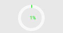
canvas.drawText(mProgress + "%", mWidth / 2 + mHalfStrokeWidth, mHeight / 2 + mHalfStrokeWidth, mTextPaint);
if (mProgress < mTargetProgress) {
mProgress += 1;
invalidate();
}
}
public int getRealSize(int measureSpec) {
int result = 1;
int mode = MeasureSpec.getMode(measureSpec);
int size = MeasureSpec.getSize(measureSpec);
if (mode == MeasureSpec.AT_MOST || mode == MeasureSpec.UNSPECIFIED) {
//自己计算
result = (int) (mRadius * 2 + mStrokeWidth);
} else {
result = size;
}
return result;
}
private void initRect() {
if (mRect == null) {
mRect = new RectF();
int viewSize = (int) (mRadius * 2);
int left = (mWidth - viewSize) / 2;
int top = (mHeight - viewSize) / 2;
int right = left + viewSize;
int bottom = top + viewSize;
mRect.set(left, top, right, bottom);
}
}
}
使用到的布局文件如下所示:
<com.jay.progressbardemo.CircleProgressBar
        android:layout_width="match_parent"
        android:layout_height="match_parent"/>
显示的效果如下:
SeekBar
SeekBar基本用法
由于是ProgressBar子类,常用的属性无非就下面这几个常用的属性,Java代码里只要setXxx即可
android:max="100" //滑动条的最大值
android:progress="60" //滑动条的当前值
android:secondaryProgress="70" //二级滑动条的进度
android:thumb = "@mipmap/sb_icon" //滑块的drawable
接着要说下SeekBar的事件了,SeekBar.OnSeekBarChangeListener 我们只需重写三个对应的方法:
onProgressChanged:进度发生改变时会触发
onStartTrackingTouch:按住SeekBar时会触发
onStopTrackingTouch:放开SeekBar时触发
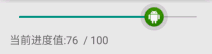
下面来看SeekBar的简单示例:
public class MainActivity extends AppCompatActivity {
    private SeekBar sb_normal;
    private TextView txt_cur;
    private Context mContext;
    @Override
    protected void onCreate(Bundle savedInstanceState) {
        super.onCreate(savedInstanceState);
        setContentView(R.layout.activity_main);
        mContext = MainActivity.this;
        bindViews();
    }
    private void bindViews() {
        sb_normal = (SeekBar) findViewById(R.id.sb_normal);
        txt_cur = (TextView) findViewById(R.id.txt_cur);
        sb_normal.setOnSeekBarChangeListener(new SeekBar.OnSeekBarChangeListener() {
            @Override
            public void onProgressChanged(SeekBar seekBar, int progress, boolean fromUser) {
                txt_cur.setText("当前进度值:" + progress + "  / 100 ");
            }
            @Override
            public void onStartTrackingTouch(SeekBar seekBar) {
                Toast.makeText(mContext, "触碰SeekBar", Toast.LENGTH_SHORT).show();
            }
            @Override
            public void onStopTrackingTouch(SeekBar seekBar) {
                Toast.makeText(mContext, "放开SeekBar", Toast.LENGTH_SHORT).show();
            }
        });
    }
}
显示的效果如下:
SeekBar定制
滑块状态Drawable:sb_thumb.xml
<?xml version="1.0" encoding="utf-8"?>
<selector xmlns:android="http://schemas.android.com/apk/res/android">
    <item android:state_pressed="true" android:drawable="@mipmap/seekbar_thumb_pressed"/>
    <item android:state_pressed="false" android:drawable="@mipmap/seekbar_thumb_normal"/>
</selector>
贴下素材:


1、条形栏Bar的Drawable:sb_bar.xml,这里用到一个layer-list的drawable资源!其实就是层叠图片,依次是:背景,二级进度条,当前进度:
<?xml version="1.0" encoding="utf-8"?>
<layer-list
    xmlns:android="http://schemas.android.com/apk/res/android">
    <item android:id="@android:id/background">
        <shape>
            <solid android:color="#FFFFD042" />
        </shape>
    </item>
    <item android:id="@android:id/secondaryProgress">
        <clip>
            <shape>
                <solid android:color="#FFFFFFFF" />
            </shape>
        </clip>
    </item>
    <item android:id="@android:id/progress">
        <clip>
            <shape>
                <solid android:color="#FF96E85D" />
            </shape>
        </clip>
    </item>
</layer-list>
2、然后布局引入SeekBar后,设置下progressDrawable与thumb即可
<SeekBar
        android:id="@+id/sb_normal"
        android:layout_width="match_parent"
        android:layout_height="wrap_content"
        android:maxHeight="5.0dp"
        android:minHeight="5.0dp"
        android:progressDrawable="@drawable/sb_bar"
        android:thumb="@drawable/sb_thumb"/>
RatingBar
它也是ProgressBar的子类,相关属性:
android:isIndicator:是否用作指示,用户无法更改,默认false
android:numStars:显示多少个星星,必须为整数
android:rating:默认评分值,必须为浮点数
android:stepSize: 评分每次增加的值,必须为浮点数
除了上面这些,还有两种样式供我们选择:
style="?android:attr/ratingBarStyleSmall"
style="?android:attr/ratingBarStyleIndicator"
为其添加事件只需为RatingBar设置OnRatingBarChangeListener事件,然后重写下onRatingChanged()方法即可。
public class MainActivity extends AppCompatActivity {
    private RatingBar rb_normal;
    @Override
    protected void onCreate(Bundle savedInstanceState) {
        super.onCreate(savedInstanceState);
        setContentView(R.layout.activity_main);
        rb_normal = (RatingBar) findViewById(R.id.rb_normal);
        rb_normal.setOnRatingBarChangeListener(new RatingBar.OnRatingBarChangeListener() {
            @Override
            public void onRatingChanged(RatingBar ratingBar, float rating, boolean fromUser) {
                Toast.makeText(MainActivity.this, "rating:" + String.valueOf(rating),
                        Toast.LENGTH_LONG).show();
            }
        });
    }
}
显示的效果如下:

RatingBar定制
1、和前面的SeekBar一样编写一个layer-list的文件:ratingbar_full.xml:
<?xml version="1.0" encoding="utf-8"?>
<layer-list xmlns:android="http://schemas.android.com/apk/res/android">
    <item android:id="@android:id/background"
        android:drawable="@mipmap/ic_rating_off1" />
    <item android:id="@android:id/secondaryProgress"
        android:drawable="@mipmap/ic_rating_off1" />
    <item android:id="@android:id/progress"
        android:drawable="@mipmap/ic_rating_on1" />
</layer-list>
2、接着在style.xml中自定义下RatingBar Style,在style.xml加上这个:
<style name="roomRatingBar" parent="@android:style/Widget.RatingBar">
     <item name="android:progressDrawable">@drawable/ratingbar_full</item>
     <item name="android:minHeight">24dip</item>
     <item name="android:maxHeight">24dip</item>
</style>
3、最后在布局中的Ratingbar组件设置下:
<RatingBar
     android:id="@+id/rb_normal"
     style="@style/roomRatingBar"
     android:layout_width="wrap_content"
     android:layout_height="wrap_content" />
显示的效果如下: