div{
         200px;
        height: 200px;
        border:1px solid #000;
        //* 要加绝对地位 */
        position: absolute;
        //* 50%-width的一半,水平居中 */
        left: calc(50% - 100px);
        //* 50%-height的一半,垂直居中 */
        top: calc(50% - 100px);
}
1、border
border-radius: 10px;//*四个方向 */
border-radius: 10px 20px 30px 40px;/ /* 左上-右上-右下-左下 */
border-radius: 10px 20px 40px; //* 左上-(右上,左下)-右下 */
      border-top-left-radius: 200px 100px;  == border-top-left-radius: 200px;
        border-top-right-radius: 200px 200px;   ==border-top-right-radius: 200px;
        border-bottom-left-radius: 200px 200px; ==  border-bottom-left-radius: 200px ;
        border-bottom-right-radius: 100px 100px;== border-bottom-right-radius: 100px;
图形:
(1)、扇形
div{
         200px;
        height: 200px;
        border:1px solid #000;
        position: absolute;
        left: calc(50% - 100px);
        top: calc(50% - 100px);
        border-top-left-radius: 200px 200px;// 水平,垂直
    }
(2)、半圆
div{
         400px;
        height: 200px;
        border:1px solid #000;
        position: absolute;
        left: calc(50% - 100px);
        top: calc(50% - 100px);
        border-top-left-radius: 200px 200px;
        border-top-right-radius: 200px 200px;
    }
(3)、叶子
div{
         200px;
        height: 200px;
        border:1px solid #000;
        position: absolute;
        left: calc(50% - 100px);
        top: calc(50% - 100px);
        border-top-left-radius: 200px 200px;
        border-bottom-right-radius: 200px 200px;
    }
div{
         400px;
        height: 200px;
        border:1px solid #000;
        position: absolute;
        left: calc(50% - 100px);
        top: calc(50% - 100px);
        border-top-left-radius: 200px 200px;
        border-bottom-right-radius: 200px 200px;
    }
2、box-shodow
box-shadow: 10px 10px 50px 500px #fff;//水平偏移量,垂直偏移量,模糊阴影(基于边框的位置向两边同时模糊),传播距离,颜色
box-shadow: outset(默认) 10px 10px 50px 500px #fff;//外阴影
box-shadow: inset 10px 10px 50px 500px #fff;//内阴影
//* 模糊颜色最前设置的在最上面 */
box-shadow: inset 0px 0px 10px #fff,
                  3px 0px 10px #f0f,
                  0px -3px 10px #0ff;
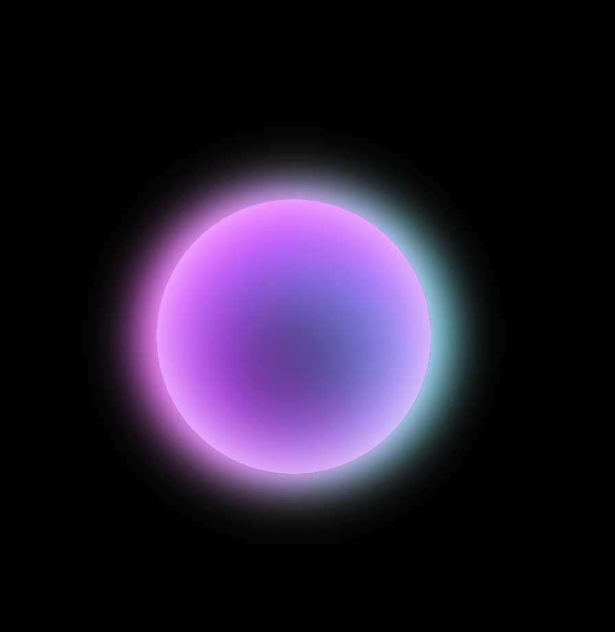
div {
             200px;
            height: 200px;
            background-color: #000;
            position: absolute;
            border-radius: 50%;
            left: calc(50% - 100px);
            top: calc(50% - 100px);
            box-shadow: inset 0px 0px 50px #fff,
                        inset 10px 30px 80px #f0f,
                        inset -10px 40px 80px #0ff,
                        inset 10px 0px 300px #f0f,
                        inset -10px 0px 300px #0ff,
                        0px 0px 50px #fff,
                        -10px 0px 30px #f0f,
                        10px 0px 30px #0ff;
        }

div {
             50px;
            height: 50px;
            background-color: #fff;
            position: absolute;
            border-radius: 50%;
            left: calc(50% - 25px);
            top: calc(50% - 25px);
            box-shadow: 0px 0px 40px 40px #fff,
                        0px 0px 200px 125px #ff0;
        }
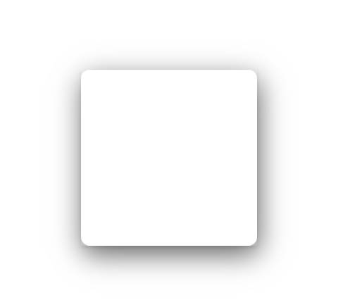
div {
             100px;
            height:100px;
            background-color: #fff;
            position: absolute;
            left: calc(50% - 25px);
            top: calc(50% - 25px);
            box-shadow: 0px 1px 2px rgba(0, 0, 0,0.1);
            transition: all 0.6s;
        }
        div::after{
            content: '';
            position: absolute;
            left: 0;
            top: 0;
             100%;
            height: 100%;
            border-radius: 5px;
            box-shadow: 1px 5px 15px rgba(0, 0, 0, 0.6);
            opacity: 0;
            transition: all 0.6s;
        }
        div:hover{
            transform: scale(1.25,1.25);
        }
        div:hover::after{
            opacity: 1;
        }
3、background-image
字体颜色是背景图片
 div {
            font-size: 30px;
            font-weight: bold;
             300px;
            height:100px;
            position: absolute;
            left: calc(50% - 25px);
            top: calc(50% - 25px);
            background-image: url('./img/1.jpg');
            -webkit-background-clip: text;
            background-clip: text;
            -webkit-text-fill-color: transparent;
            /* text-fill-color: transparent; */
            background-size: cover;
            background-position: 0 0;
            transition: all 0.6s;
        }
        div:hover{
            background-position: center center;

        }
//* 线性渐变,可以写多个值, 方向,10px是占用的宽度 */
background-image: linear-gradient(to right,#0f0 10px,#ff0 20px,#0ff 30px);
//* 镜像渐变 */
//* background-image: radial-gradient(位置,颜色(可写多个)) */
//* 位置:circle at 100px 水平 50px 垂直/ circle at right bottom/circle at 50% 20% /ellipse at 10px 30px(椭圆)
//* closest-corner(最近的角落)/closest-side(最近的边)/farthestcorner/farthest-side */
background-image: radial-gradient(ellipse farthest-side at 10px 30px, #0f0,#ff0,#0ff);