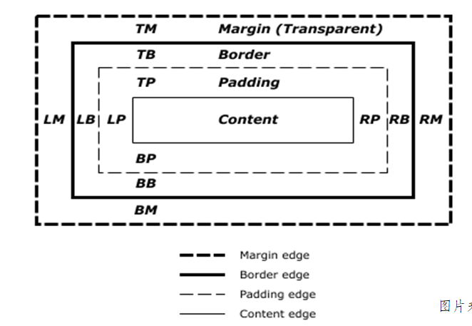
盒子模型
把页面上的每一个元素当成一个盒子
由内容,内边距,边框,外边距组成
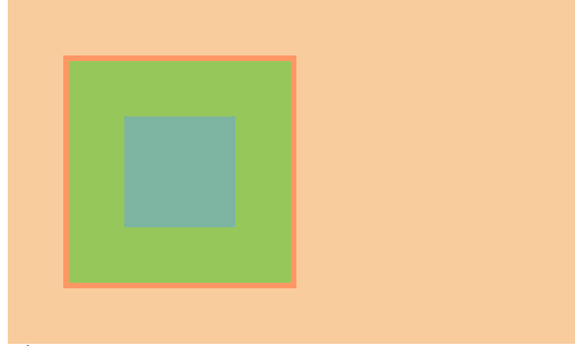
盒子模型举例
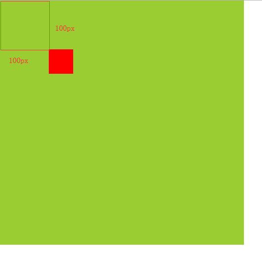
<!DOCTYPE html>
<html lang="en">
<head>
    <meta charset="UTF-8">
    <title>Title</title>
    <style>
        div{
            width: 100px;
            height: 100px;
            background: yellowgreen;
            border: 5px solid red;
            padding: 50px;    内边距
            margin: 50px;    外边距
        }
        /*
            盒子大小=样式宽 + 内边距 + 边框
            盒子宽度=左border+右border+width+左padding+右padding
            盒子高度=上border+下border+height+上padding+下padding
        */
    </style>
</head>
<body>
    <div>

    </div>
</body>
</html>
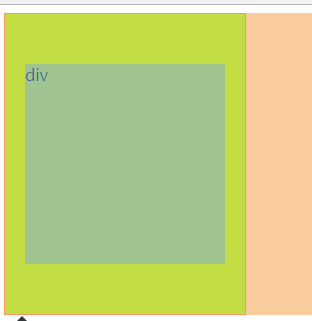
padding
<!DOCTYPE html>
<html lang="en">
<head>
    <meta charset="UTF-8">
    <title>Title</title>
    <style>
        /*
        padding  内边距,边框与内容之间的距离
         一个值的时候: 代表四个方向值一样 上右下左(顺时针)
         二个值的时候: 上下  右左
         三个值的时候: 上 右左 下
         四个值的时候: 上  右  下 左
        */
        div{
            width: 200px;
            height: 200px;
            background: yellow;
            border: 1px solid red;
            padding: 50px 20px;  上下50px,左右20px
        }
    </style>
</head>
<body>
    <div>div</div>
</body>
</html>
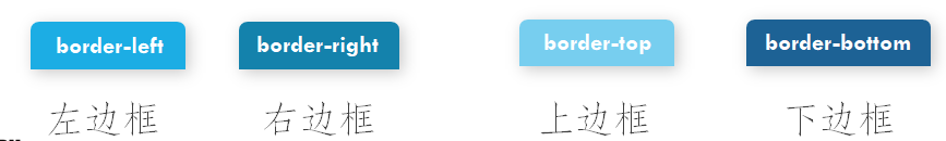
border

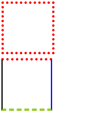
<!DOCTYPE html>
<html lang="en">
<head>
    <meta charset="UTF-8">
    <title>Title</title>
    <style>
/*
盒子模型
盒子是由内容(content)、内边距(padding)、外边距(margin)、边框(border)组成的
*/

/*
        border:边框 类型 颜色;
        border:width style color;复合样式
        border-width
        border-style solid实线 dashed虚线 dotted点线 double双边框
        border-color
        一个值的时候: 代表四个方向值一样 上右下左(顺时针)
        二个值的时候: 上下  右左
        三个值的时候: 上 右左 下
        四个值的时候: 上  右 下 左

        border-width 边框大小
        border-top-width 上边框大小
        border-right-width 右边框大小
        border-bottom-width 下边框大小
        border-left-width 左边框大小
        border-top-0

        border-style 边框样式
        border-top-style  顶部边框类型
        border-right-style 右边边框类型
        border-bottom-style 底部边框类型
        border-left-style 左边边框类型

        border-color 边框颜色
        border-top-color  顶部边框颜色
        border-right-color 右边边框颜色
        border-bottom-color 底部边框颜色
        border-left-color 左边边框颜色

     #### border-top/right/bottom/left会增加宽度/高度,可以用box-sizing: border-box; 让边框放在布局的里面排布 ####
         */
        div{
            width: 200px;
            height: 200px;
            /*background: skyblue;*/
            border: 10px dotted red;
        }
        p{
            width: 200px;
            height: 200px;
            border-width: 10px 5px;
            border-style: dotted solid dashed;
            border-color: red blue yellowgreen black;
        }
    </style>
</head>
<body>
    <div></div>
    <p></p>
</body>
</html>
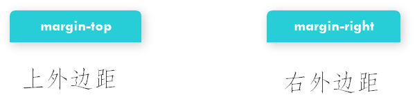
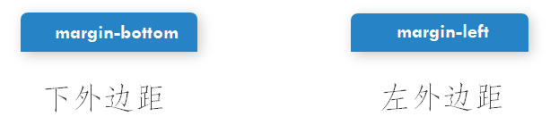
margin
<!DOCTYPE html>
<html lang="en">
<head>
    <meta charset="UTF-8">
    <title>Title</title>
    <style>
        *{
            margin: 0;
            padding: 0;
        }
        /*
        margin 外边距 元素与其他元素的距离(边框以外的距离)
        一个值的时候: 代表四个方向值一样 上右下左(顺时针)
         二个值的时候: 上下  右左
         三个值的时候: 上 右左 下
         四个值的时候: 上  右  下 左
         margin: auto; 快速左右居中
         垂直方向: margin-bottom,margin-top   取两者之间的较大值
         水平方向: margin-left,margin-right   取两者的和
         overflow:hidden; 解决内边距重叠问题
         border
         */
        /*div{*/
            /* 100px;*/
            /*height: 100px;*/
            /*background: yellow;*/
            /*!*margin: 50px auto;*!*/
            /*!*margin-left: auto;*!*/
            /*!*margin-right: auto;*!*/
            /*display: inline-block;*/
            /*margin: 0 50px;*/
        /*}*/
        .box1{
            /*margin-top: 100px;*/
        }

        .wrap{
            width: 500px;
            height: 500px;
            background: yellowgreen;
            /*border: 1px solid red;*/
            overflow: hidden;
        }
        .box{
            width: 50px;
            height: 50px;
            background: red;
            margin: 100px;
        }
    </style>
</head>
<body>
    <!--<div></div><div class="box1"></div>-->

    <div class="wrap">
        <div class="box"></div>
    </div>
</body>
</html>
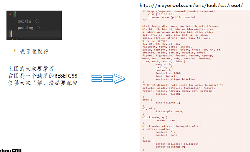
Reset CSS
重置css
浏览器在解析某些标签的时候,本身就自带了一些样式,导致写样式的时候就会效果不一致
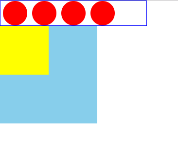
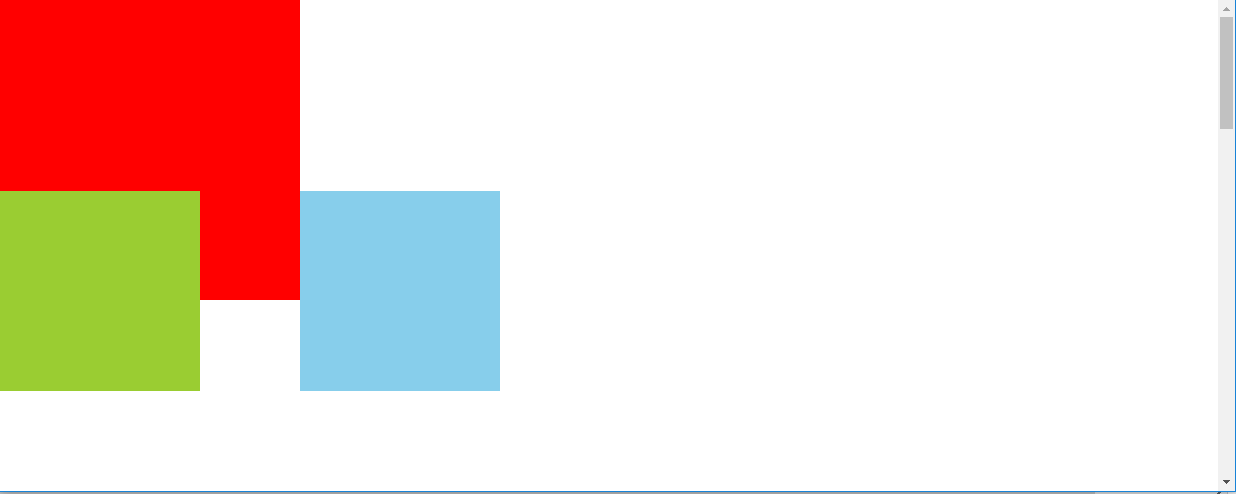
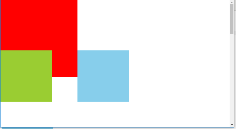
浮动
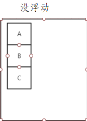
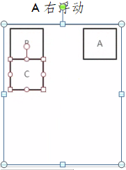
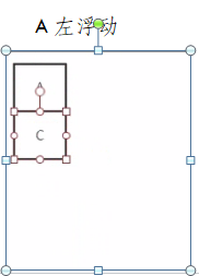
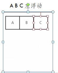
B,C上移 B,C上移,B被覆盖
<!DOCTYPE html>
<html lang="en">
<head>
    <meta charset="UTF-8">
    <title>Title</title>
    <style>
        *{
            margin: 0;
            padding: 0;
        }
        /*
    浮动的定义:使元素脱离文档流,按照指定(左右)方向发生移动,遇到父级边界或者相邻的浮动元素停下来。
    文档流:是文档中可显示对象在排列时所占用的位置/空间(在页面中占位置)
    脱离文档流 :在页面中不占位置
    清除浮动
    1.给父级增加高度(不推荐使用)
    2.给父级加overflow:hidden;
    3.给父级加一个类
    .clearfix::after{
        content: "";
        display: block;
        clear: both;
        }
    浮动的特点
    如果只给前面的元素浮动,后面的要占据他的位置
    造成高度坍塌
    */
        li{
            list-style: none;
        }

        ul{
            width: 300px;
            /*height: 50px;*/
            border: 1px solid blue;
        }
        li{
            width: 50px;
            /*display: inline-block;*/
            float: left;
            height: 50px;
            background: red;
            margin: 0 5px;
            border-radius: 50%;
        }
        .box{
            width: 100px;
            height: 100px;
            background: yellow;
            float: left;
        }
        .wrap{
            width: 200px;
            height: 200px;
            background: skyblue;
        }
        .box1{
            width: 500px;
            border: 1px solid red;
            /*height: 50px;  清除浮动1*/
            /*overflow: hidden;    清除浮动2*/
        }
        .box1 li{
            width: 100px;
            height: 50px;
            background: aqua;
        }
        li.left{
            float: left;
        }
        li.right{
            float: right;
        }
        .clearfix::after{
            display: block;
            content: "";
            clear: both;
        }
    </style>
</head>
<body>
    <ul class="clearfix">
        <li></li>
        <li></li>
        <li></li>
        <li></li>
    </ul>
    <div class="box"></div>
    <div class="wrap"></div>

    <!--<ul class="box1 clearfix">-->
        <!--<li class="left"></li>-->
        <!--<li class="right"></li>-->
    <!--</ul>-->
    <!--<p style=" 200px;height: 200px;background: red"></p>-->
</body>
</html>
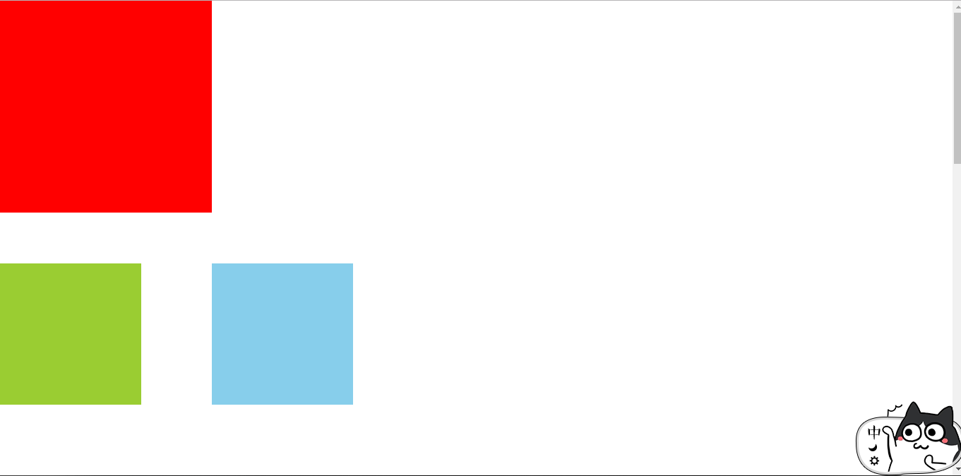
定位
定位一定要找好参照物
1,静态定位static,默认值不会发生任何变化
2,相对定位relative不会脱离文档流,以自身元素为参考,可以给top,rigth,bottem,left
3,绝对定位absolute,脱离文档流,默认以整个文档为参考,有定位父级,则父级为参考,可以给top,rigth,bottem,left
4,固定定位fixed,相对于浏览器窗口进行定位,窗口滚动,依然不会变
<!DOCTYPE html>
<html lang="en">
<head>
    <meta charset="UTF-8">
    <title>Title</title>
    <style>
        *{
            margin: 0;
            padding: 0;
        }
        /*
            position 定位
            static 静态定位(没有定位),默认
            relative 相对定位,相对于正常位置(原来没定位之前的位置)进行定位,还要占据位置
            absolute 绝对定位,没有占据位置,使元素完全脱离文档流
                     没有定位父级,则相对于整个文档发生偏移
                     参考最近非static定位的父级进行定位
            fixed    固定定位,相对于浏览器窗口进行定位
            方向词
                left
                right
                top
                bottom
            z-index 规定定位的层级(默认0)
                值:number 值越大层级越高

         */
        .box{
            width: 200px;
            height: 200px;
            background: yellowgreen;
            /*position: relative;*/
            /*margin: auto;*/
            /*top: 50px;*/
            /*left: 100px;*/
            position: absolute;
            /*margin: 50px;*/
            bottom: 100px;
        }
        .wrap{
            width: 300px;
            background: red;
            height: 300px;
        }
        .fix{
            width: 200px;
            height: 200px;
            background: skyblue;
            position: fixed;
            bottom: 100px;
            left: 300px;
        }
    </style>
</head>
<body style="height: 2000px;">
    <div class="box"></div>
    <div class="wrap"></div>
    <div class="fix"></div>
</body>
</html>
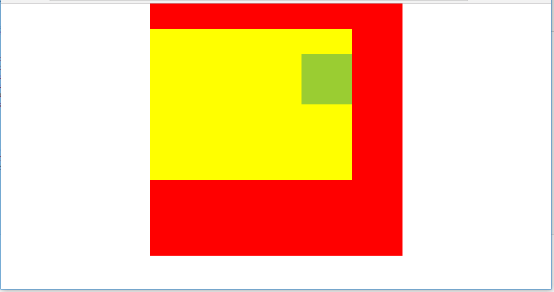
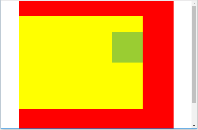
固定定位
<!DOCTYPE html>
<html lang="en">
<head>
    <meta charset="UTF-8">
    <title>Title</title>
    <style>
        *{
            margin: 0;
            padding: 0;
        }
        .box{
            width: 500px;
            height: 500px;
            background: red;
            margin: auto;
            position: relative;
        }
        .fix{
            width: 400px;
            height: 300px;
            background: yellow;
            position: fixed;
            top: 50px;
        }
        .wrap{
            width: 100px;
            height: 100px;
            background: yellowgreen;
            position: absolute;
            left: 300px;
            top: 50px;
        }
    </style>
</head>
<body>
    <div class="box">
        <div class="fix">
            <div class="wrap"></div>
        </div>
    </div>
</body>
</html>
定位涉及到z-index属性
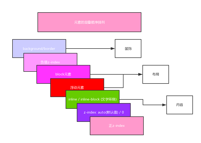
<!DOCTYPE html>
<html lang="en">
<head>
    <meta charset="UTF-8">
    <title>Title</title>
    <style>
        *{
            margin: 0;
            padding: 0;
        }
        ul{
            position: relative;
        }
        li{
            list-style: none;
            width: 50px;
            height: 50px;
            border: 1px solid red;
            position: absolute;
        }
        .box1{
            background: yellowgreen;
            /*z-index: 10;*/
        }
        .box2{
            background: red;
            /*z-index: 1;*/
        }
        .box3{
            background: black;
            z-index: -2;
        }
    </style>
</head>
<body>
<ul>
    <li class="box1"></li>
    <li class="box2"></li>
    <li class="box3"></li>
</ul>
</body>
</html>