表单主要包含表单域、输入框、下拉框、单选框、多选框和按钮等控件。
1.基本实例
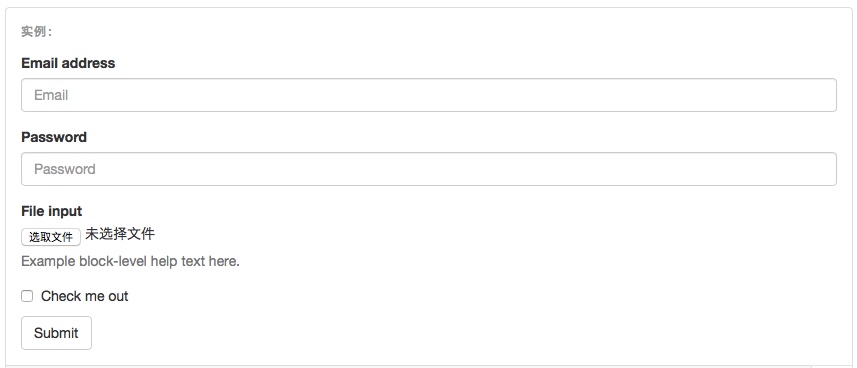
单独的表单控件会被自动赋予一些全局样式。所有设置了 .form-control 类的 <input>、<textarea>和 <select> 元素都将被默认设置宽度属性为 100%;。 将 label 元素和前面提到的控件包裹在 .form-group 中可以获得最好的排列。
<form>
  <div class="form-group">
    <label for="exampleInputEmail1">Email address</label>
    <input type="email" class="form-control" id="exampleInputEmail1" placeholder="Email">
  </div>
  <div class="form-group">
    <label for="exampleInputPassword1">Password</label>
    <input type="password" class="form-control" id="exampleInputPassword1" placeholder="Password">
  </div>
  <div class="form-group">
    <label for="exampleInputFile">File input</label>
    <input type="file" id="exampleInputFile">
    <p class="help-block">Example block-level help text here.</p>
  </div>
  <div class="checkbox">
    <label>
      <input type="checkbox"> Check me out
    </label>
  </div>
  <button type="submit" class="btn btn-default">Submit</button>
</form>

2.内联表单
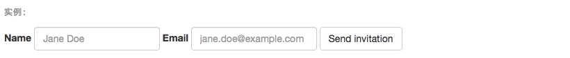
为 <form> 元素添加 .form-inline 类可使其内容左对齐并且表现为 inline-block 级别的控件。只适用于视口(viewport)至少在 768px 宽度时(视口宽度再小的话就会使表单折叠)。
可能需要手动设置宽度
在 Bootstrap 中,输入框和单选/多选框控件默认被设置为 100%; 宽度。在内联表单,我们将这些元素的宽度设置为 auto;,因此,多个控件可以排列在同一行。根据你的布局需求,可能需要一些额外的定制化组件。
一定要添加 label 标签
如果你没有为每个输入控件设置 label 标签,屏幕阅读器将无法正确识别。对于这些内联表单,你可以通过为 label 设置 .sr-only 类将其隐藏。还有一些辅助技术提供label标签的替代方案,比如 aria-label、aria-labelledby 或 title 属性。如果这些都不存在,屏幕阅读器可能会采取使用 placeholder 属性,如果存在的话,使用占位符来替代其他的标记,但要注意,这种方法是不妥当的。
<form class="form-inline">
  <div class="form-group">
    <label for="exampleInputName2">Name</label>
    <input type="text" class="form-control" id="exampleInputName2" placeholder="Jane Doe">
  </div>
  <div class="form-group">
    <label for="exampleInputEmail2">Email</label>
    <input type="email" class="form-control" id="exampleInputEmail2" placeholder="jane.doe@example.com">
  </div>
  <button type="submit" class="btn btn-default">Send invitation</button>
</form>

<form class="form-inline">
  <div class="form-group">
    <label class="sr-only" for="exampleInputEmail3">Email address</label>
    <input type="email" class="form-control" id="exampleInputEmail3" placeholder="Email">
  </div>
  <div class="form-group">
    <label class="sr-only" for="exampleInputPassword3">Password</label>
    <input type="password" class="form-control" id="exampleInputPassword3" placeholder="Password">
  </div>
  <div class="checkbox">
    <label>
      <input type="checkbox"> Remember me
    </label>
  </div>
  <button type="submit" class="btn btn-default">Sign in</button>
</form>
 

<form class="form-inline">
  <div class="form-group">
    <label class="sr-only" for="exampleInputAmount">Amount (in dollars)</label>
    <div class="input-group">
      <div class="input-group-addon">$</div>
      <input type="text" class="form-control" id="exampleInputAmount" placeholder="Amount">
      <div class="input-group-addon">.00</div>
    </div>
  </div>
  <button type="submit" class="btn btn-primary">Transfer cash</button>
</form>

3.水平排列的表单:.form-horizontal
通过为表单添加 .form-horizontal 类,并联合使用 Bootstrap 预置的栅格类,可以将 label 标签和控件组水平并排布局。这样做将改变 .form-group 的行为,使其表现为栅格系统中的行(row),因此就无需再额外添加 .row 了。这样可以通过栅格的大小控制input控件的宽度。
<form class="form-horizontal">
  <div class="form-group">
    <label for="inputEmail3" class="col-sm-2 control-label">Email</label>
    <div class="col-sm-10">
      <input type="email" class="form-control" id="inputEmail3" placeholder="Email">
    </div>
  </div>
  <div class="form-group">
    <label for="inputPassword3" class="col-sm-2 control-label">Password</label>
    <div class="col-sm-10">
      <input type="password" class="form-control" id="inputPassword3" placeholder="Password">
    </div>
  </div>
  <div class="form-group">
    <div class="col-sm-offset-2 col-sm-10">
      <div class="checkbox">
        <label>
          <input type="checkbox"> Remember me
        </label>
      </div>
    </div>
  </div>
  <div class="form-group">
    <div class="col-sm-offset-2 col-sm-10">
      <button type="submit" class="btn btn-default">Sign in</button>
    </div>
  </div>
</form>

4.被支持的控件
1>.input输入框:
包括所有Html5支持的控件,如text,password,datetime,datetime-local,date,month,time,week,number,email,url,search,tel和color。
2>.textarea文本区域
<textarea class="form-control" rows="3"></textarea>
3>.单选框和多选框
设置了 disabled 属性的单选或多选框都能被赋予合适的样式。对于和多选或单选框联合使用的
默认外观(堆叠在一起)
<div class="checkbox"> <label> <input type="checkbox" value=""> Option one is this and that—be sure to include why it's great </label> </div> <div class="checkbox disabled"> <label> <input type="checkbox" value="" disabled> Option two is disabled </label> </div> <div class="radio"> <label> <input type="radio" name="optionsRadios" id="optionsRadios1" value="option1" checked> Option one is this and that—be sure to include why it's great </label> </div> <div class="radio"> <label> <input type="radio" name="optionsRadios" id="optionsRadios2" value="option2"> Option two can be something else and selecting it will deselect option one </label> </div> <div class="radio disabled"> <label> <input type="radio" name="optionsRadios" id="optionsRadios3" value="option3" disabled> Option three is disabled </label> </div>
 

内联单选和多选框
通过将 .checkbox-inline 或 .radio-inline 类应用到一系列的多选框(checkbox)或单选框(radio)控件上,可以使这些控件排列在一行。
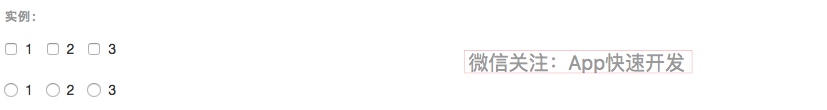
<label class="checkbox-inline">
  <input type="checkbox" id="inlineCheckbox1" value="option1"> 1
</label>
<label class="checkbox-inline">
  <input type="checkbox" id="inlineCheckbox2" value="option2"> 2
</label>
<label class="checkbox-inline">
  <input type="checkbox" id="inlineCheckbox3" value="option3"> 3
</label>

<label class="radio-inline">
  <input type="radio" name="inlineRadioOptions" id="inlineRadio1" value="option1"> 1
</label>
<label class="radio-inline">
  <input type="radio" name="inlineRadioOptions" id="inlineRadio2" value="option2"> 2
</label>
<label class="radio-inline">
  <input type="radio" name="inlineRadioOptions" id="inlineRadio3" value="option3"> 3
</label>

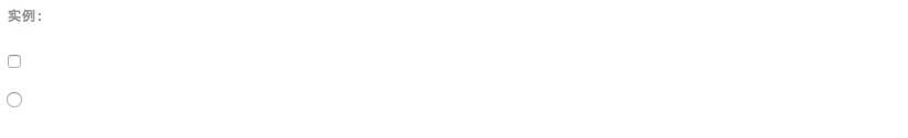
不带label文本的Checkbox 和 radio
如果需要
<div class="checkbox">
  <label>
    <input type="checkbox" id="blankCheckbox" value="option1" aria-label="...">
  </label>
</div>
<div class="radio">
  <label>
    <input type="radio" name="blankRadio" id="blankRadio1" value="option1" aria-label="...">
  </label>
</div>

4>.select下拉框
注意,很多原生选择菜单 - 即在 Safari 和 Chrome 中 - 的圆角是无法通过修改 border-radius 属性来改变的。
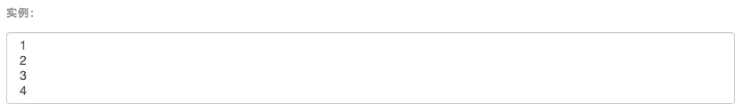
<select class="form-control">
  <option>1</option>
  <option>2</option>
  <option>3</option>
  <option>4</option>
  <option>5</option>
</select>
 

对于标记了 multiple 属性的 <select> 控件来说,默认显示多选项。
<select multiple class="form-control">
  <option>1</option>
  <option>2</option>
  <option>3</option>
  <option>4</option>
  <option>5</option>
</select>

选项组
<select size="3" multiple name="选择城市">
        <optgroup label="山东省">
            <option value="潍坊">潍坊</option>
            <option value="青岛" selected="selected">青岛</option>
        </optgroup>
        <optgroup label="山西省">
            <option value="太原">太原</option>
            <option value="榆次" >榆次</option>
        </optgroup>
    </select>
可以通过在select中设置 size来定义下拉菜单中显示的项目数目(optgroup的项目计算在其中);
设置multiple,则按住shift键可以多选。
5.静态控件
如果需要在表单中将一行纯文本和 label 元素放置于同一行,为
元素添加 .form-control-static 类即可。
<form class="form-horizontal">
  <div class="form-group">
    <label class="col-sm-2 control-label">Email</label>
    <div class="col-sm-10">
      <p class="form-control-static">email@example.com</p>
    </div>
  </div>
  <div class="form-group">
    <label for="inputPassword" class="col-sm-2 control-label">Password</label>
    <div class="col-sm-10">
      <input type="password" class="form-control" id="inputPassword" placeholder="Password">
    </div>
  </div>
</form>
 

<form class="form-inline">
  <div class="form-group">
    <label class="sr-only">Email</label>
    <p class="form-control-static">email@example.com</p>
  </div>
  <div class="form-group">
    <label for="inputPassword2" class="sr-only">Password</label>
    <input type="password" class="form-control" id="inputPassword2" placeholder="Password">
  </div>
  <button type="submit" class="btn btn-default">Confirm identity</button>
</form>
 

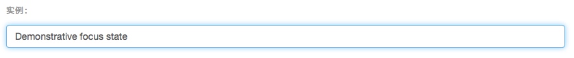
6.焦点状态
我们将某些表单控件的默认 outline 样式移除,然后对 :focus 状态赋予 box-shadow 属性。

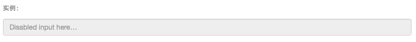
7.禁用状态
为输入框设置 disabled 属性可以禁止其与用户有任何交互(焦点、输入等)。被禁用的输入框颜色更浅,并且还添加了 not-allowed 鼠标状态。
<input class="form-control" id="disabledInput" type="text" placeholder="Disabled input here..." disabled>

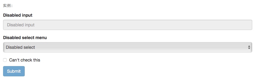
被禁用的 fieldset
为<fieldset> 设置 disabled 属性,可以禁用 <fieldset> 中包含的所有控件。
<a> 标签的链接功能不受影响
默认情况下,浏览器会将 <fieldset disabled> 内所有的原生的表单控件(<input>、<select> 和 <button> 元素)设置为禁用状态,防止键盘和鼠标与他们交互。然而,如果如果表单中还包含 <a ... class="btn btn-*"> 元素,这些元素将只被赋予 pointer-events: none 属性。正如在关于 禁用状态的按钮 章节中(尤其是关于锚点元素的子章节中)所描述的那样,该 CSS 属性尚不规范,并且在 Opera 18 及更低版本的浏览器或 Internet Explorer 11 总没有得到全面支持,并且不会阻止键盘用户能够获取焦点或激活这些链接。所以为了安全起见,建议使用自定义 JavaScript 来禁用这些链接。
跨浏览器兼容性
虽然 Bootstrap 会将这些样式应用到所有浏览器上,Internet Explorer 11 及以下浏览器中的 <fieldset> 元素并不完全支持 disabled 属性。因此建议在这些浏览器上通过 JavaScript 代码来禁用 <fieldset>。
<form>
  <fieldset disabled>
    <div class="form-group">
      <label for="disabledTextInput">Disabled input</label>
      <input type="text" id="disabledTextInput" class="form-control" placeholder="Disabled input">
    </div>
    <div class="form-group">
      <label for="disabledSelect">Disabled select menu</label>
      <select id="disabledSelect" class="form-control">
        <option>Disabled select</option>
      </select>
    </div>
    <div class="checkbox">
      <label>
        <input type="checkbox"> Can't check this
      </label>
    </div>
    <button type="submit" class="btn btn-primary">Submit</button>
  </fieldset>
</form>

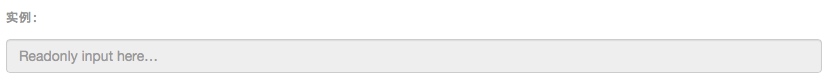
8.只读状态
为输入框设置 readonly 属性可以禁止用户修改输入框中的内容。处于只读状态的输入框颜色更浅(就像被禁用的输入框一样),但是仍然保留标准的鼠标状态。
<input class="form-control" type="text" placeholder="Readonly input here…" readonly>

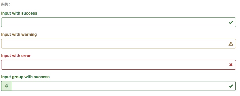
9.校验状态
Bootstrap 对表单控件的校验状态,如 error、warning 和 success 状态,都定义了样式。使用时,添加 .has-warning、.has-error 或 .has-success 类到这些控件的父元素即可。任何包含在此元素之内的 .control-label、.form-control 和 .help-block 元素都将接受这些校验状态的样式。
<div class="form-group has-success">
  <label class="control-label" for="inputSuccess1">Input with success</label>
  <input type="text" class="form-control" id="inputSuccess1">
</div>
<div class="form-group has-warning">
  <label class="control-label" for="inputWarning1">Input with warning</label>
  <input type="text" class="form-control" id="inputWarning1">
</div>
<div class="form-group has-error">
  <label class="control-label" for="inputError1">Input with error</label>
  <input type="text" class="form-control" id="inputError1">
</div>
<div class="has-success">
  <div class="checkbox">
    <label>
      <input type="checkbox" id="checkboxSuccess" value="option1">
      Checkbox with success
    </label>
  </div>
</div>
<div class="has-warning">
  <div class="checkbox">
    <label>
      <input type="checkbox" id="checkboxWarning" value="option1">
      Checkbox with warning
    </label>
  </div>
</div>
<div class="has-error">
  <div class="checkbox">
    <label>
      <input type="checkbox" id="checkboxError" value="option1">
      Checkbox with error
    </label>
  </div>
</div>
 

添加额外的图标
你还可以针对校验状态为输入框添加额外的图标。只需设置相应的 .has-feedback 类并添加正确的图标即可。
反馈图标(feedback icon)只能使用在文本输入框 <input class="form-control"> 元素上。
<div class="form-group has-success has-feedback">
  <label class="control-label" for="inputSuccess2">Input with success</label>
  <input type="text" class="form-control" id="inputSuccess2" aria-describedby="inputSuccess2Status">
  <span class="glyphicon glyphicon-ok form-control-feedback" aria-hidden="true"></span>
  <span id="inputSuccess2Status" class="sr-only">(success)</span>
</div>
<div class="form-group has-warning has-feedback">
  <label class="control-label" for="inputWarning2">Input with warning</label>
  <input type="text" class="form-control" id="inputWarning2" aria-describedby="inputWarning2Status">
  <span class="glyphicon glyphicon-warning-sign form-control-feedback" aria-hidden="true"></span>
  <span id="inputWarning2Status" class="sr-only">(warning)</span>
</div>
<div class="form-group has-error has-feedback">
  <label class="control-label" for="inputError2">Input with error</label>
  <input type="text" class="form-control" id="inputError2" aria-describedby="inputError2Status">
  <span class="glyphicon glyphicon-remove form-control-feedback" aria-hidden="true"></span>
  <span id="inputError2Status" class="sr-only">(error)</span>
</div>
<div class="form-group has-success has-feedback">
  <label class="control-label" for="inputGroupSuccess1">Input group with success</label>
  <div class="input-group">
    <span class="input-group-addon">@</span>
    <input type="text" class="form-control" id="inputGroupSuccess1" aria-describedby="inputGroupSuccess1Status">
  </div>
  <span class="glyphicon glyphicon-ok form-control-feedback" aria-hidden="true"></span>
  <span id="inputGroupSuccess1Status" class="sr-only">(success)</span>
</div>

10.控件尺寸
通过 .input-lg 类似的类可以为控件设置高度,通过 .col-lg-* 类似的类可以为控件设置宽度。
高度尺寸
创建大一些或小一些的表单控件以匹配按钮尺寸。
<input class="form-control input-lg" type="text" placeholder=".input-lg">
<input class="form-control" type="text" placeholder="Default input">
<input class="form-control input-sm" type="text" placeholder=".input-sm">
<select class="form-control input-lg">...</select>
<select class="form-control">...</select>
<select class="form-control input-sm">...</select>
 

水平排列的表单组的尺寸
通过添加 .form-group-lg 或 .form-group-sm 类,为 .form-horizontal 包裹的 label 元素和表单控件快速设置尺寸。
<form class="form-horizontal">
  <div class="form-group form-group-lg">
    <label class="col-sm-2 control-label" for="formGroupInputLarge">Large label</label>
    <div class="col-sm-10">
      <input class="form-control" type="text" id="formGroupInputLarge" placeholder="Large input">
    </div>
  </div>
  <div class="form-group form-group-sm">
    <label class="col-sm-2 control-label" for="formGroupInputSmall">Small label</label>
    <div class="col-sm-10">
      <input class="form-control" type="text" id="formGroupInputSmall" placeholder="Small input">
    </div>
  </div>
</form>
 

调整列(column)尺寸
用栅格系统中的列(column)包裹输入框或其任何父元素,都可很容易的为其设置宽度。
<div class="row">
  <div class="col-xs-2">
    <input type="text" class="form-control" placeholder=".col-xs-2">
  </div>
  <div class="col-xs-3">
    <input type="text" class="form-control" placeholder=".col-xs-3">
  </div>
  <div class="col-xs-4">
    <input type="text" class="form-control" placeholder=".col-xs-4">
  </div>
</div>
 

11.辅助文本
针对表单控件的“块(block)”级辅助文本。
与表单控件相关联的帮助文本
与表单控件相关联的帮助文本 aria-describedby 属性的表单控件关联,这将确保使用辅助技术- 如屏幕阅读器 - 的用户获取控件焦点或进入控制时显示这个帮助文本。
<label class="sr-only" for="inputHelpBlock">Input with help text</label>
<input type="text" id="inputHelpBlock" class="form-control" aria-describedby="helpBlock">
...
<span id="helpBlock" class="help-block">A block of help text that breaks onto a new line and may extend beyond one line.</span>
