Daisy.WP7.Controls自定义控件库,在这次的1.2版中新增加了四个控件:EnhancedTextBlock控件、TabControl控件、TextBubble控件、InputBubble控件。
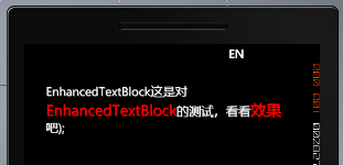
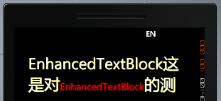
1.EnhancedTextBlock控件:这个控件可以对显示的文本增加阴影,对需要强调的文字斜体、加粗、改变颜色、字体大小等。
主要属性:
IsShowShadow:是否显示阴影效果。
Shadow:阴影颜色。
EnhancedFontSize:强调字的大小。
EnhancedFontFamily:强调字的字体。
EnhancedFontStyle:强调字的样式。
EnhancedFontWeight:强调字的粗体。
Background:设置控件背景色。
示例代码:
<my:EnhancedTextBlock HorizontalAlignment="Right" EnhancedForground="Red" IsShowShadow="True" Shadow="Yellow" EnhancedFontSize="25" FontSize="40" Foreground="White" Background="Gray" Name="enhancedTextBlock1" VerticalAlignment="Top" Height="116" Width="400" Margin="0,30,45,0">
效果:
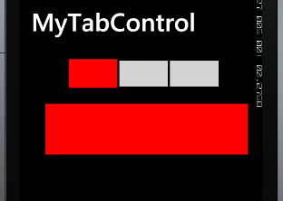
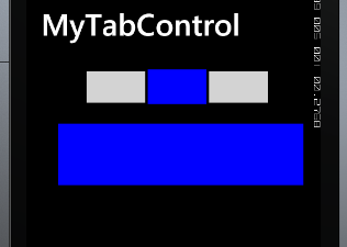
2.TabControl控件:这个控件和privot控件很相似,只是不能滑动,并且可以改变title的大小、定制任意效果,还可以对Item header定制大小和任意效果。
示例代码:
<my:TabControl Grid.Row="1" Height="332" Title="MyTabControl" HorizontalAlignment="Left" Name="tabControl1" VerticalAlignment="Top" Width="480">
<my:TabItem Header="Item1">
<my:TabItem.SelectedHeaderTemplate>
<DataTemplate>
<Rectangle Stroke="Black" StrokeThickness="2" Width="100" Height="60" Fill="Red"/>
</DataTemplate>
</my:TabItem.SelectedHeaderTemplate>
<my:TabItem.UnselectedHeaderTemplate>
<DataTemplate>
<Rectangle Stroke="Black" StrokeThickness="2" Width="100" Height="55" Fill="LightGray"/>
</DataTemplate>
</my:TabItem.UnselectedHeaderTemplate>
<Rectangle VerticalAlignment="Top" Width="400" Height="100" Fill="Red"/>
</my:TabItem>
<my:TabItem Header="Item2">
<my:TabItem.SelectedHeaderTemplate>
<DataTemplate>
<Rectangle Stroke="Black" StrokeThickness="2" Width="100" Height="60" Fill="Blue"/>
</DataTemplate>
</my:TabItem.SelectedHeaderTemplate>
<my:TabItem.UnselectedHeaderTemplate>
<DataTemplate>
<Rectangle Stroke="Black" StrokeThickness="2" Width="100" Height="55" Fill="LightGray"/>
</DataTemplate>
</my:TabItem.UnselectedHeaderTemplate>
<Rectangle VerticalAlignment="Top" Width="400" Height="100" Fill="Blue"/>
</my:TabItem>
<my:TabItem Header="Item3">
<my:TabItem.SelectedHeaderTemplate>
<DataTemplate>
<Rectangle Stroke="Black" StrokeThickness="2" Width="100" Height="60" Fill="Green"/>
</DataTemplate>
</my:TabItem.SelectedHeaderTemplate>
<my:TabItem.UnselectedHeaderTemplate>
<DataTemplate>
<Rectangle Stroke="Black" StrokeThickness="2" Width="100" Height="55" Fill="LightGray"/>
</DataTemplate>
</my:TabItem.UnselectedHeaderTemplate>
<Rectangle VerticalAlignment="Top" Width="400" Height="100" Fill="Green"/>
</my:TabItem>
</my:TabControl>
效果:

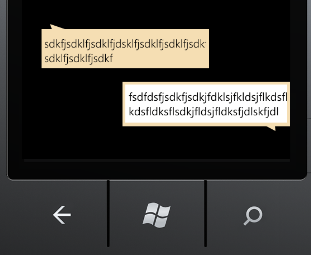
3.TextBubble控件: 这是一个像方形气泡效果的TextBlock。可以改变气泡的左右方向。
主要属性:
Background:设置控件的背景色。
Foreground:设置字体颜色。
Orientation:设置气泡的方向。
示例代码:
<my:TextBubble Grid.Row="2" Background="Wheat" Text="sdkfjsdklfjsdklfjdsklfjsdklfjsdklfjsdkfjsdklfjsdklfjsdkf" Foreground="Black" HorizontalAlignment="Left" Margin="35,39,0,0" Name="textBubble1" VerticalAlignment="Top" Width="300" />
4.InputBubble控件:这是一个像方形气泡效果的TextBox。可以改变气泡的左右方向。
主要属性:
Background:设置控件的背景色。
Foreground:设置字体颜色。
Orientation:设置气泡的方向。
LimitedHeight:最大高度,设置这个值后,这个控件才可以自动换行。
示例代码:
<my:InputBubble Grid.Row="3" Background="Wheat" Orientation="Right" HorizontalAlignment="Right" LimitedHeight="100" Name="inputBubble1" VerticalAlignment="Top" Width="300" />
两个控件的显示效果:
示例代码和控件库地址:http://www.52winphone.com/bbs/viewthread.php?tid=748&extra=page%3D1