一、简介
Matplotlib 是一个 Python 的 2D绘图库,它以各种硬拷贝格式和跨平台的交互式环境生成出版质量级别的图形。通过 Matplotlib,开发者可以仅需要几行代码,便可以生成绘图,直方图,功率谱,条形图,错误图,散点图等。
二、常用方法
1、matplotlib.pyplot.plot
该方法用来绘制图像,有两种函数签名:
plot([x], y, [fmt], data=None, **kwargs)
plot([x], y, [fmt], [x2], y2, [fmt2], ..., **kwargs)
1.1、plot([x], y, [fmt], data=None, **kwargs)
首先来看plot([x], y, [fmt], data=None, **kwargs),该函数包含5个参数,x为可选参数,指定了横轴上的点,默认为[0, 1, ..., N-1];y指定了纵轴上的点;fmt是一个字符串类型的可选参数,用来指定所绘图行的颜色、标记、线型等属性,比如bo表示所绘的线为蓝色且用o来标记线上的坐标点,r+表示线条为红色并用+来标记线上的点;data为一个可索引对象,可选,它可以是一个字典、一个pandas数据帧或者一个结构化的numpy数组;kwargs为关键字参数用来指定线宽、线标签等属性。
下面来模拟一个城市在24小时内的温度变化图。
import matplotlib.pyplot as plt
import random
# 保证生成的图片在浏览器内显示
%matplotlib inline
# 保证能正常显示中文(Windows)
plt.rcParams['font.sans-serif']=['SimHei'] #用来正常显示中文标签
plt.rcParams['axes.unicode_minus']=False #用来正常显示坐标轴负号
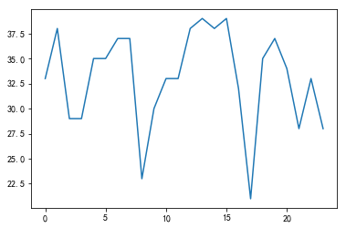
x = range(0, 24)
y = [33, 38, 29, 29, 35, 35, 37, 37, 23, 30, 33, 33, 38, 39, 38, 39, 32, 21, 35, 37, 34, 28, 33, 28]
plt.plot(x, y)
输出:

指定参数fmt为bo:
plt.plot(x, y, 'bo')
输出:

指定关键字参数kwargs来改变线宽:
plt.plot(x, y, linewidth=5)
输出:

指定data参数:
plt.plot('xlabel', 'ylabel', data={'xlabel':x, 'ylabel':y})
输出:
1.2、plot([x], y, [fmt], [x2], y2, [fmt2], ..., **kwargs)
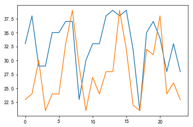
plot([x], y, [fmt], [x2], y2, [fmt2], ..., **kwargs)可以在一张图片中绘制多条曲线。
x = range(0, 24)
y1 = [33, 38, 29, 29, 35, 35, 37, 37, 23, 30, 33, 33, 38, 39, 38, 39, 32, 21, 35, 37, 34, 28, 33, 28]
y2 = [23, 24, 30, 21, 24, 24, 33, 39, 29, 21, 27, 24, 28, 28, 39, 32, 22, 21, 32, 31, 38, 24, 26, 23]
plt.plot(x, y1, x, y2)
输出:
更改线型、线宽:
plt.plot(x, y1, 'bo-', x, y2, 'y+-', linewidth=3)
输出:

2、 matplotlib.pyplot.xticks和matplotlib.pyplot.yticks
xticks和yticks用来指定坐标轴的标签(刻度),两者的区别就是xticks对x轴起作用,yticks对y轴起作用。下面对xticks作分析,xticks有两种函数签名:
locs, labels = xticks()           # 获取位置的标签

xticks(locs, [labels], **kwargs)  # 设置位置和标签
在xticks(locs, [labels], **kwargs)中,loc为用来放置刻度的位置列表,可以传递一个空列表来禁用xticks,labels为可选参数,用来指定在loc每个位置上的标签;关键字参数kwargs为Text类型的属性,用来控制标签的外观。
接着使用上面的例子:
x = range(0, 24)
# x轴标签
x_label = [u"{}时".format(t) for t in x_]
y1 = [33, 38, 29, 29, 35, 35, 37, 37, 23, 30, 33, 33, 38, 39, 38, 39, 32, 21, 35, 37, 34, 28, 33, 28]
y2 = [23, 24, 30, 21, 24, 24, 33, 39, 29, 21, 27, 24, 28, 28, 39, 32, 22, 21, 32, 31, 38, 24, 26, 23]
# y轴标签
y1_label = [u"{}℃".format(t) for t in y1]

plt.xticks(x, x_label)
plt.yticks(y, y1_label)
plt.plot(x, y1)
输出:

可以看到由于图片比较小,导致标签都重叠在了一起,这时可以使用matplotlib.pyplot.figure设置画板属性来解决这一问题。
3、 matplotlib.pyplot.figure
matplotlib.pyplot.figure用来设置画板属性,其函数签名如下:
matplotlib.pyplot.figure(num=None, figsize=None, dpi=None, facecolor=None, edgecolor=None, frameon=True, FigureClass=<class 'matplotlib.figure.Figure'>, clear=False, **kwargs)[source]
其中num是一个可选参数,如果没有提供,则创建一个新图像,如果提供,则返回id为num的图像,如果该图像不存在,则创建后返回;figsize用来指定图像的宽度和高度,单位为英寸;dpi指定了图像的分辨率;facecolor用来指定背景色;edgecolor用来指定边的颜色。
# 设置画板属性
plt.figure(figsize = (10, 7), dpi = 100)

plt.xticks(x, x_label)
plt.yticks(y, y_label)
plt.plot(x, y1)
输出:

4、matplotlib.pyplot.legend
该方法用来设置图例,其3中签名为;
legend()
legend(labels)
legend(handles, labels)
4.1、legend()
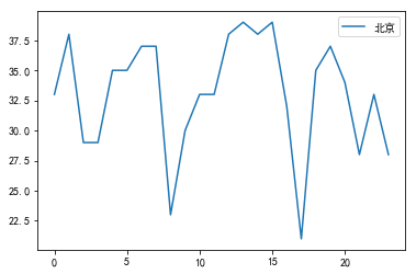
无参的legend方法自动检测要在图例中显示的元素。
x = range(0, 24)
y = [33, 38, 29, 29, 35, 35, 37, 37, 23, 30, 33, 33, 38, 39, 38, 39, 32, 21, 35, 37, 34, 28, 33, 28]

plt.plot(x, y, label=u"北京")
plt.legend()
输出:
4.2 legend(labels)
该方法不推荐使用。
4.3 legend(handles, labels)
该方法明确地指出了线条和图例的关系。
legend((line1, line2, line3), ('label1', 'label2', 'label3'))
使用方法:
x = range(0, 24)
y1 = [33, 38, 29, 29, 35, 35, 37, 37, 23, 30, 33, 33, 38, 39, 38, 39, 32, 21, 35, 37, 34, 28, 33, 28]
y2 = [23, 24, 30, 21, 24, 24, 33, 39, 29, 21, 27, 24, 28, 28, 39, 32, 22, 21, 32, 31, 38, 24, 26, 23]
#该方法具有返回值,返回值为一个元组,使用下面的方式得到线条对象
bj, = plt.plot(x, y1)
sh, = plt.plot(x, y2)
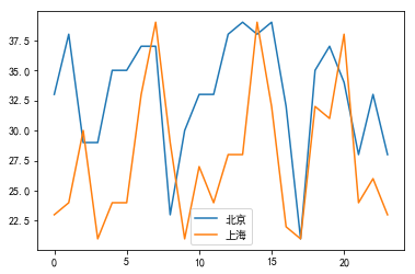
plt.legend((bj, sh), (u"北京", u"上海"))
输出:
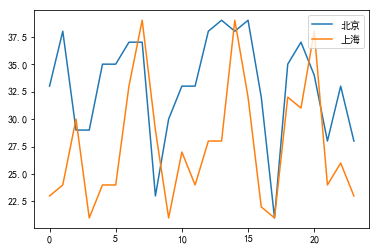
还可以通过设置loc参数来改变图例的位置。
x = range(0, 24)
y1 = [33, 38, 29, 29, 35, 35, 37, 37, 23, 30, 33, 33, 38, 39, 38, 39, 32, 21, 35, 37, 34, 28, 33, 28]
y2 = [23, 24, 30, 21, 24, 24, 33, 39, 29, 21, 27, 24, 28, 28, 39, 32, 22, 21, 32, 31, 38, 24, 26, 23]

bj, = plt.plot(x, y1)
sh, = plt.plot(x, y2)
plt.legend((bj, sh), (u"北京", u"上海"), loc='upper right')
输出:
上面通过调用两次plt.plot将两条线画进了一张图里,若想分别画在两张图,只需要在两次调用之间添加plt.figure()即可。
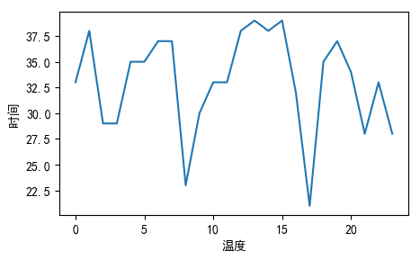
5、matplotlib.pyplot.xlabel和matplotlib.pyplot.ylabel
这两个方法分别制定x轴和y轴的标签。
x = range(0, 24)
y = [33, 38, 29, 29, 35, 35, 37, 37, 23, 30, 33, 33, 38, 39, 38, 39, 32, 21, 35, 37, 34, 28, 33, 28]

plt.figure(figsize = (5, 3), dpi = 100)
plt.plot(x, y)
plt.xlabel(u"温度")
plt.ylabel(u"时间")
输出:
6、matplotlib.pyplot.show
该方法用来显示图片。
三、绘制不同类型的图
1、折线图
上面的例子绘制的都是折线图:
x = range(0, 24)
y = [33, 38, 29, 29, 35, 35, 37, 37, 23, 30, 33, 33, 38, 39, 38, 39, 32, 21, 35, 37, 34, 28, 33, 28]

plt.figure(figsize = (5, 3), dpi = 100)
plt.plot(x, y)
plt.figure()
输出:

2、条形图
import matplotlib.pyplot as plt
import random
# 保证生成的图片在浏览器内显示
%matplotlib inline
# 保证能正常显示中文(Windows)
plt.rcParams['font.sans-serif']=['SimHei'] #用来正常显示中文标签
plt.rcParams['axes.unicode_minus']=False #用来正常显示坐标轴负号

# 条形图绘制名侦探柯南主要角色年龄
role_list = [u"柯南", u"毛利兰", u"灰原哀", u"琴酒", u"贝尔摩德", u"伏特加", u"赤井秀一", u"目暮十三"]
role_age = [7, 17, 7, 34, 32, 30, 27, 46]
# 实际年龄
role_ture_age = [18, 17, 18, 34, 45, 30, 27, 46]

x = [i for i in range(1, len(role_list)+1)]

y = role_age
y2 =role_ture_age

# 设置画板属性
plt.figure(figsize = (15, 8), dpi = 100)

# width以x为基准,向右为正,向左为负(如果多了,就需要为基准x加减响应的数值)
plt.bar([v+0.3 for v in x], y, width= 0.3, label=u"现实年龄", color="#509839")
plt.bar(x, y2, width = 0.3, label=u"实际年龄", color="#c03035")

x_ = [i for i in range(0, len(role_list)+1)]
x_desc = [u"{}".format(x_desc) for x_desc in role_list]
x_desc.insert(0, "")

y_ = range(0, 50)[::5]
y_desc = [u"{}岁".format(y_desc) for y_desc in range(0, 50)][::5]

# x轴的数值和描述
plt.xticks(x_, x_desc)
plt.yticks(y_, y_desc)

plt.xlabel(u"角色姓名")
plt.ylabel(u"年龄")
plt.title(u"名侦探柯南主要角色年龄(部分)")
plt.legend(loc="best")
输出:

3、饼图
import matplotlib.pyplot as plt
import random
# 保证生成的图片在浏览器内显示
%matplotlib inline
# 保证能正常显示中文(Windows)
plt.rcParams['font.sans-serif']=['SimHei'] #用来正常显示中文标签
plt.rcParams['axes.unicode_minus']=False #用来正常显示坐标轴负号
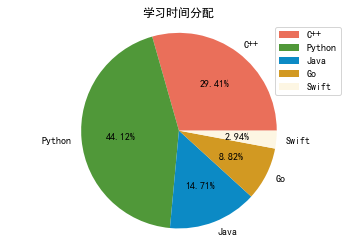
# 学习时间分配
pro_name = ["C++", "Python", "Java", "Go", "Swift"]
pro_time = [10, 15, 5, 3, 1]
# 画饼
plt.pie(pro_time, labels=pro_name, autopct="%3.2f%%", colors=["#ea6f5a", "#509839", "#0c8ac5", "#d29922", "#fdf6e3"])
# 指定标题
plt.title(u"学习时间分配")
# 保证为图形为正圆
plt.axis("equal")
# 显示图示
plt.legend(loc="best")
输出: