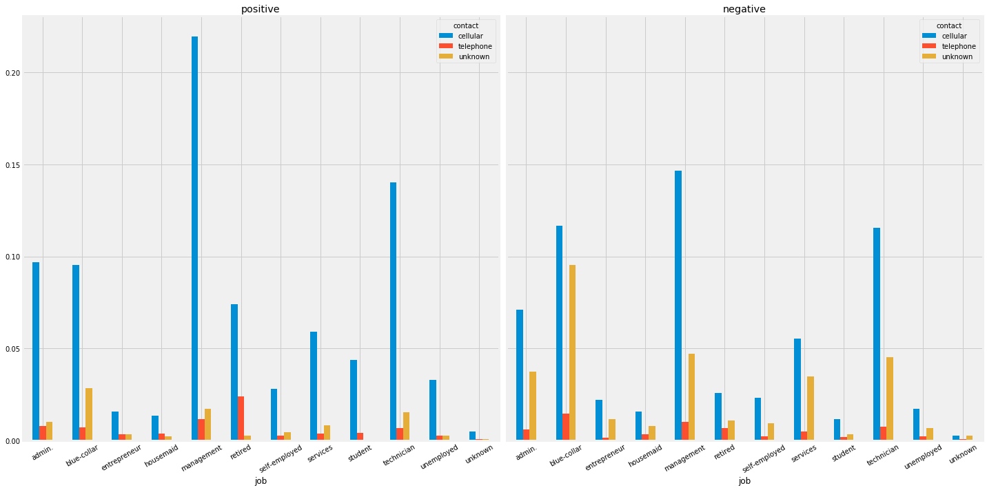
需求:比如我有一个数据集,然后其中两个初始维度都是类别变量。我希望以可视化的方式呈现这两个变量对于最终分类结果的影响。
- 利用
pandas获取DataFrame - 利用
pandas.crosstab来构建一个只关于这2个类别变量的新的DataFrame - 使用
pandas的画图函数
代码
train_df = pd.read_csv('train.csv')
train_pos_df = train_df[train_df['y']] == 1]
train_neg_df = train_df[train_df['y']] != 1]

# 希望可视化'job'与'contact'在不同分类下的情况,'normalize=True'很重要,如果样本不均衡,用比例来表示能取消不平衡带来的影响
pos_cross_df = pd.crosstab(train_df_pos.job, train_df_pos.contact, margins=True, normalize=True)
neg_cross_df = pd.crosstab(train_df_neg.job, train_df_neg.contact, margins=True, normalize=True)

# 在jupyter中这条代码能可视化DataFrame并辅以颜色,但在本例中不是重点
# pd.crosstab(train_df_pos.job, train_df_pos.contact, margins=True).style.background_gradient(cmap='summer_r')

# 对'crosstab'做处理,去掉行和列中的'All'
pos_cross_df.drop('All', inplace=True)
pos_cross_df.drop('All', axis=1, inplace=True)
neg_cross_df.drop('All', inplace=True)
neg_cross_df.drop('All', axis=1, inplace=True)

# 画图
fig, axes = plt.subplots(1, 2, figsize=(20, 10), sharex=True, sharey=True)
pos_cross_df.plot.bar(rot=30, ax=axes[0])
axes[0].set_title('positive')
neg_cross_df.plot.bar(rot=30, ax=axes[1])
axes[1].set_title('negative')
plt.tight_layout()
plt.show()
输出:

参数
kind : str
        - 'line' : line plot (default)
        - 'bar' : vertical bar plot
        - 'barh' : horizontal bar plot
        - 'hist' : histogram
        - 'box' : boxplot
        - 'kde' : Kernel Density Estimation plot
        - 'density' : same as 'kde'
        - 'area' : area plot
        - 'pie' : pie plot
        - 'scatter' : scatter plot
        - 'hexbin' : hexbin plot
figsize : a tuple (width, height) in inches
use_index : bool, default True
    Use index as ticks for x axis
title : string or list
    Title to use for the plot. If a string is passed, print the string
    at the top of the figure. If a list is passed and `subplots` is
    True, print each item in the list above the corresponding subplot.
grid : bool, default None (matlab style default)
    Axis grid lines
legend : False/True/'reverse'
    Place legend on axis subplots
style : list or dict
    matplotlib line style per column
logx : bool or 'sym', default False
    Use log scaling or symlog scaling on x axis
    .. versionchanged:: 0.25.0
logy : bool or 'sym' default False
    Use log scaling or symlog scaling on y axis
    .. versionchanged:: 0.25.0
loglog : bool or 'sym', default False
    Use log scaling or symlog scaling on both x and y axes
    .. versionchanged:: 0.25.0
xticks : sequence
    Values to use for the xticks
yticks : sequence
    Values to use for the yticks
xlim : 2-tuple/list
ylim : 2-tuple/list
rot : int, default None
    Rotation for ticks (xticks for vertical, yticks for horizontal
    plots)
fontsize : int, default None
    Font size for xticks and yticks
colormap : str or matplotlib colormap object, default None
    Colormap to select colors from. If string, load colormap with that
    name from matplotlib.
colorbar : bool, optional
    If True, plot colorbar (only relevant for 'scatter' and 'hexbin'
    plots)
position : float
    Specify relative alignments for bar plot layout.
    From 0 (left/bottom-end) to 1 (right/top-end). Default is 0.5
    (center)
table : bool, Series or DataFrame, default False
    If True, draw a table using the data in the DataFrame and the data
    will be transposed to meet matplotlib's default layout.
    If a Series or DataFrame is passed, use passed data to draw a
    table.
yerr : DataFrame, Series, array-like, dict and str
    See :ref:`Plotting with Error Bars <visualization.errorbars>` for
    detail.
xerr : DataFrame, Series, array-like, dict and str
    Equivalent to yerr.
mark_right : bool, default True
    When using a secondary_y axis, automatically mark the column
    labels with "(right)" in the legend
`**kwds` : keywords
    Options to pass to matplotlib plotting method
参考: