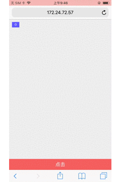
在移动端布局的时候, 在底部有一个button, 页面超过两屏, 是一个可滚动的的网页, 当运行在移动端Safari浏览器上的时候, 向下滑动页面, 浏览器的头部和尾部会自动隐藏, 这样可视区域就会变大, 本来这个设计是很好的, 但是这也跟前端工程师带来麻烦, 当头部和尾部隐藏掉之后, 再点击底部的按钮, 不会触发, 它会自动识别点击了底部, 先把底部和头部显示出来, 再次点击这个按钮时才会触发, 这就导致了底部按钮需要点击两次才能触发, QA肯定是不愿意的, 用户更是不愿意的, 废话不多说, 看效果你就明白了
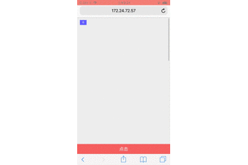
看的不是很清晰, 就是在下滑的时候头部和底部会自动隐藏, 点击按钮时, 先显示底部和头部导航, 再次点击的时候才会触发onclick事件
上个代码, 布局很简单, 放到Safari浏览器上运行就明白了
<!DOCTYPE html>
<html>
<head>
    <meta charset="utf-8">
    <meta name="viewport" content="initial-scale=1.0, maximum-scale=1.0, minimum-scale=1.0, user-scalable=no">
    <title>safari</title>
    <style type="text/css">
        * {
            margin: 0;
            padding: 0;
        }
        .box {
            height: 2000px;
            background-color: #eee;
        }
        #btn {
            height: 40px;
            line-height: 40px;
            font-size: 18px;
            color: #fff;
            text-align: center;
            border: none;
            outline: none;
            background-color: #f66;
            width: 100%;
            position: fixed;
            bottom: 0;
            left: 0;
            right: 0;
        }
        .count {
            height: 20px;
            line-height: 20px;
            font-size: 14px;
            background-color: #66f;
            color: #fff;
            padding: 0 10px;
            position: fixed;
            top: 10px;
            left: 10px;
        }
    </style>
</head>
<body>
<div class="box"></div>
<button id="btn">点击</button>
<div class="count">0</div>
</body>
<script type="text/javascript" src="./jquery.js"></script>
<script type="text/javascript">
    var a = 0;
    $('#btn').on('click', function() {
        a += 1;
        $('.count').html(a)
    })
</script>
</html>
解决的办法就是, 滚动的时候不让底部和头部导航隐藏, 这样就不会有问题了, 但是经过一番搜索之后, 用js没有办法控制浏览器的盗汗栏不消失, 最后..终于在公司大佬的帮助下解决了, 其实非常简单, 简单到用css就完美解决了
        html, body {
            height: 100%;
            overflow: auto;
        }
就是给body加上上面的代码, 导航栏就不会隐藏了